
Salute everybody, i hope y'all doing well.
Recently i have seen a lot of designs and websites using the glass effect which makes the website looks smoother 💎. So you might be wondering how have they done this effect.
Today i will show you the easiest way to use this effect in your project in 4 steps.
1- Create a new div
So first things first we create a new div in our html file and giving it a class name like so:
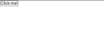
<div class="box">
  <button class="my-btn">Click me!</button>
<div>
2- Remove extra space
Secondly we go to our CSS file to remove all the extra space from the html elements.
* {
  margin: 0;
  padding: 0;
}
3- Center the content
Adding a beautiful background to the body & align our div to center.
body {
  display: flex;
  justify-content: center;
  align-items: center;
  background-image: url("<https://images.unsplash.com/photo-1488718729626-53eaa41c0848?ixlib=rb-1.2.1&ixid=MnwxMjA3fDB8MHxwaG90by1wYWdlfHx8fGVufDB8fHx8&auto=format&fit=crop&w=633&q=80>");
  background-position: center;
  background-repeat: no-repeat;
  background-size: cover;
  height: 100vh;
Third step results

4- Add glass effect
Adding some styling & glass effect.
.box {
  position: relative;
  width: 400px;
  height: 200px;
  background-color: rgba(255, 255, 255, 0.15);
  box-shadow: 0 0 1rem 0 rgba(0, 0, 0, 0.2);
  border-radius: 5px;
  backdrop-filter: blur(15px); /* glass effect */
}
Congrats 🎉🎊 you have created the glass effect successfully!
This is how the final result looks like ! 💯
For the "Click me" button here is the CSS:
.my-btn {
  cursor: pointer;
  padding: 15px 40px;
  background-color: black;
  color: white;
  border: none;
  outline: none;
  border-radius: 5px;
  position: absolute;
  top: 80%;
  left: 50%;
  transform: translate(-50%, -50%);
  transition: 0.5s;
}
🌐 Here is a link if you want to visit the whole code HERE.
Connect with me if you have any question.
👌 I hope this post helped you to create your own glass effect.
💖 If you find this post a bit useful let me know in the comment section.


Top comments (0)