This is the fourth post in my "Adventures in xAPI Implementation" series. If you're just joining us, feel free to take a look at the previous three posts to get caught up!
- Part 1: Introduction
- Part 2: Sending custom xAPI statements
- Part 3: What to do with these statements
At this point in the adventure, I am now collecting statements in our LearningLocker LRS, but as I mentioned in a previous post, it isn't the friendliest place to review your results - take a look at what I mean - apologies for the censoring - my test account uses a coworker's name:
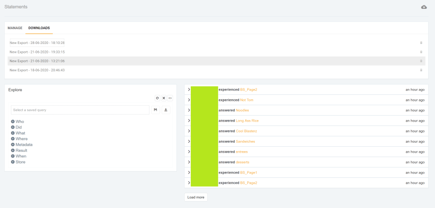
Now, this is actually already easier to read than reading the raw statements, but as you add learners, and everyone is making selections at different (or the same) times, this could get challenging very quick.
If you're just looking for basic visualizations like the total numbers of one answer, LearningLocker has several options, and your LRS may have visualization options as well - but I needed to do some comparisons that required a couple levels of extrapolation for a recent project, so I turned to PowerBI. I love PowerBI's flexibility to pull in data from multiple sources, create relationships between that data and create extremely deep queries that are also easily repeatable for different data sets.
So without further ado, let's take a look at what it takes to bring your xAPI data into PowerBI!
I've created a quick 5-question quiz based on Parks and Rec character Tom Haverford:
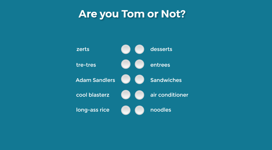
Each answer will send its own xAPI statement, and a final determination of whether the learner "is tom" or not will also be sent. What I'm going to analyze afterwards is, what are the most common answers for people who ended up being Tom, and what are the most common answers for people who did not end up being Tom.
Simple and completely not scientific - but should be an effective example.
So I run a handful of test users through the quiz, make sure the data is in our LearningLocker, and now I can open up a new report in PowerBI.
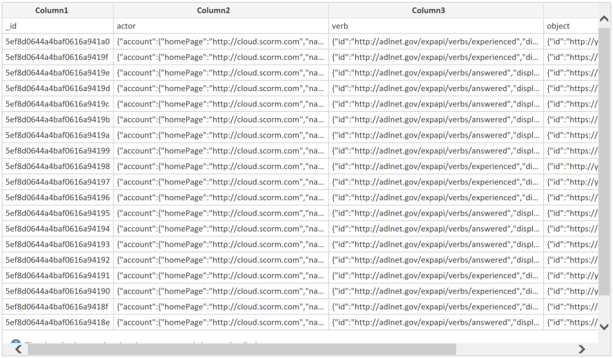
When you start a new report, you will be asked to get data from somewhere. LearningLocker has an option to download your data in .csv format, so I'm going to use the .csv option. LearningLocker stores all the data in its JSON format, so the initial import is going to look a little challenging to understand at first.
No worries though, I'm going to click "Transform Data" and get that fixed real quick.
Once the Transform Data window loads up, the first thing I'm going to do is check out the columns. You can see from my screenshot below that there's one issue we need to fix right off the bat.
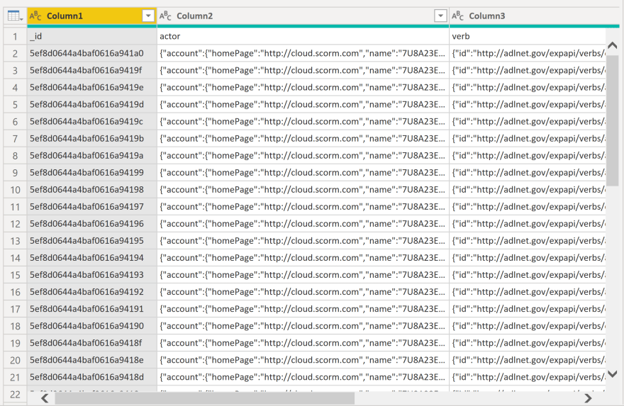
If you noticed that my actual column headers are on the first row, rather than in the proper location - you're doing great. Easy fix - PowerBI's main ribbon has a button on the Home tab specifically for this. It's labeled: "Use First Row as Headers".
Once it's clicked, my headers are in the right place, and I'm ready to do a little more cleanup. In this situation, I don't need the _id column, so I'm going to right click it and remove it.
You may be basing a query on the combination of actor, verb, and object, but for this example I'll just be using actor and object - but I need to get them out of their JSON object to work with them. Again, thankfully, PowerBI makes this extremely simple. I'm going to select all columns, switch the ribbon to the Transform tab, and find the Parse button. Select JSON from the dropdown, and........
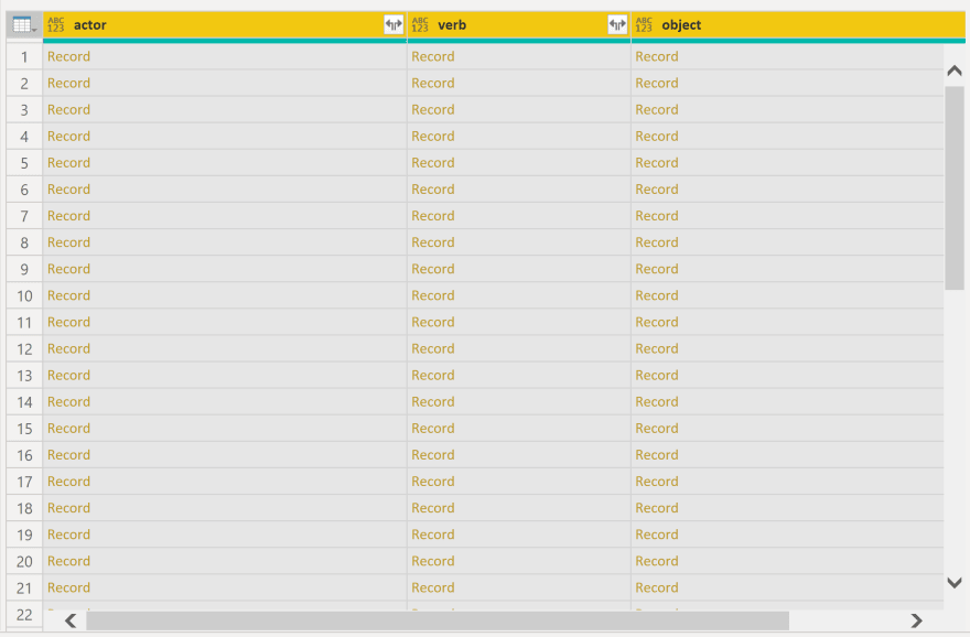
I'll admit - this looks a bit scary at first. Where there at least appeared to be data before, now all I can see is the word "Record" repeated over and over again - with no sign of my actual data anywhere in sight.
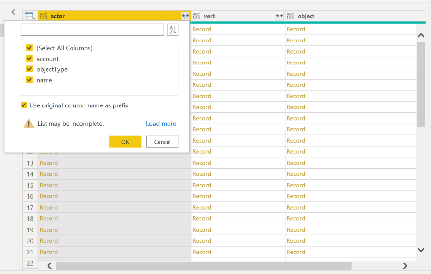
All I need to do is click the split arrow button in each column header. This activates PowerBI's "Expand" feature - a way to pull each of the object keys into their own column. You actually get a nice selection menu, to determine which of the keys you actually want to bring in.
For my work, I'm going to use the "name" key from the "actor" column - but depending on how you have your statements organized, you may choose to use a different identifier.
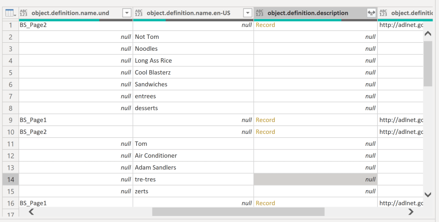
Once I've pulled out the name, I'm ready to dig into the "object" column. This time, there's a little more digging to do, as sometimes the field you want is nested a little deeper. For this report, the data I wanted was three levels deep. Sometimes, the easiest thing to do is expand one column set as much as it will expand before moving on to the next one, unless you already know where to look. Once you've found what you need, you can remove everything else.
After those final few column removals, I'm ready to save the query, and head back into the report builder by clicking "Close and Apply" on the Home tab.
Now you have your data over in the far right pane "Fields" and your Visualization options to the left of that in their own pane. At this point, you should have everything you need to start building an actual visualization.
Each of the visualizations will have slightly different setups, but at this point, a little tinkering with the placement of your fields should get you the visual of your choice. I'm far from being a PowerBI pro, and this is a very insignificant amount of data to work with, but here's a quick look at my end result before I give you a quick once-over of how I got there:
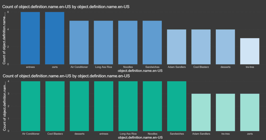
So, again - these results do not represent an actual breakdown of what 100 people taking this assessment would actually answer - but the visualization lives and works exactly the same way. The top graph is showing the breakdown of selections for those who were deemed "Tom" and the bottom graph shows the same thing for the "Not Toms".
To get there, I took my initial data set, and in the "Transform Data" window - which you can get back to by clicking on the three dot menu next to your table name in the "Fields" pane - I duplicated my data set three times, to make a total of four data sets. After that, I filtered the first one down to include only rows that matched the "Tom" value. This gives me a list of people that are Toms. Somewhat confusing in this context, but I'm sure you follow. Next I went to the second dataset and filtered it down to give me a list of people who are "Not Toms". In the third data set, I filtered down to only the rows that contained the names of those who were Toms, and filtered out the Tom objects. In the fourth data set....you probably already know, but I did the same exact thing for my set of Not Toms.
Now I have a count of Toms, a count of Not Toms, and a count of all answers that were provided by both sets.
If it sounds confusing or intimidating....well, it kind of can be at times - but there are a lot of great resources for learning how to visualize your data - my main goal here was to show how the data comes in from the LRS from a .csv and ends up in a nice visualization. I hope I was able to do that - but if you've made it this far and have any questions, please feel free to reach out to me any time - either here, or @_jonny5 on twitter.

Oldest comments (0)