I like bloging with static site generator, like hugo or hexo, but they're not good on working with responsive image.
My blog is a git repo, so I don't like to store image with it. I found that store image on cloudinary is easier (and faster), especially when I want to load images into my blog post responsively.
I'm going to separate this post into 4 parts:
- part 1: Hello World
- part 2: cloudinary
- part 3: cloudinary responsive image script
- part 4: hugo template and shortcode
part 1: Hello World
Nothing here yet, just to say Hi, and Happy New Year everyone.

part 2: cloudinary
Assumed that I found a big beautiful image somewhere on net, and I want using it for my blog post. It should load a small version on post list and big version for post full, as post cover. It also should load responsively when displaying on wide range of device (phone, tablet, desktop computer...).
OMG! too much version, too much logic just for displaying only one image...
I log in to cloudinary and add it into my collection by copy and paste the image url on Web Address tab and push upload button next to it. 1
Whenever it uploaded, you can get it's url and paste into your blog post, simpliest way is hover your mouse on thumbnail and click to link icon

As you can see on bottom right corner of thumbnail, the size is nearly 2500px*2000px. I want to use this in a post, but it size was too big. My post preview width is around 300px, and the biggest width in post cover is about 1400px (on desktop computer) 2
That's the reason I use cloudinary responsive image script
part 3: cloudinary responsive image script
I'm using Hugo.
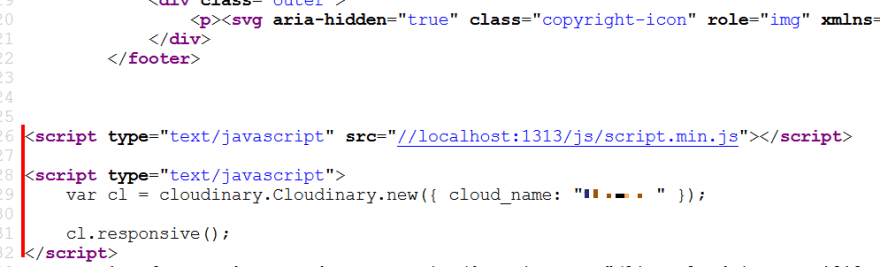
First I download the script and save it to assets/js folder. Your path to script files may be difference with mine.
Include it in partials/site-tail.html template with Hugo pipe
{{ $cloudinary := resources.Get "js/cloudinary-core-shrinkwrap.js" }}
{{/* $vars := resources.Get "other scripts" */}}
{{ $js := slice $cloudinary /* $vars */ | resources.Concat "js/script.js" | minify }}
<script type="text/javascript" src="{{ $js.Permalink }}"></script>

<script type="text/javascript">
    // replace account_name with your account
    var cl = cloudinary.Cloudinary.new({ cloud_name: "account_name" });
    cl.responsive();
</script>
Check if it included well by viewing page source
Now making images load responsively.
Normally if you copy image url from cloudinary and insert into post, your image would render like this (I've add some breaks for readability purpose)
<img
    src="https://res.cloudinary.com/account_name/image/upload/v73485485/path/to/image_name.jpg"
>
To load responsive image, Your image should be render like this
<img
    data-src="https://res.cloudinary.com/account_name/image/upload/w_auto,c_scale/v73485485/path/to/image_name.jpg"
    class="cld-responsive"
>
See differents?
- You have to use
data-srcfor image url - you have to add
c_scale, w_autoin the middle of image url - you have to use
class="cld-responsive"
I'm going to show you my Hugo template and shortcode
part 4: hugo template and shortcode
Well, hope you still reading down here without dying bored.
This is my frontmatter in yml format
---
title: "my title"
#other things

# it is easier for me to use account_name instead of img or something else
account_name: "url/you/copy/from/cloudinary"
---
the template to display post preview and post cover
Here's my partials/post-preview.html template. The reason of making this is I don't like editing image's url on every single post, just copy - paste original url.
// replace account_name with yours
<a class="card-preview" href="{{ .Permalink }}">

    {{ if (.Params.account_name) }}
        {{ $vcl := "https://res.cloudinary.com/account_name/image/upload" }}
        {{ $pth := .Params.account_name | strings.TrimLeft $vcl }}
        <div class="preview-image"><img class="cld-responsive" data-src="{{ $vcl }}/c_scale,w_auto/{{ $pth }}"></div>

    {{ else }}
        <div class="preview-image" style="background: teal;"></div>
    {{ end }}

</a>
the shortcode to insert responsive image into post
I use account_name for shortcode name because I have many cloudinary account.
Create shortcodes/account_name.html, fill with this
<div class="cld-image">
    {{ $vcl := "https://res.cloudinary.com/account_name/image/upload" }}
    {{ $path := .Get 0 | strings.TrimLeft $vcl }}
    <a href="{{ $vcl }}/{{ $path }}">
        <img data-src="{{ $vcl }}/c_scale,w_auto/{{ $path }}" class="cld-responsive">
    </a>
</div>
Use within post
{{< account_name "original/url/you/copied/from/cloudinary" >}}

// like this

{{< account_name "https://res.cloudinary.com/account_name/image/upload/v73485485/path/to/image_name.jpg" >}}
Now nearly every page in my hugo site loads image responsively base on browser screen size.
That's all. Thanks for watching.
-
Another way to add images to your collection is download to your computer and upload it by click on My Files tab, or searching for image, or get from your dropbox, facebook, instagram... ↩
-
There's a lot of screen size on others device. Eg. 500px on phone, 700-1000px on tablet, etc... None of them bigger than 1400px. ↩

Top comments (2)
is there any way to make it simple if your using netlify cms where you dont have to paste or use shortcode?
TIL, nice post~