
This is a Series of Posts where I'm sharing my journey (sort of) while I craft my Portfolio.
Festivities are over now. Time to get back to coding. Now then, It's time to add a Home Page. This will be the front facing page for my Portfolio, so gotta make it speak for itself about me.
The Plan
Since it's the landing page of my portfolio, I'll need to tell people about whom this site is for, what the person does. For Design, I'm thinking of a heading that tells about the main things that I do. Then followed by few Social handles and then my Image as well. (which I won't mention in this post, but add it later. It's kinda embarrassing 😅)
'Home Sweet Home'
To start off, I'll add a page for Home, which is of course as you have guessed.. named index.vue. Hmm? What? No, It's not named home.vue. Also, it's already added in project during creation, so I can skip that part. Instead, I'll add a page for about since currently it's being an eyesore to have both routes in active state.😑
To add a new page, i can just add a new file named about.vue in pages folder. Or instead, I can use nuxi to create it and add the base boiler, which is what I'm going to do.
npx nuxi add page about
Ignore the zsh: correct 'page' to 'pages' [nyae]? n part, that's just zsh autocorrection kicking in.

<script lang="ts" setup></script>
<template>
<div>
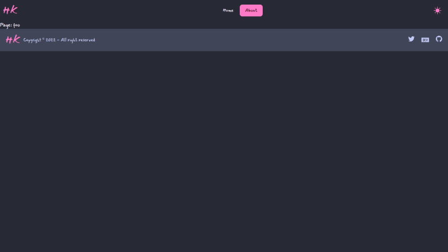
Page: foo
</div>
</template>
<style scoped></style>
Update the navigation link.
<li>
  <NuxtLink to="/about" active-class="active">About</NuxtLink>
</li>
Annnd done. * cricket noises *
The Heading
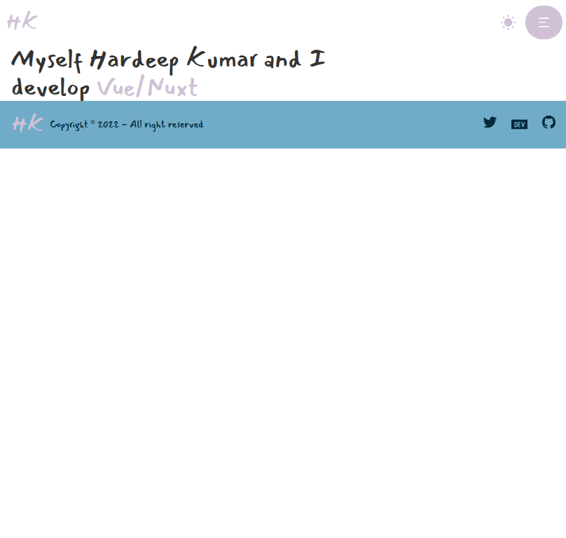
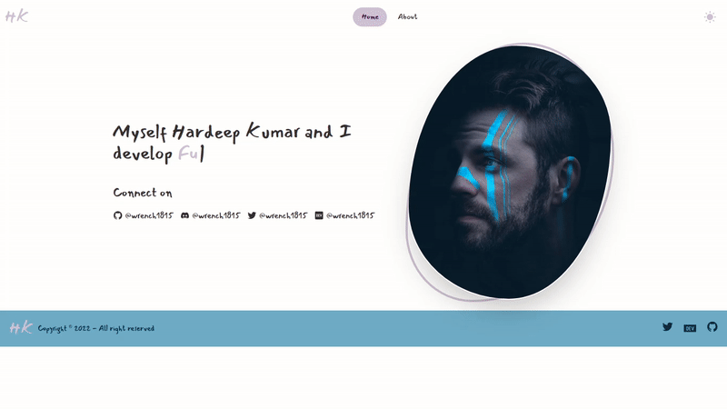
First, I'll add a heading. The heading will be my name and the stuff that I'm good at. It'll be - "Myself Hardeep Kumar and I develop ". Quite... remarkable right? I know! ahem
Now about that , I'd like to have that Typewriter effect there. Which will loop over my 'stuff' that I want to show there. I'll think about it a bit later. I'll start by adding only One line and see how it goes on.
First, I'll add a Component for Home. I'll be following the file system structure, or so what I call it. Basically a Folder with index as it root, and it will further have all its related components in it. Where the root file will be the main component which will be used.
This will create a component at components/Home/Header/index.vue. Depending on need, I'll have all related Header components in that folder and then return only one after combining Header components in index
npx nuxi add component Home/Header/index
Next, I'll add the text that I want to use for now. And I'll switch to light mode for UI Designing.
# components/Header/Home/index.vue
<script lang="ts" setup></script>

<template>
  <section class="container px-4 mx-auto">
    <div class="prose">
      <h1 class="font-medium">
        Myself Hardeep Kumar and I develop
        <span class="text-primary">Vue/Nuxt</span>
      </h1>
    </div>
  </section>
</template>

<style scoped></style>
# pages/index.vue
....
<HomeHeader />
....
Heh. Not bad. It's taking some shape.
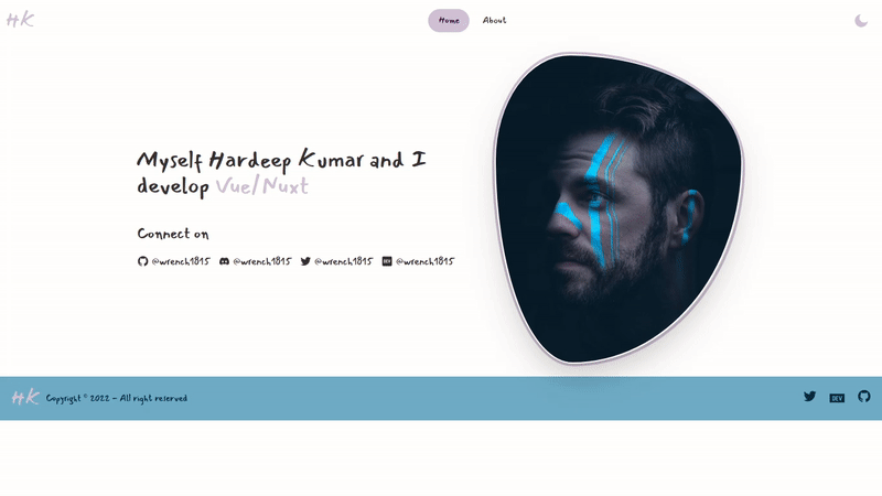
The image
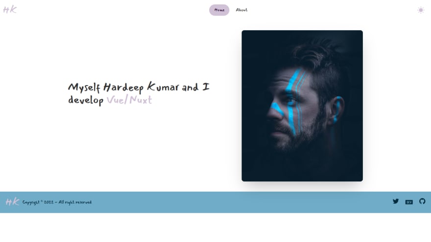
Next I want to have an image of mine there too. I'd like to show it on the right side on tablet and devices bigger than tablet, and at the bottom on devices smaller than Mobile.
For the layout, I'm going to use Hero component from Daisy UI, then further refactor it as per my need. I'm going to use this image from unsplash by
Daniel Lincoln
# components/Home/Header/index.vue
....
<template>
  <section class="container px-4 mx-auto">
    <div class="hero my-">
      <div class="hero-content flex-col-reverse md:flex-row-reverse">
        <img
          src="@/assets/image/person.jpg"
          class="rounded-lg shadow-2xl md:max-w-sm"
        />
        <div class="prose">
          <h1 class="font-medium">
            Myself Hardeep Kumar and I develop
            <span class="text-primary">Vue/Nuxt</span>
          </h1>
          <!-- <p class="py-6"></p> -->
        </div>
      </div>
    </div>
  </section>
</template>
....
Desktop
Mobile

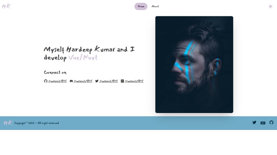
Social Handles
Now, I'll add a few Social Handles so that one can reach out. (which will never going to happen anyway) For handles, I'll be choosing Twitter, Discord, GitHub and Dev.to. Although, dev.to doesn't actually count as a Social Handle, but who cares.
# components/Home/Header.index.vue
...
<div class="prose">
  <h1 class="font-medium">
    Myself Hardeep Kumar and I develop
    <span class="text-primary">Vue/Nuxt</span>
  </h1>
  <h3 class="font-medium text-2xl text-center md:text-start">
    Connect on
  </h3>
  <div
    class="flex flex-row gap-3 flex-wrap justify-center md:justify-start"
  >
    <!-- Start:Github -->
    <a href="https://github.com/wrench1815" target="_blank">
      <OhVueIcon name="ri-github-fill" /> @wrench1815</a
    >
    <!-- End:Github -->

    <!-- Start:Discord -->
    <a
      href="https://discordapp.com/users/457360898122711041"
      target="_blank"
    >
      <OhVueIcon name="si-discord" /> @wrench1815</a
    >
    <!-- End:Discord -->

    <!-- Start:Twitter -->
    <a href="https://twitter.com/wrench1815" target="_blank">
      <OhVueIcon name="ri-twitter-fill" /> @wrench1815</a
    >
    <!-- End:Twitter -->

    <!-- Start:Dev.to -->
    <a href="https://github.com/wrench1815" target="_blank">
      <OhVueIcon name="md-logodev" /> @wrench1815</a
    >
    <!-- End:Dev.to -->
  </div>
</div>
....
Results in
Link Styles
Great. So now I have a layout the way I wanted it to be. Next up is further styling to add that flair that I want to. I'll start by changing the link styles, an underline on hover with the text color changed to another color, which I decided to be error color since it fits nicely on both light and Dark mode.
# components/Home/Header/index.vue
...
<div
  class="flex flex-row gap-3 flex-wrap justify-center md:justify-start"
>
  <!-- Start:Github -->
  <a
    href="https://github.com/wrench1815"
    target="_blank"
    class="after:content-[''] after:block after:w-0 after:h-[0.06rem] after:bg-error after:transition-all after:duration-300 after:ease-in-out hover:text-error hover:after:w-full hover:after:bg-error no-underline"
  >
    <OhVueIcon name="ri-github-fill" /> @wrench1815</a
  >
  <!-- End:Github -->

  <!-- Start:Discord -->
  <a
    href="https://discordapp.com/users/457360898122711041"
    target="_blank"
    class="after:content-[''] after:block after:w-0 after:h-[0.06rem] after:bg-error after:transition-all after:duration-300 after:ease-in-out hover:text-error hover:after:w-full hover:after:bg-error no-underline"
  >
    <OhVueIcon name="si-discord" /> @wrench1815</a
  >
  <!-- End:Discord -->

  <!-- Start:Twitter -->
  <a
    href="https://twitter.com/wrench1815"
    target="_blank"
    class="after:content-[''] after:block after:w-0 after:h-[0.06rem] after:bg-error after:transition-all after:duration-300 after:ease-in-out hover:text-error hover:after:w-full hover:after:bg-error no-underline"
  >
    <OhVueIcon name="ri-twitter-fill" /> @wrench1815</a
  >
  <!-- End:Twitter -->

  <!-- Start:Dev.to -->
  <a
    href="https://github.com/wrench1815"
    target="_blank"
    class="after:content-[''] after:block after:w-0 after:h-[0.06rem] after:bg-error after:transition-all after:duration-300 after:ease-in-out hover:text-error hover:after:w-full hover:after:bg-error no-underline"
  >
    <OhVueIcon name="md-logodev" /> @wrench1815</a
  >
  <!-- End:Dev.to -->
</div>
...
Nice Links.

Hold up. What is that stuff in class? It's way to much. Right? Well.. It can be reduced. The ways it can be done is by
- Extracting Classes with
@apply - Creating components and looping over it
Since I'm using a Frontend Framework, I'm going with the latter option. I could go with the First option, but that kinda kills the purpose of using a Frontend Framework. No doubt, both option are 100% valid, but I prefer to use the 2nd option.
First I'll create an option with the data for my Links like my username, address etc. Then I'll create a component and loop over it while passing the link data. While I'm at it, I'll also separate all the Social links in its separate component.
Very simple structure. I won't nest link in Socials because there's only one component.
npx nuxi add component Home/Header/Socials
npx nuxi add component Home/Header/Link
# components/Home/Header/Socials.vue
<script lang="ts" setup>
import { addIcons } from 'oh-vue-icons';
import {
  RiGithubFill,
  SiDiscord,
  RiTwitterFill,
  MdLogodev,
} from 'oh-vue-icons/icons';

addIcons(RiGithubFill, SiDiscord, RiTwitterFill, MdLogodev);

const socialLinks = [
  {
    username: 'wrench1815',
    link: 'https://github.com/wrench1815',
    icon: 'ri-github-fill',
  },
  {
    username: 'wrench1815',
    link: 'https://discordapp.com/users/457360898122711041',
    icon: 'si-discord',
  },
  {
    username: 'wrench1815',
    link: 'https://twitter.com/wrench1815',
    icon: 'ri-twitter-fill',
  },
  {
    username: 'wrench1815',
    link: 'https://dev.to/wrench1815',
    icon: 'md-logodev',
  },
];
</script>

<template>
  <h3 class="font-medium text-2xl text-center md:text-start">Connect on</h3>
  <div class="flex flex-row gap-3 flex-wrap justify-center md:justify-start">
    <HomeHeaderLink v-for="(item, i) in socialLinks" :key="i" :social="item" />
  </div>
</template>

<style scoped></style>
# components/Home/Header/link.vue
<script lang="ts" setup>
const props = defineProps<{
  social: {
    link: string;
    username: string;
    icon: string;
  };
}>();
</script>

<template>
  <!-- Start:Social Link -->
  <a
    :href="social.link"
    target="_blank"
    class="after:content-[''] after:block after:w-0 after:h-[0.06rem] after:bg-error after:transition-all after:duration-300 after:ease-in-out hover:text-error hover:after:w-full hover:after:bg-error no-underline"
  >
    <v-icon :name="social.icon" /> @{{ social.username }}</a
  >
  <!-- End:Social Link -->
</template>

<style scoped></style>
# components/Home/Header/index.vue
....
<HomeHeaderSocials />
....
And the result is still same regardless.


oh-vue-icons plugin
While I'm at it, I believe it is a good time to handle the oh-vue-icons a bit different way. I'll create a plugin for them named, ovi and then register it in Nuxt. Then use it to register the component and all the icons that I'll be using, thus preventing duplicated imports in different pages.
npx nuxi add plugin ovi
# plugins/ovi.ts
import { OhVueIcon, addIcons } from 'oh-vue-icons';
import {
  RiGithubFill,
  RiTwitterFill,
  SiDevdotto,
  RiCloseFill,
  RiMenu2Fill,
  RiSunFill,
  RiMoonFill,
} from 'oh-vue-icons/icons';

export default defineNuxtPlugin((nuxtApp) => {
  // register icons
  addIcons(
    RiGithubFill,
    RiTwitterFill,
    SiDevdotto,
    RiCloseFill,
    RiMenu2Fill,
    RiSunFill,
    RiMoonFill
  );

  // register Component
  nuxtApp.vueApp.component('v-icon', OhVueIcon);
});
# nuxt.config.ts
....
build: {
  transpile: ["oh-vue-icons"]
}
....
vite: {
  optimizeDeps: {
    exclude: ['oh-vue-icons/icons'],
  },
},
....
The way Nuxt 3 works, I dont need to register the plugins in nuxt.config.ts as in Nuxt 2. They are automatically imported. But I do need to tell nuxt to transpile the package as per oh-vue-icons docs. Then I'll replace all OhVueIcon refernces in .vue files with v-icon. And since nuxt 3 use vite under the hood, I'll add some config related to it as well as in oh-vue-icons docs.
Final Touches
Now I'll take a look at Image. It's looking a bit too plain. Hmm... I could use blobs to add a bit of flare to it. Lets see. I'll start by separating the Image out into a component. Then add a border radius on image in the form of a Blob.
Blob looks good.

Now, I'll add one more on the outside with primary color.

Add a bit of gap between the image and outer blob.

And finally, I'll animate them both with outer having a bit of delay.
# component/Home/HeaderImage.vue
<script lang="ts" setup></script>

<template>
  <div class="border-solid border-4 blob blob-anim-delay border-primary">
    <img
      src="@/assets/image/person.jpg"
      class="rounded-lg shadow-2xl border-transparent border-solid border-2 md:max-w-sm blob blob-anim"
    />
  </div>
</template>

<style scoped>
.blob-anim {
  border-radius: 30% 70% 70% 30%/30% 30% 70% 70%;
  animation: morphing 10s infinite;
}

.blob {
  border-radius: 30% 70% 70% 30%/30% 30% 70% 70%;
}

.blob-anim-delay {
  border-radius: 30% 70% 70% 30%/30% 30% 70% 70%;
  animation: morphing 10s infinite 0.5s;
}

@keyframes morphing {
  0% {
    border-radius: 30% 70% 70% 30%/30% 30% 70% 70%;
  }
  25% {
    border-radius: 58% 42% 75% 25%/76% 46% 54% 24%;
  }
  50% {
    border-radius: 50% 50% 33% 67%/55% 27% 73% 45%;
  }
  75% {
    border-radius: 33% 67% 58% 42%/63% 68% 32% 37%;
  }
  100% {
    border-radius: 30% 70% 70% 30%/30% 30% 70% 70%;
  }
}
</style>
The final thing that i want to do is to have a typewriter effect to cyc;e through various 'texts' on the heading, to tell the visitor what things I can do. Now for that I could use css combine with js to have what I need. But there i no need to re-invent the wheel. It won't be a good idea to re-invent wheels for your car right? I'm just going to use typed js. I could actually use the vue implementation but the thing is, it's says nothing about vue3 and also it's quite old.
npx nuxi add component Home/Header/AnimText
# components/Home/Header/AnimText.vue
<script lang="ts" setup>
import Typed from 'typed.js';

const typing = ref(null);
const loading = ref(true);

onMounted(() => {
  loading.value = false;

  new Typed(typing.value, {
    strings: ['Full Stack', 'Backend', 'APIs', 'Vue/Nuxt'],
    typeSpeed: 100,
    backSpeed: 30,
    backDelay: 1000,
    loop: true,
  });
});
</script>

<template>
  <h1 class="font-medium">
    Myself Hardeep Kumar and I develop
    <span class="text-primary" v-if="loading">Vue/Nuxt</span>
    <span class="text-primary" ref="typing"></span>
  </h1>
</template>

<style scoped></style>
And with this. the Home page for my Portfolio is finished, for now atleast. When I add more stuff in there like Blog, resume etc, I'll add more section in here but till then, this seems good enough.
Cover Credits: Joe Ng

Oldest comments (2)
Wow, dat animation + photo are soooo badass!! 💪🏻
Nice work. 👌🏻
Thanks ❤️