
One of the best things about Bootstrap CSS is that it comes with component examples in its documentation.
But these examples have flaws. Design flaws.
Luckily, they can easily be fixed with a little design know how and out of the box Bootstrap classes.
1) Rework pills for a warmer, softer feel
Bootstrap pill colors are harsh. You can use the --bs-bg-opacity CSS variable that comes with Bootstrap. This will soften the background color to create better contrast.

<span class="badge rounded-pill text-primary bg-primary" style="--bs-bg-opacity: .20;">Primary</span>
<span class="badge rounded-pill text-secondary bg-secondary" style="--bs-bg-opacity: .20;">Secondary</span>
<span class="badge rounded-pill text-success bg-success" style="--bs-bg-opacity: .20;">Success</span>
<span class="badge rounded-pill text-danger bg-danger" style="--bs-bg-opacity: .20;">Danger</span>
2) Throw list groups out the window
They are ugggggly. Use standard HTML lists. You can even add SVGs instead of standard list bullets to draw more attention.

<div class="card border-0 shadow p-2">
    <div class="card-body">
        <h3 class="fs-5">Some items we sell</h3>
        <ul class="" style="list-style: none; list-style-position: outside; padding-left: 0px;">
            <li class="d-flex align-items-center mb-1">
                <svg xmlns="http://www.w3.org/2000/svg" class="me-2 text-primary" height="16" width="16" viewBox="0 0 20 20" fill="currentColor">
                    <path fill-rule="evenodd" d="M10 18a8 8 0 100-16 8 8 0 000 16zm3.707-9.293a1 1 0 00-1.414-1.414L9 10.586 7.707 9.293a1 1 0 00-1.414 1.414l2 2a1 1 0 001.414 0l4-4z" clip-rule="evenodd" />
                </svg>
                An item
            </li>
            <li class="d-flex align-items-center mb-1">
                <svg xmlns="http://www.w3.org/2000/svg" class="me-2 text-primary" height="16" width="16" viewBox="0 0 20 20" fill="currentColor">
                    <path fill-rule="evenodd" d="M10 18a8 8 0 100-16 8 8 0 000 16zm3.707-9.293a1 1 0 00-1.414-1.414L9 10.586 7.707 9.293a1 1 0 00-1.414 1.414l2 2a1 1 0 001.414 0l4-4z" clip-rule="evenodd" />
                </svg>
                A second item
            </li>
            <li class="d-flex align-items-center mb-1">
                <svg xmlns="http://www.w3.org/2000/svg" class="me-2 text-primary" height="16" width="16" viewBox="0 0 20 20" fill="currentColor">
                    <path fill-rule="evenodd" d="M10 18a8 8 0 100-16 8 8 0 000 16zm3.707-9.293a1 1 0 00-1.414-1.414L9 10.586 7.707 9.293a1 1 0 00-1.414 1.414l2 2a1 1 0 001.414 0l4-4z" clip-rule="evenodd" />
                </svg>
                A third item
            </li>
        </ul>
    </div>
</div>
3) Give dropdowns a shadow and some room to breathe.
Add shadows with the shadow class to dropdowns. This gives it depth and the appearance that it's closer to the user. Add a small margin with mt-2 to keep the list from overlapping the button.

<div class="bg-white p-4 shadow d-flex justify-content-center" style="height: 200px;">
    <div class="dropdown">
        <button class="btn btn-secondary dropdown-toggle" type="button" id="dropdownMenuButton1" data-bs-toggle="dropdown" aria-expanded="false">
          Dropdown
        </button>
        <ul class="dropdown-menu shadow mt-2" aria-labelledby="dropdownMenuButton1">
          <li><a class="dropdown-item" href="#">Action</a></li>
          <li><a class="dropdown-item" href="#">Another action</a></li>
          <li><a class="dropdown-item" href="#">Something else here</a></li>
        </ul>
    </div>
</div>
4) Use shadows and extra padding on cards
Card borders often feel clunky. Shadows emphasize elements and give the page depth. Use the shadow class to add a shadow to your class and increase the padding with the p-2 class to give it some more internal spacing.

<div class="card border-0 shadow p-2">
    <div class="card-body">
        <h5 class="card-title fs-5">Collaborate</h5>
        <p class="card-text">
            Share your work with hundreds of like minded individuals around the world!
        </p>
    </div>
</div>
5) HTML tables don't have to be boring
Tables don't have to be a direct 1-1 representation of your database. If it makes sense, combine columns and hide headers. This makes it feel less like a database and more like a UI component.
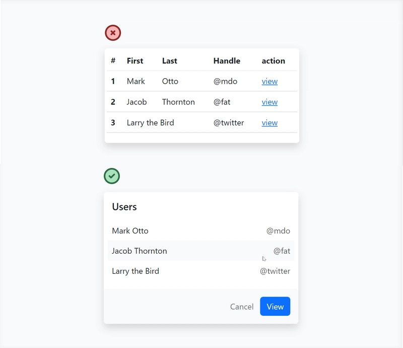
<div class="border-0 shadow bg-white rounded">
    <h3 class="fs-5 px-3 pt-3">Users</h3>
    <div class="px-2 pt-2">
        <table class="table table-borderless fs-6">
            <tbody>
                <tr>
                    <td>Mark Otto</td>
                    <td class="text-end text-muted">@mdo</td>
                </tr>
                <tr class="bg-light rounded-4">
                    <td>Jacob Thornton</td>
                    <td class="text-end text-muted">@fat</td>
                </tr>
                <tr>
                    <td>Larry the Bird</td>
                    <td class="text-end text-muted">@twitter</td>
                </tr>
            </tbody>
        </table>
    </div>
    <div class="p-3 bg-light rounded d-flex justify-content-end">
        <buttons class="btn btn-link text-secondary text-decoration-none">Cancel</buttons>
        <buttons class="btn btn-primary">View</buttons>
    </div>
</div>
More Bootstrap Tips??
If you enjoyed this, consider checking out my new project - Better Bootstrap
There you will find a free book containing 15 Bootstrap design tips. The full book will be coming out later this year.

Top comments (1)
Hi @wes_walke, really great tips. I am going to use some of them!
I am a contributor to Stride, open source C# Game Engine. Recently, I have been prototyping a new website design.
Current-Old: stride3d.net/
New prototype: stride-website.vaclavelias.com/
I am trying to remove all unnecessary dependencies, jquery plugins, .. and trying to use just Bootstrap 5 and some customisation.
Would you be interested to assist with your tips and give us a hand on how to improve our website design, or recommend someone? We would like to have it simple but still attractive and easy to maintain.
Please ping me here if you are interested twitter.com/VasoElias.
Thank you 😁.