
1. A Logo and Favicon
A logo is the most prominent brand element on your website. It will almost always live in the site navigation, near the top of the page, and in the footer. If you don’t have a logo, consider getting one. You can do it yourself or hire a graphic designer. Regardless of the route you choose, make sure you have the proper file types (AI, EPS, PDF, SVG, PNG, JPG) for your logo. It’s helpful to have two versions of your logo. The primary logo design is used most and may include a wordmark and other detailed design features. Your secondary logo should be smaller and is easier to fit into tight spaces. A favicon is the small logo icon shown in the URL address bar. A favicon makes your site look more trustworthy and professional. Here’s a screenshot of our favicon (and secondary logo): 
2. Color Palette
Do you have brand colors? If not, now is the time to select a color palette for your brand identity. A typical palette consists of three colors. The primary color is usually for text and major design elements. A secondary color works well for accents. The third, and usually the most vivid, will be an “action color” for buttons, call-out boxes, and links This is an example of a color palette: 
3. Typeface System
Typefaces (also called fonts) are one of the most underrated design components. A nice typeface can transform an average design into something really special. The typefaces you choose should align with the brand’s image and work well together. It’s best to choose a typeface with several weights (i.e., bold, italics) because it can be used in a variety of ways. 
4. Forms
Opt-in Forms If you want to build an email list or subscription service, you’ll need a form visitors can use to sign up. The form connects to an email service that generates a response when someone joins your list. 
Contact Form A contact form makes it easy for people to get in touch with you. To increase the likelihood that people will use it, don’t ask for too much information. First name and email address should be enough. 
Calls-to-Action A call-to-action invites a site visitor to engage with you. The action could be as small as clicking on a link to read a blog post or sign up for your email list. It could also involve a much more significant step, such as buying a product. Decide what you want visitors to do when landing on the site and make calls-to-action prominent. 
5. 404 Page
An error can occur when links break or change. A custom 404 page lets visitors know something went wrong and redirects them back to your site.
https://codepen.io/Navedkhan012/pen/vrWQMY
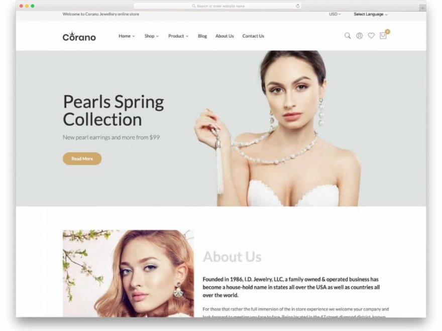
6. Theme
A theme is like the website’s foundation. Themes provide design features, layout, and other front-end elements users will see. Once you select a theme, you won’t be able to change it without damaging the site, so choose wisely.
7. Content
Your website’s content consists of individual web pages, such as the home, about, and contact pages. Blog posts often account for most of a site’s content, but images, graphics, and videos count too. It’s essential to assimilate all content before you begin the design process. Adding content as you design the site is like building a house one room at a time. Developing content first reduces the risk of building a disjointed and confusing site. Make the most valuable content easy to access. It is best to position relevant content on the home page or only one click away. Once site content is complete, check links to make sure they work. Edit text for spelling and grammatical errors. Grammarly and the Hemingway Editor are helpful tools for writing web copy.
Images make or break your website’s visual appearance. Use high-quality images and graphics that apply to site content. Images with vague meanings often confuse or bore users.Too many images overwhelm visitors. Image-heavy sites also take longer to load, which inhibits the user’s experience. I have discussed about the usage and sources for stock resources below.
https://abhirajb.hashnode.dev/the-only-stock-resources-library-you-will-ever-need
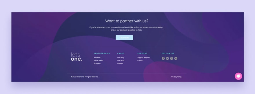
8. Footer
This section is at the bottom of the page and usually contains links to contact, terms, and privacy pages. You can also use the footer to help visitors navigate the site by placing key links inside of it. By habit, most users scroll down to the bottom of the page, which means your footer will be highly visible.
9. Announcement Bar
Do you have something important to say to your visitors? Maybe you have a big sale going on or want to share some news related to COVID-19. An announcement bar at the top of your page will grab attention so your site visitors don’t miss it. 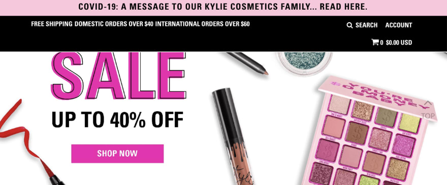
10. Responsive Design
Responsive design refers to a website’s ability to adapt to various devices and browsers. The screen sizes of an iPhone, iPad, a Surface, and a Galaxy are unique. Likewise, Microsoft Edge, Google Chrome, and Mozilla Firefox are independent web browsers. Responsive design enables the site to adjust and provide the optimal viewing experience.
The width of iPhone screens ranges from 4 to 6.7 inches. So, a website’s display may change, depending on the site’s design and the screen’s size. Responsive design is essential for a good user experience. Unfortunately, search engines penalize sites that aren’t responsive. 
Thank you for reading
If you liked this post, subscribe to our newsletter to never miss out on our blogs, product launches and tech news.


Top comments (0)