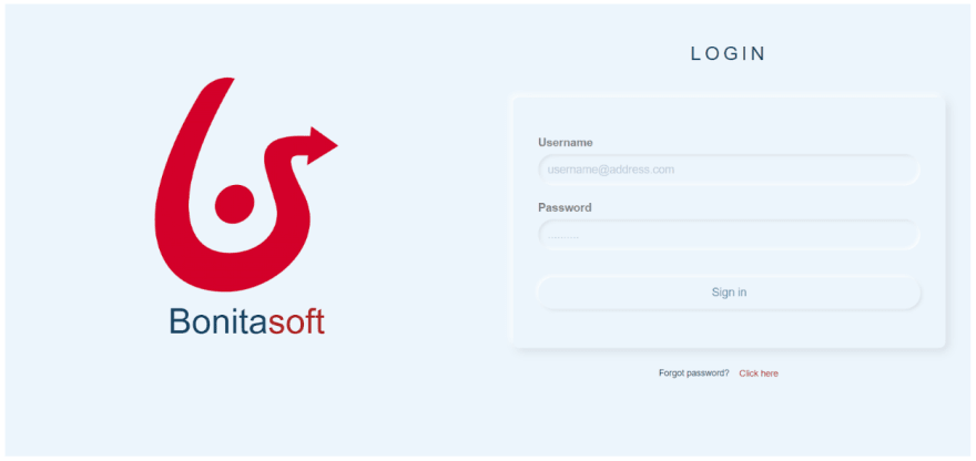
The interface style known as neumorphic (a combination of skeumorphic and realistic design) has been gaining in popularity, and I think we'll see it being used more and more in 2020.
One important aspect of neumorphism is about selecting the proper color palettes, and 3 shades of the same color are required for this.
i) Light Shadow should be done by using a light color. For example, rgba(255,255,255,1),
ii) The Main background and Element color should be in the mid-range. For example, rgba(235,245,252,1) for the background and element,
iii) Dark Shadow should be done by using a dark color. For instance, rgba(0,0,0,0.1).
Below are the 12 simple steps I followed to implement a login page using the Bonita UI Designer, inspired by https://neumorphism.io/.
First, create a new application page in UI Designer.
Step: 1
In the UI Designer whiteboard, drag & drop a container widget, give the CSS class name as “logo-box” and set the column width to 6. We will put our company logo in this container.
Step: 2
Inside the logo-box, place the logo and title as you want. Here I am using an image widget for the logo and a text widget for the company’s name. I have added the Bonitasoft logo in UI Designer as an image asset.
Now, set the properties as given below for the image widget:
- Width = 12;
- Source Type = Asset;
- Asset Name = bonitasoftLogo.png
You can download the Bonitasoft logo from this link.
Set the properties as given below for the text widget:
- Width = 12;
- CSS classes = bonita;
- Text =
Bonita<span class=”soft”>soft</span>; - Alignment = center
Note: Since the company logo and the title can be different, I suggest you write your own CSS for this part.
Step: 3
In the whiteboard outside the logo-box, drag & drop a form container widget next to the logo-box, give the CSS class name as “login-form” and set the column width to 6. We will use this form container to implement our login form.
Step: 4
Inside the login-form, create a title using title widget and set the properties as:
- Width = 12; Text = Login; Title level = Level 2; Alignment = center
Step: 5
Below the title, drag & drop a new container, give the CSS class name as “input-container” and set the column width to 12.
Step: 6
Inside the input-container, drag & drop an input widget and set the properties as:
- Width = 12; CSS classes = input-widget; Label = Username;
- Placeholder = username@address.com (you can put whatever email address you want to);
- Type = Email
Step: 7
Below the username, drag & drop another input widget and set the properties as:
- Width = 12; CSS classes = input-widget; Label = Password
- Placeholder = ……… ; Type = Password
Step: 8
Below the password widget, drag & drop a button widget and set the properties as:
- Width = 12; CSS classes = input-widget; Label = Sign in;
- Alignment = center;
- Style = default;
Step: 9
Now, outside the input-container, drag & drop a container, give the CSS class name as “forget-password” and set the column width to 12.
Step: 10
Inside the forget-password container, drag & drop a text widget and set the properties as:
- Width = 6; Text = Forgot password?; Alignment = right
Step: 11
Just to the right to the text widget, drag & drop a Link widget and set the properties as:
- Widget = 6; Text = Click here; Alignment = left; Style = link
Step: 12
Go to Assets > style.css and write the CSS below:
.logo-box {
    height: 100vh;
    position: relative;
    text-align: center;
    background: rgba(235,245,252,1);
}
.logo-box img {
   width: 40%;
   margin: 0 auto;
   padding: 15% 0 0;
}
.bonita{
    font-size: 4em;
    color: #0A4561;
}
.bonita .soft {
    color: #B52A2A;
}
.login-form {
    height: 100vh;
    position: relative;
    padding: 40px 40px 60px;
    background: rgba(235,245,252,1);
    text-align: center;
}
.input-container {
    text-align: left;
    padding: 40px 40px 60px;
    margin-top: 40px;
    box-shadow: -5px -5px 10px  rgba(255,255,255,0.8),
                 5px 5px 15px rgba(0,0,0,0.1);
    border-radius: 10px;
}
.login-form h2 {
    color: #0A4561;
    font-weight: 500;
    text-transform: uppercase;
    letter-spacing: 6px;
}

.input-container .input-widget {
    margin-top: 20px;
}
.input-container .input-widget label {
    display: block;
    color: #868686;
    margin-bottom: 5px;
    font-size: 18px;
}
.input-container .input-widget input,
.input-container .input-widget button {
    width: 100%;
    height: 50px;
    background: rgba(235,245,252,1);
    border: none;
    outline: none;
    border-radius: 40px;
    padding: 5px 15px;
    font-size: 18px;
    color: #32a3b1;
    box-shadow: inset -2px -2px   6px rgba(255,255,255,1),
                inset 2px 2px 6px rgba(0,0,0,0.1);
}
.input-container .input-widget input::placeholder {
    color: #bdcada;
    font-size: 18px;
}

.input-container .input-widget button {
    margin-top: 20px;
    box-shadow: -2px -2px 6px rgba(255,255,255,1),
          2px 2px 6px rgba(0,0,0,0.1);
}
.input-container .input-widget button:active{
    color: #006c9c;
    margin-top: 20px;
    box-shadow: inset -2px -2px 6px rgba(255,255,255,1),
  inset 2px 2px 6px rgba(0,0,0,0.1);
    outline: none;
}
.forget-password .component {
    margin-top: 30px;
    padding-right: 0;
    color: #0A4561;
}
.forget-password a {
    padding: 0;
    color: #B52A2A;
    text-decoration: none;
}
Finally, save the page and click on the preview. We will see a beautiful neumorphic login page as shown below;
Note: For a responsive page, Bonita Subscription users can define the size of the elements based on different screen sizes by clicking screen size icons to the top-right corner in the UI Designer.
Similarly, Bonita Community users can create a responsive login page by following the tutorial here.
I would love to know if you are into neumorphism as well. What are the colors you use? Please share your tips and examples.
And remember, have fun with Bonita!


Top comments (1)
Thanks for this great tutorial!
I gave it a try here is the result I get when applying my personal touch ;-)