Seaborn is a library for making statistical graphics in Python. It builds on top of matplotlib and integrates closely with pandas data structures.
Seaborn helps you explore and understand your data. Its plotting functions operate on dataframes and arrays containing whole datasets and internally perform the necessary semantic mapping and statistical aggregation to produce informative plots. Its dataset-oriented, declarative API lets you focus on what the different elements of your plots mean, rather than on the details of how to draw them.
One has to be familiar with Numpy and Matplotlib and Pandas to learn about Seaborn.
Seaborn offers the following functionalities:
-Dataset oriented API to determine the relationship between variables.
-Automatic estimation and plotting of linear regression plots.
-It supports high-level abstractions for multi-plot grids.
-Visualizing univariate and bivariate distribution.
Using Seaborn we can plot wide varieties of plots like:
-Heat maps-The heatmap represents the data in a 2-dimensional form. The ultimate goal of the heatmap is to show the summary of information in a colored graph. It utilizes the concept of using colors and color intensities to visualize a range of values.
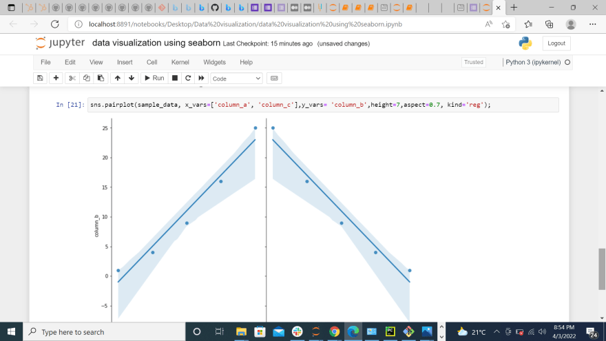
-Pair Plots -are used when we want to see the relationship pattern among more than 3 different numeric variables. For example, let’s say we want to see how a company’s sales are affected by three different factors, in that case, pair plots will be very helpful.
-pie chart and bar charts.Pie Chart is generally used to analyze the data on how a numeric variable changes across different categories.
-scatter plots-Scatter Plot is used when we want to plot the relationship between any two numeric columns from a dataset. These plots are the most powerful visualization tools that are being used in the field of machine learning.
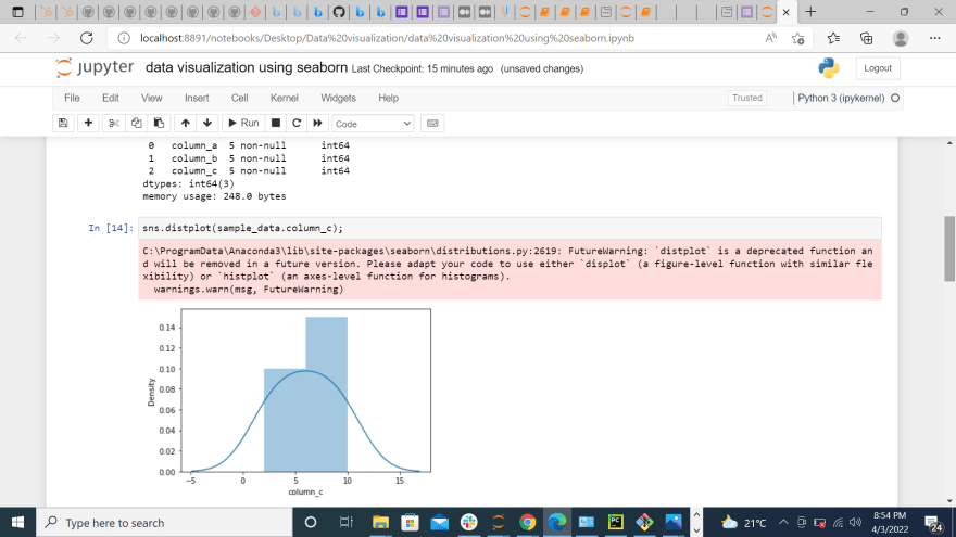
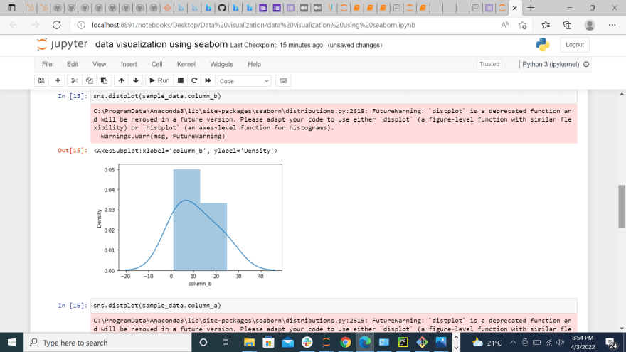
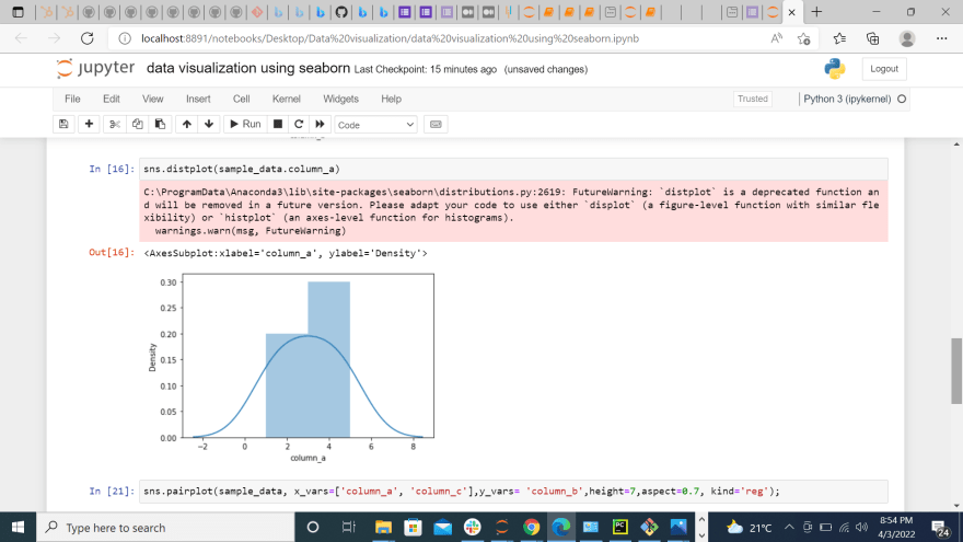
-distributions plots-We can compare the distribution plot in Seaborn to histograms in Matplotlib. They both offer pretty similar functionalities. here use sns.distplot.
Regression plots-Regression plots create a regression line between 2 numerical parameters in the jointplot(scatterplot) and help to visualize their linear relationships.
How to learn Seaborn
1.Do a thorough research on seaborns, the basics, it's importance in data visualization and how it relates with other libraries and why they do.
2.Try out plotting using seaborn this way you will grasp more lets agree on this one, practice makes perfect. So first start by looking for a dataset.
3.Try reading some articles about seaborns and looking for a worked out problem to master the techniques lastly make use of galleries and YouTube.
Installation of seaborn
I find Jupyter notebook efficient in doing data visualization hope you like it too. for the ones using local machine you run this command on your terminal. If you are using google colab or jupyter notebooks worry not about installation.
pip install seaborn
Importing the library
import seaborn as sns
Loading dataset
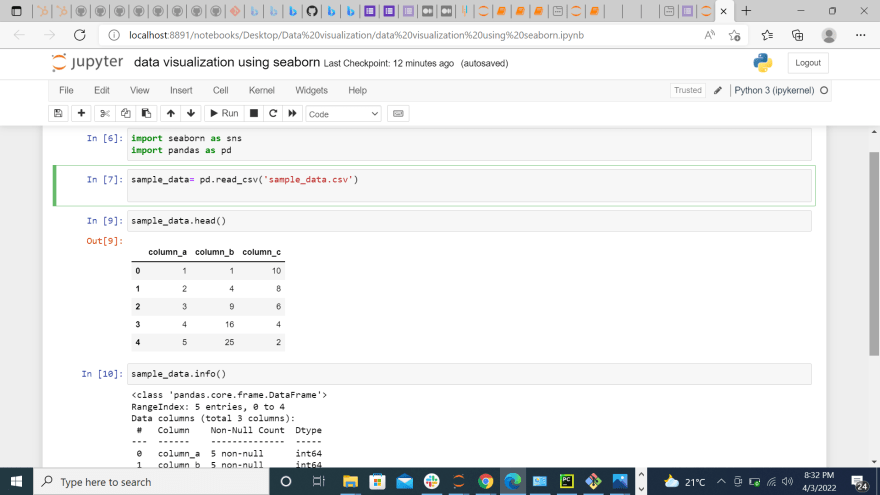
for demonstration am using a dataset in my local machine and we will see how seaborn helps us to visualize the distribution of each feature.
 This shows the relationship between matplotlib and seaborn.
Conclusion
Data visualization is fun to work with and you get to work with different python libraries and makes your plots and graphs more appealing. Go through seaborn attentively and make sure you practice using all those graphs and libraries. Consistency is key.

Top comments (1)
What is seaborn explain in brief? black magic to destroy a relationship