![Cover image for [DIY] Vuetify responsive multi-state visualization component](https://media2.dev.to/dynamic/image/width=1000,height=420,fit=cover,gravity=auto,format=auto/https%3A%2F%2Fdev-to-uploads.s3.amazonaws.com%2Fi%2Fbk37v7di0p1vwab59ms6.png)
Hello there! So, you are probably interested to get grip on Vuetify and edge cases like this one? I want to share with you how I've made Vue component that takes a lot of Vuetify in core and, at the same time, provides the flexibility to show lifecycle states of custom database object.
This particular case involves showing each state's data provided by response from web service. (We won't discuss that API today, just a pure frontend, guys.) So, imagine getting such array of lifecycle states:
[
  { name: 'Preview', actualDate: new Date('1/5/2020 3:45:00 PM') },
  { name: 'In Work', actualDate: new Date('1/29/2020 1:23:00 PM') },
  { name: 'Frozen', actualDate: new Date('2/9/2020 10:20:30 AM'), current: true },
  { name: 'Released' },
  { name: 'Obsolete' },
]
The tip of the iceberg. Enterprise system in which I integrate my component can have objects with various counts of lifecycle states, even beyond 5-6 items. In examples below you will notice 8 items just for average test purposes.
Preliminary considerations
First thought was: "Aha, <v-timeline> may serve well. Oh wait..." Doesn't fit needs: even though it looks smooth on mobile, it redundantly occupies height on desktop.
Mayhaps <v-slider>? Well, not responsive enough on mobile breakpoint for case with more than 4 items, because labels overlap, plus visualization effort via input like slider is rather stingy.
<v-tabs>? Hmmmm, almost... However, no joint line present, so user won't see sequential connection between states from first glance.
I need to ensure that user will have right perspective on what these mean, labels won't overlap each other and dates are plainly shown, all with near-to-zero CSS customization. This is how I ended up doing wrapper component with <v-stepper> under the hood. And even if stepper was intended as "tabs on steroids", we can use it for showing lifecycle states as well.
Why component?
There is some quirk with steppers: while you aren't obliged to have <v-stepper-header> for vertical steps layout, it is required for horizontal one.
Haha, only if it was as easy as
<v-stepper :vertical="$vuetify.breakpoint.xsOnly">
Make it vertical on mobile and horizontal otherwise. Easy, right? Not a chance with limitations presented by <v-stepper-header>, which is necessary for horizontal placement of steps. And when you use it with vertical, steps just seem to overflow like they never were stacked vertically at all.
Dynamically switching between vertical and horizontal layouts is somewhat challenging for this built-in component, but may be solved in further versions of Vuetify. Nevertheless, even this problem alone didn't convince me to abandon this beautiful library and the mission I've assigned to.
Hello HVStateStepper
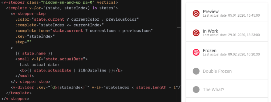
<div class="hv-state-stepper">
  <v-stepper class="hidden-sm-and-up pa-0" vertical>
    <template v-for="(state, stateIndex) in states">
      ...
    </template>
  </v-stepper>
  <v-stepper alt-labels class="hidden-xs-only">
    <v-stepper-header>
      <template v-for="(state, stateIndex) in states">
        ...
      </template>
    </v-stepper-header>
  </v-stepper>
</div>
I solve previously mentioned adaptation problem with two steppers: top one is displayed on mobile (xs) breakpoint, otherwise user sees bottom one. You can use 2 methods for visually switching between two steppers:
- change
displayproperty on certain breakpoints (usehidden-*as shown in snippet above ord-*classes that come with Vuetify), - or perform conditional rendering (hello,
v-ifandv-else, my old friends; well, they may cost some more redrawing if used exceedingly, but are very useful in other cases, which I'll cover below).
Another thought: to better distinguish each state in stepper, we need to highlight current and previous ones with "color + icon" choices. For that we write a pack of attributes which is applied to every <v-stepper-step> item. Wrapping this all, don't forget to add component's props and reuse them, as we are going to cultivate brand new component, for which input icons and colors create authentic look across various sections of application.
<template v-for="(state, stateIndex) in states">
  <v-stepper-step
    :color="state.current ? currentColor : previousColor"
    :complete="stateIndex <= currentIndex"
    :complete-icon="state.current ? currentIcon : previousIcon"
    :key="stateIndex"
    step=""
  >
    {{ state.name }}
  </v-stepper-step>
  <v-divider :key="`d${stateIndex}`" v-if="stateIndex < states.length - 1" />
</template>
Some points to pay attention on here:
-
colorandcomplete-iconwill be chosen according to whether following state is current for our imaginary object or not; - step is marked as
completeif its place is earlier in lifecycle or it's current; -
step=""is workaround to make step's circle free of text (might as well use:step="stateIndex + 1"to show number of state in queue, but that would be seen only on those which don't havecompleteset); -
<v-divider>following after each state, except for the last one, adds to perception of the inseverable lifecycle.
Now to requirements!
<script>
export default {
  computed: {
    currentIndex() {
      return this.states.findIndex(state => state.current);
    },
  },
  name: 'HVStateStepper',
  props: {
    currentColor: String,
    currentIcon: String,
    previousColor: String,
    previousIcon: String,
    states: {
      type: Array,
      required: true
    },
  },
};
</script>
Good, it seems that now we can place freshly baked component in any section, and if you feel the need to enhance State Stepper everywhere, all instances of HVStateStepper will have same changes.
Alright, without further ado, let's test our component in an empty application!
<template>
  <v-app>
    <v-content>
      <HVStateStepper
        :states="testStates"
        current-color="red accent-3"
        current-icon="mdi-bullseye"
        previous-color="red darken-4"
        previous-icon="mdi-checkbox-marked-circle-outline"
      />
    </v-content>
  </v-app>
</template>

<script>
import HVStateStepper from '@/components/HVStateStepper.vue';

export default {
  components: {
    HVStateStepper,
  },
  data: () => ({
    testStates: [
      { name: 'Preview', actualDate: new Date('1/5/2020 3:45:00 PM') },
      { name: 'In Work', actualDate: new Date('1/29/2020 1:23:00 PM') },
      { name: 'Frozen', actualDate: new Date('2/9/2020 10:20:30 AM'), current: true },
      { name: 'Double Frozen' },
      { name: 'The What?' },
      { name: 'Released' },
      { name: 'Even more?' },
      { name: 'Obsolete' },
    ],
  }),
};
</script>
So far so good on xs breakpoint:


On sm it hides the text. Well, personally I would not go that far to return it there anyway, because there is even better solution to correspond with intentional responsive design (see below).
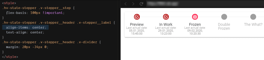
The rest has rather large padding - more space we could use for comprising with possibly big names. Now let's tweak some spacing to use all available space. I'll leave this opinionated reference:

.hv-state-stepper .v-stepper__header .v-stepper__step {
  flex-basis: 100px !important;
  padding: 8px 0 !important;
}
.hv-state-stepper .v-stepper__header .v-stepper__label {
  text-align: center;
}
.hv-state-stepper .v-stepper__header .v-divider {
  margin: 20px -34px 0;
}
v-stepper__header class relates to <v-stepper-header>, i.e. horizontal stepper layout, so changes don't affect mobile breakpoint (uh, there was one redundant padding in bottom on xs, but I preliminarily hid it with pa-0: bonus point for pedantry if you already noticed this 🙃).
Appending additional information
Now, the interesting part, ladies and gentlemen. How to simultaneously append actualDate to the lifecycle states that have it set and maintain responsive layout?
For usual stepper labels in vertical layout it's as easy as adding <small>...</small> - nothing super fancy, because it's the most compact.
Also seems versatile enough on md and larger breakpoint if you don't intend to show more data or enlarge the font:
(Here's i18nDateTime filter that was used for displaying date and time...)
Vue.filter('i18nDateTime', date => date ? date.toLocaleDateString([], { hour: 'numeric', minute: '2-digit', second: '2-digit' }) : '');
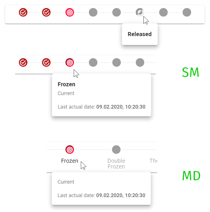
But what if there is more information to come and it exceeds the reasonable height? (Let alone "Last actual date" that will also occupy unnecessary height with two-line state's name.)
Appending forgotten
That's right, I promised to return to this matter: what's the better solution to adding labels for states on breakpoint that has no big capacity - sm? Show it in popup! No-no, not that dinosaur era or ad popup, but <v-menu> with <v-card>.
With hovering on the state user will be able to see extraneous information about it, and that's exactly where <v-menu> comes into play.
Just make sure you do menu for stepper with horizontal layout (because it may be not fitting the mobile one):
  <div class="hv-state-stepper">
    <v-stepper class="hidden-sm-and-up pa-0" vertical>
      <template v-for="(state, stateIndex) in states">
        <!-- `xs` steps -->
      </template>
    </v-stepper>
    <v-stepper alt-labels class="hidden-xs-only">
      <v-stepper-header>
        <template v-for="(state, stateIndex) in states">
          <!-- HERE -->
        </template>
      </v-stepper-header>
    </v-stepper>
  </div>
The content of each item's iteration will be as follows:
          <v-menu :key="stateIndex" bottom offset-y open-on-hover>
            <template #activator="{ on, value }">
              <v-stepper-step
                @mouseenter.native="on.mouseenter"
                @mouseleave.native="on.mouseleave"
                :class="[value && 'v-stepper__step--hover']"
                :color="state.current ? currentColor : previousColor"
                :complete="stateIndex <= currentIndex"
                :complete-icon="state.current ? currentIcon : previousIcon"
                step=""
              >
                {{ state.name }}
              </v-stepper-step>
            </template>
            <v-card>
              <v-card-title class="font-weight-bold subtitle-1" v-if="$vuetify.breakpoint.smOnly">{{ state.name }}</v-card-title>
              <v-card-subtitle v-if="state.current">Current</v-card-subtitle>
              <v-card-text v-if="state.actualDate">
                Last actual date:
                <b>{{ state.actualDate | i18nDateTime }}</b>
              </v-card-text>
            </v-card>
          </v-menu>
          <v-divider :key="`d${stateIndex}`" v-if="stateIndex < states.length - 1" />
Let's review major parts.
-
<v-menu>wrapper, where default slot is designated a menu's content andactivatorslot is for element that is being wrapped. - Naturally,
<v-stepper-step>is the component which is going to stay in one row with<v-divider>and show menu on certain events. For that, it's placed inactivatorslot of<v-menu>. -
<v-card>comes as a part of default slot in<v-menu>, hence it's used as menu's content.
I pass some attributes to <v-menu>. Pay attention to open-on-hover. It's literally a lever that summons event handlers for mouseenter and mouseleave, which you then borrow in <template #activator="{ on }"> via property on.
Just so happens that <v-stepper-step> doesn't follow v-on="on" directive, because it has no event handling for neither mouseenter, mouseleave, nor click. That is why I've set event listeners explicitly, like @mouseenter.native="on.mouseenter", to allow DOM element of step to call these handlers: now you hover on state - menu appears, move mouse out - menu disappears. For styling's sake, I also needed custom class on hover: :class="[value && 'v-stepper__step--hover']". You even can go one step further by adding appearance handler to @focus.native and set tabindex - to let users to see state's information without mouse.
In our example, full <v-card> contains three components: <v-card-title>, <v-card-subtitle> and <v-card-text>. Each has somewhat distinct styling. But they also depend on presense of each other because of such CSS selectors involved like :first-child. So simple d-* or hidden-* classes won't do alone here, you'll actually need to perform conditional rendering of each block with v-if directive. Block #1 contains the name of state and will be rendered only on sm breakpoint. Block #2 contains "Current" and will be rendered only when it's current state. Block #3 contains last actual date, which will be rendered if one exists.
Better shown than said:
There I also added few styles regarding the hover effect on steps for visual feedback:
.hv-state-stepper .v-stepper__header .v-stepper__step__step {
  border-style: groove;
  border-width: 0;
  transition: border-width .3s;
}
.hv-state-stepper .v-stepper__header .v-stepper__step--hover .v-stepper__step__step {
  border-width: 12px;
}
Conclusion
I hope it's pretty straightforward. Also looking for your opinions regarding all material. 😉
You can experiment with ready component out here.

Top comments (0)