
You must be very familiar with the layout system of popular CSS frameworks like Bootstrap, Bulma, etc. But have you ever wondered how these are built and work behind the scenes. 🤔
In this story, lets try to build our own grid layout system and understand the basics. 😃
I’ll be using Sass for this project so that less code can be written. Sass is really simple, and it won’t be difficult for you to follow along if you are a pure CSS person.
Official Sass guide is a great place to start learning Sass.
Lets begin by defining the responsive breakpoints
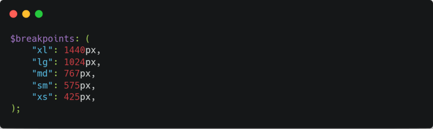
These will declare the various screen sizes our grid would support.
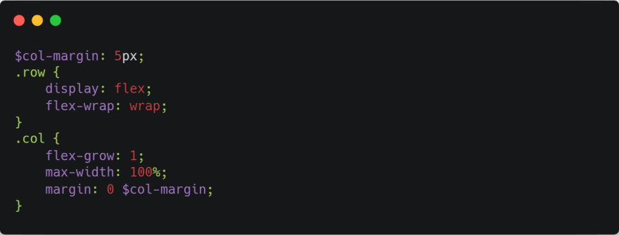
Next lets style the rows and columns
The next few lines will be the core of our layout, basically we’ll loop through the breakpoints map and add media queries and create 12 columns for each breakpoint. We’ll also include containers for each breakpoints.

Just imagine the amount of code that we would have had to write for the same thing in CSS. 🤦♂️ Anyways moving forward.
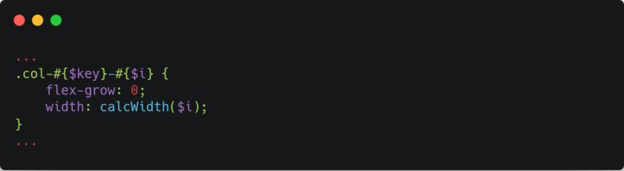
To calculate the width of the column we need to divide the columns into 12 groups based on their size in terms of percentage.
So to do that lets write a function in Sass that takes the column size as an argument and returns the width in percentage.

And then call the function inside the for loop
That’s it we are done with the12 column layout system 🍻.
As a bonus feature lets write a class that will remove the column margin and update our calcWidth() function accordingly.

Have a look at the layout in action. Resize your browser and see how the columns behave.
Thanks for reading the post. If you would like to add any other feature let me know below or you can DM me on Instagram @vijit__ail
This post was originally posted on Medium

Top comments (1)
The layout demo link is broken I think...