
Introduction
It's often useful to think of individual HTML elements as boxes within your larger page layout, or, in the case of a parent container with nested children, as a box-shaped container holding multiple HTML element boxes. As a designer, you have the power to adjust how these boxes appear and interact with one another.
The box model is a conceptual framework that visualizes the ways in which you can do this.
Understanding the CSS Box Model
In the image below, the white box represents your HTML element. Let's imagine it's an HTML image tag that renders a jpeg file within the browser.
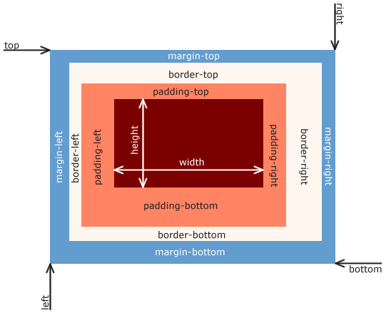
This jpeg image is the content of your box model, so the image is represented by the white box above. Padding, border, and margin are the CSS properties that you can now apply to a selector associated with this image. You can adjust these to meet your design needs. You now have three properties that can apply to this image:
img {
    padding: 0px 0px;
    border: none;
    margin: 0px 0px;
    }
Understanding Border
Border is the perimeter around your image, essentially its edge or outline.The CSS border declaration has a specific syntax that allows you to define its style efficiently. It looks like this:
border: width & border-style (required) & color
In practice, it looks like this:
img {
    border: 5px solid black;
}
In the above border declaration, we've given the image a solid black border that's 5 pixels wide. For more details on the types of property values associated with the border property, visit MDN CSS: border
Understanding Padding
Padding is the space between your content and the border. Padding can be adjusted multiple ways.
img {
    padding-top: 5px;
    padding-right: 20px
    padding-bottom: 10px;
    padding-left: 0px;
    }
The above padding declarations assign padding widths and heights to their respective sides individually. The same padding dimensions can be achieved in shorthand like this:
img {
   padding: 5px 20px 10px 0;
}
In the above example, the shorthand begins by setting the padding-top and then goes clockwise from there. Another, more limited, shorthand method is:
img {
    padding: 5px 10px;
    }
In the above code:
5px applies to the top and bottom padding
10px applies to the left and right padding
Understanding Margin
Margin is the spacing between the your content's border and any adjacent HTML elements. The property declarations are the same as padding. Using auto for the shorthand method will often center a component. The code would look like this:
.my-component {
    width: 400px;
    height: 400px;
    margin: 20px auto;
}
The above code will have a top and bottom margin of 20px and the auto property value will center the component so that the left and right margins are always equal.
Understanding Height and Width
In many cases, you may need your component to have a specific height or width. So it's important to understand how padding, margin, and border affect the dimensions of your component. Let's look at the following example:
.my-content {
    width: 400px;
    height: 200px;
    padding: 10px 10px;
    margin: 20px 5px;
    border: 5px solid red;
}
In the above example, you might think that your component width would equal 400px. But this is not the case. Padding, margin, and border are added to the width and height. So, remembering that when using shorthand the first value applies to the top and bottom, our height is equal to 200px + (10px * 2) + (20px * 2) + (5px * 2), for a total height of 270px. We add the size of the padding, margin, and border twice because they all apply to the top and bottom.
There is a CSS property that changes this behavior. The box-sizing property used with the border-box property value includes padding and border in the element's total width and height. See the example below:
.my-content {
    box-sizing: border-box;
    width: 400px;
    height: 200px;
    padding: 10px 10px;
    margin: 20px 5px;
    border: 5px solid red;
}
In the above example, the padding and border are added inside of the declared width and height, meaning the calculated height would amount to 200px + 20px + 20px, or 240px.
Conclusion
You just learned about the CSS Box model, the border property, the padding property, the margin property, the box-sizing property and gained some familiarity with the ways in which they can change how HTML elements render in the browser.

Top comments (0)