
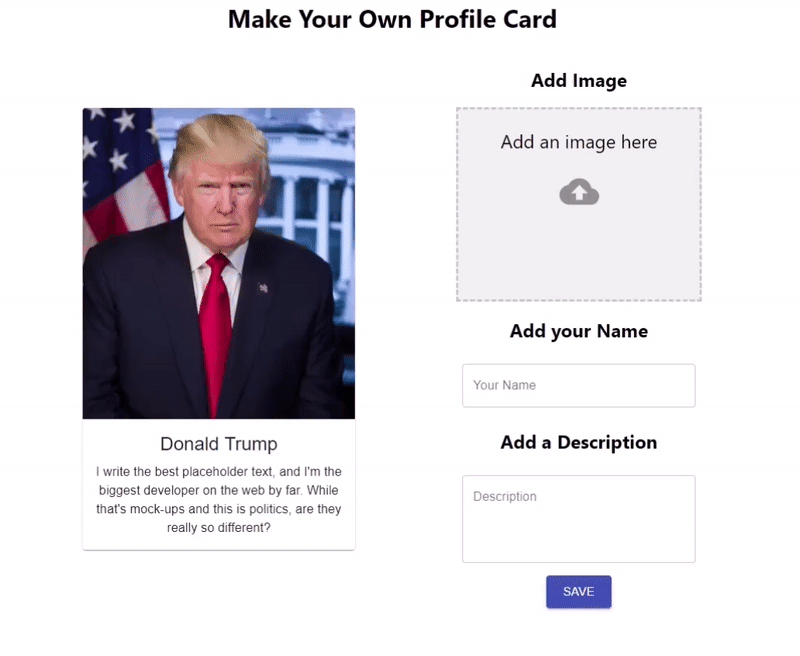
As part of the Vets Who Code organization we give each other small coding challenges to help us stay frosty. One recent challenge was to "Create a form that takes a picture, a name, and description and make a little profile card from the upload."
Challenge Accepted
Being an unemployed veteran of the Marine Corps, it leaves me with a lot of time to try and make things more interesting for myself, so I thought "What if I did the challenge, but using React?" As developers, we have to be comfortable with making forms of all types. This includes image upload. That's why I thought this challenge was interesting.
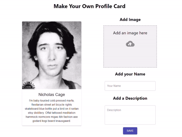
Here's what we will be making:
Goal
I like to put my thoughts into words. This tutorial is just as much for me as it is for other newer developers that have questions that you can't easily find. Also, forms. Forms are used all over the web to collect information. This tutorial will help make use of good form design.
Table of Contents
Prerequisites
A basic understanding of HTML, CSS, and JavaScript are needed for this tutorial. Also your favorite code editor (I'm using VS Code) I will do my best to show everything else.
Cloudinary
Along the way I discovered a neat little website named Cloudinary. It's a service that can store, manipulate, manage, and serve images. I chose to use Cloudinary because it has a free tier that includes all the features needed to make this project work. For this tutorial, all you need is a free account.
Other Libraries/Frameworks
- Material-UI - for design
- SuperAgent - for ajax
- react-dropzone - handle the image upload
Set Up
Cloudinary Set Up
Get a free account at Cloudinary.
Once you have an account, navigate to Setting > Upload.
It took me a sec to find the Settings. It's in the top-right corner and looks like a little blue gear ⚙️. Then click the Uploads tab.
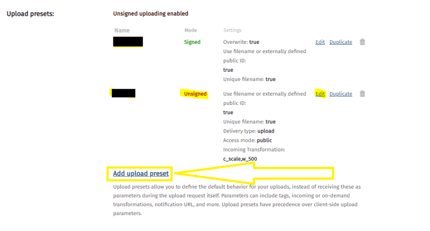
Select Add Upload Preset under Upload presets.
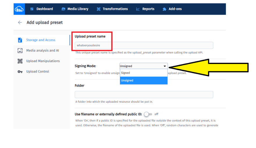
On the Add Upload Presets page name your Upload Preset Name, it doesn't matter what it is; you can name it rigmarole if you want to. Also set the Signing Mode to Unsigned.
React Set Up
Let's start with creating a new React App.
npx create-react-app profile-card
cd profile-card
Install the dependencies we will need and start our local server:
npm install @material-ui/core material-ui-dropzone superagent --save
npm start

Go ahead and delete the boilerplate that comes preloaded with a React App like everything between the <div className="App"> and add a new folder named components within the src folder. Create two files within the components folder named MediaCard.jsx and Form.jsx. These are the two files we will mostly be working with.
App.js
Initially, App.js should look like this:
import React from "react";
import "./App.css";
import MediaCard from "./components/MediaCard";
import Form from "./components/Form";

function App() {
  return (
    <div className="App">
      <h1 className="title">Make Your Own Profile Card</h1>
      <div className="container">
        <MediaCard />
        <Form />
      </div>
    </div>
  );
}

export default App;
App.css
A little itsy-bitsy CSS setup is required to align everything overall. You can style it how you want but I used flexbox to adjust everything:
App.css
.App {
  text-align: center;
  height: auto;
  margin: 0;
  padding: 0;
  box-sizing: border-box;
  display: flex;
  justify-content: center;
  flex-flow: column nowrap;
  align-items: center;
}
.container {
  width: 55%;
  display: flex;
  flex-flow: row wrap;
  align-items: center;
  justify-content: space-evenly;
}
For the MediaCard.jsx and the Form.jsx since we are setting up something to display and a form I used Material-UI. They have many pre-built components that implement Google's Material Design making design that much easier.
MediaCard.jsx
For the MediaCard.jsx display I used a card component. There are many pre-built ones to choose from and I thought this one would work for this small challenge. I went ahead and stripped the buttons from it since we won't need them, unless you want to include them.
Here it is:
MediaCard.jsx
import React from "react";
import PropTypes from "prop-types";
import { withStyles } from "@material-ui/core/styles";
import Card from "@material-ui/core/Card";
import CardActionArea from "@material-ui/core/CardActionArea";
import CardContent from "@material-ui/core/CardContent";
import CardMedia from "@material-ui/core/CardMedia";
import Typography from "@material-ui/core/Typography";

const styles = {
  /*
  Make adjustments for the card width. It is styled using traditional CSS.
  */
  card: {
    width: 300,
    marginBottom: 10
  },
  /*
  Make adjustments for the media so it properly appears on the profile card.
   */
  media: {
    height: 400
  }
};
const MediaCard = { classes } => {
  return (
    <Card className={classes.card}>
      <CardActionArea>
        {/*
        image= URL to your image, local or URL
        title= Title of the card, for accessibility purposes.
       */}
        <CardMedia
          className={classes.media}
          image="https://www.placecage.com/300/300"
          title="Nicolas Cage"
        />
        <CardContent>
          {/*Title of the profile card */}
          <Typography gutterBottom variant="h5" component="h2">
            Nicholas Cage
          </Typography>
          {/* This is where the description will go. I used [Hipster Ipsum](https://hipsum.co/)
          for this example.
          */}
          <Typography component="p">
            I'm baby tousled cold-pressed marfa, flexitarian street art bicycle
            rights skateboard blue bottle put a bird on it seitan etsy
            distillery. Offal tattooed meditation hammock normcore migas tbh
            fashion axe godard kogi beard knausgaard.
          </Typography>
        </CardContent>
      </CardActionArea>
    </Card>
  );
};
MediaCard.propTypes = {
  classes: PropTypes.object.isRequired
};

export default withStyles(styles)(MediaCard);
Form.jsx
Material-UI forms use a TextField wrapper. I decided to combine a few of these text fields along with the DropZone component to create the form. Standard form attributes are supported e.g. required, disabled, type, etc. as well as a helperText which is used to give context about a field’s input, such as how the input will be used. It is wrapped in the the Material-UI Grid component to make it responsive. Examples can be found here. There are a wide range of inputs that can be selected to create your form. Go ahead and make it your own. This is what I used:
Form.jsx
import React from "react";
import TextField from "@material-ui/core/TextField";
import { DropzoneArea } from "material-ui-dropzone";
import Grid from "@material-ui/core/Grid";
import Button from "@material-ui/core/Button";
import { makeStyles } from "@material-ui/core/styles";
import request from "superagent";

/*
useStyles is a custom hook from Material-UI.
*/
const useStyles = makeStyles(theme => ({
  button: {
    margin: theme.spacing(1)
  },
  root: {
    "& .MuiTextField-root": {
      margin: theme.spacing(1),
      width: 300
    }
  }
}));
const Form = () => {
  const classes = useStyles();

  return (
    <form className={classes.root}>
      <Grid container direction="column" justify="center" alignItems="center">
        <h2 className="addImage">Add Image</h2>
        {/*
        I added a few DropZone and TextField attributes, For DropZone we limit the size,
        limit to images only and a few other self-explanatory items. For the TextField
        we use a standard format to display a well-formatted input.
        Also added an onChange handler pointing to a function we are going
        to create soon.
        */}
        <DropzoneArea
          showFileNamesInPreview={true}
          maxFileSize={10000000}
          multiple="false"
          accept="image/*"
          onDrop={console.log}
          dropzoneText="Add an image here"
          type="file"
          onChange={onImageDrop}
        ></DropzoneArea>
        <h2>Add your Name</h2>
        <TextField
          className={classes.root}
          id="outlined-basic"
          label="Your Name"
          variant="outlined"
          autoFocus
          type="text"
          name="name"
          autoComplete="false"
          onChange={handleChange}
        />
        <h2>Add a Description</h2>
        <TextField
          type="text"
          className={classes.root}
          id="outlined-basic"
          label="Description"
          variant="outlined"
          rows="4"
          multiline
          name="description"
          onChange={handleChange}
        />
        <Button
          type="submit"
          variant="contained"
          color="primary"
          size="large"
          className={classes.button}
        >
          Save
        </Button>
      </Grid>
    </form>
  );
};
export default Form;
That does it for setup. We've added a lot of boilerplate up to this point but it will pay off when we start making everything dynamic. With Hot Module Reloading (HMR) you should see something like this:
Functionality
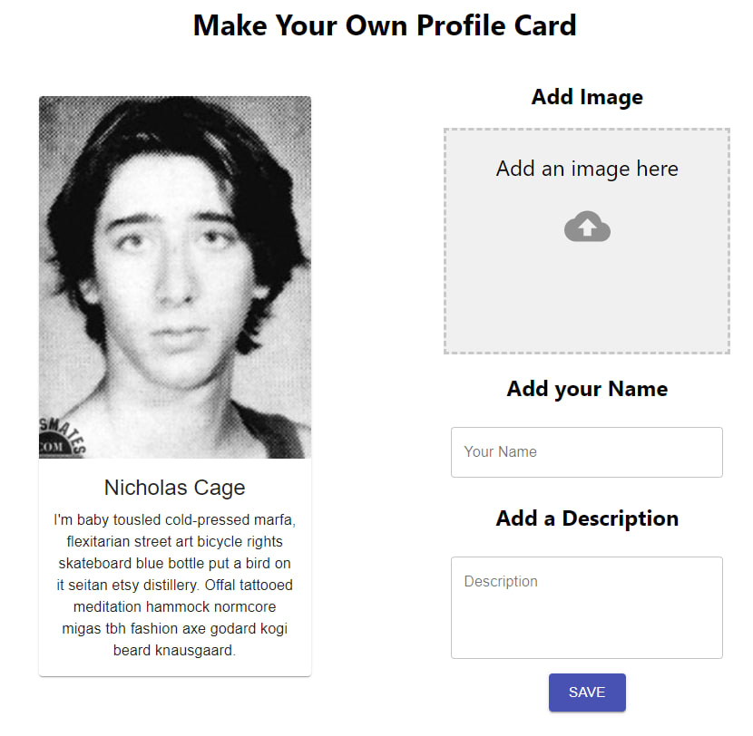
To make our application dynamic we have to introduce some state to it. The concept of state in React is that it is a plain JavaScript object that can change. For instance the current state of our app shows an image of Nick Cage along with an <h1> of "Nicolas Cage" and some paragraph text. When we fill out our form the state should change to reflect what we entered, i.e., state change. If you want an app to do anything, like create, read, update, or delete you'll have to introduce state management to it. That, is the nuts and bolts 🔩 of state in React. To change the state in our app we are going to use a useState() hook with it. I like useState() better than classes for several reasons: One, the code is shorter; there is no constructor or binding functions to components for its methods to have access to this in the component instance. Two, I think it is simpler to understand. Finally, it is how I was taught in Vets Who Code.
Back to coding... 😄
In our App.js add the following:
App.js
//add { useState} to our import.
import React, { useState } from "react";

function App() {
//Add a state to track the URL of the image we add.
const [uploadedFileUrl, setUploadedFileUrl] = useState({ uploadedFiles: null });

//Add a state to track the data entered in to our form.
  const [formData, setFormData] = useState({
    name: "",
    description: ""
  });

/*
Add a state to trigger our change in our profile card.
This will help us create a "conditional ternary operator"
(fancy if/else statement)
 */
const [change, setChange] = useState(true);
You are probably wondering why are we adding these states to App.js. The answer is simple. It is the center of gravity for both our components. App.js is the common denominator of MediaCard.jsx and Form.jsx so to share states between the two components we send them through App.js.

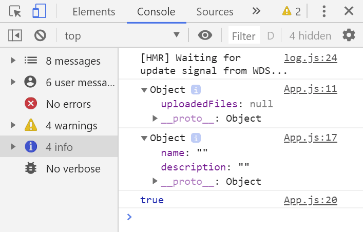
If you were to console.log these states you will see two objects and a Boolean:
Let's put these state objects to use and make our form functional.
In App.js add these props to MediaCard.jsx and Form.jsx
        <MediaCard
          change={change}
          setChange={setChange}
          formData={formData}
          uploadedFileUrl={uploadedFileUrl}
        />
        <Form
          formData={formData}
          setFormData={setFormData}
          setChange={setChange}
          setUploadedFileUrl={setUploadedFileUrl}
          uploadedFileUrl={uploadedFileUrl}
        />
Open Form.jsx and import request from our superagent module we downloaded at the beginning. Then add your Cloudinary account information and the props we are passing to the Form.jsx component:
Form.jsx
//import statements
import request from "superagent";

const CLOUDINARY_UPLOAD_PRESET = "upload_preset_id";
const CLOUDINARY_UPLOAD_URL =
  "https://api.cloudinary.com/v1_1/cloudinary_app_name/upload";

const Form = ({formData, setFormData, setChange, setUploadedFileUrl, uploadedFileUrl}) =>{...
  const classes = useStyles();

  return (...)
}
In the body of Form.jsx above the return statement add:
Form.jsx
const Form = ({formData, setFormData, setChange, setUploadedFileUrl, uploadedFileUrl}) =>{...
  const classes = useStyles();
/*
onSubmit is the main function that will handle the button click.
Much like an `addEventListener` in vanilla JavaScript.
'e' is shorthand for 'event'
*/
  const onSubmit = e => {
    e.preventDefault();
    setChange(false);
    setUploadedFileUrl({ uploadedFiles: e[0] });
    /*
    I console.log here to check if the onSubmit is grabbing the image.
    */
    console.log(uploadedFileUrl.uploadedFiles);
    handleImageUpload(uploadedFileUrl.uploadedFiles);
  };
/*
handleChange changes the state of our formData state. It takes the value from the event
and uses a spread operator to update the state of nested objects.
It takes the name of the objects and spreads them through the state array.
*/
  const handleChange = e => {
    const value = e.target.value;
    setFormData({ ...formData, [e.target.name]: value });
  };
/*
According to the react-dropzone documentation, it will always return
an array of the uploaded files. We pass that array to the files
parameter of the onImageDrop function. Since we are only allowing one
image at a time we know that the image will always be in the first
position of the array ([0]).
*/
  const onImageDrop = e => {
    setUploadedFileUrl({ uploadedFiles: e[0] });
  };
/*
Here we harness the power of superagent request to upload the image to Cloudinary.
*/
  const handleImageUpload = file => {
    let upload = request
      .post(CLOUDINARY_UPLOAD_URL)
      .field("upload_preset", CLOUDINARY_UPLOAD_PRESET)
      .field("file", file);
    upload.end((err, response) => {
      if (err) {
        console.error(err);
      }
      if (response.body.secure_url !== "") {
        setUploadedFileUrl({
          uploadedFiles: response.body.secure_url
        });
      }
    });
  };

  return (...)
}
Now is where we get to see the state change. In MediaCard.jsx we are going to add the conditional ternaries to make it functional. Basically, Form.jsx is going to send information to MediaCard.jsx by way of App.js and we'll see it change.
const MediaCard = ({ classes, change, formData, uploadedFileUrl }) => {

  return (
    <Card className={classes.card}>
      <CardActionArea>
        {/*
        image= URL to your image, local or URL
        title= Title of the card, for accessibility purposes.
        This is where we use the conditional ternaries. It's a boolean
        so it checks if change is true or false. True? (default state) it
        stays the same. False? It changes to the input we sent with onSubmit.
       */}

        {change ? (
          <CardMedia
            className={classes.media}
            image="https://www.placecage.com/300/300"
            title="Profile Card"
          />
        ) : (
          <CardMedia
            className={classes.media}
            image={uploadedFileUrl.uploadedFiles}
            title="Profile Card"
          />
        )}
        <CardContent>
          {/*Title of the profile card */}
          {change ? (
            <Typography gutterBottom variant="h5" component="h2">
              Nicholas Cage
            </Typography>
          ) : (
            <Typography gutterBottom variant="h5" component="h2">
              {formData.name}
            </Typography>
          )}
          {/* This is where the description will go. I used [Hipster Ipsum](https://hipsum.co/)
          for this example.
          */}
          {change ? (
            <Typography component="p">
              I'm baby tousled cold-pressed marfa, flexitarian street art
              bicycle rights skateboard blue bottle put a bird on it seitan etsy
              distillery. Offal tattooed meditation hammock normcore migas tbh
              fashion axe godard kogi beard knausgaard.
            </Typography>
          ) : (
            <Typography component="p">{formData.description}</Typography>
          )}
        </CardContent>
      </CardActionArea>
    </Card>
  );
};
MediaCard.propTypes = {
  classes: PropTypes.object.isRequired
};

export default withStyles(styles)(MediaCard);
If everything worked out you should see this.
Here's the whole project in case you missed something.
App.js
import React, { useState } from "react";
import "./App.css";
import MediaCard from "./components/MediaCard";
import Form from "./components/Form";

function App() {
  //Add a state to track the URL of the image we add.
  const [uploadedFileUrl, setUploadedFileUrl] = useState({
    uploadedFiles: null
  });
  console.log(uploadedFileUrl);
  //Add a state to track the data entered in to our form.
  const [formData, setFormData] = useState({
    name: "",
    description: ""
  });
  //Add a state to trigger our change in our profile card.
  const [change, setChange] = useState(true);
  return (
    <div className="App">
      <h1 className="title">Make Your Own Profile Card</h1>
      <div className="container">
        <MediaCard
          change={change}
          setChange={setChange}
          formData={formData}
          uploadedFileUrl={uploadedFileUrl}
        />
        <Form
          formData={formData}
          setFormData={setFormData}
          setChange={setChange}
          setUploadedFileUrl={setUploadedFileUrl}
          uploadedFileUrl={uploadedFileUrl}
        />
      </div>
    </div>
  );
}

export default App;
MediaCard.jsx
import React from "react";
import PropTypes from "prop-types";
import { withStyles } from "@material-ui/core/styles";
import Card from "@material-ui/core/Card";
import CardActionArea from "@material-ui/core/CardActionArea";
import CardContent from "@material-ui/core/CardContent";
import CardMedia from "@material-ui/core/CardMedia";
import Typography from "@material-ui/core/Typography";

const styles = {
  /*
  Make adjustments for the card width. It is styled using traditional CSS.
  */
  card: {
    width: 350,
    marginBottom: 10
  },
  /*
  Make adjustments for the media so it properly appears on the profile card.
   */
  media: {
    height: 400
  }
};

const MediaCard = ({ classes, change, formData, uploadedFileUrl }) => {
  //const { classes } = props;
  return (
    <Card className={classes.card}>
      <CardActionArea>
        {/*
        image= URL to your image, local or URL
        title= Title of the card, for accessibility purposes.
       */}

        {change ? (
          <CardMedia
            className={classes.media}
            image="https://www.placecage.com/300/300"
            title="Profile Card"
          />
        ) : (
          <CardMedia
            className={classes.media}
            image={uploadedFileUrl.uploadedFiles}
            title="Profile Card"
          />
        )}
        <CardContent>
          {/*Title of the profile card */}
          {change ? (
            <Typography gutterBottom variant="h5" component="h2">
              Nicholas Cage
            </Typography>
          ) : (
            <Typography gutterBottom variant="h5" component="h2">
              {formData.name}
            </Typography>
          )}
          {/* This is where the description will go. I used [Hipster Ipsum](https://hipsum.co/)
          for this example.
          */}
          {change ? (
            <Typography component="p">
              I'm baby tousled cold-pressed marfa, flexitarian street art
              bicycle rights skateboard blue bottle put a bird on it seitan etsy
              distillery. Offal tattooed meditation hammock normcore migas tbh
              fashion axe godard kogi beard knausgaard.
            </Typography>
          ) : (
            <Typography component="p">{formData.description}</Typography>
          )}
        </CardContent>
      </CardActionArea>
    </Card>
  );
};
MediaCard.propTypes = {
  classes: PropTypes.object.isRequired
};

export default withStyles(styles)(MediaCard);
Form.jsx
import React from "react";
import TextField from "@material-ui/core/TextField";
import { DropzoneArea } from "material-ui-dropzone";
import Grid from "@material-ui/core/Grid";
import Button from "@material-ui/core/Button";
import { makeStyles } from "@material-ui/core/styles";
import request from "superagent";

/*
useStyles is a custom hook from Material-UI.
*/
const useStyles = makeStyles(theme => ({
  button: {
    margin: theme.spacing(1)
  },
  root: {
    "& .MuiTextField-root": {
      margin: theme.spacing(1),
      width: 300
    }
  }
}));
const CLOUDINARY_UPLOAD_PRESET = "upload_preset_id";
const CLOUDINARY_UPLOAD_URL =
  "https://api.cloudinary.com/v1_1/cloudinary_app_name/upload";

const Form = ({
  formData,
  setFormData,
  setChange,
  setUploadedFileUrl,
  uploadedFileUrl
}) => {
  const classes = useStyles();
  /*
onSubmit is the main function that will handle the button click.
Much like an `addEventListener` in vanilla JavaScript.
'e' is shorthand for 'event'
*/
  const onSubmit = e => {
    e.preventDefault();
    setChange(false);
    setUploadedFileUrl({ uploadedFiles: e[0] });
    console.log(uploadedFileUrl.uploadedFiles);
    handleImageUpload(uploadedFileUrl.uploadedFiles);
  };
  /*
handleChange changes the state of our formData state. It takes the value from the event
and uses a spread operator to update the state of nested objects.
It takes the name of the objects and spreads them through the state array.
*/
  const handleChange = e => {
    const value = e.target.value;
    setFormData({ ...formData, [e.target.name]: value });
  };
  /*
According to the react-dropzone documentation, it will always return
an array of the uploaded files. We pass that array to the files
parameter of the onImageDrop function. Since we are only allowing one
image at a time we know that the image will always be in the first
position of the array ([0]).
*/
  const onImageDrop = e => {
    setUploadedFileUrl({ uploadedFiles: e[0] });
  };
  /*
Here we harness the power of superagent request to upload the image to Cloudinary.
*/
  const handleImageUpload = file => {
    let upload = request
      .post(CLOUDINARY_UPLOAD_URL)
      .field("upload_preset", CLOUDINARY_UPLOAD_PRESET)
      .field("file", file);
    upload.end((err, response) => {
      if (err) {
        console.error(err);
      }
      if (response.body.secure_url !== "") {
        setUploadedFileUrl({
          uploadedFiles: response.body.secure_url
        });
      }
    });
    console.log(uploadedFileUrl.uploadedFiles);
  };

  return (
    <form className={classes.root} onSubmit={onSubmit}>
      <Grid container direction="column" justify="center" alignItems="center">
        <h2 className="addImage">Add Image</h2>
        {/*
        I added a few DropZone attributes to limit the size,
        limit to images only and a few other self-explanatory items.
        */}
        <DropzoneArea
          showFileNamesInPreview={true}
          maxFileSize={10000000}
          multiple="false"
          accept="image/*"
          onDrop={console.log}
          dropzoneText="Add an image here"
          type="file"
          onChange={onImageDrop}
        ></DropzoneArea>
        <h2>Add your Name</h2>
        <TextField
          className={classes.root}
          id="outlined-basic"
          label="Your Name"
          variant="outlined"
          autoFocus
          type="text"
          name="name"
          autoComplete="false"
          onChange={handleChange}
        />
        <h2>Add a Description</h2>
        <TextField
          type="text"
          className={classes.root}
          id="outlined-basic"
          label="Description"
          variant="outlined"
          rows="4"
          multiline
          name="description"
          onChange={handleChange}
        />
        <Button
          type="submit"
          variant="contained"
          color="primary"
          size="large"
          className={classes.button}
        >
          Save
        </Button>
      </Grid>
    </form>
  );
};
export default Form;
Wrapping it up
Don't worry if you're a little lost. I just wanted to fully explain the functionality of everything instead of just blasting an answer at you. I figure working things out is the best way to learn a concept. It was really a short project that I learned a tremendous amount from. I am sure there is going to be some experts coming on here telling me I could've done it better this way but as I am a n00b, I figured it out this way, and with more experience and practice I will find better ways to do things.
Vets Who Code
Did you like what you read? Want to see more?
Let me know what you think about this tutorial in the comments below.
As always, a donation to Vets Who Code goes to helping veterans, like myself, in learning front end development and other coding skills. You can donate here: VetsWhoCode
Thank you for your time!


Top comments (0)