
Mastering CSS Gradients
what is CSS Gradients?
CSS gradients are a powerful way to create smooth transitions between two or more colors, creating visually appealing backgrounds and effects on elements.
Gradients can be 3 types linear, radial & conic and can incorporate various colors and color stops

1. Linear Gradient
A linear gradient in CSS is a background image effect that creates a smooth color transition between two or more colors in a linear direction. It's a powerful way to add visual interest to elements on a web page, such as backgrounds, buttons, or containers. Linear gradients allow you to smoothly blend colors, creating eye-catching and dynamic effects.
Syntax for Linear Gradient:
.selector {
  background: linear-gradient(direction, color-stop1, color-stop2, ...);
}
.selector: This is the CSS selector for the element you want to apply the gradient to.
background: linear-gradient: This is the CSS property and value that specifies a linear gradient background.
direction: Specifies the direction of the gradient. It can be angles (in degrees), keywords like to left, to right, to top, to bottom, and their combinations (e.g., to bottom right).
color-stop1, color-stop2, ...: These are the color stops that define the colors and positions of the gradient. You can use color values (hex, RGB, named colors) and also define their positions.

Examples for linear gradient
Example1:
html
<div class="linear-gradient1">
    Codewithvayola </div>
css
.linear-gradient1 {
  width: 300px;
  height: 100px;
  background: linear-gradient(to right, #ff0000, #00ff00);
}

Example2:
html
<div class="linear-gradient1">
    Codewithvayola </div>
css
.linear-gradient1 {
  width: 300px;
  height: 100px;
  background: linear-gradient(to left, #ff0000, #00ff00);
}

Example3:
html
<div class="linear-gradient1">
    Codewithvayola </div>
css
.linear-gradient1 {
  width: 300px;
  height: 100px;
  background: linear-gradient(to top, #ff0000, #00ff00);
}

Example4:
html
<div class="linear-gradient1">
    Codewithvayola </div>
css
.linear-gradient1 {
  width: 300px;
  height: 100px;
  background: linear-gradient(to bottom, #ff0000, #00ff00);
}

Example5:
html
<div class="linear-gradient1">
    Codewithvayola </div>
css
.linear-gradient1 {
  width: 300px;
  height: 100px;
  background: linear-gradient(to bottom right, #ff0000, #00ff00);
}

Example6:
html
<div class="linear-gradient1">
    Codewithvayola </div>
css
.linear-gradient1 {
width: 300px;
height: 100px;
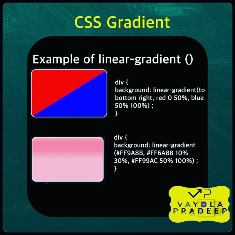
background: linear-gradient(to bottom right, red 0 50%, blue
50% 100%) ;
}

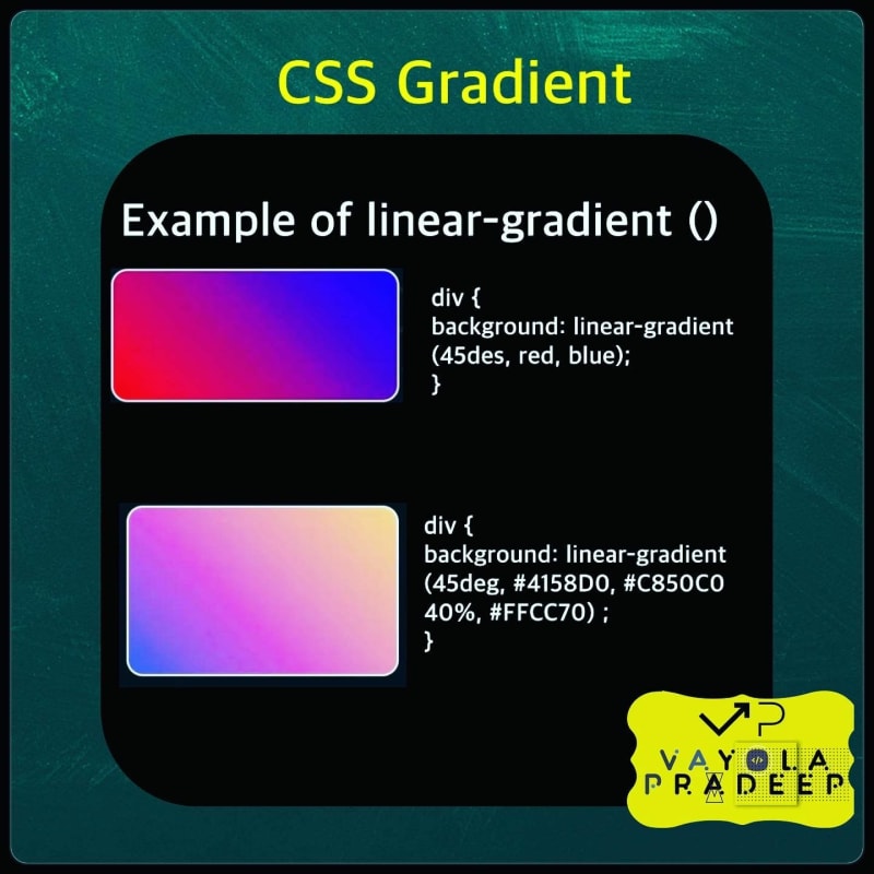
Linear gradients are versatile and allow for various visual effects. You can experiment with different color combinations, angles, and color stop positions to achieve the desired look. Gradients are widely used for enhancing the design and aesthetics of web interfaces.
2. Radial Gradient
A radial gradient in CSS is a background image effect that creates a smooth color transition radiating from a center point to the edges of an element. It's a visually appealing way to add depth and dimension to various elements on a web page, such as buttons, divs, and backgrounds.
Syntax for Radial Gradient:
.selector {
  background: radial-gradient(shape size at position, color-stop1, color-stop2, ...);
}
.selector: This is the CSS selector for the element you want to apply the gradient to.
background: radial-gradient: This is the CSS property and value that specifies a radial gradient background.
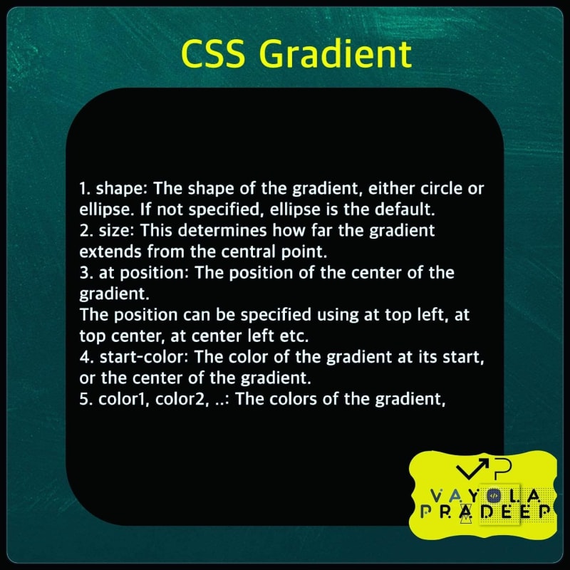
shape size at position: Specifies the shape and size of the gradient, along with the position of the center point. The shape can be circle or ellipse, followed by the size in percentages or pixels. The at position determines where the center of the gradient is located.
color-stop1, color-stop2, ...: These are the color stops that define the colors and positions of the gradient. You can use color values (hex, RGB, named colors) and also define their positions.

Examples for Radial gradient
Example1:
html
<div class="radial-gradient1">
    Codewithvayola </div>
css
.radial-gradient1 {
  width: 300px;
  height: 100px;
background: radial-gradient(circle, red, blue);
}

Example2:
html
<div class="radial-gradient1">
    Codewithvayola </div>
css
.radial-gradient1 {
  width: 300px;
  height: 100px;
background: radial-gradient(ellipse, red, blue);
}


Radial gradients provide a way to achieve various visual effects, from subtle shading to more complex color transitions. They are commonly used for decorative elements, buttons, and backgrounds in web design
2. Conic Gradient
A conic gradient in CSS is a type of background image effect that creates a color transition around a center point in a circular manner. Unlike linear or radial gradients, conic gradients produce a rotation of colors around a central axis. This can be used to create unique and dynamic visual effects, such as pie charts or circular color patterns.
Syntax for Conic Gradient:
.selector {
  background: conic-gradient([starting angle], color-stop1, color-stop2, ...);
}
.selector: This is the CSS selector for the element you want to apply the conic gradient to.
background: conic-gradient: This is the CSS property and value that specifies a conic gradient background.
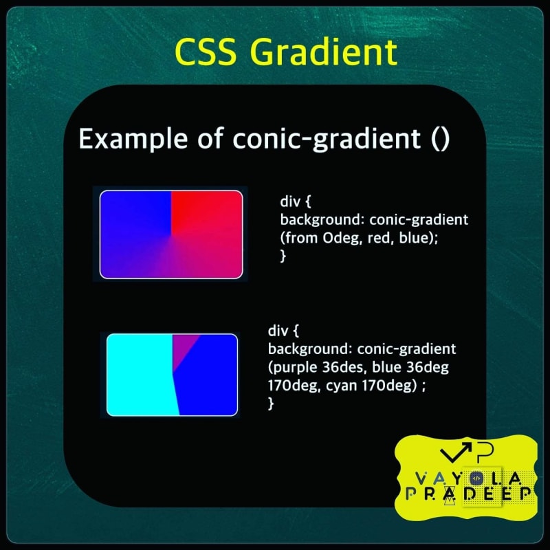
[starting angle]: Specifies the starting angle in degrees from which the gradient begins. It's optional and defaults to 0deg (top).
color-stop1, color-stop2, ...: These are the color stops that define the colors and positions of the gradient. You can use color values (hex, RGB, named colors) and also define their positions.

Examples of Conic Gradient
Example1
html
<div class="conic-gradient1">
    Codewithvayola </div>
css
.conic-gradient1 {
  width: 300px;
  height: 100px;
 background: conic-gradient(red, blue);
}

Conic gradients are a versatile way to create dynamic and eye-catching effects that involve color rotation around a center point. They can be used to create circular progress indicators, color wheels, and other creative designs


Top comments (0)