
The introduction of media query was the savior and pinnacle of web responsiveness; without it, we would still be stuck with building websites for different screen sizes (the old age).
However, specifying media queries for different screen sizes when developing a website can get cumbersome. This can potentially add unnecessary codes that in turn can make CSS debugging a nightmare. To overcome this, we're going to be using a CSS in-built function called the "min()" function.
As the saying goes - "Seeing is believing", so I'm going to show you a video example of how website responsiveness can work effectively by using min().


 Vayo@vayo_tweet
 Taking website responsiveness to a whole new level 🌐09:30 AM - 01 Mar 2023


The
min()CSS function lets you set the smallest (most negative) value from a list of comma-separated expressions as the value of a CSS property value. Themin()function can be used anywhere a<length>,<frequency>,<angle>,<time>,<percentage>,<number>, or<integer>is allowed.
Basically what this means is that the min() function accepts a variety of units (e.g %, rem, px, vw) and returns the one that is the smallest. This value is then set as the value of a CSS property.
The min() function is a really powerful CSS feature that can be used to style lots of elements that need to scale perfectly to fit different screen sizes. Some CSS properties like width, font size, margin, paddings, gap, etc should not have a fixed size when dealing with a responsive website.
Did You Know
The
min()function also has a sibling called themax()function.The
max()function does the opposite of what themin()function does,max()returns the biggest value passed to it. Read more onmax()function here.
Font Size Responsiveness
The code below demonstrates an example of a min() formula that can be used in making the font size of a website as responsive as possible
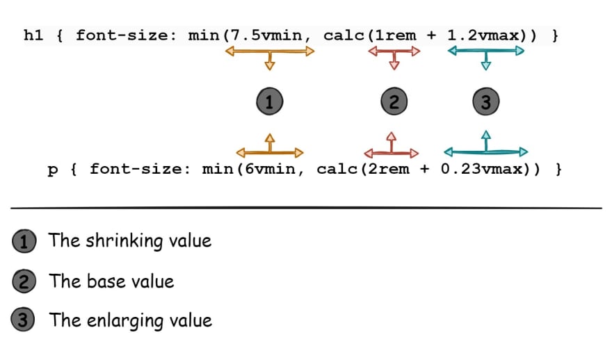
font-size: min(6vmin, calc(1rem + 0.23vmax));
The min() is used to set the smallest value between these two values - 6vmin and calc(1rem + 0.23vmax) - as the value for the font size CSS property.
The 6vmin value is 6% of the smallest part of the viewport, which can either be the vw (viewport width) or vh (viewport height). By using vmin, we are able to reduce the font size to fit any small screen. This helps the font size to scale as minimum as needed.
The calc(1rem + 0.23vmax) is more of a derived formula that has been tested and it has proven to efficiently increase the font size in accordance with the viewport size. The value of 1rem is the preferred base font value. Although as the screen size grows, 1rem becomes too small for big screens; therefore, a tiny fraction of the largest viewport dimension i.e 0.23vmax was added to 1rem using calc(). By adding these two values, we can guarantee that the font size will increase bit by bit as the screen size increases and still remain readable without becoming too large.
Therefore, using min() allows CSS to choose the perfect length that'd fit any screen size, the font size would shrink as much as needed to fit small screen sizes (i.e using 6vmin) and would grow as large as needed to fit large screen sizes (i.e using calc(1rem + 0.23vmax)).
Using different media queries to make sure a particular element scales well also works, for example -
p {
  font-size: 1.1rem;
}

@media (min-width: 1200px) {
  p {
    font-size: 1.2rem;
  }
}
@media (max-width: 350px) {
  p {
    font-size: 0.9rem;
  }
}
It'd work fine, no problem... but a problem arises when a user for instance uses a smartwatch or a large screen, say 200 inches to access your website. Now both media queries you put in place won't work properly because the font size would be too small for a user with a 200-inch screen and too large for a user with a smartwatch.
Worst of all, you can't say it isn't possible because you never know what device a user will use to access your website or what monstrosities of screen sizes will be created in the future. Look at foldable phones for instance—who would have thought?
Instead, if you used just one line of code like this...
p { font-size: min(6vmin, calc(1rem + 0.23vmax)) }
...this would take into account adjusting the p tag's font size to shrink and enlarge as much as needed, depending on the screen size, all without using a single media query.
Workaround
Some developers may choose to specify a max-width that their website should have; so using the
min()trick above could disrupt that. This would happen due to the font-size potentially enlarging more than the website max-width, thereby causing an overflow.To fix this, include the maximum value the tag property should have, which in this case is the
font-size:p { font-size: min(6vmin, calc(1rem + 0.23vmax), 2rem); }With this fix, the
ptag's font size would undergo the usual shrinking and enlarging but would stop enlarging once it reaches 2rem.
Although, when using this min(6vmin, calc(1rem + 0.23vmax)) trick for a p tag, it works fine; but trying to use this trick for tags that are meant to be huge like header tags may not work as expected.
This is because headers typically need to be larger than regular text to be noticeable, so simply using the same min() formula may result in headers being too small. To compensate, you may have to make a few tweaks, like increasing the vmin and vmax values in the min() function for headers. For example -
h1 {
  /* font-size: min(6vmin, calc(2rem + 0.23vmax)); Old formula*/
  font-size: min(7.5vmin, calc(2rem + 1.2vmax));
}
Because headers are larger than regular texts, the vmax value was raised from 0.23vmax to 1.2vmax and the vmin value was raised from 6vmin to 7.5vmin. This ensures that the difference between headers and regular texts is noticeable.
Generally, this is the formula I use when dealing with regular texts and headers
This formula has always made any text on websites I design responsive. You could also experiment by tweaking the values to see how they could fit perfectly in your code; you never know, you might come up with a much better formula. Just don't forget to help a brother out.
For the lazy developers, I've got you. At the end of this article, I've included a list of different font sizes that could be used for texts ranging from extremely small to gigantic. This would save you the stress of tweaking the formula values.
Margin & Padding Responsiveness
To ensure fluid margin and padding responsiveness, it all boils down to which type of unit is used. Using fixed units like rem or px to define margins and paddings eventually doesn't go as planned as soon as responsiveness steps in.
For example, if you set a margin of 30px on an element and then reduce the viewport size, the padding won't reduce in size due to the fixed unit used. This could result in overflows or smaller screens with large margins, eventually resulting in the need for media queries for responsive adjustment.
With just one line of code, this issue can be avoided. The min() function allows you to set both a relative unit and a fixed unit, with the fixed unit acting as a threshold to prevent the margin from exceeding a certain value, which may occur due to the relative unit increasing in size.
For example, instead of setting only a fixed margin of 30px, you can use...
div {
  /* margin: 30px; */
  margin: min(10vmin, 30px);
}
This sets a value of 10vmin or 30px, whichever is greater would be used as the margin value. In smaller screens, the margin would have a relative unit of 10vmin which would shrink correctly with the screen size; however as the screen gets bigger and 10vmin becomes equal to the size of 30px, the 30px is then used as the margin, and it eventually stops increasing in size. This is all done without a media query in sight, which is amazing.
Pro Tip
When using paddings, use the "em" unit whenever possible. Because "em" is dependent on the font size of its element or its nearest ancestor with a specified font size, it would scale perfectly with how the font size scales. This only works if the font size scales as well.
For example, consider a div with
font-size: min(6vmin, calc(1rem + 0.12vmax));andpadding: 1.2em;. This would ensure that the padding would always scale relative to how the font-size scales. If the font decreases, the padding decreases as well; if the font increases, the padding increases.All it takes is a few tweaks to the padding value, and you've got a responsive padding.
At the end of this article, I have included a list of different pre-defined sizes that you can use to style most margins and paddings so that they are responsive no matter the screen size. Just remember to tweak any of the values if they don't fit well in your code.
Width Responsiveness
Making width as responsive as possible is less tedious than dealing with font size. Most of the time, developers want an element's width to fill the viewport width or 100% of its container while also preventing it from growing beyond a certain size. There are two ways to go about this
div {
  max-width: 700px;
  width: 100%;
}
/* Or */
div {
  width: min(100%, 700px);
}
Both codes work the same way, using the min() instead of max-width is just an easier way to write the code; let's face it, writing one line of code is much more blissful than writing multiple lines of code that achieves the same thing.
However, the width of regular text on your website should also be taken into account. There's a sort of rule that governs the width of texts; this is because if the text is too long, it becomes difficult to read cause you tend to tilt your head more. As a result, when reading texts on large screens, you'll notice that the overall text width does not span the entire width of the viewport.
To control how many characters should fit on a single line before wrapping to the next, the CSS font value "ch" is used. Generally speaking, the recommended value for "ch" is between 50 and 75 characters per line, but this can change depending on how your website is designed.
p {
  width: min(100%, 50ch); /* Max 50 characters */
}
Custom Responsive Values List
The following are pre-defined custom values that I use to style font-size, margins, paddings, widths, gaps, and other elements. These values have been defined as CSS custom properties that can be used with the var() function. Although you could simply copy and paste them into the appropriate CSS property, your choice.
:root {
  --font-size-6x: min(7.5vmin, calc(2rem + 1.2vmax));
  --font-size-5x: min(6.5vmin, calc(1.1rem + 1.2vmax));
  --font-size-4x: min(4vmin, calc(0.8rem + 1.2vmax));
  --font-size-3x: min(6vmin, calc(1rem + 0.12vmax));
  --font-size-2x: min(4vmin, calc(0.85rem + 0.12vmax));
  --font-size-1x: min(2vmin, calc(0.65rem + 0.12vmax));
  --width-2x: min(100vw, 1300px);
  --width-1x: min(100%, 1200px);
  --gap-3x: min(5vmin, 1.5rem);
  --gap-2x: min(4.5vmin, 1rem);
  --size-10x: min(15vmin, 5.5rem);
  --size-9x: min(10vmin, 5rem);
  --size-8x: min(10vmin, 4rem);
  --size-7x: min(10vmin, 3rem);
  --size-6x: min(8.5vmin, 2.5rem);
  --size-5x: min(8vmin, 2rem);
  --size-4x: min(8vmin, 1.5rem);
  --size-3x: min(7vmin, 1rem);
  --size-2x: min(5vmin, 1rem);
  --size-1x: min(2.5vmin, 0.5rem);
}
/* The custom properties prefixed with "--size-" are used mostly for margins and paddings. */
These values can be tweaked as needed. So, feel free to adjust the values to suit your specific needs.
Possible Questions
-
Can clamp() be used instead of min()?
Yes, the CSS clamp() function can also be used in place of the min() function. However, min() is much more favorable because clamp() only accepts three values (a minimum, a preferred value, and a maximum), unlike min() which accepts as many values as needed.
-
Can another min() be used inside a min()?
Yes, you can embed a min() function inside another min(). Other CSS functions like clamp(), min(), max(), or calc() can also be used inside a min() function.
For example,
min(min(5px, 1vw), calc(10vh - 20px), max(10%, 15px), 10rem)is perfectly valid in CSS. But beware, you could get confused easily, so tread with caution. -
Does using min() imply that media queries are no longer required?
No, media queries are still essential for the responsiveness of modern websites. However, if the min() function is well utilized, you would need just a few media queries in your code.
For instance, when working with CSS properties that don't use units like display or position, you're definitely going to need media queries.
-
How can I tweak the min() values found in the custom list provided above?
Tweaking the min() values are really simple. For instance, if you're working with text that displays a product's location and you decide to use this:
--font-size-3x: min(6vmin, calc(1rem + 0.12vmax));Since this kind of text needs to be a little smaller than regular text, you can simply reduce
6vminto like4.5vminand1remto like0.8rem; you can leave the0.12vmaxas it is (you rarely need to tweak that). -
What can be used to check the effect of changing the min() values?
Use the developer tools of your browser to better visualize and understand how changing each value in min() would affect the element's size.
You can instantly see how your website will scale to different screen sizes by switching to responsive mode in developer tools.
-
Instead of using vmin, can't vw be used instead?
It depends on the context. Use vw if you only want the sizing of an element to scale according to the width of the screen.
However, using vmin works better since you never know the exact dimensions of the user's screen. Using vmin helps you remain consistent across multiple devices, regardless of screen size differences.
-
Is min() supported in all browsers?
At the time of this writing, min() is supported in 94% of all browsers, which is more than enough.
All major browsers support it apart from one famous culprit, Internet Explorer.
Check here for the latest support - https://caniuse.com/?search=min()
Congratulations on reaching the end of this article; I'm proud of you. If you enjoyed this article, a like would be much appreciated.
Got any questions? The comment section is all yours.
Oh, and one more thing, if you want me to explore any topics or have some cool ideas you want me to check out, don't be shy; let me know!
Send me a text on Twitter - @vayo_tweet
Send me an email - vayospot@gmail.com
Now, go forth and create the most responsive websites the world has ever seen! May your CSS skills be sharp, your code be clean, and your designs be spectacular.


Top comments (0)