
CSS is one of the essential skills for frontend developers and a topic that is normally asked about in interview process.
Flexbox Layout
Flexbox Layout was designed for a layout in one dimension, either a row or a column.

| Property | Values |
|---|---|
| display: | flexbox, inline-flex; |
| flex-direction: | row, row-reverse, column, column-reverse; |
| flex-wrap: | nowrap, wrap, wrap-reverse; |
| flex-flow: | <‘flex-direction’>, <‘flex-wrap’> |
| justify-content: | flex-start, flex-end, center, space-between, space-around; |
| align-items: | flex-start, flex-end, center, baseline, stretch; |
| align-content: | flex-start, flex-end, center, space-between, space-around, stretch; |
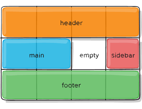
Grid Layout
Grid was designed for two-dimensional layout, rows and columns at the same time.
| Property | Description |
|---|---|
| column-gap | Specifies the gap between the columns |
| gap | A shorthand property for the row-gap and the column-gap properties |
| grid | A shorthand property for the grid-template-rows, grid-template-columns, grid-template-areas, grid-auto-rows, grid-auto-columns, and the grid-auto-flow properties |
| grid-area | Either specifies a name for the grid item, or this property is a shorthand property for the grid-row-start, grid-column-start, grid-row-end, and grid-column-end properties |
| grid-auto-columns | Specifies a default column size |
| grid-auto-flow | Specifies how auto-placed items are inserted in the grid |
| grid-auto-rows | Specifies a default row size |
| grid-column | A shorthand property for the grid-column-start and the grid-column-end properties |
| grid-column-end | Specifies where to end the grid item |
| grid-column-gap | Specifies the size of the gap between columns |
| grid-column-start | Specifies where to start the grid item |
| grid-gap | A shorthand property for the grid-row-gap and grid-column-gap properties |
| grid-row | A shorthand property for the grid-row-start and the grid-row-end properties |
| grid-row-end | Specifies where to end the grid item |
| grid-row-gap | Specifies the size of the gap between rows |
| grid-row-start | Specifies where to start the grid item |
| grid-template | A shorthand property for the grid-template-rows, grid-template-columns and grid-areas properties |
| grid-template-areas | Specifies how to display columns and rows, using named grid items |
| grid-template-columns | Specifies the size of the columns, and how many columns in a grid layout |
| grid-template-rows | Specifies the size of the rows in a grid layout |
| row-gap | Specifies the gap between the grid rows |
The fr unit
The fr unit represents a fraction of the available space in the grid container.
When to use it?
The main difference between the Flexbox and Grid layout is that Flexbox creates content-first design while Grid creates layout-first design.
If you are well aware of your content before making the layout, then the better option will be to use Flexbox, otherwise opt for the Grid.
Flexbox layout is the most appropriate for the components and small-scale layouts.
Grid layout is more focused to larger scale layouts which aren’t linear in their design.

Top comments (0)