
Follow me on Youtube
Css scoped variables
In this post/video we will take a look at css scoped variables. I already have a post where we had a look at how we can swap out text colors with Css Custom properties but in this one i want to talk about declaring our variables inline.
___
So let's say we have this basic markup below. A simple unordered list with 8 items.
<ul>
  <li>Lorem</li>
  <li>Lorem</li>
  <li>Lorem</li>
  <li>Lorem</li>
  <li>Lorem</li>
  <li>Lorem</li>
  <li>Lorem</li>
  <li>Lorem</li>
  <li>Lorem</li>
</ul>
With some basic styling we can turn these items into a 9 by 8 grid.
ul {
  display: grid;
  grid-template-columns: 1fr 1fr 1fr;
  padding: 0;
  list-style: none;
}

li {
  margin: 0;
  aspect-ratio: 1 / 1;
  padding: 1.5rem;
  background-color: white;
}
But a static grid can be kinda boring, so lets animate them a bit by creating a simple keyframe animation.
@keyframes show {
  0% {
    opacity: 0;
    scale: 0.5;
  }

  100% {
    opacity: 1;
    scale: 1;
  }
}
With these keyframes we animate from fully transparent to fully visable, and we change the scale from 50% to 100%. We can now add this animation to our items.
li {
  ...
  animation-name: show;
  animation-duration: 0.5s;
}
Here we set the animation name to be equal to that of the keyframes, and make the animation last for half a second.
li {
  ...
  animation-name: show;
  animation-duration: 0.5s;
  animation-delay: var(--delay, 0s);
}
If we set a animation delay that will be applied to all our list items. But we want to stagger the animation so instead of giving a hard coded value we set it by using a css custom property or variable with a default value of 0 seconds.
<ul>
  <li style="--delay: 0s;">Lorem</li>
  <li style="--delay: 0.1s;">Lorem</li>
  <li style="--delay: 0.2s;">Lorem</li>
  <li style="--delay: 0.3s;">Lorem</li>
  <li style="--delay: 0.4s;">Lorem</li>
  <li style="--delay: 0.5s;">Lorem</li>
  <li style="--delay: 0.6s;">Lorem</li>
  <li style="--delay: 0.7s;">Lorem</li>
  <li style="--delay: 0.8s;">Lorem</li>
</ul>
With the variable in place we can give it a unique value for each of our list items by placing it inline.
We could do the same with the nth-of-type pseudo selector, but that gets messy real quick, and it will fix the number of items we can have. (If you want to know more about pseudo selectors i have a article about that here)
Next we could use this same technique to change our background colors.
li {
  animation-name: show;
  animation-duration: 0.5s;
  animation-delay: var(--delay, 0s);
  background-color: hsl(var(--hue, 0), 50%, 50%);
}
Here we add a background color to our css, and use the hsl function to create the color. We also set the hue value with a variable called --hue! (Not sure about hsl? Check out my introduction video)
<ul>
  <li style="--delay: 0s; --hue: 100;">Lorem</li>
  <li style="--delay: 0.1s; --hue: 120;">Lorem</li>
  <li style="--delay: 0.2s; --hue: 140;">Lorem</li>
  <li style="--delay: 0.3s; --hue: 160;">Lorem</li>
  <li style="--delay: 0.4s; --hue: 180;">Lorem</li>
  <li style="--delay: 0.5s; --hue: 200;">Lorem</li>
  <li style="--delay: 0.6s; --hue: 220;">Lorem</li>
  <li style="--delay: 0.7s; --hue: 240;">Lorem</li>
  <li style="--delay: 0.8s; --hue: 260;">Lorem</li>
</ul>
We can then also set these variables inline in our html. And that would give us the animation as shown below.

Making it a bit more dynamic
Creating all these inline variable manualy can become a bit tedious. So it would be a bit more usefull if we can create these dynamically.
const listItems = Array(7).fill(null);

export default function App() {
  return (
    <main>
      <ul>
        {listItems.map((_val, i) => {
          return (
            <li key={i} style={{ "--i": i }}>
              List item
            </li>
          );
        })}
      </ul>
    </main>
  );
}
Here we have a very basic React app that creates a array 0f 7 empty items, and then llops over this array to make 7 list items. It also creates a inline variable called --i and sets it value to the current index.
li {
  animation-name: show;
  animation-duration: 0.5s;
  animation-delay: var(--i, 0s);
}
We can now use this variable in our css! Except that the snippet above wont do anything because the value of --i is set to an integer without any usable css unit!
li {
  animation-name: show;
  animation-duration: 0.5s;
  animation-delay: calc(var(--i, 0s) * 0.1s);
}
To give it that unit we can use the calc() function and multiply the value of --i with, in this case, 0.1s! This will make each item have a 0.1s longer delay then the previous one.
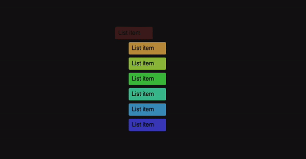
li {
  animation-name: show;
  animation-duration: 0.5s;
  animation-delay: calc(var(--i, 0s) * 0.1s);
  background-color: hsl(calc(var(--i, 0) * 40), 50%, 50%);
}
And again we can do the same for our background. Except in this case we multiply --i by 40 since the hue value is a number between 0 and 360 degrees, and this will give a nice rainbow effect like in the example below.
All done! I'm pretty sure you can come up with more creative use cases then making rainbows, but at least now you have this technique in your tool belt!
Subscribe to my Youtube channel
Buy me a coffee
Come chat on Twitter
And follow me here for more articles
Thanks for your precious time, and have an awesome day!

Top comments (0)