The problem isn't the broken tests. We just have very broken tools for UI testing.
UI testing sucks. It really does.
If you aren't already familiar with automating end-to-end tests yet, there's a few well-known free and open-source frameworks out there, in the order of Github stars: NightmareJS (16K), Selenium (12K), WebDriverIO (4K), CodeceptJS (1K).
Tests typically look more or less like this - take a minute to figure out what this "Hello World" example from NightmareJS does 🤔:
const Nightmare = require('nightmare')
const nightmare = Nightmare({ show: true })

nightmare
  .goto('https://duckduckgo.com')
  .type('#search_form_input_homepage', 'github nightmare')
  .click('#search_button_homepage')
  .wait('#r1-0 a.result__a')
  .evaluate(() => document.querySelector('#r1-0 a.result__a').href)
  .end()
  .then(console.log)
  .catch(error => {
    console.error('Search failed:', error)
  })
Have you figured it out?
What this does is to go to DuckDuckGo, enter "github nightmare" into the search box, press the search button, wait for the first result to show up, and print the link address of the first result.
Come on people, I thought we already know that hard-coding stuff and using magic waits is a no-no. Test code is still code, and this code smells 💩. This makes things hard to read, and harder to maintain. What if product changes the design or front-end decides to do just a bit of spring cleaning? Damn, the tests broke. Ain't nobody got time to fix those hundred and one bloody CSS selectors!
And, what are we really trying to test anyway?
The user journey, or the HTML?
How about writing tests like this?
I.goTo("https://duckduckgo.com")
I.fill("Search", "Github nightmare")
I.pressEnter()
I.see("Github - segmentio/nightmare")
I.click("Github - segmentio/nightmare")
Concise. Readable. Maintainable.
And front-end agnostic. VueJS, ReactJS, Angular... does it matter?
@picocreator and I have been working building web applications since pre-jQuery times, we both have accumulated our own 2AM horror stories in trying to making sure stuff gets tested and shipped on time, or having things blow up in our face by testing in production 💣💣💣😱😱😱. We tell junior devs these horror stories every year on halloween night. Ok, getting a little side-tracked, anyway...
We disagree a lot on software architecture and often debate what maintainable code looks like, but one thing we agree is that the problem isn't the broken tests. We just have very broken tools for UI testing. Someone needs to fix it. And this is what we've dedicated our past two years working on:
Piece of cake.
But this test is too simple. You are probably thinking, yeah that's nice, but what if things get more complicated, like when there's 50 "Add to cart" buttons, or what about icon buttons?
Let's have some fun, shall we? 😎
Oh wait, and before we start, just so you know, this absolutely isn't a black box algorithm Powered by AI™, but more on that later.
Testing Dev.To
Let's start with the basics, and make sure that the one of the most critical feature - Search - works.
I.goTo("https://dev.to/")
I.fill("Search", "dev.to")
I.pressEnter()
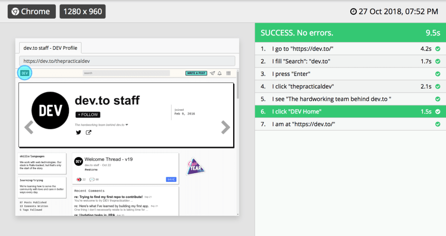
I.click("thepracticaldev")
I.see("The hardworking team behind dev.to ") // mmhm, very hardworking indeed.
The nice thing about tests being decoupled from the implementation of the UI is that we can easily reuse the same test for testing responsive designs. Let's see if search works as expected on desktop and on mobile view.
Now, let's try clicking on DEV.to's logo to get back home. UI-licious scans for accessibility attributes and tooltips set with title and other similar attributes used by various popular frameworks. Does our home logo have something we can use?
<a href="/" class="logo-link" id="logo-link" aria-label="DEV Home"><svg ... /></a>
Oh look, this is what DEV.to's logo looks like under the hood. There's an aria-label, fantastic! Let's click on "Dev Home".
I.click("DEV Home") // We love aria-labels
I.amAt("https://dev.to/")
There we go:
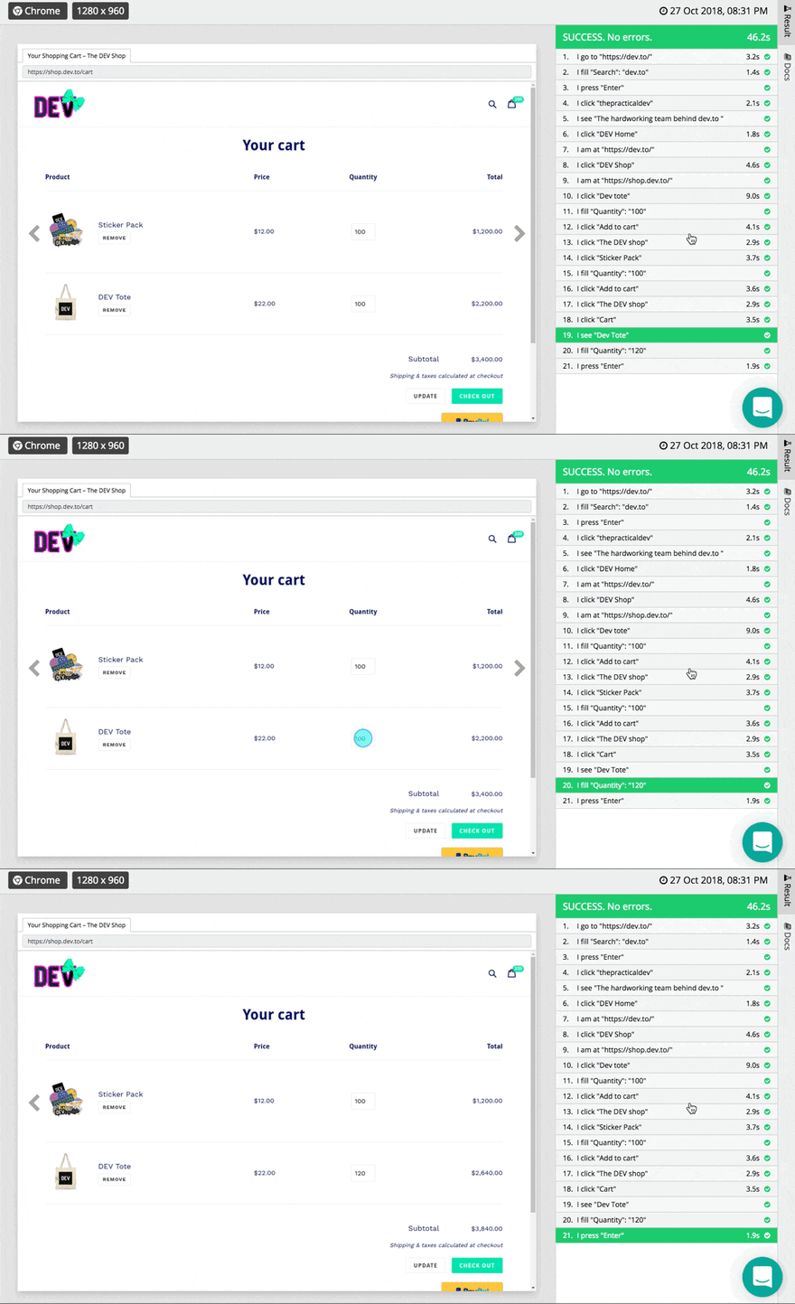
Ok, let's get creative and do a bit of shopping at the Dev Shop. I'm just gonna grab a hundred of these Sticker Pack and Dev totes.
I.click("DEV Shop")
I.amAt("https://shop.dev.to/")

let shopping_list = [
  "Dev tote",
  "Sticker Pack"
]
shopping_list.forEach((item) => {
  I.click("The DEV shop")
  I.click(item)
  I.fill("Quantity", 100) // lets' get a hundred of each
  I.click("Add to cart")
})
Ok... almost done. No wait, let's just grab a few more totes. Hmm... there's a few rows of items in the cart, we need to pick the correct quantity box to update. No sweat, I just need to be a little specific and tell UI-licious what I.see before updating the quantity.
I.amAt("/cart")
I.see("Dev tote")
I.fill("Quantity", 120) // UI-licious will pick the quantity box for "Dev Tote" to fill
I.pressEnter()
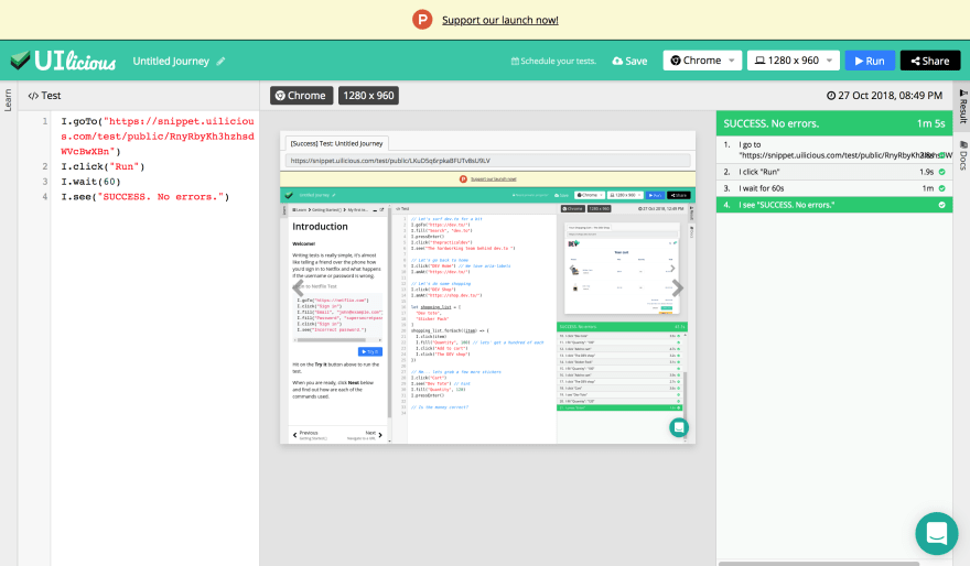
And to top it off, let's just do some test-ception, just to make sure UI-licious itself works.
Yea baby. Piece of cake. 😎
Under the hood
No, it's not Powered by AI™. Not in the modern sense at least.
Warning, opinion™ ahead! Tests should be deterministic, meaning it should always produce the same result given the same input. Random unpredictable behaviour isn't exactly desirable in tests, and fixing defects in an AI-driven test engine involves... throwing more "correct" sample data at it to make it more accurate.
UI-licious works by methodologically reverse engineering intent (What you mean by I.click("Sign in") from your HTML) and what the previous steps were. It works best on accessible websites. Your code doesn't have to be perfect to be testable, but it certainly helps to use semantic HTML and ARIA attributes.
(And by the way, the UI-licious IDE is completely built using VueJS. \o/)
Making testing great... for the person fixing the bug.
I think the most annoying part of getting bug reports is when they are incomplete and I need to chase after the reporter for steps to replicate the bug. While at the same time, to be honest, I get lazy reporting bugs too. That's why we try to make bug replication reports as complete and actionable (and pretty!) as possible. 👇
When should you automate UI testing?
A good guideline is: When you are testing that login flow for that user role for the n-th time.
And also 👇
Should you automate unit tests or integration tests or end-to-end test first? Doesn't matter, just start somewhere. I usually recommend starting with unit tests for anything requiring complex conditionals and math, and end-to-end tests for critical user flows because these can also help catch errors downstream too.
Pros and cons?
Pro: It starts at $0. And it's one less thing for devops to worry about.
Con: It's not open-source, yet. (... until money falls from the sky)
Is the cake real?
Yes. It's not a lie, we always have cake where ever we go.

 UI-licious@ui_licious
 Break time @fossasia! Have some 🍰 and ☕ at the exhibition hall.04:01 AM - 24 Mar 2018
And Happy Halloween folks!
👻👻👻
Credits
We have a very small but dedicated team of senior and junior devs -> @picocreator, @jmtiong, @sopnopriyo, Wesley Chang, and myself.
Cover Photo by NeONBRAND on Unsplash


Top comments (11)
It looks really interesting! I really like your test.uilicious.com site.
I've been looking a bit into cypress.io/ How would you say that you differ from each other?
Do you have any plans for a free plan for open source projects?
Co-founder here - having given a similar answer on cypress in the snippet launch post
Cypress - focuses on chrome based testing, being embedded inside the browser itself. On the downside, while it means lack of other browser testing such as IE11, it has one of the fastest! test speeds without any of the webdriver overheads. Its test scripts are also more technical in nature.
Uilicious - on the other hand, focuses more on simulating user behaviour, across multiple browsers, including the minor slow downs and delays between actions, and key strokes. With a test scripting language to cater for the non-programmers : 90% of the time.
As for open source projects, we have in the pipeline the functionality to execute test scripts from a public git repo, similar to travis CI. Its still in extremely early stages of development. But thats the plan (no fixed date yet, as its heavily dependent on our next investment round) 🙂
Its something we are committed in doing for our FOSS community and local Engineers.SG. Hopefully paving the way for more opensource friendly companies in our country Singapore, which we feel is lacking in our asian region.
Thanks for your answer! It looks really promising! Thanks for pushing the development further in this field!
I am also interested in this comparison.
At my company for new projects we have been using codeception with gherkin to do UI acceptance testing and it has been great. It is very similar to what is presented here just but instead of defining steps in code, you define them in gherkin. Anything to make UI testing easier is awesome. Unfortunately I have found that UI still needs some human touch to fully test.
Yea you still do need some check things by eye, there are things like whether or not there's a red outline around erroreous input fields are hard to write automated checks for. I find that really good testers can point out not just what's not working, but what's doesn't feel right for the user in terms of UX.
Very interesting.
This sounds like a really clever tool and I can totally see myself using that in what I'm building in the future. Great job!
That looks awesome. I tried it a bit, it works fine on a few things however the handling of non-ASCII characters seems problematic :)
Oh yeah, you're right, thanks for pointing that out. We have that working on the Pro version of the app, but this is we have a bug here on the free version. Looks like we missed out testing international languages, need to add that to our test suites. Shall get that sorted out over the next week 😉
Some comments may only be visible to logged-in visitors. Sign in to view all comments.