
Website responsiveness has become an important factor for success. It's crucial to ensure your website delivers an exceptional experience across all devices. In this tutorial, I will explore the world of responsive design using the powerful Elementor page builder for WordPress.
To provide a practical example, I will guide you through the process of redesigning the laptop version of the All Things Savvy website (https://www.atsavvy.com). While the mobile version required minimal adjustments, our main focus will be on selecting a different laptop version that enhances the overall user experience.
By the end of this tutorial, you'll be equipped with the knowledge and skills to plan and create unique laptop and mobile homepages that adapt flawlessly to different screen sizes and devices. Let's dive in and unlock the potential of responsive design with Elementor!
Planning Your Laptop and Mobile Homepages:
Before delving into the technical aspects, it's essential to approach the planning of your laptop and mobile homepages thoughtfully. Take the time to decide on the overall design you want to implement, carefully curate images, and consider the written content to shape the desired look and feel. To facilitate my design process, I personally found Canva Pro to be an invaluable tool. With Canva Pro, I could easily create and customise images that perfectly complement both the laptop and mobile versions of the website.
Getting Started with Elementor:
To begin, log in to the backend of your WordPress website by visiting "https://yoursite.com/wp-admin". Once logged in, it's essential to ensure that you have the Elementor plugin installed. If you don't have it yet, follow these steps to install it seamlessly.
Install the Plugin:
- Scroll down the dashboard menu on the left-hand side.
- Hover your cursor over "Plugins". A small menu will pop up.
- Click on "Add New Plugin".

- You'll be redirected to a section where you can add a new plugin.
- In the search bar, type "Elementor" and click on the "Install" button next to the Elementor Website Builder plugin.

Once the installation is complete, you're ready to start creating.
Designing the Homepage:
Once you have successfully installed the Elementor plugin, it's time to dive into designing your homepage.
To begin, navigate to your homepage by following these steps:
- Locate and click on the "Pages" option in the dashboard menu.
- In the small menu that appears, select the "All Pages" option and click on it.

You will be directed to a page displaying all the pages on your website, including your homepage. From here, you can proceed with editing and customising your homepage.
Locate the homepage, and then click on "Edit with Elementor" to enter the page editing interface.

Responsive Mode: Enabling Device-Specific Editing
To effectively customize your website for different device sizes, it's crucial to enable responsive mode in Elementor. This feature allows you to toggle between various device views and visualize how your edits will appear on different screens. To access responsive mode, follow these steps:
Locate the Responsive Mode Button:
- Look for the responsive mode button in the lower left corner of your Elementor editor's menu.
- Click on the button, and a top bar will appear, displaying different device options.
Select the Desired Device:
- In the top bar, you'll find a list of device icons representing different screen sizes, such as desktop, tablet, and mobile.
- Click on the device icon you want to edit for, and the editor will switch to the corresponding view.
Editing Sections:
Website sections play a crucial role in organizing and structuring the layout of a webpage. Each section serves a specific purpose and contains related content. Common examples of website sections include the Header, Hero Section, About Us Section, and Footer.
I will be changing most of the sections of the laptop view.
To begin editing the sections, follow these steps:
Add a New Section:
- Click on the "Add" button located at the top of your existing sections.
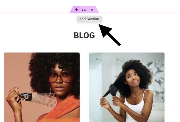
- If your page doesn't have any content yet, you'll see a bar in the middle of the page with options to add a new section.

Drag and Drop:
To customize your sections, Elementor provides a convenient drag-and-drop functionality. This allows you to effortlessly position and arrange various widgets within your added sections.
Here's how you can make use of the drag-and-drop feature:
- Select a Widget: Open the Elementor menu and browse through the available widgets.

For example, let's say you want to add an image widget. Simply locate the image widget in the Elementor menu.
- Drag and Drop the Widget: Click and hold the widget you want to add (in this case, the image widget). While still holding the mouse button, drag the widget to the desired section where you want to place it.

Release the mouse button to drop the widget into the section.
- Edit the Image: After dropping the image widget into the section, the image edit menu will appear.

You can now proceed to add your desired image to the widget.
Choose an image from your media library by selecting the appropriate option.

Alternatively, if you want to upload a new image, click on the "Upload Files" button and follow the prompts to upload the image.

Responsive:
Congratulations on your progress so far! You have successfully added a new section, dragged and dropped an image widget, and uploaded an image. Now, it's time to adjust the visibility of your new section based on different devices. Since this section was designed for the laptop view, we will configure the settings to show it only on laptops, hiding it on mobile and tablet devices.
To accomplish this, follow these steps:
- Make sure your desired section is still open in the Elementor editor.
Access Responsive Settings:
- At the top of the Elementor menu, you will find three edit options: Content, Style, and Advanced.

- Click on "Advanced" to access advanced settings.
- Scroll down within the Advanced settings until you find the "Responsive" section.

- Click on it to expand the options.
Configure Visibility:
Within the Responsive settings, you will see three options: "Hide on Desktop," "Hide on Tablet," and "Hide on Mobile."
Select your preferred options based on the desired visibility for your section. In this case, we want to hide the section on tablet and mobile devices.

Remember, if you encounter empty sections that appear after hiding certain sections, it's essential not to delete them. These empty-looking sections are placeholders and removing them will affect the overall structure of your website.

By following these steps, you can adjust the visibility of your sections to ensure they appear only on the appropriate devices. In this case, the sections designed for mobile view will be hidden when viewed on a laptop and vice versa. Repeat these steps for other sections as needed, customizing the visibility based on your design requirements.
Conclusion
In this blog post, we explored the importance of responsive design and how to achieve it using Elementor. We discussed the benefits of having a responsive WordPress website and walked through the process of designing laptop and mobile homepages. With Elementor's drag-and-drop functionality and responsive settings, you can create stunning and adaptable websites. By optimizing performance and testing your design, you ensure a seamless user experience. Embrace the power of Elementor and craft websites that shine on any device.

Top comments (0)