I recently started The Odin Project and I hit a wall during the FlexBox section. I had a bit of trouble understanding exactly how flex-basis in particular functioned relative to different flex-grow and flex-shrink values so after going taking time to go through different resources, I've found a way that helped me understand which is just through a bit of ratio math.
Terminologies
flex-basis - This defines the default size of an element before the remaining space is distributed. It can be a length (e.g. 20%, 5rem, etc.) or a keyword. Default value of auto which takes width/height instead depending on flex-direction. If no width/height is set then it uses the content size.
flex-grow - This defines the ability for a flex item to grow if necessary. It accepts a unitless value that serves as a proportion. It dictates what amount of the available space inside the flex container the item should take up. Default value of 0.
You can think of flex-basis as a virtual width or the width that the entire flex system sees relative to a particular element. Set a flex-basis of 50px to the fourth element and observe the change.
The boxes are colored along with the container to show you changes in width/increase in available space in container
The 4th box decreases in size by 50px and the available space increases +50px. It basically put up part of its width as being free to take. If the code were running on your browser natively and you checked the flex section in your developer tools, you would see something like:
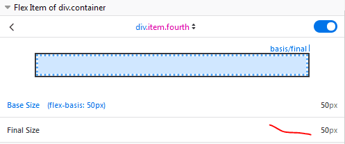
Notice how the final size says 50px , comment out the flex-basis styling and notice it goes back to the set width which is because the default value of flex-basis is auto and so it defaults to the width of the item.
Now add the flex-basis styling back and then set a flex-grow of 1 to the box and observe the changes.
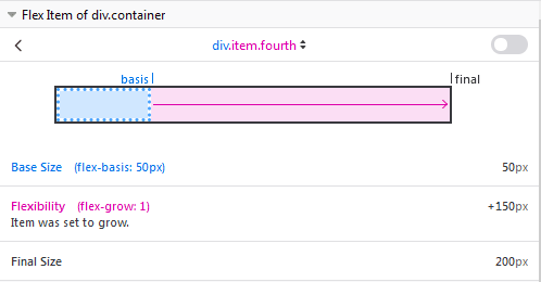
By increasing its flex-grow, we've given it permission to grow and essentially take up any available space . Notice that it takes up the 150px space that is available.
Like before, temporarily comment out flex-basis and see what changes, this time since it's width is back to 100px , the available space is 100px and it still takes it all. Add the flex-basis value back.
Set a flex-grow of 1 to the 3rd box and observe the changes.
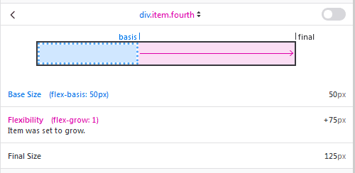
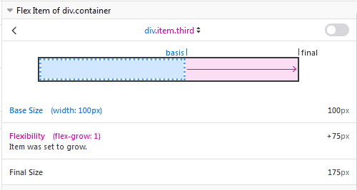
This time the 4th box takes only 75px of space, same goes for the third box. Why? Well, now we gave the 3rd box permission to grow and it will do that. It will want to take a piece out of the available space just like the 4th does. How do they decide how the space is allocated? simply by ratio.
Assume the flex-grow values of items in a flex-container as a ratio of how much available space it will get.
Box #1 - 0 Box #2 - 0 Box #3 - 1 Box #4 - 1 free space - 150px
What is listed above is the flex-grow values for the items in the flex container and the available space in the container. Lets see some simple ratio math.
Box #1
(0/(0+0+1+1)) * 150px = 0px Box 1 = 100px + 0px.
Box #2
(0/(0+0+1+1)) * 150px = 0px Box 2 = 100px + 0px.
Box #3
(1/(0+0+1+1)) * 150px = 75px Box 3 = 100px + 75px
Box #4
(1/(0+0+1+1)) * 150px = 75px Box 4 = 50px + 75px
Remember Box 4 lost 50px of its width when it set its
flex-basisto 50px
As you can see, rather than box 3 and 4 splitting 100px which is the available space by default, they ended up splitting up 150px because has a flex-basis of 50px which you can interpret as having a perceived width(in terms of the entire flex system) of 50px.
If two elements have the same flex-grow value, they will receive the same amount of space from the available space.(in most cases)
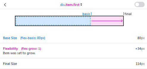
Lets spice things up a bit, don't revert any current chances to the css code, give the 1st box a flex basis of 80px and a flex-grow of 1, also give Box 2 a flex-grow of 2. Using the previous approach, you can deduce how much space will be allocated to each element.
Now that Box 1 has a flex-basis of 80px,you can say its adding 20px of its width to the available space. So now the available space becomes 100px + 50px + 20px = 170px
Box #1
(1/(1+2+1+1)) * 170px = 34px Box 1 = 80px + 34px = 114px
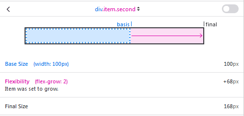
Box #2
(2/(1+2+1+1)) * 170px = 68px Box 2 = 100px + 68px = 168px
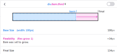
Box #3
(1/(1+2+1+1)) * 170px = 34px Box 3 = 100px + 34px = 134px
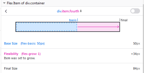
Box #4
(1/(1+2+1+1)) * 170px = 34px Box 4 = 50px + 34px = 84px
You can see the new width of the boxes, it can be verified through the developer tools or you can set the width of that black box and check it against each of the flex items by moving it around in its container.
Note that if we increased the flex-basis of an item here higher than its own width, it will increase in width in this flex system. To get the increase in width, just get the difference between its set width and the flex-basis . If it has a flex-grow higher than 0, the same ratio approach will still work as long as you realize that the specific item basically took a chunk out of the available space before the allocation of space to all items begins.

Top comments (0)