
Testing for accessibility is a must but not easy, it means testing for various use cases, and of course, all parts of your application. Color contrast is among the simplest of accessibility requirements that you can and should ensure you're meeting. Plus, it will result in great usability improvement for ALL types of users.
Content is the most important part of your application, right? So imagine not being able to read it because of colors! Therefore, ensuring enough color contrast means ensuring that all your content is readable to all the sighted users. Let's explore a few things you should keep in mind.
Color contrast ratio requirements
The WAI-WCAG guidelines defines the minimum requirements to follow so you have proper color contrast. They are:
- 4.5:1 ratio for normal sized and smaller text
- 3:1 ratio for large text because it is easier to be read than smaller sizes
- 3:1 same ratio also for meaningful non-textual elements
- logos, decorative images, and disabled elements are excluded from these requirements.
The contrast ratio is a calculation of the difference in color based on brightness and luminosity. It is not as important to understand how it is calculated, as many tools that do this will be mentioned in the sections below.
Testing
The first thing to do is to audit your app and identify the information which is valuable and needs to be tested. This includes all text content, visuals (such as images, input borders, etc.), focusable elements, and so on.
Textual content
It is important that all text of your page is readable, so sometimes even if we meet the 4.5:1 ratio, it still can be difficult to read, for example:


This is why the above requirements are only a minimum, and always aim for a higher contrast ratio. However, this does not mean that all possible colors of your app must meet the ratios, what is important is the combination of these colors. Some tools to test text contrast are:
- Edge developer tools - opening developer tools and then, inspecting the color of an HTML element will show the contrast ratio in the color picker. Within the color picker, you can change the color on the fly while showing with a ✔️ if you're meeting the minimum rations or not. The image below shows the color picker where the colors meet the contrast ratio of enhanced (AAA) level.

-
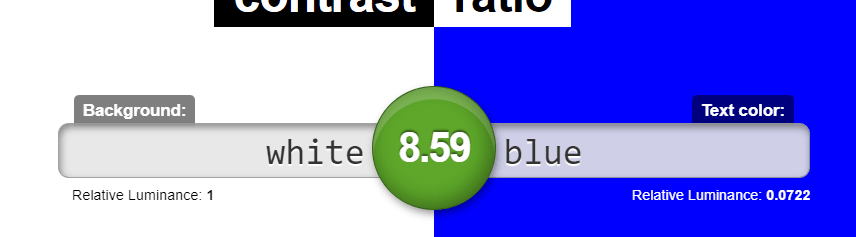
Contrast-ratio - is another great tool where you can enter the color codes manually, and it will show the ratio as a number marked with green if this color combination passed the contrast requirement, or red if it doesn't.
** Text on images ** must fulfill the same requirements mentioned above. It is important especially on parts of content where the image on the background is dynamic and not known beforehand. One simple solution to this is adding a background shadow that makes the text visible independently from the image. Example from Bing search page:

The Color Contrast Analyzer chrome extension is great for checking color contrast for both text and images of text. It offers the possibility to scan for two levels (AA and AAA) of ARIA requirements. The extension applies a mask and highlights only the parts of the UI which fulfill the color contrast, e.g:

The image below is the result after the color analysis where the highlighted parts do meet the contrast ratio.

This tool also works great for testing text-based content as well, e.g:

Visual content
Images and icons are valuable content too that needs to be visible without extra effort by the user. The general rule is that they should meet at least a 3:1 contrast ratio against adjacent colors. For example, in the image below, the magnifier icon meets the requirement with the gray color of the icon. However, the whole icon does not meet the contrast ratio in comparison to the background image (fun exercise: can you understand what the icon is?).
Use of color
The meaning of content should never be conveyed only with color, because users that have problems distinguishing colors, or using the high contrast mode (windows) will not be able to understand it. The image below has a list of blog posts titles that are categorized by colors, where blue stands for "JavaScript", yellow for "Programming", and black for "UX".

However, when switching to high contrast mode in windows, this meaning is lost because the colors are removed and all that is left are white circles. This is shown in the image below:

On the other hand, when we add color and text alternatives we provide two ways for users to get the same information. The image below shows the same list, with the same colors, but with text next to it:

And, in high contrast mode that we do not have the colors, the text provides the needed information, so we do not depend only on color to get the meaning.

So, always make sure to use either color and text, or color and pattern.
Interactive elements
Elements on the page such as links, menus, buttons, etc. (also referred to as controls) have temporary states which depending on the design have different styling. Make sure to use CSS selectors such as :focus, :hover to define the colors for these states. The WCAG guidelines do not give any specifications when it comes to the colors of the states. However, the text inside those interactive elements must always meet the above-mentioned requirements.
Additionally, when navigating with a keyboard only, controls need to have a focus indicator that is easily noticeable and visible. It used to be common to remove the focus ring using the
outline: none
, but this is a bad practice. The outline none will make your app unusable for keyboard users. Besides, the default focus ring is different for many browsers, some show it as a blue outline or black, etc. which might not be visible enough if your design uses a similar color. The best way to handle this is customizing the outline based on your design with simple CSS, for example:
button:focus {
 outline: 2 px solid purple;
 outline-offset: 2px
}
will give us the following result:

Conclusion
This post is not an exhaustive list of tools and cases that you should test for because each application has its own edge cases that should be considered. Further, the best way to get most of the testing is using a combination of the tools that are mentioned in this post. Most important takeaways:
- Always make sure the text meets at least the contrast ratio (4.5:1 for small text, 3:1 for large text).
- Images and icons must also have enough contrast so they are visible (3:1 contrast ratio).
- Logos and disabled elements do not have any contrast ratio requirements.
- Never depend on color only to convey meaning, always use another alternative way.
- States for controls must also be tested for contrast and the focus ring must always be distinguishable.
Hope you found this helpful🌟!
Happy coding 👩💻!
Other tools:
- axe-dev-tools chrome extension is a great tool that analyzes your page and shows you the list of violations and how to fix them.
- Accessibility Insights chrome extension is a great tool that has testing for more aspects of accessibility other than color contrast. It also has many checklists that will help you with manual testing too.
Resources
- WebAIM - Contrast and color accessibility
- WCAG Success criterion 1.4.3 - Minimum requirements for color contrast
- Color contrast analyzer guide by eBay, OATMEAL handbook
- WCAG guidelines - Ensuring contrast ratio for icons


Top comments (2)
Color contrast is a very important component of creating a more accessible web for all users. To make your text easy to read, the contrast between the text and the background should be high. Use this color contrast checker to determine whether or not your color combinations are accessible or not.
[[..PingBack...]]
This article was curated as a part of 44th Issue of software Testing Notes.