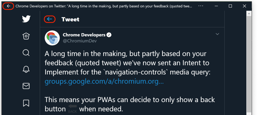
On the Google Chrome team, we're working on solving the interesting problem that some platforms like Windows 10 show a native ← Back button in the app window's title bar when the user has navigated into a standalone or fullscreen Progressive Web App (PWA). This can lead to PWAs inadvertently showing two means of in-app navigation: one from the operating system and one from the app itself. The screenshot below from Twitter's PWA illustrates this issue well. The two back buttons are highlighted in red, the Windows-generated button is in the title bar.
In order for PWAs to be able to detect the presence or absence of system-level navigation controls, we've proposed a new, aptly named CSS media query called navigation-controls. The Explainer goes into great detail on how this media query works, but the most basic way to use it can be seen in the code sample below.
/**
 * Hide the app's own back button if the browser or the OS
 * provides any navigation controls.
 */
@media (navigation-controls) {
  #back-button {
    display: none;
  }
}
This leads to the interesting question how developers can find out via JavaScript if a media query is supported and understood at all by a browser. Note that the @supports CSS at-rule can't be used to detect media query support. Before we dive into this question, let's get some things defined first.
Media types
Media types describe the general category of a device. Some examples are print, screen, speech, or simply the default media type all.
Media features
Media features describe specific characteristics of the user agent, output device, or environment. Media feature expressions test for their presence or value. Examples are prefers-color-scheme, hover, and many more. Media feature expressions must always be surrounded by parentheses.
Let's take a media feature expression like (max-width: 600px). From a JavaScript context, you can test if it matches as shown below.
window.matchMedia('(max-width: 600px)').matches;
// Returns either `true` or `false`.
Some media features are evaluated in theboolean context. This means that if the feature would be true for any value other than the number 0, a <dimension> with the value 0, the keyword none, or a value explicitly defined by that media feature to evaluate as false in a boolean context, the media feature evaluates to true. This is oftentimes a convenient shorthand for features like hoverthat accepts the two values none and hover. Usually you don't mind for the none value, but instead want to make sure you only use hover events if the user agent has some kind of hoverable device like a mouse. In this case, you can simply test for @media (hover) { … }.
Testing if a browser understands a media query
The window.matchMedia() method returns a MediaQueryList whose media read-only property is a DOMString representing a serialized media query. What this means in practice is that we can use this to normalize media query expression strings.
// Note the superfluous spaces and the '+' before the width
window.matchMedia('( max-width: +600px)').media;
// Returns `"(max-width: 600px)"`.
The newly proposed media feature navigation-controls—apart from back—hasnone as one of its allowed keywords, and is evaluated in a boolean context. Bringing things together, we can thus check if the browser understands it by looking at the media property.
window.matchMedia('(navigation-controls)').media;
// Returns `"not all"` when the browser doesn't understand
// the media query, or `"(navigation-controls)"` else.
The interesting value here is "not all", meaning the browser doesn't understand the media feature. If the browser doesn't have the slightest clue what navigation-controls is about, it tells you the serialization of this (unknown) media feature is something that will never match: the media type @media not all. Because not all is nothing.


Top comments (0)