
Hi all! This blog is me sharing how I applied CSS to make the cards flip on my memory game web-app called Flip!
Browser view

Mobile view

The game was built for a project submission while I was in the bootcamp. Main requirement is to utilize vanilla JavaScript.
Besides the themes and APIs I’ve used, I am pretty proud that I was able to pull through the card flip effect using CSS!
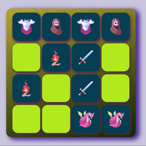
The animation we’re trying to breakdown looks like this:
I'm just going to breakdown how I did it with vanilla JavaScript. (You may definitely apply the similar principles with a library like React!)
So where do we begin?
Making the container/deck for our cards:
- Here, we add the
eventListenerfor a click, and use a built-in function called toggle to switch the class.

- Don't forget to append it to the body! (Ex.
body.appendChild(container))
Inside our container are the cards. There are 4 parts of the card.
- The card container - I utilized this for size, shape and positioning of the 'cards' in the deck and also where we toggle class every click.
- Flip-card - A div that contains our Front and Back divs and will have the animation
- Front - A div that will remain empty as if the card is facing down
-
Back - A div where the icon or image will be in.
- Don't forget to append them and nest them correctly! It will look like this;

Okay now we have our cards set and our class toggle is in code, let's work our CSS.
.card-container {
  width: 180px;
  height: 200px;
  perspective: 1000px;
  border-radius: 20px;
}
Something new here is the perspective attribute. The higher the pixel, the tighter the turn as our card flips. Setting it lower will make it look like a big door swing.(Try to set it at 200px and you'll see what I mean.)
.flip-card {
  position: relative;
  width: 100%;
  height: 100%;
  transition: transform 1s;
  transform-style: preserve-3d;
}
2 important things here, the transition and transform-style. For transition, there can be 4 attributes values you can declare. CSS tricks explains it in detail. But all we need is the transition-property of transform with a duration of 1s or 1 second. Definitely can adjust slower or faster based on your preference. While for transform-style, we need it in preserve-3d value to have our elements stack up together in 3d dimension. Codrops explains other subcategories of transform-style.
.card-container.flip .flip-card {
  transform: rotateY(180deg);
}
In here, we're setting our flip-card div to transform rotate in Y-axis at 180 degrees. In line with transform-style, CSS-tricks also explained how perspective transform works and has examples here.
.flip-card-front, .flip-card-back {
  padding: 30px;
  width: 100%;
  height: 100%;
  position: absolute;
  backface-visibility: hidden;
  border-radius: 20px
}
So here we set the size for both front and back divs. You probably notice the backface-visibility set as hidden. It's literally doing what it says. Hiding the backface of the element since we have them set in 3d dimension. Here's a link for a better breakdown of what it does.
.flip-card-front {
  background-color: #333;
  color: #fff;
}

.flip-card-back {
  background-color: #05486b;
  color: #fff;
  transform: rotateY(180deg);
}
Of course! Colors! Just to differentiate the front and back, and see it flip better, I set it into 2 different background colors. But one div has also a transform rotate. We want the empty side to show first.
Now you should have something like this!!
In game, I have a function that collects the event target, compares them, flips them back if it's not a match and adds 1 to the number of moves.
I hope this is helpful for anyone wanting to build an app with this effect! Until the next!
References:
My CodePen: Card flip
CSS tricks: link
RickMorty API: Characters
Flip! memory game: App

Top comments (5)
Hi Elaine! Your app has a nice look. Did you test it on a mobile screen? I just tried to start a game, but don't know how.
I figured it out! 😁 After selecting the difficulty you have to scroll down in order to pick the theme and find the start button 👍
I am guilty that is one thing I noticed when I tested it on mobile that scroll feature is a little too invisible, any suggestions?
You could lay out the three items (difficulty, theme, start button) next to each other horizontally. CSS flex could be handy in that case
Or you could display these questions inside a modal, that covers the whole screen