Hi guys,
I'm looking for feedback on my newly created personal website.
You can find it here: https://website-thomas.thomasledoux1.now.sh.
The source code can be found here: https://github.com/thomasledoux1/website-thomas
Quick preview: 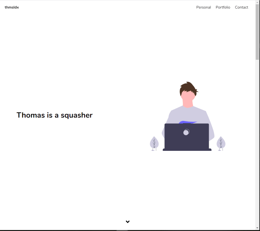
It was created with NextJS, I wrote some custom animations, used React Hooks, used some illustrations from unDraw, lazy loading for the images, and other speed optimizations.
It's currently lacking a resume section, this will be added in a later stage, I'll create it from scratch in HTML and provide a PDF download option for it.
Any other suggestions/remarks are more than welcome!
If you have any questions about how I implemented something, I'll gladly elaborate :-).
Thank you!

Top comments (9)
Hi Thomas :)
I had a quick look at your website and wanted to point out a couple of things. First of all, the first time the user scrolls through your portfolio carousel, the logo images are not visualised immediately. They take a couple of seconds to load. I would look at a way to preload them or hide them until they are loaded. Something like that would not go unnoticed by someone evaluating your skills.
Furthermore, I'd extend your portfolio with some use cases, screenshots of the apps you developed, etc. I guess people want to see what you've done rather than just who you worked for.
Hope I've been helpful :) If you need anything else, drop me a message!
Alessia
Hey Alessia,
Thank you for the feedback!
I will take it into account and do the necessary changes :).
Thomas
Hi Aleksander,
Thank you for the elaborate feedback!
Much appreciated.
I agree with your remarks, and I will see how I can best implement them into my site.
As for the arrow: something must have broken in my last commit, normally the arrow is animated and the arrowhead appears. Once this actually works I think it's a good addition to the website.
I'll comment here again when I updated my site, so you can maybe have a second look :)
Thomas
Kitze roasts a site (gives honest feedback) weekly on Twitch.
You can leave a comment in weekly post on twitter.com/twiwdev by requesting to to "roast" (asking for a feedback) your site and how you can update it :)
This week's stream is over, so you might go for the next week's
Hey Aleksandr,
I updated my website with most of the comments you gave. You can check it on the URL I provided before :)
Nice feedback~!