Truly Accessible Custom Components in Angular
For the first time in my "Make it Accessible" series, I'm going to work on building a component that meets the requirements specified in the WAI-ARIA Authoring Practices. We'll even do the optional stuff! When I was looking for a good example, I saw that most of the examples out there cover things like a radio button. I wanted to pursue this concept even further, so we're building an Accordion Component.
Exciting right? Let's do this!
Before we start, here you can access the source code of the accordion
The Problem
When we are building an Angular application, native HTML Elements can be used. And even though this is what I always recommend, there are cases that need something unique. An Accordion is not that unique, but it's certainly custom, and no native elements are required to build it.
The Solution
In this case, I'm going to stick to the specification instead of making all of the decisions myself. Instead, I'm going to the WAI-ARIA Authoring Practices, and will paste all we need to be compliant here.
I want to explicitly state that I'm not taking any credit for the specification.
1. Structure
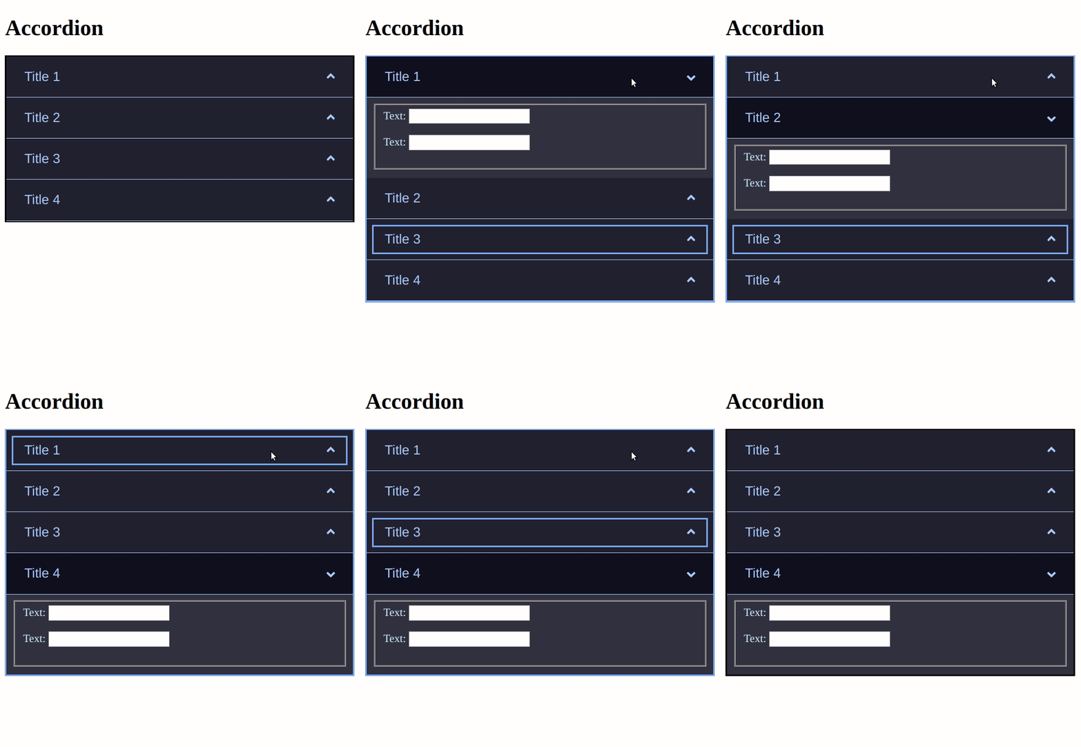
An accordion is a vertically stacked set of interactive headings that each contain a title, content snippet, or thumbnail, representing a section of content. The headings function as controls that enable users to reveal or hide their associated sections of content. Accordions are commonly used to reduce the need to scroll when presenting multiple sections of content on a single page.
Terms for understanding accordions include:
1.1. Accordion Header
Label for our thumbnail, representing a section of content that also serves as a control for showing, and in some implementations, hiding the section of content.
1.2. Accordion Panel
Section of content associated with an accordion header.
In some accordions, there are additional elements that are always seen adjacent to the accordion header. For instance, a menu button may accompany each accordion header to provide access to actions that apply to that section. And, in some cases, a snippet of the hidden content may also be visually persistent.
2. Keyboard Interaction
2.1. Enter or Space
- When focus is on the accordion header for a collapsed panel, expands the associated panel. If the implementation allows only one panel to be expanded, and if another panel is expanded, collapses that panel.
- When focus is on the accordion header for an expanded panel, collapse the panel if the implementation supports collapsing. Some implementations require one panel to be expanded at all times, and allow only one panel to be expanded; so, they do not support a collapse function.
2.2. Tab
Moves focus to the next focusable element; all focusable elements in the accordion are included in the page Tab sequence.
2.3. Shift + Tab
Moves focus to the previous focusable element; all focusable elements in the accordion are included in the page Tab sequence.
2.4. Down Arrow (Optional):
If focus is on an accordion header, moves focus to the next accordion header. If focus is on the last accordion header, either does nothing or moves focus to the first accordion header.
2.5. Up Arrow (Optional):
If focus is on an accordion header, moves focus to the previous accordion header. If focus is on the first accordion header, either does nothing or moves focus to the last accordion header.
2.6. Home (Optional):
When focus is on an accordion header, moves focus to the first accordion header.
2.7. End (Optional):
When focus is on an accordion header, moves focus to the last accordion header.
3. WAI-ARIA Roles, States, and Properties
3.1. Accordion Header Title
The title of each accordion header is contained in an element with role button.
3.2. Level of Accordion Header
Each accordion header button is wrapped in an element with role heading that has a value set for aria-level that is appropriate for the information architecture of the page.
- If the native host language has an element with an implicit heading and aria-level, such as an HTML heading tag, a native host language element may be used.
- The button element is the only element inside the heading element. That is, if there are other visually persistent elements, they are not included inside the heading element.
3.3. Update aria-expanded accordingly
If the accordion panel associated with an accordion header is visible, the header button element has aria-expanded set to true. If the panel is not visible, aria-expanded is set to false.
3.4. Use aria-control respectively
The accordion header button element has aria-controls set to the ID of the element containing the accordion panel content.
3.5. Update aria-disabled accordingly
If the accordion panel associated with an accordion header is visible, and if the accordion does not permit the panel to be collapsed, the header button element has aria-disabled set to true.
3.6. Usage of aria regions
Optionally, each element that serves as a container for panel content has role region and aria-labelledby with a value that refers to the button that controls display of the panel.
- Avoid using the region role in circumstances that create landmark region proliferation, e.g., in an accordion that contains more than approximately 6 panels that can be expanded at the same time.
- Role region is especially helpful for the perception of structure by screen reader users when panels contain heading elements or a nested accordion.
Implementation
If you want to code along the way, I created a repository that has a branch with a starter accordion. Clone that repository, and let's do this together.
You dont have to care about the structure, the code I just gave you already has that. Our focus will be in the Keyboard Interactions, and the WAI-ARIA Roles, States, and Properties.
2. Keyboard Interactions
2.1. Enter or Space
I decided to allow users to collapse an expanded panel, so there's only one thing to do. We need to call the toggle method when clicking a header, with Enter or Space, when focused. Thankfully I decided to use a native HTML button, which comes out of the box with keyboard support.
2.2. Tab
The Tab funcionality comes out of the box too, as long as we make items tabbable. Since the headers are buttons, that's already true. One thing to keep in mind is that a panel's content shouldnt be tabbable when collapsed, but if you read 5 Tips to Make your Angular Apps more Accessible you will know that the ngIf directive removes the all of the content so we don't have to do anything else.
2.3. Shift + Tab
The same logic for 2.2 applies here.
The other interactions
We are getting closer to the fun stuff.
We'll need to listen to keyup events, if the pressed key is equal to any of the ones, required by WAI-ARIA, that we will act upon. Basically we need a keyup handler, a goToNext and goToPrevious methods. Let's jump on the code and do that:
Go to src/app.component.ts and do this:
// ...
const ARROW_DOWN = 'ArrowDown';
const ARROW_UP = 'ArrowUp';
const HOME = 'Home';
const END = 'End';

@Component(/* */)
export class AppComponent implements AfterViewInit {
  // ...
  @ViewChildren(AccordionHeaderComponent) accordionHeaders: QueryList<
    ElementRef
  >;
  private panelQuantity: number;

  ngAfterViewInit() {
    this.panelQuantity = this.accordionHeaders.length;
  }

  private goToNext() {
    this.currentlyFocused = (this.currentlyFocused + 1) % this.panelQuantity;
  }

  private goToPrevious() {
    if (this.currentlyFocused === 0) {
      this.currentlyFocused = this.panelQuantity - 1;
    } else {
      this.currentlyFocused = this.currentlyFocused - 1;
    }
  }

  // ...

  handleKeyUp(event: KeyboardEvent) {
    switch (event.key) {
      case ARROW_DOWN:
        this.goToNext();
        break;
      case ARROW_UP:
        this.goToPrevious();
        break;
      case HOME:
        this.currentlyFocused = 0;
        return;
      case END:
        this.currentlyFocused = this.panelQuantity - 1;
        return;
      default:
        break;
    }
  }
}
Let's break it down. We are using the AfterViewInit hook to get the number of headers the accordion has. This will be useful for the Arrow support. That way, if the user presses the Up Arrow in the first item, the focus is sent to the last header, and the opposite for Down Arrow. Home and End are way easier, since the currentlyFocused is the mechanism we are using in order to know which one is currently focused in an imperative way, we just need to update it to first or the last, respectively.
Just to recap, we have successfully integrated keyboard support to our custom widget following WAI-ARIA spec.
3. WAI-ARIA Roles, States, and Properties
Now it's time to go a little deeper, and work with aria-* attributes, roles and properties.
I don't know how many times I've said this, but I'll keep saying it. If you think about accessibility from the design stage, you will dramatically reduce longterm development costs. Since I read the specs before starting, I made a few decisions in the starter code, so the two first things in the aria part are already done; the headers are buttons, and they contain a heading with a level.
3.3. Update aria-expanded accordingly
This one is extremely simple, since we already have the isOpen category in the AccordionHeader component, we just need to wire its value to the aria-expanded property in the button element. For this, you have to go to src/app/shared/components/accordion-header/accordion-header.component.html
<h2 class="header" [ngClass]="{ 'is-open': isOpen }">
  <button ... [attr.aria-expanded]="isOpen">
    <!-- ... -->
  </button>
</h2>

<!-- ... -->
3.4. Use aria-control respectively
This one is a bit trickier because we need a way to wire the button with the panel. For this, we'll need to use the index input property. With it, we'll assign a unique id to the panel, and will use the same value for the aria-controls. For this, you have to go to src/app/shared/components/accordion-header/accordion-header.component.html
<h2 class="header" [ngClass]="{ 'is-open': isOpen }">
  <button ... [attr.aria-controls]="'panel-' + index">
    <!-- ... -->
  </button>
</h2>

<div [id]="'panel-' + index">
  <!-- ... -->
</div>
In this case, we dont care about updating the aria-disabled property, because I decided to allow users to collapse expanded panels.
3.6. Usage of aria regions
This one is easier, but is also easy to forget. Right now, the panel is not a region. Without it, the panels are just containers for html, but they do not provide any extra information to Screen Reader users. That's why this is such an important step. For this, you have to go to src/app/shared/components/accordion-header/accordion-header.component.html
<!-- ... -->
<div ... [attr.aria-labelledby]="'accordion-' + index" role="region">
  <!-- ... -->
</div>
That's it!
The accordion header template will end up looking like this:
<h2 class="header" [ngClass]="{ 'is-open': isOpen }">
  <button
    [id]="'accordion-' + index"
    class="header__trigger"
    [appFocusable]="isFocused"
    (click)="togglePanel()"
    (focus)="setFocus()"
    (blur)="setBlur()"
    [attr.aria-expanded]="isOpen"
    [attr.aria-controls]="'panel-' + index"
  >
    <div class="header__title">
      <span>{{ headerTitle }}</span>
      <fa-icon [icon]="faAngleUp"></fa-icon>
    </div>
  </button>
</h2>

<div
  [id]="'panel-' + index"
  [attr.aria-labelledby]="'accordion-' + index"
  role="region"
>
  <ng-content *ngIf="isOpen"></ng-content>
</div>
Conclusion
I know this one was a little longer than the usual Make it Accessible articles, but it had to be done. We definetely needed to go into detail, and build a custom component that was totally compliant with the specs. Just as a reminder, make sure you have unique ids. Even though what I just gave you isn't reusable (we are not building an open source library), it can definitely give you more understanding of how to do this on your own.
In my free time, I'm currently working on building a small library that includes all the concepts I dive into in this series. If you would like to help me, feel free to drop a comment, or message me on Twitter.
This Dot Labs is a modern web consultancy focused on helping companies realize their digital transformation efforts. For expert architectural guidance, training, or consulting in React, Angular, Vue, Web Components, GraphQL, Node, Bazel, or Polymer, visit [thisdotlabs.com]((https://www.thisdotlabs.com).
This Dot Media is focused on creating an inclusive and educational web for all. We keep you up to date with advancements in the modern web through events, podcasts, and free content. To learn, visit thisdot.co.


Top comments (0)