
The Indigo.Design System, provided by Infragistics, offers a unified platform for visual design, UX prototyping, code generation, and app development.
You've got your designers, and developers, both integrated into a single platform. This design system has a workflow that is depicted as follows:

Designers create designs in Sketch using the Indigo.Design System.
They share and test prototypes with peer developers, designers, and stakeholders via a common platform, the Cloud Indigo Design.
Developers generate Angular components, and code, from the prototypes.
We are going to dissect the Infragistics Indigo Design System by exploring its major elements. We'll then create a new design for a Contact-Us page inside Sketch, upload the design into the Cloud Indigo Design platform, and create a Prototype. Finally, we will generate an Angular module and component for this Prototype.
Indigo.Design Sketch UI Kit
The Indigo.Design Sketch UI Kit is a primary component of the Indigo.Design System. It provides all the tools needed by designers to build their designs inside Sketch. This UI Kit is composed of:
Indigo-Components
Design library with 50+ components that have a one-to-one match with Ignite UI for Angular UI components.
Indigo-Patterns
A collection of common UI patterns composed of Indigo-Components. Such as a ready-made Booking Form UI pattern, that you can place straight into your design.
Indigo-Styling
With Indigo-Styling you can customize colors, typography, icons, and elevations to match your brand.
The Indigo.Design Sketch UI Kit offers the packages as Sketch libraries. You download, install and start using the Indigo.Design System in your designs.
The components are offered as Sketch Symbols. Each Symbol can be customized by tweaking around its properties. These Symbol properties, at the time of code generation, are then mapped to actual properties on the Ignite UI for Angular UI components.
Download the Sketch UI Kit
To download the Sketch UI Kit, navigate to the Cloud Indigo Design website. If you haven't created an account yet, register for a free account over a trial period.
Once you register, sign in to your account, click the Download Indigo.Design Assets button and a list of assets become available:
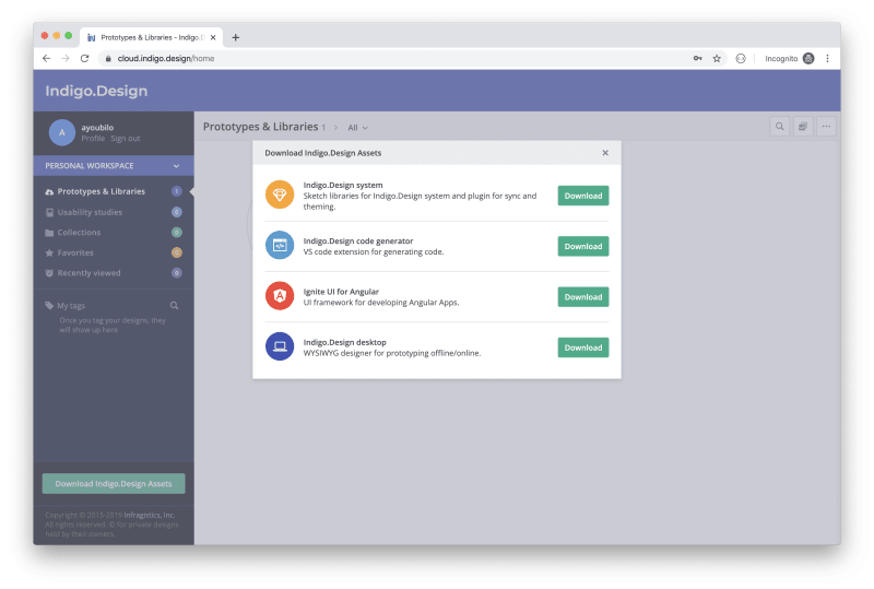
Find the first item Indigo.Design system, and click the Download button. The file downloaded contains Sketch library files.
Uncompress the file downloaded into a folder on your file system.
Install the Sketch UI Kit libraries
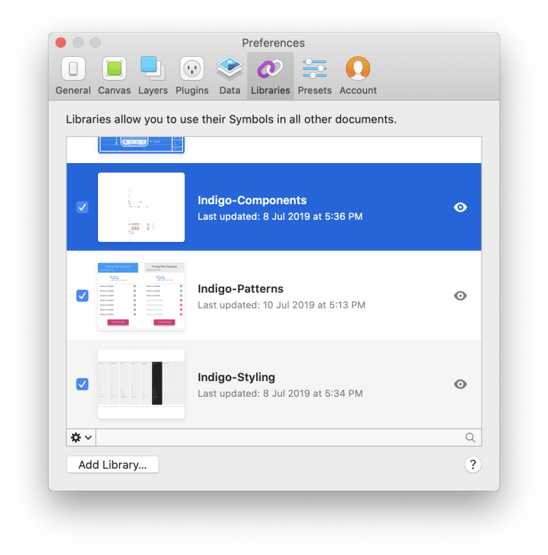
Now that the IndigoDesign Sketch libraries are downloaded, it's time to add them to the Sketch app before you are able to use them in your designs.
- Open the Sketch app.
- Go to the
Sketchmenu. - Click the
Preferencesmenu item. The preferences window opens - Click the
Librariestab. - Click the
Add library...button at the bottom of the window.
At this stage, select the three files you've downloaded (Indigo-Components.sketch, Indigo-Patterns.sketch, and Indigo-Styling.sketch).
Make sure you select the three libraries' checkboxes.
The libraries are now installed.
To verify the libraries are installed, create a new Sketch document, and open the Insert menu:

As you can see, all the Indigo.Design symbols have been successfully installed.
Install the Titillium Web Google font
The Indigo.Design Sketch UI Kit makes use of the Titillium Web font. Make sure you have it installed on your Macbook computer.
To install the font, go to Titillium Web Google font and download it locally on your computer.
Open the Font Book app and select the font files you just downloaded.
That's all you've got to do to get the Titillium Web font.
Infragistics provides thorough and rich documentation for every Symbol that’s part of the Indigo Design System. I highly recommend you check out the documentation to learn more about the Symbols available.
Indigo.Design Prototypes
Once the design is ready, it’s time to create a Prototype of it to share with your team for review and incorporate any comments inside the design.
To do so, navigate to the Cloud Indigo.Design website and sign in with your credentials.

Click the Create prototype button to upload your images or Sketch designs.

Once the images or Sketch design is uploaded, the Indigo.Design Cloud generates the Prototypes for you. You can even define interactivity among the screens to simulate the use of the screens.
Finally, you can publish your Prototypes online, and make them public. You can control access to them via a password. You then share the link for the published Prototypes with your team.
I will delve into more details on how to create Prototypes later in the demonstration below.
Indigo.Design Code Generator
The Indigo.Design Code Generator is the last piece of the Indigo.Design System. Given a published Prototype, you can run a code generation process that will convert your Prototype to an actual Angular Component(s).
First you need to make sure the Indigo.Design Code Generator extension is installed locally on your computer.
Download the Code Generator
Browse and sign in to the Cloud Indigo.Design website. Click the Download Indigo.Design Assets button. A list of assets is now displayed on the screen as follows:
Locate the Indigo.code generator and click Download. The downloaded file contains a single file with an extension of .vsix. This is a Visual Studio Code plugin or extension file.
Decompress the downloaded file to a folder on your file system.
Install the Code Generator
To install a Visual Studio Code extension from a local VSIX file, launch Visual Studio Code:

Navigate to the Extensions page:
- Click the
...ellipsis. - Click the
Install from VSIX…menu item. - Pick the
indigo-design-code-generator-x.x.x.vsixfile you downloaded.
The extension is now installed.
I will go into more detail on how to do code generation using the Indigo.Design Code Generator later in the demonstration.
Demo - Contact Us Design
To uncover the real power of the Indigo.Design System, I will take you through this design system in more depth by designing a Contact Us page, creating a prototype for this design, and generating an Angular Component from the prototype.
Design - Contact Us Screen
Let's open the Sketch app and start building our design. The Contact Us page is going to be simple and it will include the following fields:
- Name.
- Email.
- Notes.
- Send Message button.
Press the a character to create a new artboard inside Sketch. For this artboard, make sure to select the Desktop layout.

Add Page Header
To create the header of the page I will be using 2 symbols:
- A color symbol.
- An H2 symbol.
To insert the color symbol, follow the steps below:
- Go to the
Insertmenu. - Click on the
Indigo-Stylingmenu item. - Click on the
Colorssub-menu item. - Select
primary.100color symbol. - Place the color symbol on the artboard.
- Make sure to resize the color symbol to
1024x150and stick it to the top of the page.
To insert the H2 symbol, follow these steps:
- Go to the
Insertmenu. - Click on the
Text Styles / Indigo-Stylingmenu item. - Select the
H2 Headlinesub-menu item. - Select
Active Style. - Place the H2 symbol on top of the color symbol.
- Make sure to change the text inside the symbol to
Contact Usand place it in the center of the color symbols.
You can view the result here:

Add Form Fields
The form will contain:
- Name input field.
- Email input field.
- Notes input field.
To add an input field:
- Go to the
Insertmenu. - Click on the
Indigo-Componentsmenu item. - Select the
Inputssub-menu item. - Select the
Inputsub-menu item. - Select the
Linesymbol. - Place the symbol inside the artboard.
- Click the field and notice the Properties panel on the right side.
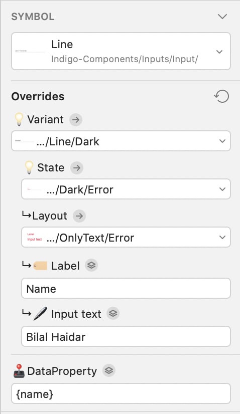
Each Symbol will have its own set of properties. These properties are used by the Indigo.Design Code Generator to map each Symbol property to an Angular Component property.
The Symbol Properties are rich and have all the possible values that you could select on the real Angular Component properties. Give it a try and play around with the different values offered.
The DataProperty defines the data-binding field used inside the Angular Component. In this case, I've used {name}.
Finally, make sure to rename this field to Name. The name you assign to a symbol will be used during the code generation. Therefore, giving meaningful names to your fields is desirable.
Repeat the steps to add the Email and Notes fields.
Now let's add the Button.
- Go to the
Insertmenu. - Click on the
Indigo-Componentsmenu item. - Select the
Buttonssub-menu item. - Select the
Raisedsymbol. - Change the Button symbol properties to look as follows:
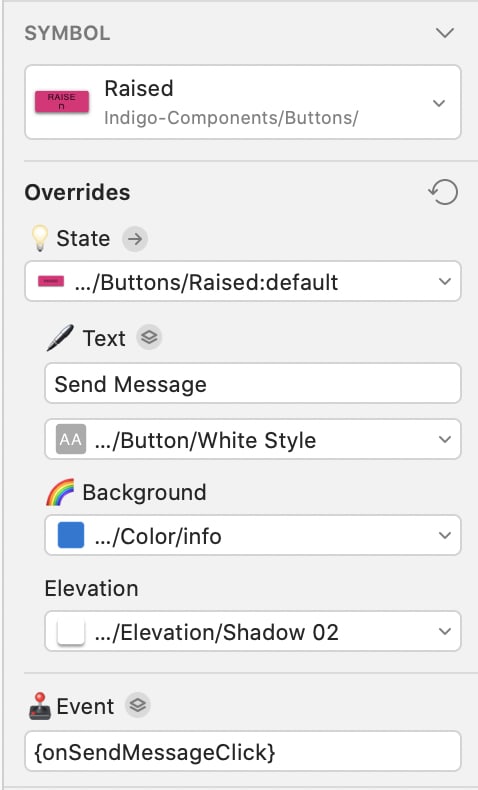
You can change the properties’ values as you see fit.
Notice the Event property. You need to enter the name of the function that will handle the click of this button inside the Angular Component.
So far, we have the following page layout:
One important aspect to remember when building the design with Sketch and before uploading your design to the Cloud Indigo Design; is fixing the alignment and sizing of the symbols. This will help in making your design responsive, and adaptable, to screen size changes.
In fact, Infragistics offers the Best practices for designing layout guide that you can read online.
Prototype - Contact Us Prototype
Now that the design is ready, let’s look to the Cloud Indigo Design, and create a Prototype for it. With your new-found knowledge, upload your design to the Cloud Indigo Design website:

Edit the name of the Prototype to something like Contact Us Screen. Also make sure to right-click the single page shown, and click Set as home. This is more useful when your design contains multiple pages or screens.
Click the Run button to view the Prototype in the browser:
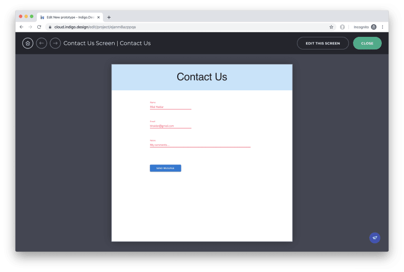
Awesomeness!
Click the Publish button to publish your Prototype. When publishing a Prototype, you can give it a new name, a brief description, assign a password, or allow/not allow comments by reviewers.

Once you're done editing the Prototype Publish window, locate and click the Publish button.
A message is shown saying that the Prototype has been published. Also, the Prototype URL is displayed. Make sure to copy this URL to the clipboard as we will be using it very soon to generate Angular code.
In general, your design contains multiple pages or screens. You can define interactivity between the pages inside the Cloud Indigo Design or through Sketch. The Cloud Indigo Design handles Prototypes created inside the Sketch design.
Generate - Contact Us Angular Component
Now that the Prototype is published, let's use the Prototype URL to generate some Angular code.
Create a new Angular application using the Angular CLI by running the following command:
ng new indigo-design
The command scaffolds a new Angular app for you.
Once done, open the app with Visual Studio Code editor. Open the Command Palette and click the Launch Indigo.Design Code Generator command.
If it's the first time you click the command, you will probably have to wait a few seconds until the extension is set up for first time use.
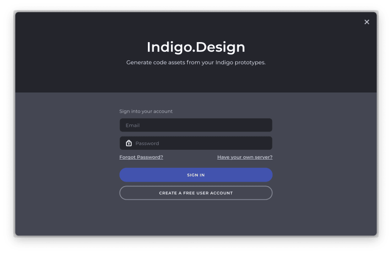
Once the extension is successfully setup on your computer, you are requested to sign in to your Cloud Indigo Design account:
Once you are signed in, paste the Prototype URL you saved earlier and hit Enter.
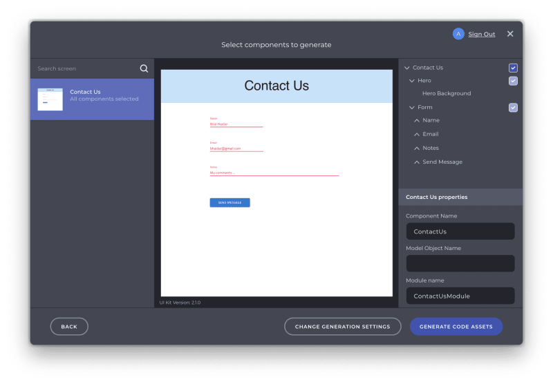
You can see the Angular Component generated with all the elements and fields. You can pick and choose the elements to generate. In addition, you can change the Component name, Module name and other settings too.
Once done configuring the screen, click the Generate Code Assets button.
At this stage, the extension requests your permission to install the Infragistics NPM packages that are used by the Angular Component to be generated. Click Yes to proceed. In addition, you will be asked for permission to override some of the files in the application. This step is required by the extension in order to import the module and component generated into the main app module.

A new contact-us module has been generated and imported inside the app.module.ts file.
In order to test the component generated, locate the app.component.html and replace its content with the following:
<app-contact-us></app-contact-us>
Let's run the app by issuing the following command:
npm run start
The application gets compiled and is ready to be served inside a browser. Open your browser, and navigate to http://localhost:4200/:

The Angular Component looks exactly as it was designed inside Sketch! The extension generated the Angular module, the HTML markup that builds up the page and added all the CSS styles required by the Component.
Conclusion
This is just the tip of the iceberg for what you can achieve when using the Indigo.Design.
Imagine the following scenario: You build the entire design of your application inside Sketch, you upload the design to the Cloud Indigo Design, create the Prototypes with all the interactions between the pages, and finally generate Angular code for the entire application with a few clicks!
Indigo.Design is a lifesaver.

Top comments (0)