Configuring reports, part 2
In this “Making Alfabet Your Own” series of articles, we look at how to configure the Alfabet product for best fit and best practices in business and IT transformation. This episode is the second of two focusing on what types of reports can be configured in Alfabet.
| Issue 1, 2019 |  Download PDF Download PDF |
|---|
Alfabet is a facilitator for transformation
Alfabet helps plan and monitor the performance of IT support for business throughout its lifecycle—ensuring that business strategy and demands are understood, prioritized and executed upon. It also ensures that the costs, quality and risks of IT support are known and considered during decision-making.
Alfabet is a facilitator for the team of planners, strategists, architects, portfolio managers and the CIO office tasked with business and IT transformation. It enables them to evolve business vision into successful projects and reliable operations.
A prerequisite for this, of course, is having a comprehensive information base on hand and visual aids for rendering that information quickly understandable. The way information is visualized can be a help or a hindrance in understanding the impact of change to the landscape. Alfabet’s ability to capture the many relationships each planning element has is what makes its repository the powerhouse of information that it is. By understanding complex network structures and multi-level hierarchies, users can better manage the complexity that is today’s business IT reality.
Configurable visualizations
Alfabet offers a wide variety of means to visualize information. In addition to more than 1,000 reports delivered out-of-the-box, Alfabet offers templates and configuration assistants to design reports that display datasets, matrices, lifecycle charts, bar charts, pie charts, geo-maps and more. These can be filled with any combination of information needed to provide answers to the questions at hand.
Colors, variable sizing, different line types and icons can be used in reports as indicators of a certain metric or criteria and to draw attention to important information. All reports support drill-down to the specific objects depicted in the display. Interactive filter criteria also allow the user to change the view to fit his/her precise information needs.
The reports that were highlighted in part 1 of this article are:
- Tabular reports
- Lifecycle charts or Gantt charts
- Portfolio charts
- Treemap reports
- Layer diagrams
- Grid reports
Here are more reports that can be configured with Alfabet:
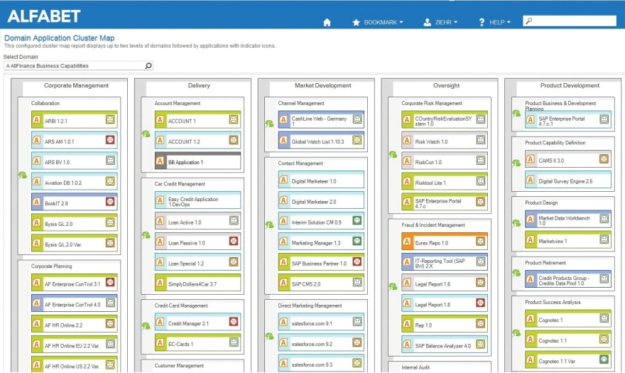
Cluster maps show related objects in multiple levels of nested boxes. The outermost boxes can be arranged vertically or horizontally. Boxes represent objects and their nesting is described through relationships or business rules. Boxes can be colored based on flexibly configurable rules and be associated with indicators which are based on configurable rules as well.
Figure 1 shows two levels of business capabilities and which applications belong to the lower-level capabilities. Cluster maps are, like treemaps, highly efficient in showing many relationships using a limited amount of space. Connections between objects in different cells can be used to show relationships between objects. The basis for a connection is freely definable. For example, a user can define how an application in one sub-domain is connected to applications in other sub-domains based on a particular indicator. Users can define the color, line style and start and end types for the arrows based on available data. The display can be filtered to show only connections for selected cells.

Figure 1 : Cluster maps show related objects in nested clusters. They are highly efficient in usage of space. Connections show applications in other domains that are related the source application through some chosen aspect.
Matrix reports show object dependencies in a matrix in which columns and rows of the report represent objects in the Alfabet database. The cells display objects that are related to both the object in the row header and the object of the column header of the respective cell. In this context a relationship can either be directly taken from the meta-model or be defined through a business rule. Box colors and icons are used for indicators as well as variable sizing of boxes and connections between boxes. Icons can be used to represent indicators such as quality, usage or strategic importance. Sizing can represent, for example, cost or strategy fulfillment. Connections can be used to show, for example, migrations, using different line styles or colors for the various migration phases. Matrix maps can have multiple levels of row and column headers. This enables understanding of relationships at a greater level of detail. It clearly shows subordinate objects and how they are supported.

Figure 2 : A matrix report shows relationships of between objects through subordinate objects such as shown here in the platform architecture for the application “CRM CSS.”

Figure 3 : This multi-level matrix map of business supports shows a master plan map for “Trading” with the subordinate processes such as “Asset Class Trading” and “Hedging” which are also delineated according to “Capital Markets,” “Direct Banking” and so on along the horizontal axis. Along the vertical axis are the organizations that belong to "Trading." Here the subordinate organization “FD Trading” is delineated according to “Corporate Commercial Clients,” “Mass Consumer Segment” etc. The cells thus show the business supports relating to each of the subordinate objects and thus at a greater level of detail yet still in the context of the superior objects.
Lane reports provide an overview of relationships between collections of objects pertaining to a specific aspect. The user can thus better understand the behavior of and relationships between groups of objects instead of just individual objects. Figure 4, for example, shows how, if we were planning any changes to the applications in the Trading domain, that could affect the projects associated with those applications and, in turn, the strategic themes that are being executed on with projects.

Figure 4 : Lane reports show relationships between groups of objects
Branch diagrams allow the content of an expandable table to be displayed as a graphic tree with objects of the first-level listed on top of each other on the left of the report and objects of the next level displayed on the right of the first level objects with a line connecting them. The report can either use the object's icon to display an object or display the object as a bubble with a defined color. The report can also display titles on the connecting lines. This kind of chart is easily readable and space-efficient. It can be rendered vertical or horizontal.

Figure 5 : This branch diagram shows the structure of the service product “Trade*Net Application Service 1.”To the right we see the service products that comprise the main service product and, further to the right, the service items (e.g., ICT objects, applications and deployments) that comprise the subordinate service products.
Geo-map reports are geographic-based analyses to support the global and geographically interdependent nature of business today. Regions as they are associated with organizational units, market products or distribution channels are an important context for enterprise planning decisions. Location-based data adds another dimension to KPI analysis. Understanding that there may be environmental reasons for certain aspects of a region’s performance provides added insight that can be extremely relevant for evaluation. Costs, revenues, customer satisfaction, channel effectiveness—the reasons for a varied range of performance become clearer when relating these to location. Geographic dashboards can be particularly effective when collaborating with the business side of the house on enterprise transformation. Alfabet offers geo-mapping of any information captured in the product. Close to a thousand maps are available for use—covering the whole globe or just your corner of the universe. Simple queries for defining the desired KPIs and drill- down links as well as report assistants for defining color scales make it easy to create geo-map reports. The user can drill down on a region to, for example, find out more about the organization that has high application costs or customer support challenges— any drill-down link is possible. “Markers” in reports can be used to draw attention to performance in particular locations or establish connections between locations—useful for, for example, indicating flows or dependencies between locations, for example for capacity management or risk management.

Figure 6 : This geo-map report shows the risk at locations that are executing or hosting IT for the process “Sales, Markets and Relationships.”
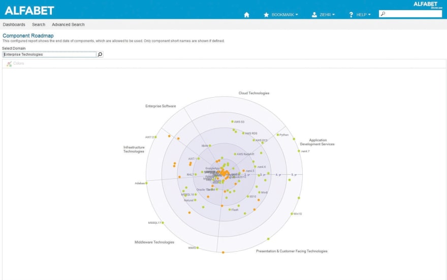
Circular roadmaps are offered to support large organizations which commonly have very many objects belonging to a particular scope of observance, for example, projects, applications or technologies that are put in relation to each other according to their association with factors, such as time, strategic importance, technology domain, innovation area, lifecycle phase and planning. Circular roadmaps provide a more efficient and easily viewed representation of information. A circular roadmap consists of concentric circles that are partitioned into sectors. Items are placed into a particular circle and sector depending on their relationship to the other objects or their values for defined indicators. Circles commonly represent a timeline but can also be defined to indicate some other range such as strategic horizons or priorities. Sectors relate to each other in the context of a subject such as technology domains, organizations, scores, capabilities, etc., and can be sized differently from each other to demonstrate a relationship, e.g., strategic importance or priority. Objects are placed on the roadmap as particular shapes—circles, triangles, squares, etc.—also possessing meaning.
For example, in the case of application retirement, it could indicate whether the application is legacy, client server, mobile or cloud. Or in the case of projects, whether the project targets differentiation, innovation or system of record. The exact placement in the particular circle and sector is a function of the axial value and angular value typically determined by indicators on the object. The user can quickly identify changes by using connecting lines to indicate trends, plans or dependencies.

Figure 7 : This circular roadmap shows technologies positioned on a time-axis according to their end-of-life dates. The colors indicate whether they are free for use (green) or need approval (orange). The graph is sectioned according to technology category.
Directed graphs (or “node-arc reports”) help to better understand dependencies in the architecture with a richer set of representation options. They let users automatically generate information flows, data lineage, migrations and other relationships on various levels in one representation. They are useful for presenting object relationships with a large set of objects and one in which the relationships are arbitrarily structured and not necessarily in a hierarchy. Various layout mechanisms are available to be able to choose which one works best with the current set of data. Queries are used to determine the nodes and the arcs. Nodes permit definition of a diagram item template, coloring and dynamic assignment of property values. Indicator rules are also supported. Arcs permit the definition of style, weight, color and decoration to the connecting lines.

Figure 8 : The node-arc report allows a multi-layered representation of information. Classic usage of a node-arc report is in the visualization of information flows as shown here. The node-arc report is also used in Alfabet for the visualization of the Alfabet meta-model based on the user’s existing object/relationship values.
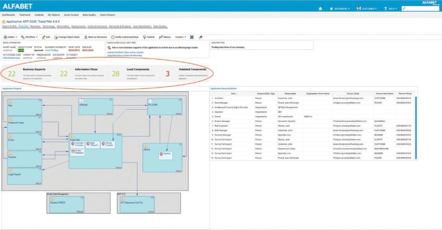
Widget reports use the “widget” as a simple, reusable user interface element that combines texts and images to quickly convey information such as a count or an image summarizing or indicating particularly relevant information relating to an object. AQL (Alfabet Query Language) or SQL queries are used to define the widget context, i.e., determine text and image content as well as text color and size. The graphic design of a widget can be used repeatedly for different content. Widget reports are built on widgets and can be embedded into cockpits or guide views.

Figure 9 : The widget report shown in this cockpit provides counts for the number of business supports, information flows, local components and outdated components of the Trade*Net 6.0.3 application.

Figure 10 : The widget report shown in this cockpit shows the TIME investment status object state and supported countries for the Trade*Net 6.0.3 application.
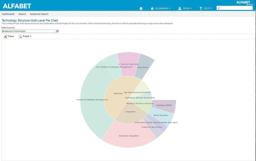
Chart reports are used to express measures of things (whereas the reports presented previously describe relationships of objects to each other). Chart reports are the types of diagrams commonly used in business: bar, line, pie, radar, gauge and waterfall charts. Here, again, the user is provided a template to enter the objects to be compared and according to what criteria as well as to define colors, labels, etc. Variances on these charts such as the combo chart and multi-level pie chart provide more context.

Figure 11 : The combo chart adds context to evaluations by combining several graphs into a single view. Users can use different graph styles and axis systems to increase depth of exploration.

Figure 12 : A multi-level pie chart is used to visualize hierarchical data in a form made of concentric circles. It provides the viewer a good sense of proportion between the objects on the same hierarchical level. The size of slices along the concentric circles is determined by a qualitative indicator like cost, count, risk, criticality or similar.
Publishing reports
As an enterprise planning process involves many stakeholders beyond the borders of IT, it is important to have attractive documents in a format familiar to those working in a non-IT environment. Alfabet comes with the ability to create documents that bring together any type of information, reports and charts. These documents can be Microsoft® Word documents or Microsoft PowerPoint ® presentations.
For Microsoft Word documents, users define Microsoft Word document templates, determining text layout, creating static and dynamic fields, and formatting the document according to corporate standards or other publishing guidelines. Dynamic fields are filled with content from Alfabet such as the names of applications, domains and business processes as well as any standard or custom report related that has been created in Alfabet. The template can hold a nested structure of separate documents on different objects. Once created, the template is uploaded into Alfabet for generation of the publication.
For Microsoft PowerPoint documents, Alfabet uses PowerPoint’s slide master concept to create a design for the presentation. Individual slides have separate layouts which have names relating to names in the publication configuration engine in Alfabet.
The publication engine uses rules for populating the layout. All elements—text boxes, shapes etc—in the layout have individual names for relating to objects in Alfabet and can be interacted with. Elements can be static text such as “End Date:” or “Responsible Group:” or can be a variable to be filled with input from Alfabet, i.e., the actual end date and responsible group.
Objects are found in Alfabet using queries and are then mapped to the PowerPoint slide according to the defined elements.
Visualizations are provided by Alfabet. Context is provided by entries such as application name or responsible user. Datasets, business support matrices and business graphics can all be put into the publication.
Alfabet’s publication facilities offer:
- A flexible way to amalgamate information so that the results are relevant to the purpose in terms of content, format, usability and attractiveness
- A standardized procedure for creating publications to enable user self-sufficiency
- Compatibility with corporate documentation standards to easily collaborate with non-Alfabet users
The publications created via the Application Publication Facility (APF) are extremely useful for:
- Decision support documents for management
- Report archival
- Reports for auditors or other external stakeholders
True worth
The wealth of information in Alfabet’s repository makes it the planning and management powerhouse that it is. Yet it is the facilities for visually communicating that information to the various stakeholders that Alfabet provides that proves its true worth— most certainly more than a thousand words.
Visit www.alfabet.softwareag.com to learn more.


Top comments (0)