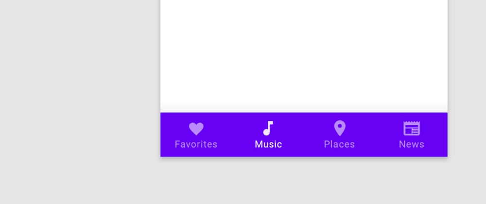
So we want to create a mobile navbar in bulma which will display a full navbar at top of the screen in desktop but bottom navbar on mobile
For this the approach will be following:
- On desktop viewport hide the bottom navbar and display the top navbar.
- On mobile viewport hide the top navbar and display the bottom navbar.
CODE
<!DOCTYPE html>
<html>
  <head>
    <meta charset="utf-8">
    <meta name="viewport" content="width=device-width, initial-scale=1">
    <title>Hello Bulma!</title>
    <link rel="stylesheet" href="https://cdn.jsdelivr.net/npm/bulma@0.9.3/css/bulma.min.css">
  </head>
  <body>
    <nav class="navbar is-hidden-mobile" role="navigation" aria-label="main navigation">
      <div class="navbar-brand">
        <a class="navbar-item" href="https://bulma.io">
          <img src="https://bulma.io/images/bulma-logo.png" width="112" height="28">
        </a>

        <a role="button" class="navbar-burger" aria-label="menu" aria-expanded="false" data-target="navbarBasicExample">
          <span aria-hidden="true"></span>
          <span aria-hidden="true"></span>
          <span aria-hidden="true"></span>
        </a>
      </div>

      <div id="navbarBasicExample" class="navbar-menu">
        <div class="navbar-start">
          <a class="navbar-item">
            Home
          </a>

          <a class="navbar-item">
            Documentation
          </a>

          <div class="navbar-item has-dropdown is-hoverable">
            <a class="navbar-link">
              More
            </a>

            <div class="navbar-dropdown">
              <a class="navbar-item">
                About
              </a>
              <a class="navbar-item">
                Jobs
              </a>
              <a class="navbar-item">
                Contact
              </a>
              <hr class="navbar-divider">
              <a class="navbar-item">
                Report an issue
              </a>
            </div>
          </div>
        </div>

        <div class="navbar-end">
          <div class="navbar-item">
            <div class="buttons">
              <a class="button is-primary">
                <strong>Sign up</strong>
              </a>
              <a class="button is-light">
                Log in
              </a>
            </div>
          </div>
        </div>
      </div>
    </nav>
  <section class="section">
    <div class="container">
      <h1 class="title">
        Hello World
      </h1>
      <p class="subtitle">
        My first website with <strong>Bulma</strong>!
      </p>
    </div>
  </section>
  <!-- Bottm bar -->
  <nav class="navbar is-link is-fixed-bottom is-hidden-tablet" role="navigation">
    <div class="navbar-brand">
        <a class="navbar-item is-expanded is-block has-text-centered">
            <i class="fa fa-user"></i>
            <p class="is-size-7">Account</p>
        </a>
        <a class="navbar-item is-expanded is-block has-text-centered">
            <i class="fa fa-list"></i>
            <p class="is-size-7">Tasks</p>
        </a>
        <a class="navbar-item is-expanded is-block has-text-centered">
            <i class="fa fa-flag"></i>
            <p class="is-size-7">Alerts</p>
        </a>
        <a class="navbar-item is-expanded is-block has-text-centered">
            <i class="fa fa-cog"></i>
            <p class="is-size-7">Settings</p>
        </a>
    </div>
</nav>
  <!-- End bottom bar -->
  </body>
</html>


Top comments (0)