6 Min to read
Ant design is a very popular UI library for React. It provides a well designed and eminently composable collection of components.
However, it is very opinionated about styles. Its philosophy is not only to provide tools, but a whole conceptual approach for designing UIs. Depending on your needs and inclinations, this can be a massive pro, or a very irritating con.
Thankfully, Ant Design also provides a way to theme the experience they offer. This page in Ant Design’s documentation provides guidelines for making its components look more in line with a user’s brand identity. It is serviceable, but the operative word here is “guideline”: It only superficially lists approaches you can employ to make it happen, there is no actual example of it being implemented in a real app, and the required configuration is only lightly touched upon.
This article aims to complement the docs by providing a step by step guide to theming Ant Design with their recommended approach. Possible pain points will be signalled with a ⚠️gotcha alert⚠️, and for each step, I will point to a specific commit of the repo I created for this article.
It is based on a barebone project starter I made for testing and experimentation, but any project built with Webpack and Babel where you have access to the config files will behave similarly. Theming an unejected create-react-app project is different and arguably better documented.
If you just want to see the code, head over there now : https://github.com/mathieu-anderson/antd-theming-examples
Step 1: Create project, install Ant Design and babel-plugin-import
Link to commit
Install the antd package (to be able to import components from the library, as seen here).

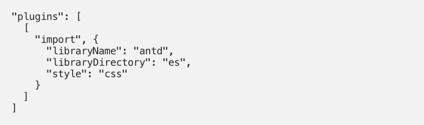
⚠️gotcha alert⚠️ Install the Babel plugin babel-plugin-import. This is only briefly mentioned in the docs, but is very important. We will explain its purpose in a second.

Configure babel-plugin-import in .babelrc (see in commit). Notice that we pass “css” as our style option. The other possible option is true, but we'll come back to it later.
The purpose of babel-plugin-import is to allow modular import of Ant Design components, so that writing this…

… only imports the Select component, not the whole Ant Design library. But more importantly, the styles option of this plugin adds the possibility to also import the styles of the given component. This allows us to never have to import styles directly from antd (as it's done in the component’s demo Codesandbox provided by Ant Design’s docs with import "antd/dist/antd.css";).
This gives us an application styled with the default Ant Design theme :
Example app with Ant Design default theme (blue)

Example app after Step 1 is complete
Step 2: Install less and less-loader, edit Webpack config, edit babel-plugin-import style option
Link to commit
Ant Design styles rely on the CSS post-processor less. It's made clear that the correct way to theme Ant Design is to override the default less variables. We therefore need to be able to parse those variables, and use them in our project.

Install the Webpack loader necessary to parse less files, less-loader.

Add a rule to the Webpack config to appropriately parse less files (see in commit). ⚠️gotcha alert⚠️ Notice the javascriptEnabled: true option set for less-loader: it is required to load Ant Design’s less styles without issues.
test loader

Change the style option of babel-plugin-import to true. When we used “css”, we were simply importing the pre-bundled CSS styles from the library as is. ⚠️gotcha alert⚠️ With true, we import the source files. This means we can modify them during the compilation step (handled by Babel and Webpack), which allows us to customize the theme.
plugins import

Nothing has changed in the looks of our app, but all the preliminary preparations are now done. We can start theming our Ant Design components!
Step 3: Override less variables in Webpack config (inline)
Link to commit
Now that the configuration is correct, we can follow the official docs more easily. The first solution is to write inline configuration for our theme, in a “plain object” kind of syntax.
Add the modifyVars option to less-loader (see in commit), populated with a simple object where the keys are the less variable to override, and the values are what we override them with. This leverages a feature of Less.
loader modifying options

This override happens during the compile time, and finally we see tangible results!
Example app after Step 3 is complete

Example app with Ant Design our first theme (green and serif font)
This naive approach to theming might not be the most practical, though. You might want the native IDE support you get when writing actual CSS/LESS. You also might want to separate your configs better, and have something like a theme file.
Step 4: Override less variables with a theme.less file
Link to commit
Add a theme.less file overriding the less variable values from Ant Design (see in commit).

Add hack key to modifyVars option in less-loader . This will write an @import for our theme file where appropriate in the source styles. ⚠️gotcha alert⚠️ Be careful to give the proper path to your .less theme file. This syntax can be tricky (see in commit).

This is a much more robust solution for theming, and gives the same result as the previous one (with different colours and fonts).
Example app with our second theme (red and sans serif font)

Example app after Step 4 is complete
Optional step: Dealing with Ant Design’s global styles
Link to commit
You'll probably have noticed that everything is styled according to the theme we specified, not just the Ant Design components. ⚠️gotcha alert⚠️ This is because the default behaviour of Ant Design is to ship a host of global styles whenever you import a component’s style. Another instance of Ant Design being very opinionated.
There are ways to avoid this, but they deserve their own article. In the meantime, you can directly overwrite the Ant Design styles and theme by writing your own CSS for the components you want to have control over.
These rules let us regain control over the fonts and the links styles:

And reach this masterpiece:

Example app with our final theme (red with Courier font and blue links)
Example app after this optional step is complete
So, I hope this guide helps anyone having difficulties implementing the theming recommendations from Ant Design’s official docs.
If you have other approaches to this task, please get in touch and share them with us!

Latest comments (0)