
Howdy! In this blog, we’ll be replicating an immersive UI in .NET MAUI based on this Dribbble design.
We are going to break down this UI as shown in the following screenshot to implement it step by step.

We will make some modifications to the original UI to get the most out of the controls with which we will be working.
Before starting, let’s have a glance at what will learn in this blog:
- Render images with rounded borders.
- Use the Syncfusion .NET MAUI Avatar Viewand Badge View controls to render a profile image with a badge.
Let’s start the coding!
Main layout
First, let’s design the main layout of the UI.
Inside the ScrollView , we will use a new layout that .NET MAUI provides us, the VerticalStackLayout . It helps us organize the controls on our screen vertically.
Refer to the following code example.
 <ScrollView VerticalScrollBarVisibility="Never">
<!--Main layout-->
<VerticalStackLayout Margin="20,0" VerticalOptions="Center">
<!-- Add all your UI content here -->
</VerticalStackLayout>
</ScrollView>
Step 1: Main information
 To understand the code clearly, we have divided the implementation into several steps.
Rounding the edges of an image
Images with rounded borders provide a more modern and fresh look to our UI. To achieve this, please follow these steps:
Add a frame.
First, let’s add a frame and customize the following properties:
Padding: Set the padding value to 0. This will eliminate the blank spaces and allow our image to occupy the entire space of the frame.
IsClippedToBounds: Set this property with the value True. This indicates that the content will be clipped beyond its bounds.
CornerRadius: This represents the value that the edges will take to give the rounded corner effect.
After adding the frame, add the image. Refer to the following code example.
<!-- Main home image-->
<Frame Padding="0" IsClippedToBounds="True" HasShadow="False" CornerRadius="20" Margin="10,25,10,0">
<Image Source="mainhome.png" Aspect="AspectFill" HeightRequest="250"/>
</Frame>
<!-- You must write here what is explained in the next code block -->
Add profile image with a badge
To design the profile image, we are going to use the Syncfusion .NET MAUI Avatar View and Badge View controls:
- Add the Syncfusion.Maui.Core NuGet package.

- Go to the MauiProgram.cs file and register the handler for Syncfusion core by going to the CreateMauiApp method and adding the .ConfigureSyncfusionCore() method just below the .UseMauiApp() line *. *
- Now, add the Syncfusion.Maui.Core namespace in your XAML page.
xmlns:sfControl="clr-namespace:Syncfusion.Maui.Core;assembly=Syncfusion.Maui.Core"
- Then, add the Syncfusion .NET MAUI Avatar View and Badge View controls inside a grid to make it easier to organize the controls.
Refer to the following code.
<!--Profile information-->
<Grid RowDefinitions="Auto,Auto,Auto" ColumnDefinitions="Auto,*,Auto" Padding="25,30">
<!-- Avatar & Badge view-->
<sfControl:SfBadgeView Grid.Row="0" Grid.Column="0" Grid.RowSpan="2" BadgeText="1" HeightRequest="70" WidthRequest="60" HorizontalOptions="Center" VerticalOptions="Center">
<sfControl:SfBadgeView.Content>
<sfControl:SfAvatarView
ContentType="Default"
VerticalOptions="Center"
HorizontalOptions="Center"
BackgroundColor="LightBlue"
BorderColor="Transparent"
WidthRequest="50"
HeightRequest="50"
CornerRadius="25"/>
</sfControl:SfBadgeView.Content>
<sfControl:SfBadgeView.BadgeSettings>
<sfControl:BadgeSettings Type="Success" Position="BottomRight"/>
</sfControl:SfBadgeView.BadgeSettings>
</sfControl:SfBadgeView>


<!-- Add the basic information here: user's name, status, and phone button information here. →
</Grid>
<!-- You must write here what is explained in the next code block -->
Add name, status, and call button.
Now, add the basic user information: name, status, and call button.
<!-- Basic information: user's name, status, and phone button-->
<Label Grid.Row="0" Grid.Column="1" Text="Mark Won" FontAttributes="Bold" TextColor="Black" Padding="20,0,0,0" VerticalTextAlignment="End" FontSize="15"/>
<Label Grid.Row="1" Grid.Column="1" Text="Available" FontAttributes="Bold" TextColor="Silver" Padding="20,0,0,0" VerticalTextAlignment="Start" FontSize="13"/>
<Button Grid.Row="0" Grid.Column="2" Grid.RowSpan="2" ImageSource="phone" CornerRadius="25" HeightRequest="50" WidthRequest="50" BackgroundColor="White" BorderColor="Silver" BorderWidth="1" VerticalOptions="Center"/>
Step 2: Details
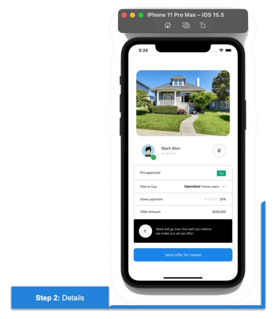 First, let’s build the frame in which all the information of this block must be added.
<!-- General details-->
<Frame CornerRadius="10" BorderColor="Silver" Padding="0,20,0,0" HasShadow="False">
<Grid RowDefinitions="Auto,Auto,Auto,Auto,Auto,Auto,Auto,Auto" ColumnDefinitions="Auto,*,Auto" VerticalOptions="Center" HorizontalOptions="FillAndExpand" Padding="25,0">
<!-- You must write here what is explained in the details block →
</Grid>
</Frame>
<!-- You must write here what is explained in the next code block -->
Then, add a set of information inside the previously added frame. For better understanding, we divided the explanation into sub-blocks.
Note: The names of these sub-blocks will be the same as those contained in the design line.
Pre-approved
We add two labels and a BoxView to achieve a dividing line. We can also achieve this design using the line shape feature in .NET MAUI.
Refer to the following code example.
<!--Pre-approved-->
<Label Grid.Row="0" Grid.Column="0" Text="Pre-approved" FontAttributes="Bold" TextColor="Black" FontSize="12"/>
<Label Grid.Row="0" Grid.Column="2" Text="Yes" TextColor="White" BackgroundColor="#00a77c" HorizontalOptions="End" FontSize="10" Padding="9,4"/>
<BoxView Grid.Row="1" Grid.Column="0" Grid.ColumnSpan="3" HeightRequest="1" Color="Silver" Margin="-25,15" />
<!-- You must write here what is explained in the next code block -->
Plan to buy
This information contains the same elements as the previous code block, except that this time, we will also start working with the FormattedText.
Refer to the following code to add different styles to the same label. This helps avoid declaring different labels.
<!--Plan to buy-->
<Label Grid.Row="2" Grid.Column="0" Text="Plan to buy" FontAttributes="Bold" TextColor="Black" FontSize="12"/>
<Label Grid.Row="2" Grid.Column="1" HorizontalOptions="End" TranslationX="25">
<Label.FormattedText>
<FormattedString>
<Span Text="Opendoor" TextColor="Black" FontAttributes="Bold" FontSize="13"/>
<Span Text=" Home Loans" TextColor="Black" FontSize="11"/>
</FormattedString>
</Label.FormattedText>
</Label>
<Image Grid.Row="2" Grid.Column="2" HorizontalOptions="End" VerticalOptions="Center" Source="arrow"/>
<BoxView Grid.Row="3" Grid.Column="0" Grid.ColumnSpan="3" HeightRequest="1" Color="Silver" Margin="-25,15" />
<!-- You must write here what is explained in the next code block -->
Down payment
Refer to the following code example to render the down payment details.
<!--Down payment-->
<Label Grid.Row="4" Grid.Column="0" Text="Down payment" FontAttributes="Bold" TextColor="Black" FontSize="12"/>
<Label Grid.Row="4" Grid.Column="1" Text="$100,000" TextColor="Silver" FontSize="12" HorizontalTextAlignment="End" TranslationX="20"/>
<Label Grid.Row="4" Grid.Column="2" Text="20%" TextColor="Black" FontSize="12" HorizontalTextAlignment="End"/>
<BoxView Grid.Row="5" Grid.Column="0" Grid.ColumnSpan="3" HeightRequest="1" Color="Silver" Margin="-25,15" />
<!-- You must write here what is explained in the next code block -->
Offer Amount
Refer to the following code example to render the offer amount details.
  <!--Offer amount-->
<Label Grid.Row="6" Grid.Column="0" Text="Offer Amount" FontAttributes="Bold" TextColor="Black" FontSize="12"/>
<Label Grid.Row="6" Grid.Column="2" Text="$500,000" TextColor="Black" FontSize="12" HorizontalOptions="End" />
<!-- You must write here what is explained in the next code block -->
Black space
Now, use another frame to simulate the footer of the main frame. This must have a black background.
Using the Margin property, we recover the borders required by the previous controls so that this frame will completely cover the footer of the parent frame. We achieve that by adding negative values to the edges.
Here, we also use another new layout called HorizontalStackLayout. It organizes the controls horizontally.
Refer to the following code example.
 <!--Black space-->
<Frame Grid.Row="7" Grid.Column="0" Grid.ColumnSpan="3" HasShadow="False" BackgroundColor="Black" Margin="-25,20,-25,0">
<HorizontalStackLayout>
<Button ImageSource="mark" CornerRadius="25" HeightRequest="50" WidthRequest="50" BackgroundColor="White" VerticalOptions="Center"/>
<Label Text="Mark will go over this with you before
we make our all-cas offer." VerticalTextAlignment="Center" FontSize="12" Padding="15,0,0,0" TextColor="White"/>
</HorizontalStackLayout>
</Frame>
Send for review button
Finally, add the Send offer for review button using the following code.
<Button Text="Send offer for review" FontAttributes="Bold" TextColor="White" CornerRadius="10" HeightRequest="50" BackgroundColor="#1c85e8" Margin="0,20"/>
Step 3: Offer
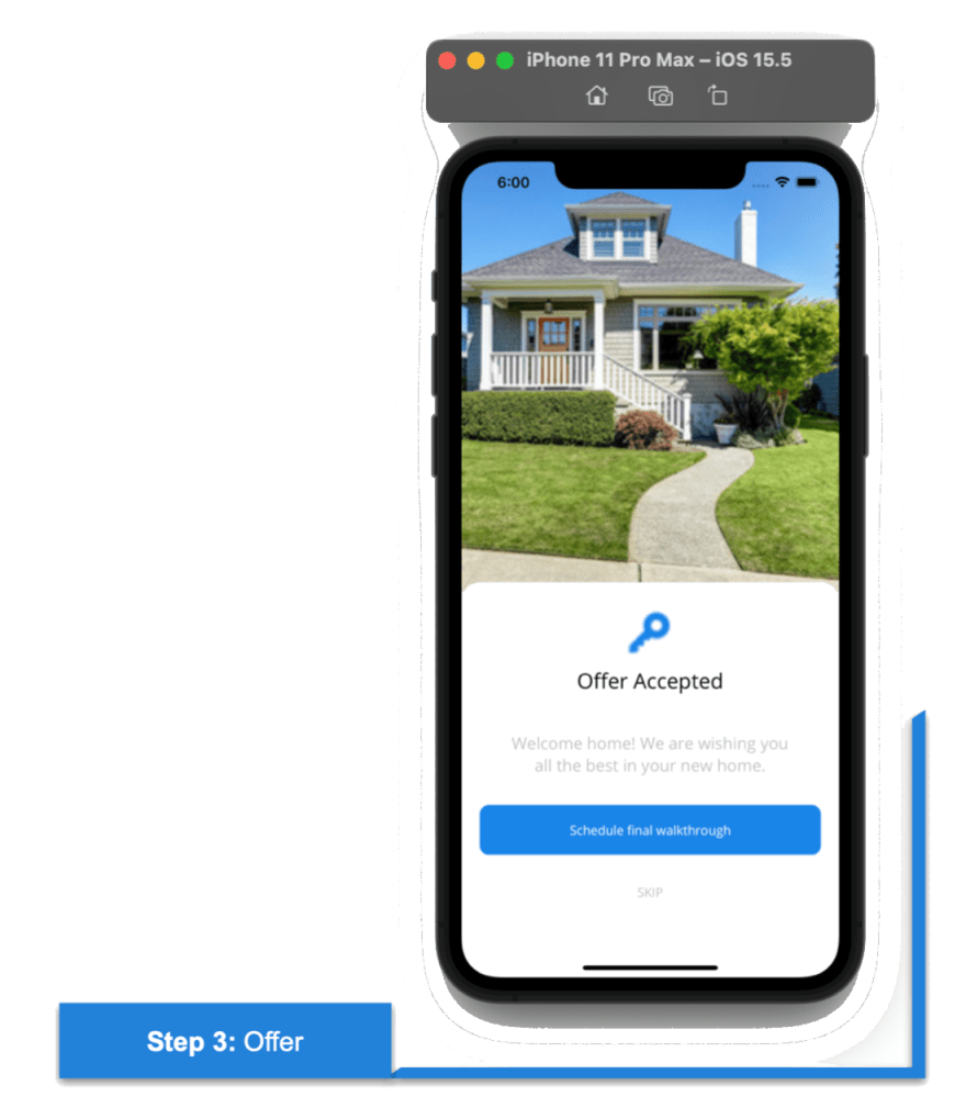 To finish with the third step, create another page named OfferPage.xaml. Add the following code to render the Offer details.
<Grid RowDefinitions="*,Auto">
<!-- Main image-->
<Image Grid.Row="0" Source="mainhome.png" Aspect="AspectFill" Margin="0,-50,0,0"/>
<!-- General information-->
<Frame Grid.Row="1" CornerRadius="20" VerticalOptions="StartAndExpand" HasShadow="False" BackgroundColor="White" HeightRequest="400" Margin="0,-10,0,0">
<Grid RowDefinitions="*,*,*,*,*">
<Image Grid.Row="0" Source="key.png" WidthRequest="70" HeightRequest="70" Aspect="AspectFill" HorizontalOptions="Center"/>
<Label Grid.Row="1" Text="Offer Accepted" FontSize="23" FontAttributes="Bold" TextColor="Black" HorizontalTextAlignment="Center"/>
<Label Grid.Row="2" Text="Welcome home! We are wishing you
all the best in your new home." FontSize="18" HorizontalTextAlignment="Center" TextColor="Silver"/>
<Button Grid.Row="3" Text="Schedule final walkthrough" FontAttributes="Bold" TextColor="White" CornerRadius="10" HeightRequest="55" BackgroundColor="#1c85e8"/>
<Label Grid.Row="4" Text="SKIP" TextColor="Silver" HorizontalTextAlignment="Center" Padding="0,15,0,0" />
</Grid>
</Frame>
</Grid>
And our UI is done! You can see the full design here.

GitHub reference
To see the complete code structure of this project, refer to our Immersive UI in .NET MAUI demo on GitHub.
Conclusion
Thanks for reading! In this blog, we have seen how to replicate an immersive UI using Syncfusion .NET MAUI controls. Try out the steps discussed in this blog and leave your feedback in the comments below.
Syncfusion .NET MAUI controls were built from scratch using .NET MAUI, so they feel like framework controls. They are fine-tuned to work with a huge volume of data. Use them to build your elite, cross-platform mobile and desktop apps.
For current customers, the new Essential Studio version is available for download from the License and Downloads page. If you are not yet a Syncfusion customer, you can always download our free evaluation to see all our controls in action.
For questions, you can contact us through our support forum, support portal, or feedback portal. We are always happy to assist you!
See you next time!

Top comments (0)