
Our Blazor kanban board is a task scheduling component that provides a clear user interface for managing tasks with multiple stages.
Kanban boards are widely used in various real-time applications such as task scheduling, project management, software development, manufacturing processes, personal task management, and many more. The Syncfusion Kanban component supports both Blazor Server and Blazor WebAssembly (WASM) applications. This blog post showcases the following features of our Blazor kanban board:
- Data Binding
- Swimlanes
- Work-in-Progress Validation
- Toggling Columns
- Sorting Cards
- Templates
- Stacked Headers
- Performing CRUD Operations
Let’s get a bird’s-eye view of them!
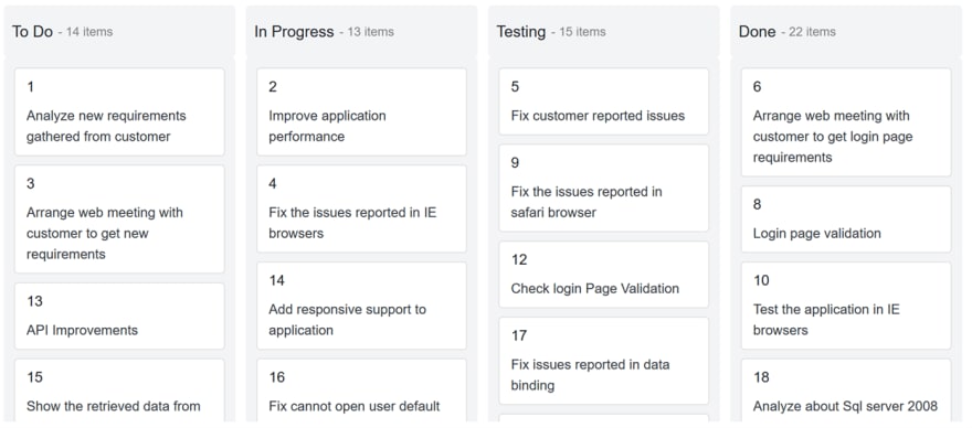
Data binding
Let’s look at the different ways to bind data sources to the Blazor kanban board. The component provides two methods:
Local data binding
In local data binding, we need to create required model classes and data. Then, we have to bind the data to the DataSource property of the SfKanban tag.
Add the following code in your Razor file to bind the local data to the kanban board.
@page "/"
@using System.Collections.Generic

<h3>Local Data Binding</h3>

<SfKanban KeyField="Status" DataSource="Source">
    <KanbanColumns>
         @foreach (ColumnModel item in columnData)
            {
                 <KanbanColumn HeaderText="@item.HeaderText" KeyField="@item.KeyField"></KanbanColumn>
            }
    </KanbanColumns>
    <KanbanCardSettings HeaderField="Title" ContentField="Summary"></KanbanCardSettings>
</SfKanban>

@code {
    private List<KanbanModel> Source = new KanbanModel().GetTaskDetails();
    private List<ColumnModel> columnData = new List<ColumnModel>() {
        new ColumnModel(){ HeaderText= "To Do", KeyField= new List<string>() { "Open" } },
        new ColumnModel(){ HeaderText= "In Progress", KeyField= new List<string>() { "InProgress" } },
        new ColumnModel(){ HeaderText= "Testing", KeyField= new List<string>() { "Testing" } },
        new ColumnModel(){ HeaderText= "Done", KeyField= new List<string>() { "Close" } }
    };
}

Remote data binding
In remote data binding, use the Syncfusion Data Manager to retrieve tasks from a remote data source. Then, define the key fields, columns, and card settings to bind the data to the Kanban component.
Refer to the following code example.
<SfKanban TValue="KanbanModel" KeyField="Status" AllowDragAndDrop="false">
   <SfDataManager Url="https://js.syncfusion.com/ejServices/wcf/Northwind.svc/Tasks" CrossDomain="true"></SfDataManager>
    <KanbanColumns>
        @foreach (ColumnModel item in columnData)
        {
            <KanbanColumn HeaderText="@item.HeaderText" KeyField="@item.KeyField"></KanbanColumn>
        }
    </KanbanColumns>
    <KanbanCardSettings HeaderField="Id" ContentField="Summary"></KanbanCardSettings>
</SfKanban>
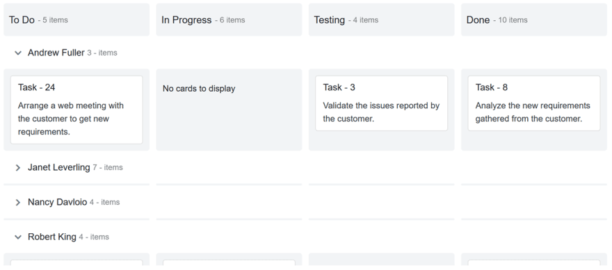
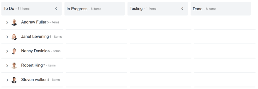
Swimlanes
With the swimlane row feature, you can split the Kanban component horizontally based on fields such as assignee, priority, and more. Its rows can be expanded and collapsed. Also, you can show or hide empty rows and the task count in each row, and also sort swimlane rows.
For example, when we group the board with the assignee field as a swimlane, the board will show a clear picture of each assignee’s tasks with their progress.
Refer to the following code example.
<SfKanban TValue="KanbanModel" KeyField="Status">
…
 <KanbanSwimlaneSettings KeyField="Assignee" TextField="Assignee" AllowDragAndDrop=false ShowItemCount=true SortDirection=SortDirection.Ascending ShowEmptyRow=true>
 </KanbanSwimlaneSettings>

</SfKanban>
The following image shows the swimlane in use.
Note: To learn about template support in the swimlane header, you can refer to this section of the blog.
Work-in-progress validation
You can limit the minimum and maximum card count per column or swimlane. This will help you monitor the capacity of the team that owns the kanban board.
For example, if you limit the maximum card count to two in the progress column, when a user moves more than two cards into it, the column will be highlighted to denote the validation failure.
The validation fails when the card count is less than the MinCount or more than the MaxCount. Custom appearances can be used to denote the individual validation failures for the min count and max count.
You can configure the work-in-progress limitation as demonstrated in the following code example.
<SfKanban TValue="KanbanModel" KeyField="Status" ConstraintType=ConstraintType.Column>
…
    <KanbanColumns>
    @foreach (ColumnModel item in columnData)
    {
        <KanbanColumn HeaderText="@item.HeaderText" KeyField="@item.KeyField" MinCount='@item.MinCount' MaxCount='@item.MaxCount'></KanbanColumn>
    }
    </KanbanColumns>
…
</SfKanban>

Toggling columns
The Kanban board column headers can be expanded or collapsed. If you want to hide a few columns or empty columns, use the toggling columns feature. Toggling columns provides a broader view for visualizing the remaining visible columns.
If toggling is enabled, then an expand/collapse icon will be rendered on the right corner of the column. Simply click on the icon to collapse or expand the column.
Note: If you want to collapse a column on initial load, you have to set the IsExpanded property to false.
You can configure the KanbanColumns tag as shown in the following code example to utilize the toggle column feature.
<SfKanban TValue="KanbanModel" KeyField="Status">
…
    <KanbanColumns>
    @foreach (ColumnModel item in columnData)
    {
        <KanbanColumn HeaderText="@item.HeaderText" KeyField="@item.KeyField" AllowToggle="@item.AllowToggle" IsExpanded="@item.IsExpanded" ></KanbanColumn>
    }
    </KanbanColumns>
…
</SfKanban>

Sorting cards
By default, the Kanban component displays its cards based on the order in which they are placed in the data source. If you want to sort the cards using a specific field value, you can easily do this through the built-in sorting options to organize the cards based on specific fields such as field, rank, assignee, etc.
When adding cards dynamically, sorting will be applied to the corresponding column once the cards are added in the board.
Refer to the following code example.
<SfKanban TValue="KanbanModel" KeyField="Status">
…
    <KanbanSortSettings SortBy=SortOrderBy.Custom Direction=SortDirection.Descending Field="Priority"></KanbanSortSettings>
</SfKanban>

Templates
Templates allow you to easily add any HTML content or any Blazor UI components inside the kanban board. You can apply templates to the following kanban board elements:
The Template tag provides the context object to access its corresponding attributes. For example, the KanbanColumn ’s context property provides all the information about a column such as key field, header text, toggle, expand/collapse state, and more.
Column header templates
To design a column header with template content, place the HTML content or Blazor UI component inside the Template tag under the KanbanColumn tag.
Access the column properties through the context property of the KanbanColumn and add the template content as explained in the following code example.
<SfKanban TValue="KanbanModel" KeyField="Status">
…
    <KanbanColumns>
    @foreach (ColumnModel item in columnData)
    {
        <KanbanColumn HeaderText="@item.HeaderText" KeyField="@item.KeyField">
            <Template>
            @{
                KanbanColumn column = (context as KanbanColumn);
                <div class="header-template-wrap">
                    <div class="header-icon e-icons @column.KeyField[0]"></div>
                    <div class="header-text">@column.HeaderText</div>
                </div>
            }
            </Template>
        </KanbanColumn>
    }
    </KanbanColumns>
 …
</SfKanban>

Swimlane header templates
The Template tag is available inside the KanbanSwimlaneSettings tag. It is used to customize swimlane headers with icons or any other HTML content or Blazor component.
You can access the swimlane settings through the context property of the SwimlaneSettingsModel class and customize it as shown in the following code example.
<SfKanban TValue="KanbanModel" KeyField="Status">
…
    <KanbanSwimlaneSettings KeyField="Assignee">
    <Template>
        @{
            SwimlaneSettingsModel swimlane = (SwimlaneSettingsModel)context;
            <div class="swimlane-template e-swimlane-template-table">
                <div class="e-swimlane-row-text">
                    <img src="./images/@(swimlane.KeyField).png" alt="@swimlane.TextField" />
                    <span>@swimlane.TextField</span>
                </div>
            </div>

        }
    </Template>
    </KanbanSwimlaneSettings>
    …
</SfKanban>
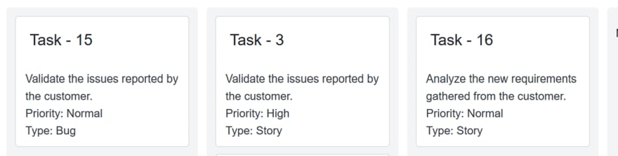
Card templates
We can customize each of the cards in the kanban board using the Template tag inside the KanbanCardSettings tag. To do so, place the required HTML or Blazor component within the Template tag to display it in the cards.
In the following code example, you can see how to configure templates for the cards in a kanban board.
<SfKanban TValue="KanbanModel" KeyField="Status">
…
    <KanbanCardSettings>
        <Template>
            @{
                KanbanModel card = (KanbanModel)context;
                <div class="e-card-header-title">@card.Title</div>
                <div class="e-card-content">
                    <span>@card.Summary</span><br>
                    <span>Priority: @card.Priority</span><br>
                    <span>Type: @card.Type</span>
                </div>
            }
        </Template>
    </KanbanCardSettings>
…
</SfKanban>
Tooltip templates
We have also added tooltip template support to the Kanban component in the 2020 Volume 4 release.
Stacked headers
Stacked headers are an additional header feature that helps you group kanban columns based on specific categories. To stack columns, you have to define the KanbanStackedHeader property with key fields inside the KanbanStackedHeaders tag. Map the key fields to render the header in a stacked manner.
For example, the task statuses in progress , code review , and testing can be grouped under the development phase by using the stacked header feature.
Refer to the following code example.
<SfKanban TValue="KanbanModel" KeyField="Status">
    <SfDataManager Json="Tasks"></SfDataManager>
    <KanbanColumns>
         @foreach (ColumnModel item in columnData)
            {
                 <KanbanColumn HeaderText="@item.HeaderText" KeyField="@item.KeyField"></KanbanColumn>
            }
    </KanbanColumns>
    <KanbanStackedHeaders>
            @foreach (StackedHeaderModel item in stackedHeaderData)
            {
                <KanbanStackedHeader Text="@item.Text" KeyFields="@item.KeyFields"></KanbanStackedHeader>
            }
        </KanbanStackedHeaders>
    <KanbanCardSettings HeaderField="Title" ContentField="Summary"></KanbanCardSettings>
</SfKanban>

@code {
    List<KanbanModel> Tasks = new KanbanModel().GetTaskDetails();
    private List<ColumnModel> columnData = new List<ColumnModel>() {
        new ColumnModel(){ HeaderText= "Open", KeyField= new List<string>() { "Open" } },
        new ColumnModel(){ HeaderText= "In Progress", KeyField= new List<string>() { "InProgress" } },
        new ColumnModel(){ HeaderText= "Testing", KeyField= new List<string>() { "Testing" } },
        new ColumnModel(){ HeaderText= "Done", KeyField= new List<string>() { "Close" } }
    };
     private List<StackedHeaderModel> stackedHeaderData = new List<StackedHeaderModel>() {
        new StackedHeaderModel(){ Text= "To Do", KeyFields= new List<string>() { "Open" } },
        new StackedHeaderModel(){ Text= "Development Phase", KeyFields= new List<string>() { "InProgress", "Testing" } },
        new StackedHeaderModel(){ Text= "Completed", KeyFields= new List<string>() { "Close" } }
    };
}

Performing CRUD operations
Use the Syncfusion Data Manager in the Kanban component to perform CRUD (create, read, update, and delete) operations. We can perform CRUD actions in the following ways:
Before defining a kanban board, you have to implement the data access layer to pass the data and handle the added, modified, and deleted cards.
Configure the adapter to the Data Manager to handle CRUD actions.
| Custom Adapter |
<SfKanban ID="Kanban" TValue="Order" KeyField="ShipCity">
<SfDataManager AdaptorInstance ="@typeof(CustomAdaptor)"  Adaptor = "Adaptors.CustomAdaptor"></SfDataManager>
…
</SfKanban>
|
| URL adapter |
<SfKanban ID="Kanban" TValue="Order" KeyField="ShipCity">
<SfDataManager Url="/api/Default" CrudUrl ="/api/Default/Batch" Adaptor="Adaptors.UrlAdaptor"></SfDataManager>
…
</SfKanban>
|
The added, changed, and deleted card details will get the corresponding argument of the Data Manager’s adapter. You can perform further processing based on it.
For example:
| Custom
Adapter
|
public override object BatchUpdate(DataManager dm, object Changed, object Added, object Deleted, string KeyField, string Key, int? dropIndex)
{
if (Changed != null)
{
foreach (var rec in (IEnumerable<Order>)Changed)
{
db.UpdateOrder(rec);
}
}
if (Added != null)
{
foreach (var rec in (IEnumerable<Order>)Added)
{
db.AddOrder((Order)rec);
}
}
if (Deleted != null)
{
foreach (var rec in (IEnumerable<Order>)Deleted)
{
db.DeleteOrder((Order)rec);
}
}
return new { };
}
|
| URL adapter |
[HttpPost]
[Route("api/Default/Batch")]
public void Batch([FromBody]CRUDModel<Order> value)
{
if (value.Changed.Count > 0)
{
foreach (Order rec in value.Changed)
{
db.UpdateOrder(rec);
}
}
if (value.Added.Count > 0)
{
foreach (Order rec in value.Added)
{
db.AddOrder(rec);
}
}
if (value.Deleted.Count > 0)
{
foreach (Order rec in value.Deleted)
{
db.DeleteOrder(rec);
}
}
}
|
Using built-in dialogs
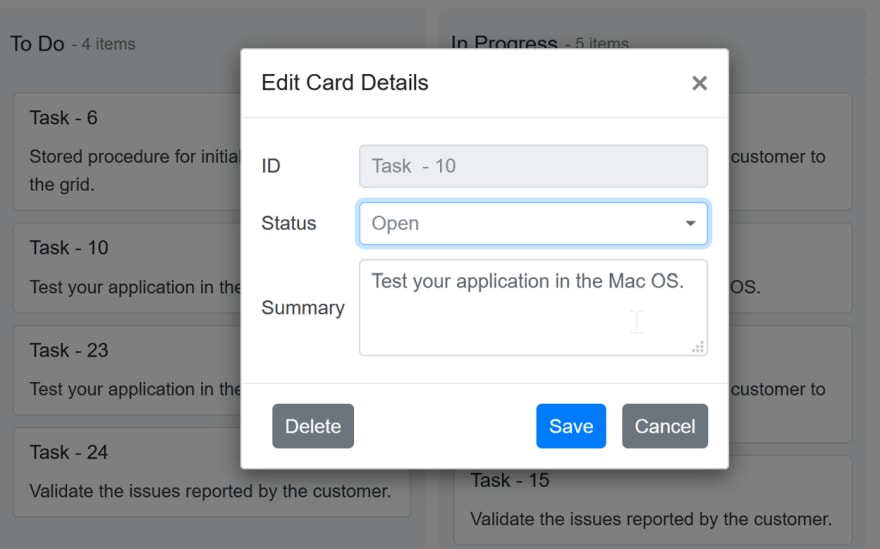
There are no additional settings needed to edit a card using the built-in dialog. However, if you want to show the Add card button in each column, use the AllowAdding property.
The default built-in dialog will open with the mapped details while adding or editing a card.
The default dialog contains the following three fields:
- Card Header
- Kanban Key
- Card Content
Refer to the following code example.
<SfKanban ID="Kanban" TValue="Order" KeyField="ShipCity">
…
    <KanbanColumns>
        <KanbanColumn HeaderText="Brazil" KeyField=@(new List<string>{"Brazil"}) AllowAdding=true></KanbanColumn>
…
    </KanbanColumns>
…
</SfKanban>
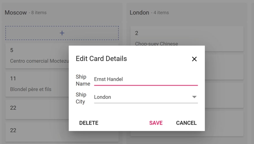
Dialog with custom fields
You can also include custom dialog fields in the editing dialog by including their rendering component type and text using the DialogSettingsFields tag. The following component types are available to configure:
- Text Box
- Drop-Down
- Numeric
- Text Area
Refer to the following code example.
<SfKanban ID="Kanban" TValue="Order" KeyField="ShipCity">
…
    <KanbanDialogSettings>
        <KanbanDialogSettingsFields>
            <KanbanDialogSettingsField Text="Ship City" Key="ShipCity" Type=DialogFieldType.DropDown></KanbanDialogSettingsField>
            <KanbanDialogSettingsField Text="Ship Name" Key="ShipName" Type=DialogFieldType.TextBox></KanbanDialogSettingsField>
            <KanbanDialogSettingsField Text="Employee ID" Key="EmployeeID" Type=DialogFieldType.TextBox></KanbanDialogSettingsField>
        </KanbanDialogSettingsFields>
    </KanbanDialogSettings>
…
</SfKanban>

Dialog template
You can design your own form to create or edit a card within the Template tag of the KanbanDialogSettings tag. You can also render HTML content or any other Blazor UI component inside the template.
Refer to the following code example.
<SfKanban ID="Kanban" TValue="Order" KeyField="ShipCity">
…
    <KanbanDialogSettings>
        <Template>
            @{

            }
        </Template>
    </KanbanDialogSettings>
…
</SfKanban>
GitHub reference
You can find working samples of the CRUD operations in the Kanban component at the following GitHub locations:
- URL adapter: https://github.com/SyncfusionExamples/blazor-kanban-crud-url-adaptor.git
- Custom adapter: https://github.com/SyncfusionExamples/blazor-kanban-crud-custom-adaptor.git
Also, you can download the complete source code of our Blazor Kanban features from the following GitHub link: https://github.com/SyncfusionExamples/blazor-kanban-board-features.git.
Other features
There are many other helpful features in our Blazor Kanban component, including:
- Themes: Material, Fabric, Bootstrap, Bootstrap 4, and high contrast.
- Mobile support: Adaptive for all mobile devices.
- Keyboard access: Access to all kanban board functionalities through the keyboard.
- Web accessibility: ARIA (accessible rich internet applications) support to meet accessibility standards.
- Localization: Localize all of the component’s static texts based on culture.
- Right-to-left (RTL) direction: Display the layout in a right-to-left direction.
- Tooltip: Display more useful information about a card.
- Drag-and-drop support: Drag and drop a card between swimlane rows.
- Selection: Select single or multiple cards.
Conclusion
We have included in the Syncfusion Blazor Kanban component support for most common requirements and have implemented them with modular architectures. In addition, we have included the following features in the recent 2020 Volume 4 release:
- Workflow Restrictions
- Tooltip Templates
We will be publishing detailed blogs regarding the new features soon. We look forward to you trying out the Kanban component and providing your feedback.
If you don’t have a license yet, you can try out the Kanban component’s features by downloading our free trial. You can also explore our online demos and documentation pages to learn more about our other Blazor controls.
You can contact us with questions or comments through our support forums, Direct-Trac, or feedback portal. We are always happy to assist you!


Top comments (0)