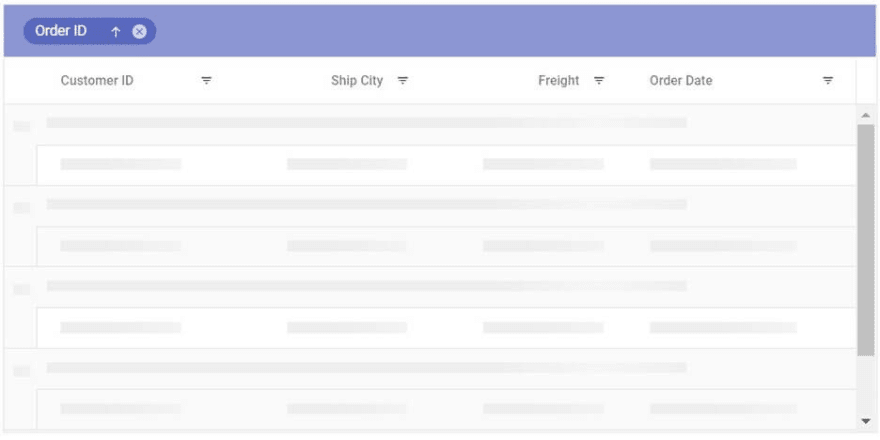
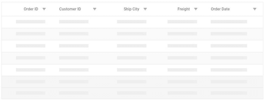
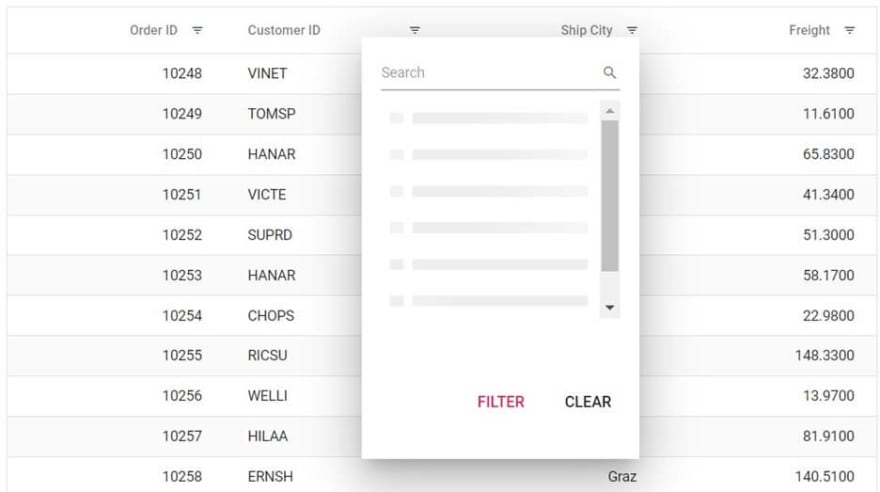
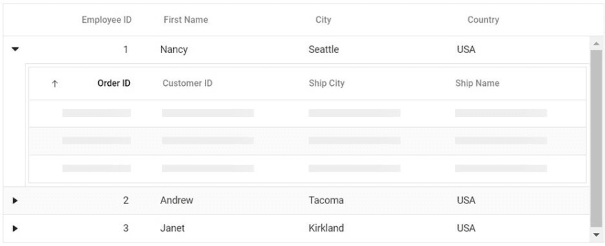
In modern UI design, most of us expect to show visual effects until the control is ready for user interaction. A skeleton effect shows a loading indicator in the shape of the content to be loaded in a control. In a grid, a skeleton effect would display rows and columns without any data.
From the 2022 Volume 3 release onward, Syncfusion’s Essential JS 2 DataGrid supports a skeleton loading indicator (shimmer effect) between fetching data from the server (or another service) and binding it to the grid during initial rendering, while refreshing, or after performing any grid actions like sorting, filtering, or grouping.
In this blog, we will see how to visualize the skeleton loading indicator for various features in our Essential JS 2 DataGrid.
Enable skeleton loading indicator in Syncfusion Essential JS 2 DataGrid
Syncfusion DataGrid supports both spinner and shimmer effects as loading indicators. In modern design, the shimmer effect is preferred over a spinner.
Both paginated and virtualization-enabled grids are used to visualize a huge volume of data without any performance degradation. Let’s see how to enable the shimmer effect for both paginated and virtualized grids in our Essential JS 2 DataGrid.
For paginated DataGrid
In a pagination-enabled DataGrid, we can enable the shimmer effect by setting the loadingIndicator property as Shimmer. The default value of loadingIndicator is Spinner. So, we have to define this property to use the shimmer effect.
This doesn’t mean that the shimmer effect will be shown for pagination alone. It can also be shown while performing other grid actions. The skeleton loading indicator will be shown to represent the grid content layout whenever the grid is waiting for content.
Refer to the following code example.
import { Grid, Page, Selection } from '@syncfusion/ej2-grids';
import { orderData } from './data-source'; // import your data source

Grid.Inject(Page);

let grid: Grid = new Grid(
{
  dataSource: orderData,
  allowPaging: true,
  loadingIndicator: { indicatorType: 'Shimmer' },
  columns: [
    { field: 'OrderID', headerText: 'Order ID', width: 120, textAlign: 'Right' },
    { field: 'CustomerID', headerText: 'Customer ID', width: 150 },
    { field: 'ShipCity', headerText: 'Ship City', width: 150 },
  ],
  pageSettings: { pageSize: 7 }
});
grid.appendTo('#Grid');
For virtualization-enabled DataGrid
In a virtualization-enabled DataGrid, instead of loading all the data, the data will load on demand while the user scrolls the DataGrid with the vertical scroll bar.
Syncfusion Essential JS 2 DataGrid allows you to show the skeleton shimmer effect while loading data on demand, and you can enable this feature by setting the enableVirtualMaskRow property value as true.
Refer to the following code example.
import { VirtualScroll, Grid, Edit, Toolbar } from '@syncfusion/ej2-grids';
import { orderData } from './data-source'; // import your data source

Grid.Inject(VirtualScroll);

let grid: Grid = new Grid(
{
  dataSource: orderData,
  enableVirtualization: true,
  height: 400,
  enableVirtualMaskRow:true,
  columns: [
    { field: 'OrderID', headerText: 'Order ID', width: 120, textAlign: 'Right' },
    { field: 'CustomerID', headerText: 'Customer ID', width: 150 },
    { field: 'ShipCity', headerText: 'Ship City', width: 150 },

  ],
});
grid.appendTo('#Grid');
Other DataGrid features with skeleton loading indicator
Let’s see the shimmer effect in other features of the Essential JS 2 DataGrid.
Single column grouping 
Multiple column grouping 
Group caption aggregate 
Footer aggregate 
Hierarchical DataGrid
Checkbox column 
Checkbox filtering 
References
For more details, refer to our Syncfusion Essential JS 2 DataGrid documentation and demos.
Conclusion
Thanks for reading! We hope you enjoyed this quick introduction to the skeleton loading indicator (shimmer effect) in our Essential JS 2 DataGrid in the 2022 Volume 3 release. Try out this great feature and provide your feedback in the comments section below.
Also, check out our Release Notes and What’s New pages to see all the new updates in this release.
You can also contact us through our support forums, support portal, or feedback portal. We are always happy to assist you!


Top comments (0)