The Syncfusion Angular Tree Grid is a feature-rich control used to visualize self-referential hierarchical (tree-like structure) data effectively in a tabular format. Its rich feature set includes many functionalities: data binding, editing, sorting, filtering, paging, aggregating rows, and exporting to Excel, CSV, and PDF formats. Though it has a vast set of built-in and custom features, sometimes one may need to customize Angular Tree Grid to match their requirement in several instances of their application.
At that point, the developer has to rewrite the customization code in every place of use in the application. This will be time-consuming and affect productivity.
One way to avoid this is by using reusable functions containing customizing codes. In other words, we can create a custom component that carries the customized Tree Grid inside it. Every customization is possible when using the Tree Grid inside a custom component. Thus, reworking can be avoided.
Let’s dive into the implementation of the custom component!
Component creation
I hope you have gone through the getting started with Angular Tree Grid documentation and Angular component overview and are familiar with this component’s basics.
Please follow these steps to create a custom reusable component from the Angular Tree Grid:
Step 1: First, let’s create the component file tree-component.ts. Pick a selector and inline template for the custom component. Then, provide them in the Angular Tree Grid component.
Refer to the following code example.
@Component({
    selector: 'custom-tree',
    template:
        `<ejs-treegrid #ejsTreeGrid [treeColumnIndex]='treeColumnIndex'
            [childMapping]='childMapping' [dataSource]="dataSource">
        </ejs-treegrid>`
})
Here, I have given custom-tree as the name for the custom component.
Step 2: The Tree Grid component needs values for some of its default properties to render a basic tree grid. So, inside the custom-tree component class, let’s define those input properties.
Refer to the following code example.
export class CustomTreeComponent {
    @Input() dataSource: { [key: string]: object }[] | object[];
    @Input() columns: ColumnModel[] | string[] | Column[];
    @Input() childMapping: string;
    @Input() treeColumnIndex: string;

    …
}
Step 3: To utilize this component, declare it in the app.module.ts file like in the following code.
@NgModule({
  declarations: [
    AppComponent, CustomTreeComponent
  ],
…
})
Step 4: Now, you can start using the custom-tree component in the application like our default Tree Grid component.
Refer to the following code.
//app.component.html file

<custom-tree #customTreeGrid childMapping='subtasks' [columns]='treeColumn' [treeColumnIndex]='1' [allowPaging]='true' [dataSource]='treeData' >
</custom-tree>
// app.component.ts file

@Component({
  selector: 'app-root',
  templateUrl: './app.component.html'
})
export class AppComponent {

  …

  ngOnInit(): void {
    this.treeData = sampleData;
    this.treeColumn =  [
      { field: 'taskID', headerText: 'Task ID', width: 70, textAlign: 'Right' },
      …
    ]
  }

}
Since we haven’t included any customization code, running this application would display the default Syncfusion Tree Grid. Let’s start the customization.
Tree Grid custom component with customizations
Step 1: Let’s add the queryCellInfo event to the custom-tree component.
Step 2: Then, add an event handler for the queryCellInfo event in the Tree Grid inside our new custom component.
Step 3: Emit the custom-tree event in the Tree Grid’s queryCellInfo event.
Refer to the following code example.
@Component({
    selector: 'custom-tree',
    template:
        `<ejs-treegrid #ejsTreeGrid
             …
            (queryCellInfo)="QueryCellInfo($event)"
            >
        </ejs-treegrid>`
})

export class CustomTreeComponent {

…
@Output() queryCellInfo = new EventEmitter();

…
QueryCellInfo(args: any) {
        if (args.column.index == 1) {
            args.cell.style.backgroundColor = 'cyan';
        }
        this.queryCellInfo.emit(args);
    }
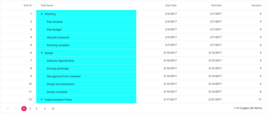
In the previous code example, the queryCellInfo event of the Tree Grid is triggered in the custom-tree component and we have done the CSS customizations to the Tree Grid’s columns.
This custom-tree component is nothing but a tree grid with CSS changes in the tree columns. If you have common CSS changes or any other common customization for Tree Grid in multiple places of your application, then you can use this custom component to have all the customization codes in one place.
Note: To utilize all the features of the Angular Tree Grid, we need to map all its properties, methods, and events to the newly created custom component.
Refer to the following screenshot in which the Task Name column background color is set to cyan.

Demo sample
For more information, you can refer the Angular Tree Grid customizing by creating reuasble components demo.
Conclusion
In this blog post, we have seen how to customize the Syncfusion Angular Tree Grid component by creating a reusable custom component from it. In this way, there is no need to write the custom codes again and again. This will definitely save us time and reduce our workload. Try out our Tree Grid component, which is highly customizable to adapt to any unique or complex requirement that your application needs. If you would like to try the TreeGrid component, you can download our free trial. You can check our Angular live demos and documentation for detailed explanations and the facts you need to proceed further.
Our Syncfusion Tree Grid control is available in our Blazor, ASP.NET (Core, MVC, Web Forms), JavaScript, React, Vue, UWP, WPF, and WinUI platforms. Try them out and leave your feedback in the comments section below.
You can also contact us through our support forum, Direct-Trac, or feedback portal. We are always happy to assist you!
If you liked this blog post, we think you’ll also like the following articles:


Top comments (0)