
An adaptive UI is an interactive user interface that adapts well to all kinds of devices we deploy in modern web app development. Not surprisingly, users of smaller devices such as phones and tablets are rapidly increasing year by year, so providing UIs that fit is becoming more important as well.
Fortunately, the Syncfusion Blazor DataGrid provides built-in responsiveness, but some of its features’ layouts don’t fit perfectly on smaller devices. You can easily resolve this issue using the interactive adaptive UI layout.
In this blog, we will see how to render and utilize the adaptive UI layout in the Blazor DataGrid to make it fit all kinds of devices.
Note: Before proceeding, refer to the Getting started with Blazor DataGrid documentation.
How to use the adaptive UI layout of Blazor DataGrid in your app
Sometimes, we might need to place the entire grid inside a parent element without affecting its height and width. To do so, define the Height and Width properties of DataGrid as 100% and enable the EnableAdaptiveUI property.
Refer to the following code example to enable adaptive UI layout in the Blazor DataGrid.
<div style="position:relative;width:600px;min-height: 400px;border:solid 1px red">
  <SfGrid DataSource="@Orders" AllowSorting="true" AllowFiltering="true" EnableAdaptiveUI="true" Height="100%" Width="100%" AllowPaging="true">
   <GridFilterSettings Type="@FilterType.Excel"></GridFilterSettings>
   <GridEditSettings AllowAdding="true" AllowEditing="true" AllowDeleting="true" Mode="EditMode.Dialog"></GridEditSettings>
    <GridColumns>
      <GridColumn Field=@nameof(Order.OrderID) HeaderText="Order ID" IsPrimaryKey="true" Width="80"></GridColumn>
      <GridColumn Field=@nameof(Order.CustomerID) HeaderText="Customer Name" Width="120"></GridColumn>
      <GridColumn Field=@nameof(Order.OrderDate) HeaderText=" Order Date" Format="d" Type="ColumnType.Date" Width="130"></GridColumn>
      <GridColumn Field=@nameof(Order.Freight) HeaderText="Freight" Format="C2" Width="120"></GridColumn>
    </GridColumns>
  </SfGrid>
</div>
Two different views/modes of adaptive UI layout
Most users expect to view the records in a data grid without having to scroll horizontally. This is the most difficult experience to provide on small screens.
We have resolved this using the RowRenderingMode feature in our Blazor DataGrid. There are two types of rendering modes:
Let’s look at them.
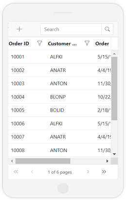
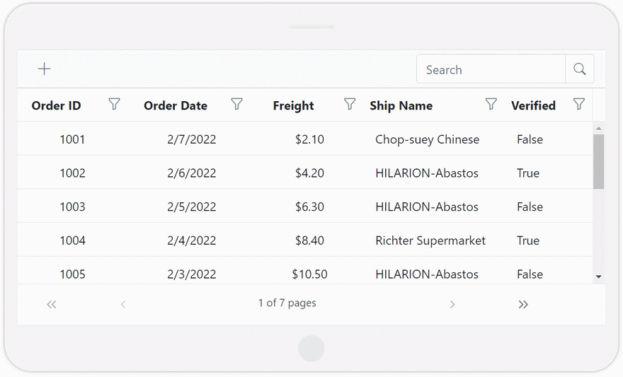
Horizontal rendering mode
The Blazor DataGrid rows are rendered horizontally by default. The following screenshot shows the adaptive UI layout of the Blazor DataGrid in the default horizontal view.
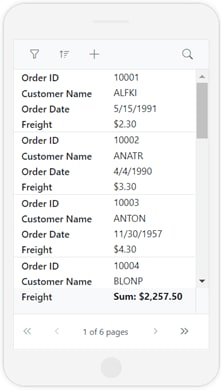
Vertical rendering mode
In the vertical mode, the rows are rendered vertically with headers positioned in the same row instead of at the top. This feature helps fit the grid on smaller screens, especially phones.
The following screenshot shows the adaptive UI layout of Blazor DataGrid in vertical mode.
Exclusive adaptive UI layouts for interactive features
The Blazor DataGrid can render adaptive dialogs such that they will fit the full screen to provide a better user experience on smaller screen devices. You can enjoy a full-screen adaptive UI layout for some DataGrid actions, such as filtering, sorting, and CRUD operations.
Toolbar
The toolbar items will look similar in both vertical and horizontal row rendering modes. However, filter and sort icons will be included in the toolbar items if the grid is rendered vertically. Icons for CRUD actions like edit, delete, save, and cancel will be dynamically added or removed on selecting or deselecting the row.

Note: For more details, refer to the Toolbar in Blazor DataGrid documentation.
Filtering
The Blazor DataGrid provides built-in support for filtering. This feature displays the records that meet an applied filtering criteria. You can filter data against one or multiple columns. For more details, refer to the Filtering in Blazor DataGrid documentation.
In the adaptive UI layout of Blazor DataGrid, you can render different UIs for filtering actions to achieve a better user experience.
Refer to the following GIF image.

Note: The same adaptive UI layout will be rendered in horizontal and vertical modes. However, in the horizontal mode, the filter icon will be rendered in the column’s header like in the horizontal toolbar appearance.
Sorting
You can sort the data in ascending and descending order using the Blazor DataGrid, and you can do so with an adaptive UI layout in the vertical rendering mode alone.
In the horizontal mode, you can sort the data by clicking the column’s headers. For more details, refer to Sorting in Blazor DataGrid documentation.
CRUD operations
The adaptive UI layouts also provide a great editing experience in the Blazor DataGrid. You can dynamically insert, update, and delete rows. For more details, refer to the Editing in Blazor DataGrid documentation.
The following editing modes are supported:
The vertical row rendering mode only supports the Dialog edit mode as shown in the following GIF image.

The adaptive UI layout supports these editing modes in tablets as well.
Show priority columns
In our Blazor DataGrid, you can easily hide columns based on the device width. This approach is useful when you don’t want to render the horizontal scroller for the DataGrid on a tablet. To do so, first, we have to mark the priority for individual columns.
This can be achieved by defining the media queries in the HideAtMedia Column property of the Blazor DataGrid. Then, the DataGrid will automatically show the columns based on their priority and the device width. For more details, check out the Responsive Columns in Blazor DataGrid documentation.
GitHub reference
For more details, refer to the adaptive UI layout in the Blazor DataGrid demo on GitHub.
Conclusion
Thanks for reading! In this blog, we have seen how to effectively render an adaptive UI layout for the Syncfusion Blazor DataGrid on smaller screens to provide a better user experience. We encourage you to go through our Blazor DataGrid demos and documentation for more details. Try out this marvelous feature and leave your feedback in the comments section below!
The Syncfusion DataGrid is also available for the ASP.NET (Core, MVC, WebForms), Angular, Blazor, JavaScript, React, Vue, Xamarin, Flutter, UWP, WinForms, WPF, and WinUI platforms.
If you aren’t a customer yet, you can try our 30-day free trial to check out the DataGrid and hundreds of other components.
You can also contact us through our support forum, support portal, or feedback portal. We are always happy to assist you!

Top comments (0)