
A picture is worth a thousand words; that’s where diagrams come in handy to explain and communicate complex information more effectively. When it comes to developing a diagramming application, the Syncfusion WPF Diagram control is the component of choice. The WPF Diagram (SfDiagram) control is powerful, extensible, and feature-rich library for creating, and editing interactive diagrams.
This blog explains how the WPF Diagram control enables you to develop a diagramming app, draw a software installation flowchart with the created app, and use the various settings and features available to customize your diagram.
Create a WPF application project
Follow the Microsoft documentation to create your first WPF application using Visual Studio 2019. Build and run the WPF app.
Add diagram canvas
After creating a blank WPF app, add the diagram canvas to begin building the diagrams. The Diagram control is a part of the Syncfusion.SfDiagram.WPF NuGet package. This installing NuGet packages guide will walk you through the installation procedure.
Now, add the SfDiagram control to your app by dragging it from the toolbox to the designer view or by adding the control manually using the XAML/C# code.
The following code example explains how to add the diagram canvas manually to your application.
<syncfusion:SfDiagram x:Name="diagramcontrol"
                              Margin="-1"
                              Grid.Column="1"
                              Grid.Row="1"
                              DefaultConnectorType="Line"
                              Constraints="Default,Undoable,AutomaticPortCreation"
                              Tool="MultipleSelect">
    <syncfusion:SfDiagram.Theme>
       <syncfusion:OfficeTheme/>
    </syncfusion:SfDiagram.Theme>
    <!--To change the scroll settings of diagram page -->
    <syncfusion:SfDiagram.ScrollSettings>
       <syncfusion:ScrollSettings ScrollLimit="Diagram"/>
    </syncfusion:SfDiagram.ScrollSettings>

    <!--To change the page settings values of diagram -->
    <syncfusion:SfDiagram.PageSettings>
       <syncfusion:PageSettings PageBorderBrush="White" PageBackground="White"/>
    </syncfusion:SfDiagram.PageSettings>

    <!--To change the snap settings values of diagram -->
    <syncfusion:SfDiagram.SnapSettings>
       <syncfusion:SnapSettings SnapConstraints="All" SnapToObject="All"/>
    </syncfusion:SfDiagram.SnapSettings>

    <syncfusion:SfDiagram.HorizontalRuler>
       <syncfusion:Ruler Orientation="Horizontal"/>
    </syncfusion:SfDiagram.HorizontalRuler>

    <syncfusion:SfDiagram.VerticalRuler>
       <syncfusion:Ruler Orientation="Vertical"/>
    </syncfusion:SfDiagram.VerticalRuler>

    <!--Initialize Node-->
    <syncfusion:SfDiagram.Nodes>
       <syncfusion:NodeCollection/>
    </syncfusion:SfDiagram.Nodes>

     <!--Initialize Connector-->
     <syncfusion:SfDiagram.Connectors>
       <syncfusion:ConnectorCollection/>
     </syncfusion:SfDiagram.Connectors>

     <!--Initialize Group-->
     <syncfusion:SfDiagram.Groups>
        <syncfusion:GroupCollection />
     </syncfusion:SfDiagram.Groups>
</syncfusion:SfDiagram>
Note: For more details, refer to the getting started with WPF Diagram control documentation.
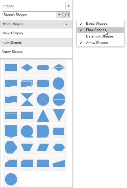
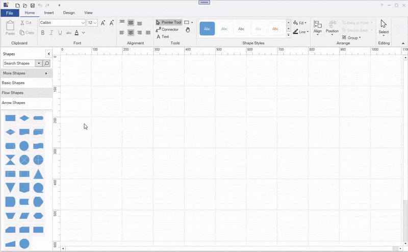
Add a gallery of reusable shapes
The WPF Diagram control provides a gallery of reusable symbols and diagram elements called Stencil. You can drag and drop the symbols and elements onto the diagram canvas any number of times.
Let’s see how to create a stencil using the available, built-in shapes. Diagram control provides a set of pre-defined categories of shapes. For example, the flowchart shape category includes all the shapes necessary to create a flowchart.
The following are the built-in shape categories available in the diagram resource dictionary:
- Basic shapes
- Flow shapes
- Arrow shapes
- Data flow shapes
- UML activity
- UML use case
- UML relationship
- Electrical shapes
You can load the built-in shape categories into the stencil by specifying the Keys and Title properties of the StencilCategory class.
- Keys – Specifies the static resource key name value of the category collection.
- Title – Specifies the title that should be displayed as a header for the category collection.
The following code explains how to create a stencil with flow shapes using the basic shapes, flow shapes_,_ data flow shapes, and arrow shapes categories.
<syncfusion:Stencil x:Name="stencil"
                            Width="230"
                            Margin="-1"
                            Grid.Column="0"
                            Grid.Row="1"
                            ShowDisplayModeToggleButton="True"
                            ShowSearchTextBox="True"
                            SymbolFilterDisplayMode="List"
                            Title="Shapes"
                            DataContext="{StaticResource FlowdiagramVM}"
                            SymbolFilters="{Binding Symbolfilters}"
                            SelectedFilter="{Binding Selectedfilter}"
                            ExpandMode="OneOrMore">
  <syncfusion:Stencil.Categories>
     <syncfusion:StencilCategoryCollection>
         <!--Specify the basic shapes category with title and resource key-->
         <syncfusion:StencilCategory Title="Basic Shapes" Keys="{StaticResource BasicShapes}"/>
         <syncfusion:StencilCategory Title="Flow Shapes" Keys="{StaticResource FlowShapes}"/>
         <syncfusion:StencilCategory Title="DataFlow Shapes" Keys="{StaticResource DataFlowShapes}"/>
         <syncfusion:StencilCategory Title="Arrow Shapes" Keys="{StaticResource ArrowShapes}"/>
      </syncfusion:StencilCategoryCollection>
   </syncfusion:Stencil.Categories>
   <syncfusion:Stencil.SymbolGroups>
      <syncfusion:SymbolGroups>
         <!--Separate groups based on the key-->
         <syncfusion:SymbolGroupProvider MappingName="Key"/>
      </syncfusion:SymbolGroups>
   </syncfusion:Stencil.SymbolGroups>
</syncfusion:Stencil>
Note: Refer to the stencil documentation to add custom shapes and shape categories and customize the stencil appearance.
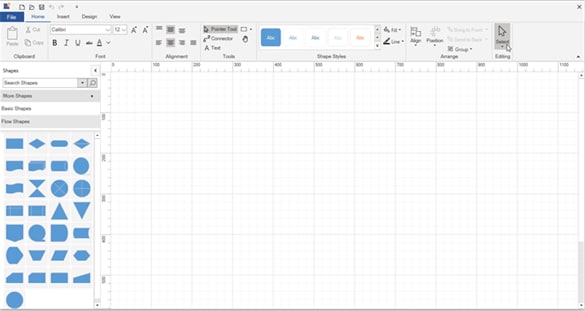
Add ready-to-use ribbon
The WPF Diagram ribbon control provides UI elements that allow the end-users to load and save diagrams, add diagram items to the canvas, format text within the diagram items, rearrange and re-color shapes, change the canvas size and orientation, and perform clipboard operations.
You can add the SfDiagramRibbon control to the app by dragging it from the toolbox to the designer view or by adding the control manually using XAML/C# code.
The following code explains how to add the ready-to-use diagram ribbon to your application.
<syncfusion:SfDiagramRibbon DataContext="{Binding ElementName=diagramcontrol}" Grid.Row="0" Grid.Column="0" Grid.ColumnSpan="2"/>
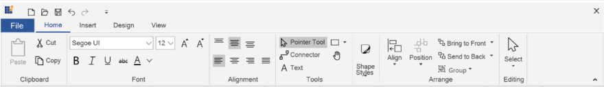
Note: Refer to the Diagram ribbon documentation for more details on how to add a diagram ribbon in your app and various settings and features available to customize it.
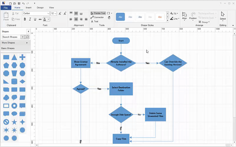
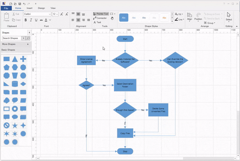
How to draw a simple diagram
Now, we have successfully created our diagramming application. Let’s draw our first diagram. You can easily draw a diagram by dragging and dropping the shapes from the stencil, arranging them on the canvas, and connecting them.
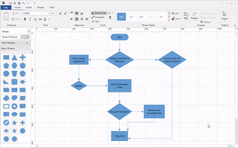
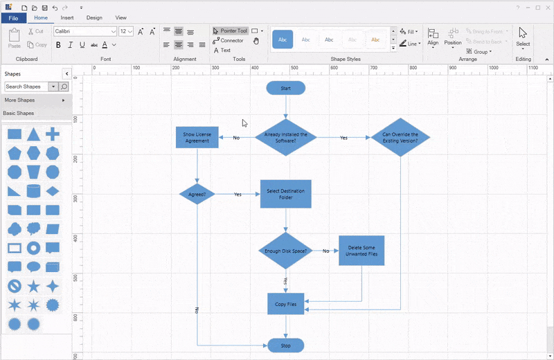
Our first diagram is going to describe the workflow for the software installation on a Windows OS machine.

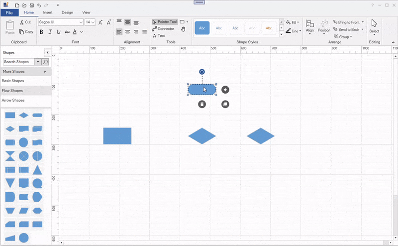
Step 1: Add flow shapes to the canvas
Start by dragging the shapes you need onto the diagramming canvas from the flow shapes category in the stencil. Arrange them in an order that clearly explains where the process starts and how the various processes are linked. People who read the diagram should be able to see where to start, and how to follow the connections.
Refer to the following .gif image.
Step 2: Add text to shapes
Add text to the flow shapes, by double-clicking the shape or by selecting the shape and pressing the F2 key. Once you have done typing, press the Esc key to accept the string and exit text editing. You can add text to the connectors, too.
You can format the text using the font ribbon bar. It has bold, italic, underline, and strikethrough font styles, as well as options to change the font family, size, and text color.
Step 3: Connecting shapes
Each diagram shape has a Draw quick command visible when the shape is selected. This quick command helps us to create a connection from the shape by clicking and dragging the connector and dropping it on another shape.

Note: Refer to the quick command documentation for more details on how to add or remove defaults, and customize quick commands in your app and customize their appearance.
You can also create connectors by selecting the Connector Tool  from the Tools ribbon bar. Click a shape and drag a connector to another shape. When you are done, click the Pointer Tool
  from the ribbon to select the shapes.

Note: For more information, refer to the tools documentation regarding the supported diagram tools.
Step 4: Customizing connection line style
The WPF Diagram control provides five different types of connection lines:
- Line
- Orthogonal
- Cubic Bezier
- Quadric Bezier
- Ploy line
You can change the connector type by selecting it and using the Connectors ribbon bar from the Design tab. The default type is the orthogonal connector.
Note: For more information, refer to the Connector types in WPF Diagram control documentation.
Step 5: Resize, rotate and move shapes
To change the size of the dropped shape, simply click on the shape to select it and move the cursor to any side of the resize handles. Then, click the resize handle and drag to the desired location in the diagram canvas.
You can rotate the shapes to any angle. To do so, select the shape and use the rotate handle on top of it, and rotate it in either clockwise or counterclockwise direction. You can also do this using the Position > Rotate Clockwise/ Rotate- CounterClockwise options from the Arrange ribbon bar of the Home tab.

Change the position of the dropped shape by selecting the shape, holding down the mouse key, and then dragging the shape to its new location.
You can also select more than one shape and move all of them at the same time.
When you move a shape, the connection lines will be glued to the shape automatically. So, you do not have to reattach them.
Note: If you hold down the Shift key while trying to move a selected shape, you are restricted to moving in the horizontal or vertical planes. Holding down the shift key will also prevent the shape from skewing out in the other direction.
Before you move or resize a shape, make sure that the Snap to Grid, and Snap to Objects check boxes are checked in the View tab. Turning on these two guides will give us some nice visual hints.
 In the previous .gif image, you would have noticed two things as the shape labeled Can Override the Existing Version? is moved:
-
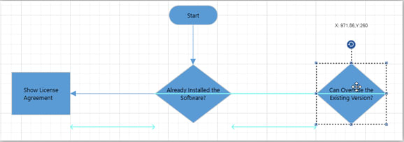 First, a thin blue line going through Already Installed the Software? and Can Override the Existing Version? shapes. This is a visual cue that the two shapes are aligned vertically centered to each other.
 - Secondly, between the shapes, we see some distance indicators. This is a visual cue that the distance between shape numbers 1 and 2 is equal to the distance between shape numbers 2 and 3.
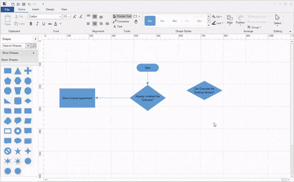
Similarly, you will notice two things when you resize the Can Override the Existing Version? shape in the bottom-right direction:
-
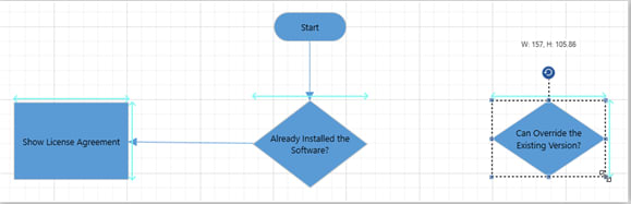 First, is the thin blue line on the top and right side of the Show License Agreement and Can Override the Existing Version? shapes. This is a visual cue that indicates that the height and width of the two shapes are equal.
 - Second, a visual cue on the top of the *Already Installed the Software? * shape indicates that the width of both the *Already Installed the Software? * and *Can Override the Existing Version? * shapes are equal.
Note: Refer to the snapping documentation for more details about snapping and other behaviors related to shape interaction.
Step 6: Apply styles to your diagram
You can customize the appearance of shapes by changing their text colors, font, fill colors, line weight, and style. By default, the Diagram control applies an Office theme style to all the shapes and connectors. You can apply your own style or predefined styles to the shapes and connectors using the Shape Styles ribbon bar.
The Shape Styles ribbon bar contains a gallery of predefined shapes and connector styles. You can choose a style that suits your diagram. If the predefined styles do not suit your diagram, then you can individually customize the shape or connector fill color, line color, line style, and line weight by clicking the Fill and Line options and selecting the formatting style you want.
Step 7: Loading and saving diagram
You can save your current work and resume it later by loading the saved diagram back to the diagram canvas. For that, select the save icon  from the quick access toolbar or the File > Save menu command to save your current diagram in XAML format to the local drive.
Use the Open icon  or File > Open menu command to load a saved diagram XAML file from your local drive.
Note: For more information, refer to the load and save documentation pages.
Step 8: Exporting the diagram
You can export a diagram to PDF format or an image format (JPEG, PNG, BMP, TIF, GIF, and more) by selecting the File > Export menu command.

Note: Refer to the exporting documentation for more details on how to configure diagram exporting functionality in your application.
Step 9: Printing the diagram
Print a diagram directly by selecting the File > Print menu command.
The following screenshot shows the Print Diagram dialog box along with the custom print options.

Note: Refer to the printing documentation for more details on how to configure diagram printing functionality in your application.
Pan and zoom
The WPF Diagram control provides support to pan and zoom the diagram in different ways.
Pan and zoom by using the keyboard
- Hold down the Ctrl ** and **Shift keys. The pointer will turn into a magnifying glass.
- Try the following techniques:
- Click the left mouse button to enlarge the view.
- Click the right mouse button to reduce the view.
- Click and drag the left mouse button over a rectangular region you want to zoom into.
- Right-click and drag to pan the diagram.
Pan and zoom by using the scroll wheel
Do any of the following:
- To scroll up or down, rotate the scroll wheel forward or backward.
- To scroll left or right, hold down *Shift * as you rotate the scroll wheel forward or backward.
- To zoom in or out, hold down *Ctrl * as you rotate the scroll wheel forward or backward.
Pan and zoom by using Overview control
While working on a complex diagram, you may not know on which part you are actually working and navigating from one part to another might be difficult. In that case, for navigation, you have to zoom out to find where you are. This solution is not helpful when you need frequent navigation.
The Overview control solves this problem by displaying a preview (overall view) of the entire diagram with options to pan and zoom. You can open the overview control from the View tab in the Show group. Click on the Task Panes , and then click the *Pan & Zoom * option.
Do any of the following for zoom and pan:
- In the Pan & Zoom window , if you do not see a red box, drag to create a red box. The red box indicates the region of the page that is shown in the drawing window.
- Resize the red box by dragging a side until it fits the area that you want to magnify.
- To view other sections of the diagram (to pan), click inside the red box and drag it over the section you want to view.
Zoom using the zoom controls
The zoom controls are in the Zoom ribbon bar of the View tab. Click the Zoom Out and Zoom In buttons to change the zoom level of the diagram. You can make the entire diagram fit into the current view by clicking the Fit to Window button.
Pan by using the pan tool
You can pan the diagram by selecting the Pan tool  from the Tools ribbon bar of the Home tab. Then, click and drag the mouse to pan the diagram.
Canvas configuration
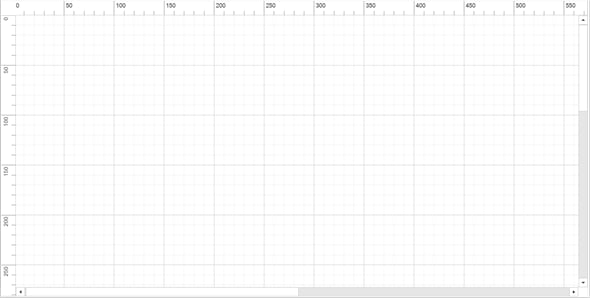
Rulers and Gridlines
The Ruler provides a horizontal and vertical guide for measuring in the Diagram control. You can use the ruler to measure the diagram objects, indicate positions, and align diagram elements. This is especially useful in creating scale models. You can also set the unit of measurements, such as centimeters or inches.
Gridlines are crisscrossed lines drawn on the diagram page like the lines on a traditional graph sheet. It helps us to position the diagram elements on the diagram page.
You can turn the visibility of rulers and gridlines on or off from the Show ribbon bar in the View tab.
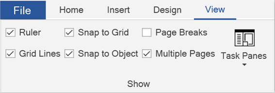
Note: Refer to the Ruler and Gridlines documentation for more details about these features.
Page settings
By default, the diagram canvas page size is A4. You can customize the page size and orientation of the diagram canvas using the Orientation and Page Size options in the Design tab.
Note: For more information, refer to the Page settings documentation.
Resources
You can also download the WPF diagramming application demos from this GitHub location.
Conclusion
In this blog post, we have seen how to develop a diagramming app and draw a software installation flowchart using our Syncfusion WPF Diagram control. You can create your own diagram creation application, like an organization chart creator, a flow chart creator, a network diagram, or a logic circuit diagram, using the Diagram control. It supports more rich, interactive features than just those demonstrated here, like automatic layouts, and data binding from different data sources. To explore features in more depth, refer to our WPF Diagram documentation.
If you’re already a Syncfusion user, you can download the product setup from our website. Otherwise, you can download a free, 30-day trial here.
If you have any questions, please let us know in the comments section below. You can also contact us through our support forums, Direct-Trac, or feedback portal. We are always happy to assist you!

Top comments (0)