
“Never depend on a single income. Make investment to create a second source”
– Warren Buffet
Today, people are more likely to be investing their money in securities like stocks, mutual funds, and bonds. There are several systematic investment planning (SIP) applications available. They all have an attractive UI to estimate an investment plan for us.
To build any investment planning app, we need sliders to interact with, a radial gauge to show the output, and some text box controls.
Our Syncfusion .NET MAUI Slider and Radial Gauge are highly customizable data visualization controls providing a rich set of features.
Let’s smartly design a SIP calculator with these controls!
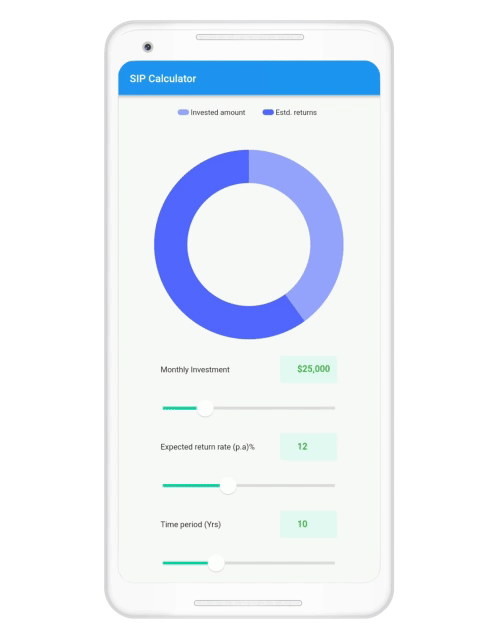
The following is the UI we want to achieve in this article.

Note: If you are new to our Syncfusion .NET MAUI platform, please refer to the Slider and Radial Gauge documentation before proceeding.
Create a SIP calculator in .NET MAUI
Follow these steps to create a SIP calculator app in .NET MAUI.
Install and configure the .NET MAUI controls.
- First, create a simple .NET MAUI project.
- Then, add the latest Syncfusion .NET MAUI Sliders package to the project.
Install-Package Syncfusion.Maui.Sliders
- Now, add the latest Syncfusion .NET MAUI Gauges package to the project.
Install-Package Syncfusion.Maui.Gauges
Add and initialize the .NET MAUI Slider.
Let’s create a slider to show the initial investment details, along with a text field to display the selected value. ** **

Default Slider
Refer to the following code to add a default slider to your app.
<ContentPage xmlns="http://schemas.microsoft.com/dotnet/2021/maui"
             xmlns:x="http://schemas.microsoft.com/winfx/2009/xaml"
             xmlns:sliders="clr-namespace:Syncfusion.Maui.Sliders;assembly=Syncfusion.Maui.Sliders">

<ContentPage.Content>
    <sliders:SfSlider Value="0.5" />
</ContentPage.Content>

Customize the sider appearance
You can customize the Syncfusion .NET MAUI Slider control as you wish. For this app, we’ll customize the size and color of the Slider. We’ll also define the minimum and maximum values for the investment options.
Refer to the following code.
<sliders:SfSlider x:Name="InvestSlider"
                    Minimum="500"
                    Maximum="100000"
                    Value="{Binding MonthlyInvestment}"
                    Grid.Row="1">

  <sliders:SfSlider.TrackStyle>
     <sliders:SliderTrackStyle ActiveFill="#00d09c"
                               InactiveFill="#ecedef"
                               ActiveSize="5"
                               InactiveSize="5" />
  </sliders:SfSlider.TrackStyle>

  <sliders:SfSlider.ThumbStyle>
    <sliders:SliderThumbStyle Fill="White"
                              Radius="15"
                              Stroke="Grey"
                              StrokeThickness=".5" />
  </sliders:SfSlider.ThumbStyle>

  <sliders:SfSlider.ThumbOverlayStyle>
    <sliders:SliderThumbOverlayStyle Radius="15" />
  </sliders:SfSlider.ThumbOverlayStyle>
</sliders:SfSlider>
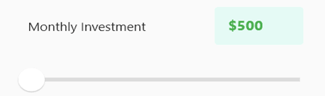
Now, the UI will look like the following image.

Add the Slider value to the text field
Now, add the Slider values to the text field like in the following code example.
<Grid ColumnDefinitions="*,*"
      Grid.Row="0">

  <Label Text="Monthly Investment"
         TextColor="Black"
         Grid.Column="0"
         Padding="25,30,0,0" />

  <Entry WidthRequest="100"
         HeightRequest="30"
         Grid.Column="1"
         HorizontalOptions="End"
         VerticalOptions="End"
         Placeholder="10000"
         IsEnabled="False"
         TextColor="Green"
         Text="{Binding Value, Source={x:Reference InvestSlider},StringFormat='$ {0:0}'}"
         BackgroundColor="#e5faf5" />
</Grid>
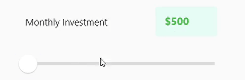
Refer to the following output image.
Once the UI is set up, add the value changes to the text field. To do so, bind the slider value to the label.
Refer to the following code example.
<Grid ColumnDefinitions="*,*"
      Grid.Row="0">

  <Label Text="Monthly Investment"
         TextColor="Black"
         Grid.Column="0"
         Padding="25,30,0,0" />

  <Entry WidthRequest="100"
         HeightRequest="30"
         Grid.Column="1"
         HorizontalOptions="End"
         VerticalOptions="End"
         Placeholder="10000"
         IsEnabled="False"
         TextColor="Green"
         Text="{Binding Value, Source={x:Reference InvestSlider},StringFormat='$ {0:0}'}"
         BackgroundColor="#e5faf5" />

</Grid>

<sliders:SfSlider x:Name="InvestSlider"
                      Minimum="500"
                      Maximum="100000"
                      Value="{Binding MonthlyInvestment}"
                      Grid.Row="1">

  <sliders:SfSlider.TrackStyle>
    <sliders:SliderTrackStyle ActiveFill="#00d09c"
                              InactiveFill="#ecedef"
                              ActiveSize="5"
                              InactiveSize="5" />
  </sliders:SfSlider.TrackStyle>

  <sliders:SfSlider.ThumbStyle>
    <sliders:SliderThumbStyle Fill="White"
                              Radius="15"
                              Stroke="Grey"
                              StrokeThickness=".5" />
  </sliders:SfSlider.ThumbStyle>

  <sliders:SfSlider.ThumbOverlayStyle>
    <sliders:SliderThumbOverlayStyle Radius="15" />
  </sliders:SfSlider.ThumbOverlayStyle>
</sliders:SfSlider>
Create other sliders
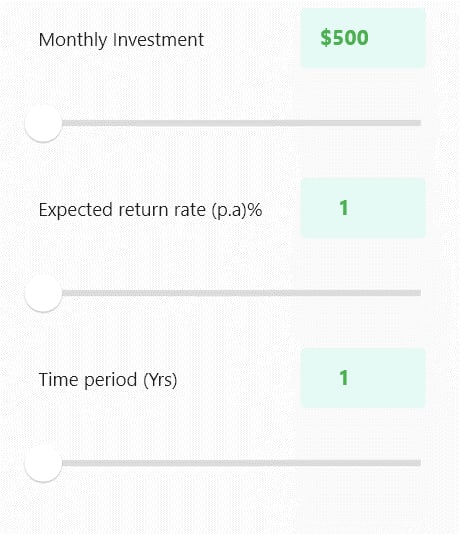
For our app, we’ll add two more slider controls for the expected return rate and time period. Repeat the previous steps to design these sliders.
Once we have added all the sliders to our project, the UI will look like the following image.
Add the .NET MAUI Radial Gauge to show the results
Then, create the .NET MAUI Radial Gauge to show the Sliders’ values in it.
Refer to the following code example.
<gauge:SfRadialGauge Grid.Row="1">
  <gauge:SfRadialGauge.Axes>
     <gauge:RadialAxis Minimum="1"
                       Maximum="30"
                       Interval="1"
                       Margin="20,10,0,0"
                       StartAngle="270"
                       EndAngle="270"
                       RadiusFactor=".9"
                       ShowLabels="False"
                       ShowTicks="False">

          <gauge:RadialAxis.AxisLineStyle>
             <gauge:RadialLineStyle ThicknessUnit="Pixel"
                                    Thickness="50" />
          </gauge:RadialAxis.AxisLineStyle>

          <gauge:RadialAxis.Ranges>
            <gauge:RadialRange StartValue="0"
                               EndValue="30"
                               StartWidth="50"
                               EndWidth="50"
                               Fill="#98a4ff" />

            <gauge:RadialRange StartValue="0"
                               EndValue="17"
                               StartWidth="50"
                               EndWidth="50"
                               Fill="#98a4ff" />

            <gauge:RadialRange StartValue="{Binding ExpectedReturnRate}"
                               EndValue="30"
                               StartWidth="50"
                               EndWidth="50"
                               Fill="#5367ff" />
         </gauge:RadialAxis.Ranges>
      </gauge:RadialAxis>
  </gauge:SfRadialGauge.Axes>

</gauge:SfRadialGauge>
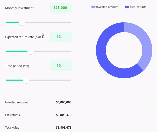
Executing this code example will render the UI like in the following GIF image.

Adding labels
Now, create labels to spell out the results from our data visualization control.
This is just a business logic that involves simple calculations. For more details, refer to the .NET MAUI SIP calculator demo on GitHub.
Once done, the desktop UI will look like the following GIF image.
The mobile layout will look like the following GIF image.
Conclusion
Thanks for reading! This app has a lot of room to improve in the UI and functionalities. Still, this is a good start. I hope this blog was useful and you enjoyed creating an investment calculator app in .NET MAUI.
We have used only the Syncfusion .NET MAUI Sliders and Radial Gauge controls for this app. There are more controls to check out. You can go through the complete .NET MAUI user guide for detailed explanations.
For questions, you can contact us through our support forums, support portal, or feedback portal. We are always happy to assist you!

Top comments (0)