
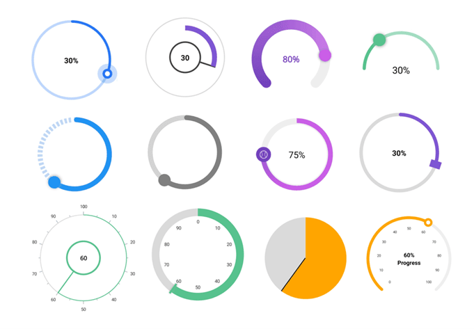
A radial slider (also known as a round slider or circular slider) is used to select a single value from a range of values on a circular scale. We can select the desired value by interacting with the thumb on the slider.
The Syncfusion .NET MAUI Radial Gauge is a multi-purpose data visualization control that displays numerical values on a circular scale. It has a rich set of features such as axes, ranges, pointers, and annotations that are fully customizable and extendable. You can also use it to create various styles of radial sliders by customizing their appearance.
In this article, we will look at how to utilize the .NET MAUI Radial Gauge control to design different styles of radial sliders.
Note: Refer to the Getting Started with .NET MAUI Radial Gauge documentation to know how to integrate a basic radial gauge into your .NET MAUI app before going through the various customization options.
Create different styles of radial slider
We can easily customize the .NET MAUI Radial Gauge to become a radial slider by enabling dragging support for the pointer element. Also, we can customize the axis line, range pointer, and shape pointer in the Radial Gauge to enrich the appearance of the track and thumb in the slider.
Let’s see how to design a radial slider with the following styles using the .NET MAUI Radial Gauge:
- Basic radial slider.
- Varying angle radial tracks.
- Gradient track.
- Continuous and segmented tracks.
- Different and customized thumbs.
- Analog appearance.
- Pie-shaped radial slider.
- Discrete value support.
To achieve all of these styles, we need to customize the Radial Gauge’s axis line, pointers, and annotations features.
Basic radial slider
To create a basic radial slider, we need to disable the labels and ticks in the RadialAxis class. Then, set the axis range values in the Minimum and Maximum properties based on your design needs.
To show a range of 100 percent on the radial slider, define the axis’s minimum property value as 0 and maximum property value as 100 like in the following code example.
<gauge:SfRadialGauge>
 <gauge:SfRadialGauge.Axes>
  <gauge:RadialAxis ShowTicks="False"
                    ShowLabels="False"
                    Minimum="0"
                    Maximum="100">
  </gauge:RadialAxis>
 </gauge:SfRadialGauge.Axes>
</gauge:SfRadialGauge>
You can customize the axis line and range pointer to serve as an active track and the shape pointer to serve as the thumb element in the radial slider. Also, you can add annotations to show the value progress in the slider.
Refer to the following code example to create a basic radial slider.
<gauge:SfRadialGauge>
 <gauge:SfRadialGauge.Axes>
  <gauge:RadialAxis ShowTicks="False"
                    ShowLabels="False"
                    Minimum="0"
                    Maximum="100">

   <gauge:RadialAxis.AxisLineStyle>
    <gauge:RadialLineStyle Fill="#BFD6F5"
                           Thickness="8"/>
   </gauge:RadialAxis.AxisLineStyle>

   <gauge:RadialAxis.Pointers>
    <gauge:RangePointer Value="{Binding Source={x:Reference markerPointer}, Path=Value}"
                        CornerStyle="BothCurve"
                        Fill="#2194f3"
                        PointerWidth="8"/>
    <gauge:ShapePointer x:Name="markerPointer" ShapeType="Circle"
                          HasShadow="True"
                          Value="70"
                          IsInteractive="True"
                         ShapeHeight="30"
                         ShapeWidth="30"
                         Fill="#2194f3"/>
   </gauge:RadialAxis.Pointers>

   <gauge:RadialAxis.Annotations>
    <gauge:GaugeAnnotation>
     <gauge:GaugeAnnotation.Content>
       <Label Text="70%"/>
     </gauge:GaugeAnnotation.Content>
    </gauge:GaugeAnnotation>
   </gauge:RadialAxis.Annotations>
  </gauge:RadialAxis>
 </gauge:SfRadialGauge.Axes>
</gauge:SfRadialGauge>
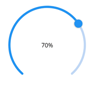
That’s it. We have now created a simple radial slider using the .NET MAUI Radial Gauge.
Let’s see how to apply different styles to it!
Radial slider with varying angle tracks
The radial slider track can be a complete circle, semicircle, or a quarter circle. We can use the StartAngle and EndAngle properties of the axis to customize the slider track angle in various styles.
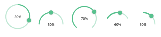
Refer to the following code example to see how to customize the slider track angle.
<gauge:SfRadialGauge>
 <gauge:SfRadialGauge.Axes>
  <gauge:RadialAxis StartAngle="180" EndAngle="360"
                    ShowTicks="False" ShowLabels="False">

   <gauge:RadialAxis.AxisLineStyle>
    <gauge:RadialLineStyle Fill="#5f58c28f" Thickness="5"/>
   </gauge:RadialAxis.AxisLineStyle>

   <gauge:RadialAxis.Pointers>
    <gauge:RangePointer Value="{Binding Source={x:Reference markerPointer}, Path=Value}"
                        CornerStyle="BothCurve" Fill="#58c28f" PointerWidth="5"/>
    <gauge:ShapePointer x:Name="markerPointer" ShapeType="Circle"
                          HasShadow="True" Value="50" IsInteractive="True"
                          ShapeHeight="20" ShapeWidth="20" Fill="#58c28f"/>
   </gauge:RadialAxis.Pointers>

  </gauge:RadialAxis>
 </gauge:SfRadialGauge.Axes>
</gauge:SfRadialGauge>
Radial sliders with gradient tracks
Instead of using a solid color for the slider’s active track, we can use gradient colors to fill it.
Assume we’re creating a musical app in which sliders are used to control the equalization settings. Colors can be used to indicate which genre of music best fits the current equalizer setting, such as yellow for classical, purple for jazz, red for rock, cyan for pop, and so on. So, we can fill the slider with gradient colors based on the style of music that suits the current setting.
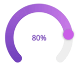
Refer to the following code example to see how to apply gradient tracks to the radial slider.
<gauge:SfRadialGauge HeightRequest="200" WidthRequest="200">
 <gauge:SfRadialGauge.Axes>
  <gauge:RadialAxis ShowTicks="False" ShowLabels="False">
   <gauge:RadialAxis.AxisLineStyle>
    <gauge:RadialLineStyle Thickness="20" CornerStyle="BothCurve"/>
   </gauge:RadialAxis.AxisLineStyle>
   <gauge:RadialAxis.Pointers>
    <gauge:RangePointer Value="{Binding Source={x:Reference markerPointer3}, Path=Value}"
                        PointerWidth="20" CornerStyle="BothCurve" >
     <gauge:RangePointer.GradientStops>
       <gauge:GaugeGradientStop Value="0"
                                Color="#7343bd" />
       <gauge:GaugeGradientStop Value="100"
                                Color="#dc88f2" />
    </gauge:RangePointer.GradientStops>
   </gauge:RangePointer>
   <gauge:ShapePointer x:Name="markerPointer3" ShapeType="Circle"
                         HasShadow="True" Value="80" IsInteractive="True"
                         ShapeHeight="25" ShapeWidth="25" Fill="#ca5ee6"/>
   </gauge:RadialAxis.Pointers>
  </gauge:RadialAxis>
 </gauge:SfRadialGauge.Axes>
</gauge:SfRadialGauge>
Radial sliders with continuous and segmented tracks
We can modify the range pointer and axis line colors to show the different states of a slider, such as enabled and disabled.
Also, you can customize the axis line to be dashed lines to show a segmented track in the slider.
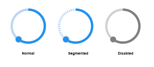
Refer to the following code example to segment the slider track.
<gauge:SfRadialGauge HeightRequest="150" WidthRequest="150" >
 <gauge:SfRadialGauge.Axes>
  <gauge:RadialAxis StartAngle="270" EndAngle="270"
                    ShowTicks="False" ShowLabels="False">
   <gauge:RadialAxis.AxisLineStyle>
    <gauge:RadialLineStyle Fill="#BFD6F5" DashArray="4,3" Thickness="8"/>
   </gauge:RadialAxis.AxisLineStyle>

   <gauge:RadialAxis.Pointers>
    <gauge:RangePointer Value="{Binding Source={x:Reference markerPointer4}, Path=Value}"
                        CornerStyle="BothCurve" Fill="#2194f3"
                        PointerWidth="8"/>
    <gauge:ShapePointer x:Name="markerPointer4" ShapeType="Circle"
                          HasShadow="True" Value="60" IsInteractive="True"
                          ShapeHeight="20" ShapeWidth="20" Fill="#2194f3"/>
   </gauge:RadialAxis.Pointers>
  </gauge:RadialAxis>
 </gauge:SfRadialGauge.Axes>
</gauge:SfRadialGauge>
Radial slider with customized thumbs
The shape pointer can be set to depict different shapes for the thumb of a slider. We can use built-in shapes such as circles, rectangles, diamonds, and triangles. To add more shapes, images, or any other content to the thumb, we can use a content pointer as a thumb and load content on it.
Consider a car dashboard app where we need different sliders to indicate and control the volume of music and the level of cooling from the air conditioner. To represent each functionality, we can use different images or shapes for thumbs.
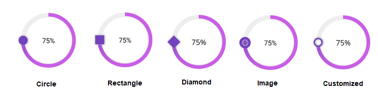
Refer to the following code example to customize the slider thumb to depict an image.
<gauge:SfRadialGauge>
 <gauge:SfRadialGauge.Axes>
  <gauge:RadialAxis StartAngle="270" EndAngle="270"
                    ShowTicks="False" ShowLabels="False">

   <gauge:RadialAxis.Pointers>
    <gauge:RangePointer Value="{Binding Source={x:Reference thumpMarkerPointer}, Path=Value}"
                        PointerWidth="8">
      <gauge:RangePointer.GradientStops>
        <gauge:GaugeGradientStop Value="50"
                                 Color="#ca5ee6" />
        <gauge:GaugeGradientStop Value="100"
                                 Color="#7343bd" />
      </gauge:RangePointer.GradientStops>
    </gauge:RangePointer>
    <gauge:ShapePointer x:Name="thumpMarkerPointer" ShapeType="Circle"
                          Value="75" OverlayRadius="0"
                          IsInteractive="True" ShapeHeight="25" ShapeWidth="25"
                          Fill="#7343bd"/>
    <gauge:ContentPointer Value="{Binding Source={x:Reference thumpMarkerPointer3}, Path=Value}" >
     <gauge:ContentPointer.Content>
        <Image Source="ball.png" HeightRequest="25" WidthRequest="25"/>
     </gauge:ContentPointer.Content>
    </gauge:ContentPointer>
   </gauge:RadialAxis.Pointers>

  </gauge:RadialAxis>
 </gauge:SfRadialGauge.Axes>
</gauge:SfRadialGauge>
Radial slider with analog appearance
Ticks and labels can be enabled in the axis to provide an analog appearance to a radial slider. Depending on our design needs, we can use either a marker pointer or a needle pointer.
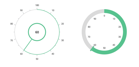
Refer to the following code example to create a radial slider with an analog appearance.
<gauge:SfRadialGauge>
 <gauge:SfRadialGauge.Axes>
  <gauge:RadialAxis LabelPosition="Outside" TickPosition="Outside"
                    StartAngle="270" EndAngle="270">
   <gauge:RadialAxis.AxisLineStyle>
    <gauge:RadialLineStyle Fill="#dadada" Thickness="2"/>
   </gauge:RadialAxis.AxisLineStyle>
   <gauge:RadialAxis.Pointers>
    <gauge:NeedlePointer Value="60" x:Name="needlePointer" NeedleStartWidth="3" NeedleEndWidth="3"
                         NeedleFill="#58c28f" KnobStroke="#58c28f"
                         KnobFill="White" KnobRadius="0.4" NeedleLength="1"
                         KnobStrokeThickness="0.03" IsInteractive="True" />
    <gauge:RangePointer Value="{Binding Source={x:Reference needlePointer}, Path=Value}"
                        Fill="#58c28f" PointerWidth="2" />
   </gauge:RadialAxis.Pointers>
  </gauge:RadialAxis>
 </gauge:SfRadialGauge.Axes>
</gauge:SfRadialGauge>
Pie-shaped radial slider
We can design a pie-shaped radial slider by increasing the thickness of the axis line and range pointer of the .NET MAUI Radial Gauge.

Refer to the following code example to create a pie-shaped radial slider.
<gauge:SfRadialGauge>
 <gauge:SfRadialGauge.Axes>
  <gauge:RadialAxis ShowTicks="False" ShowLabels="False"
                    StartAngle="270" EndAngle="270">
   <gauge:RadialAxis.AxisLineStyle>
    <gauge:RadialLineStyle Fill="#dadada" ThicknessUnit="Factor" Thickness="1"/>
   </gauge:RadialAxis.AxisLineStyle>
   <gauge:RadialAxis.Pointers>
    <gauge:NeedlePointer Value="60" x:Name="needlePointer" NeedleStartWidth="3" NeedleEndWidth="3"
                         NeedleFill="Black" KnobRadius="0" NeedleLength="1"
                         NeedleLengthUnit="Factor" IsInteractive="True"/>
    <gauge:RangePointer Value="{Binding Source={x:Reference needlePointer}, Path=Value}"
                        WidthUnit="Factor" PointerWidth="1" Fill="Orange"/>
   </gauge:RadialAxis.Pointers>
  </gauge:RadialAxis>
 </gauge:SfRadialGauge.Axes>
</gauge:SfRadialGauge>
Radial slider with a discrete value selection
We can select discrete numerical values on a slider by setting values in the StepFrequecy property of the pointer. This value will determine the interval between the snap points while dragging the pointer.
For example, if the value of StepFrequency is 10, the pointer will not move continuously while dragging; instead, it will snap to multiples of 10.

GitHub reference
To dive deeper into these examples, refer to creating different styles of the radial sliders using the .NET Radial Gauge GitHub demo.
Conclusion
Thanks for reading! In this blog, we explored several ways to use the Syncfusion .NET MAUI Radial Gauge to create different styles of radial sliders. Try them out for yourself or create your own and share them in the comments section below.
For existing customers, the newest version of our .NET MAUI controls is available for download from the License and Downloads page. If you are not yet a Syncfusion customer, you can try our 30-day free trial to check out our available features.
Also, you can contact us through our support forums, support portal, or feedback portal. We are always happy to assist you!

Top comments (0)