
The JavaScript Carousel is a highly responsive and completely customizable UI control. It can display images with content, links, and more, like a slideshow. You can use it to display scrolling news headlines, featured articles on home pages, and image galleries. Now, it has been developed to meet industrial standards and is production-ready.

Let’s explore the JavaScript Carousel control and its rich features with code examples.
Overview
The Carousel control provides the flexibility to create slides and configure their look and feel. You can also enjoy web-standard functionalities like accessibility, keyboard interactions, and events.
Key features
The key features of the JavaScript Carousel control are as follows:
- Easy slide creation
- Navigation buttons
- Play/pause button
- Indicators
- Animation and transitions
- WAI-ARIA compliance and keyboard accessibility
Slide creation
In the JavaScript Carousel control, you can easily create slides and design your slide content. Then, assign them to the carousel items template to display them as a slideshow. Refer to the following code example.
Import { Carousel } from “@syncfusion/ej2-navigations”;

const carouselObj = new Carousel({
 items: [
   { template: ‘<figure class=”img-container”><img src=”https://ej2.syncfusion.com/products/images/carousel/cardinal.png” alt=”cardinal” style=”height:100%;width:100%;” /><figcaption class=”img-caption”>Cardinal</figcaption></figure>’ },
   { template: ‘<figure class=”img-container”><img src=”https://ej2.syncfusion.com/products/images/carousel/hunei.png” alt=”kingfisher” style=”height:100%;width:100%;” /><figcaption class=”img-caption”>Kingfisher</figcaption></figure>’ },
   { template: ‘<figure class=”img-container”><img src=”https://ej2.syncfusion.com/products/images/carousel/costa-rica.png” alt=”keel-billed-toucan” style=”height:100%;width:100%;” /><figcaption class=”img-caption”>Keel-billed-toucan</figcaption></figure>’ },
   { template: ‘<figure class=”img-container”><img src=”https://ej2.syncfusion.com/products/images/carousel/kaohsiung.png” alt=”yellow-warbler” style=”height:100%;width:100%;” /><figcaption class=”img-caption”>Yellow-warbler</figcaption></figure>’ },
   { template: ‘<figure class=”img-container”><img src=”https://ej2.syncfusion.com/products/images/carousel/bee-eater.png” alt=”bee-eater” style=”height:100%;width:100%;” /><figcaption class=”img-caption”>Bee-eater</figcaption></figure>’ }
 ]
});
carouselObj.appendTo(“#carousel”);

Navigation buttons
You can manually perform slide transitions with the previous and next navigation buttons. You can show or hide the buttons using the buttonsVisibility property with any of the following values:
- Hidden : Hides the navigator buttons.
- Visible : Shows the navigator buttons.
- VisibleOnHover : Shows the navigator buttons only when the mouse is hovering over the Carousel.
Use the template options to customize the navigation buttons.
Refer to the following code example to show the navigator buttons on mouse hover in the Carousel control.
Import { Carousel } from “@syncfusion/ej2-navigations”;
const carouselObj: Carousel = new Carousel({
  buttonsVisibility: “VisibleOnHover”,
  items: [
    { template: ‘<figure class=”img-container”><img src=”https://ej2.syncfusion.com/products/images/carousel/cardinal.png” alt=”cardinal” style=”height:100%;width:100%;” /><figcaption class=”img-caption”>Cardinal</figcaption></figure>’ },
    { template: ‘<figure class=”img-container”><img src=”https://ej2.syncfusion.com/products/images/carousel/hunei.png” alt=”kingfisher” style=”height:100%;width:100%;” /><figcaption class=”img-caption”>Kingfisher</figcaption></figure>’ },
    { template: ‘<figure class=”img-container”><img src=”https://ej2.syncfusion.com/products/images/carousel/costa-rica.png” alt=”keel-billed-toucan” style=”height:100%;width:100%;” /><figcaption class=”img-caption”>Keel-billed-toucan</figcaption></figure>’ },
    { template: ‘<figure class=”img-container”><img src=”https://ej2.syncfusion.com/products/images/carousel/kaohsiung.png” alt=”yellow-warbler” style=”height:100%;width:100%;” /><figcaption class=”img-caption”>Yellow-warbler</figcaption></figure>’ },
    { template: ‘<figure class=”img-container”><img src=”https://ej2.syncfusion.com/products/images/carousel/bee-eater.png” alt=”bee-eater” style=”height:100%;width:100%;” /><figcaption class=”img-caption”>Bee-eater</figcaption></figure>’ }
  ]});
carouselObj.appendTo(“#carousel”);
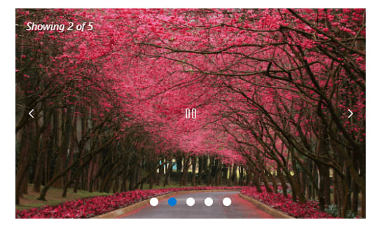
Play/pause button
The play button is used to control the autoplay slide functionality. You can show or hide and customize the play button using the showPlayButton and playButtonTemplate properties, respectively.
Refer to the following image.
Indicators
Indicators help us depict the total number of slides and the currently active slide in the Carousel. You can show or hide the indicators using the showIndicators property. Display the preview of a slide or thumbnail in the indicators using the indicatorsTemplate property.
Refer to the following image.

Note: Refer to the template examples in the JavaScript Carousel control for more details.
Animation and transitions
You can enjoy hassle-free transitions while navigating among the slides with the built-in slide and cross-fade animation effects.
The Carousel supports autoplay functionality, which performs slide transition after a specified or default interval. On reaching the last slide, the slides will be repeated with the selected transition by default.
You can enable or disable infinite slide transitions using the loop property.
You can also use the pauseOnHover property to play or pause the slides when hovering the mouse pointer over the Carousel element.
Custom animations
Apart from the built-in slide animation effects, you can also customize the animation effects.
Note: For more details, refer to the custom animation in the JavaScript Carousel documentation.
WAI-ARIA compliance and keyboard accessibility
The Carousel control was built based on the WAI-ARIA specifications, roles, states, and properties. It also has keyboard support. This will be helpful for people who use assistive devices.
You can easily interact with the JavaScript Carousel control using these keyboard shortcuts:
| Key | Functionalities |
| Arrow keys | Navigate between slides. |
| Home | Navigate to the first slide. |
| End | Navigate to the last slide. |
| Space | Play or pause the slide transitions. |
| Enter | Perform the respective action when in focus. |
Reference
For more details, refer to the Getting started with JavaScript Carousel control documentation and online demos.
Conclusion
Thanks for reading! In this blog, we have seen the key features of our JavaScript Carousel control. The Carousel control is also available in our Angular, Blazor, React, Vue, ASP.NET (Core and MVC), WinForms, WPF, Xamarin, and UWP platforms. Use it in your app and enjoy hassle-free slide navigation!
If you’re already a Syncfusion user, you can download the product setup, or, you can download a free 30-day trial to evaluate our products.
For questions, contact us through our support forums, support portal, or feedback portal. We are delighted to help you at any time!

Latest comments (0)