Can you spot the differences between Exhibit A:
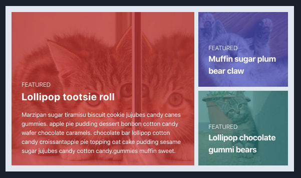
And Exhibit B:

Which one looks subjectively better?
Would it help to know how many differences to look for? I'll tell you down below, but if you like the challenge, give this a try :)
Design Eye
I think a key difference between designers and frontend developers is "Design Eye".
I can't tell you how many times I've gotten a spec from a designer, implemented it, and handed it back only for them to completely tear it apart pointing out the small details I missed.
Or maybe you know the feeling when you design something and it kinda sorta looks fine, but then you put it up next to something a designer made and it looks like crap. And you can't even explain why - because you don't even have the vocabulary!
That's "Design Eye".
I mean, I like to believe I'm detail oriented where it counts, e.g. if a comma goes where it shouldn't in code, you bet I'm all over that. But I'm nothing compared to designers. Heck, their leading industry podcast is even called Design Details!
So I'd like to train my "Design Eye".
Spotting the Differences
There are 3 differences between Exhibit A and B above. They range from Easy, Medium, and Hard. If you didn't get the 2nd or 3rd one, I don't blame you.
💁♂️ Here's your chance to scroll up and look again if you'd like to test yourself.
I've discussed the Ben Franklin method before in my post on How To Learn In Private. Basically, you look at something you want to make, then try to make it to the best of your ability, and then get an expert (or yourself) to critique the difference.
Today I realized I could apply the Ben Franklin method to training my "Design Eye". I saw a request to code up this screenshot:

Which I then turned into Exhibit A - not a faithful reproduction, but "Good Enough", I thought, and certainly better than anything I've done on my own before:
I then tweeted it out, and immediately Alex Clark and Darian Moody found problems with it 😂 Cunningham's Law never fails!
So I asked Darian to teach me, and he obliged by forking my Codepen and producing Exhibit B:
And now time to learn by spotting the difference!
Difference 1: Line Height
This is the "Easy" one. Line Heights should be adjusted relative to the size of the text - a rare instance when too much spacing is not better when it comes to design.

In Tailwind this maps to the leading-tight class.
Difference 2: Letter Spacing
This is "Medium" - but also very very hard for me. But for some it's just obvious that the letters are too far apart:
In Tailwind this maps to the tracking-tight class.
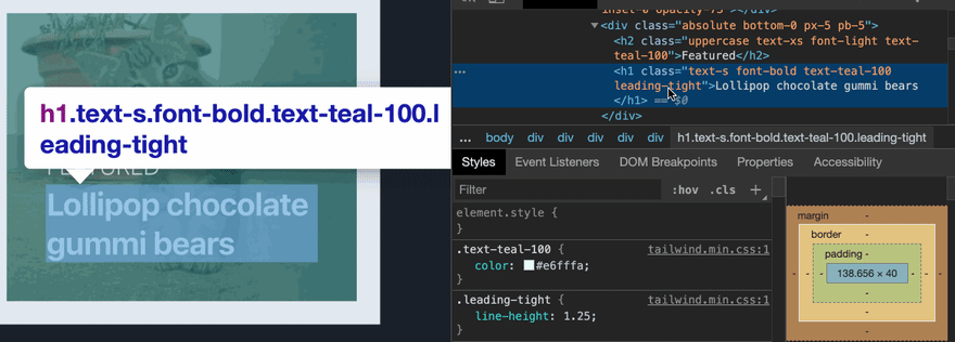
Difference 3: Text Color
Text colors should match their surroundings to provide a gentler visual transition. This is "Hard" - even when you tell me its there, I struggle to see it, but it's obvious for designers:

In Tailwind this maps to the text-{color}-{weight} class.
This is the kind of extreme detail Steve Schoger teaches in his talks and in Refactoring UI, but it really takes practice to see it.
Conclusion
I learned a few new tricks going through this exercise today, and I imagine I will need to do a few more rounds of this for it to really stick.
Do you want to try learning how to refactor your own UI's this way? Maybe play a few games of "Spot the Difference"!
Sure, these details aren't as important as getting the big picture right. But I think attention to detail is what distinguishes the premium apps from the merely OK.

Top comments (5)
Difference 4 : The dark border around your Exhibit B is much thinner, especially the bottom one ;-)
Agreed, the dark border looked like the main difference, the second being the lack of sharpness in B. The line height was one I missed, but the letter spacing and text color aren’t really noticeable at all TBH.
thats probably just me screenshotting
Nice post! I actually found only the first two and would’ve never found the font color on my own. Very fun challenge though 😊
yeah.. i was toggling the CSS myself and i couldnt even see it myself! this is how to train Design Eye though.