Motion graphics are at the peak of their popularity among marketing-savvy designers from around the world. It’s no wonder that logo animation is rapidly gaining traction among smaller brands as well. These brands are following in the footsteps of current market giants like Google, Netflix, and Linkedin.
Need some logo animation examples to get those creative juices flowing? We’ve got you covered! Skim through this list of the best animated logos out there, and you’ll see how these visuals are in fact doing more than just establishing brand identity: the best animated logos also manage to get a brand’s message across in a persuasive, engaging, and inspiring way.
Wondering if you need coding skills to be on par with the designers of these cool logo animations? No worries - we'll show you how to easily animate a logo without writing a single line of code. But first, let's get inspired!
Inspiration-sparking logo animation examples
Discord
Discord’s OG mascot logo is the iconic gaming console character named “Clyde''. With the brand shifting their focus to cater to a broader consumer base, moving away from its gaming-centric origins, Clyde has gone through some changes as well.
Designers first freed Clyde from his restrictive speech bubble and then reshaped the character to make its features easier to translate when scaled to print on merch. The animated Discord logo brings the friendlier and more playful feel of the mascot full-circle, with a wink and some fine-tuned changes in the brand’s color palette and wordmark.
Netflix
Starting off with its signature animated “N” ribbon, the Netflix logo animation then morphs into a barcode-like visual. This concept originated from the team’s initial idea of using the thumbnails of Netflix originals, seen from a sideways view.
The play on the color spectrum and the illusion of depth are the key effects behind this logo animation’s ability to draw consumers into a cinema-like atmosphere. The animated logo hints at how Netflix is maturing from its streaming-only roots into its production studio aspirations.
Google’s signature graphics need no introduction, but the brand’s animated logo does a fine job of showcasing the wide-ranging services under its umbrella. Through morph animation, the logo carries across brand messaging using just basic shapes and Google’s official colors.
Unlike a Google Doodle, which is a temporary commemorative Google logo animation, the official animated Google logo aims to talk about the tech giant’s future. The smooth animation of the mic morphing into sound waves, and then into a system processing a request, translates into adaptability, scalability, and interactivity.
Other products from the same brand like Google Ads now also have an animated version of their logo.
Apple
Apple has been continuously simplifying its logo ever since it started using its rainbow-striped iconic apple in 1976. The logo’s design has seen a constant shift towards a minimalist look. Given this trend, the company doesn’t have an official Apple logo animation.
However, the brand does leverage the attention-grabbing nature of logo animation on its “Jobs at Apple'' page. Users are met with a rapid-fire loop of animated Apple logos, designed using all the web animation techniques under the sun, from fluid animation, to seamless morphing, to some of the most intriguing 3D logo animation examples out there!
Fiverr
Fiverr’s distinct wordmark logo is associated with the brand’s signature pricing model: the starting price for every digital service on the marketplace is $5. The Fiverr logo animation doesn’t stray too far away from the memorable logotype that its consumers are familiar with.
The Fiverr circle was first used as a holding shape with a fill color that the brand calls Fiverr Green. Now, in the static Fiverr logo, the circle is used as a period at the end of the wordmark.
In the animated logo, an exciting entrance animation takes the lead. It is then followed by a bounce of the Fiverr circle, emphasizing how quickly you can get projects done by hiring their freelancers.
By Lemons
Facebook’s new animated logo is meant to distance the Facebook parent company from the Facebook app, helping users to easily distinguish between the two of them. The app’s logo has seen very few changes from its initial design. The most “drastic” tweaks have been a vibrant blue gradient and a round holding shape, revealed after the logo’s redesign in 2019.
For the animated logo, Facebook uses a rather generic logotype, leaving behind the blocky wordmark users easily recognized. The animated gradients display the signature colors of all the apps under the Facebook parent company’s umbrella (blue for Facebook, pink for Instagram, green for WhatsApp, etc.).
Firefox
The entire digital world can easily identify the iconic purple globe with its gradient shades, along with the orange fox with its fire-like tail hugging it. The Firefox logo animation is a true testament of the brand’s evolution!
The animated logo starts off with the brand’s static logo, which then morphs into a stylized, abstract version of itself. The Firefox wordmark only scales, while all the services that Firefox now offers are showcased using only morphing icons and a basic logotype in the brand’s colors. This is another example of how great logo animations can convey a ton of information easily.
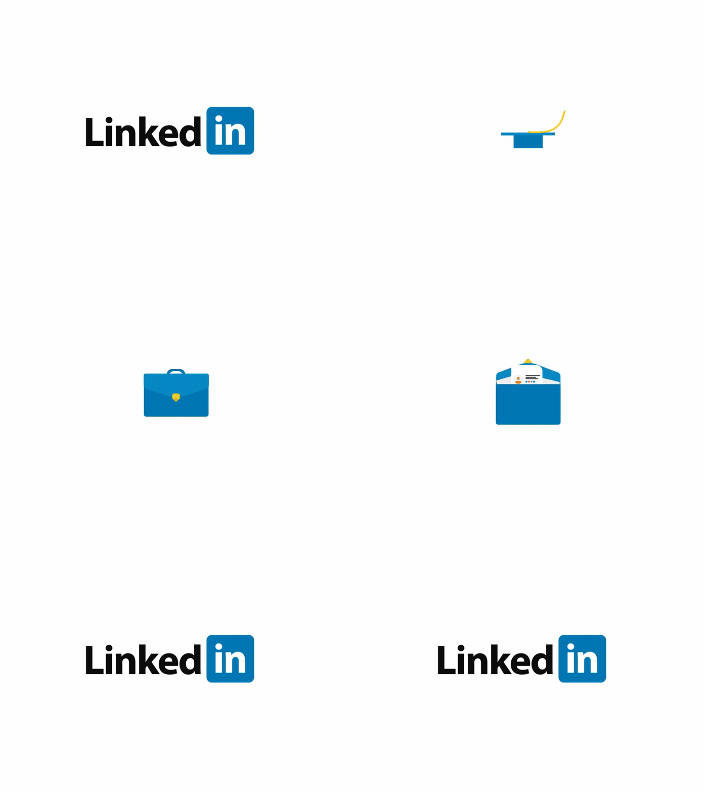
The Linkedin brand is easily recognizable thanks to its retro web 2.0 logo, with an executive typeface and black, white, and Linkedin-blue color palette. The design itself speaks to the company’s all-business and practicality-focused mindset.
The Linkedin animated logo follows the same pattern, revealing the platform’s focal points: education and resume building strategies to land you your dream job. The animation starts off with a graduate cap in Linkedin colors and morphs into a briefcase with documents that pop up. The briefcase then scales down and closes to morph into the Linkedin icon, which is a part of the Linkedin wordmark.
By Hamza Quaziz
Nike
This is one of the best SVG logo animation examples on the list! And that’s because it vividly animates the exact meaning behind the original Nike swoosh: a simple fluid design that expresses motion and speed.
Nike’s logo animation has an all-black background, with the Nike swoosh used as a clipping mask. The mask puts into view a fluid animation that alternates between swooshes of magenta and teal gradients. A logo design that’s packed with motion, speed, and creativity!
Master Card
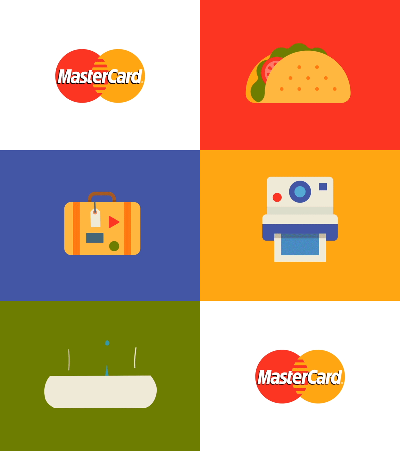
MasterCard’s logo is globally recognized, with its interlocking red and ocher-orange circles, with the brand’s wordmark centered between the two. The logo has been only subtly altered to better reflect the company’s digital-driven attitude.
To illustrate its wide array of purposes in the digital landscape, the MasterCard logo animation shows customers the exciting delights and experiences they can pay for with Mastercard. In a fluid motion, the Mastercard symbol morphs into a stylized taco, followed up with a suitcase, a flashing Polaroid, a map, and then looping back to the brand’s logo.
Coca-Cola
The Coca-Cola logo has played a monumental role in the powerful brand identity behind the market giant that is The Coca-Cola Company.
Coca-Cola’s logo animation unites the abstract bottles of the most consumed Coca-Cola flavors (Coca Cola Classic and Diet Coke) inside the original red disc logo. With this design, and the world famous white-ribbon logotype on top of the “Taste the feeling” wordmark, the animated logo plays into Coca-Cola’s one-brand strategy.
Disney
We’re all familiar with Disney’s magical logo, with the abstract version of the DisneyLand castle serving as a background to Disney’s emblematic wordmark. For many of us, this logo was a childhood emotional trademark for fun and unlimited entertainment, just like Walt Disney intended it to be.
Disney’s animated logo pushes the magical feel of the brand a step further, animating a shooting star that arcs above the castle. Walt Disney Pictures, the production studio, uses this logo animation as an intro to every Disney movie, to set the scene for a world of wonder and wishes granted.
Snapchat
Making its way among the coolest logo animations, the animated Snapchat logo feels like a spellbinding morphing marathon. The design uses just Snapchat's yellow, black, and white color-trio along with line animation to give the brand’s mascot, Ghostface Chillah, a very dramatic entrance.
The ghostly appearance that finally morphs into the Snapchat icon references the brand’s core “phantom” policy, which is to delete pictures after a user-set time limit.
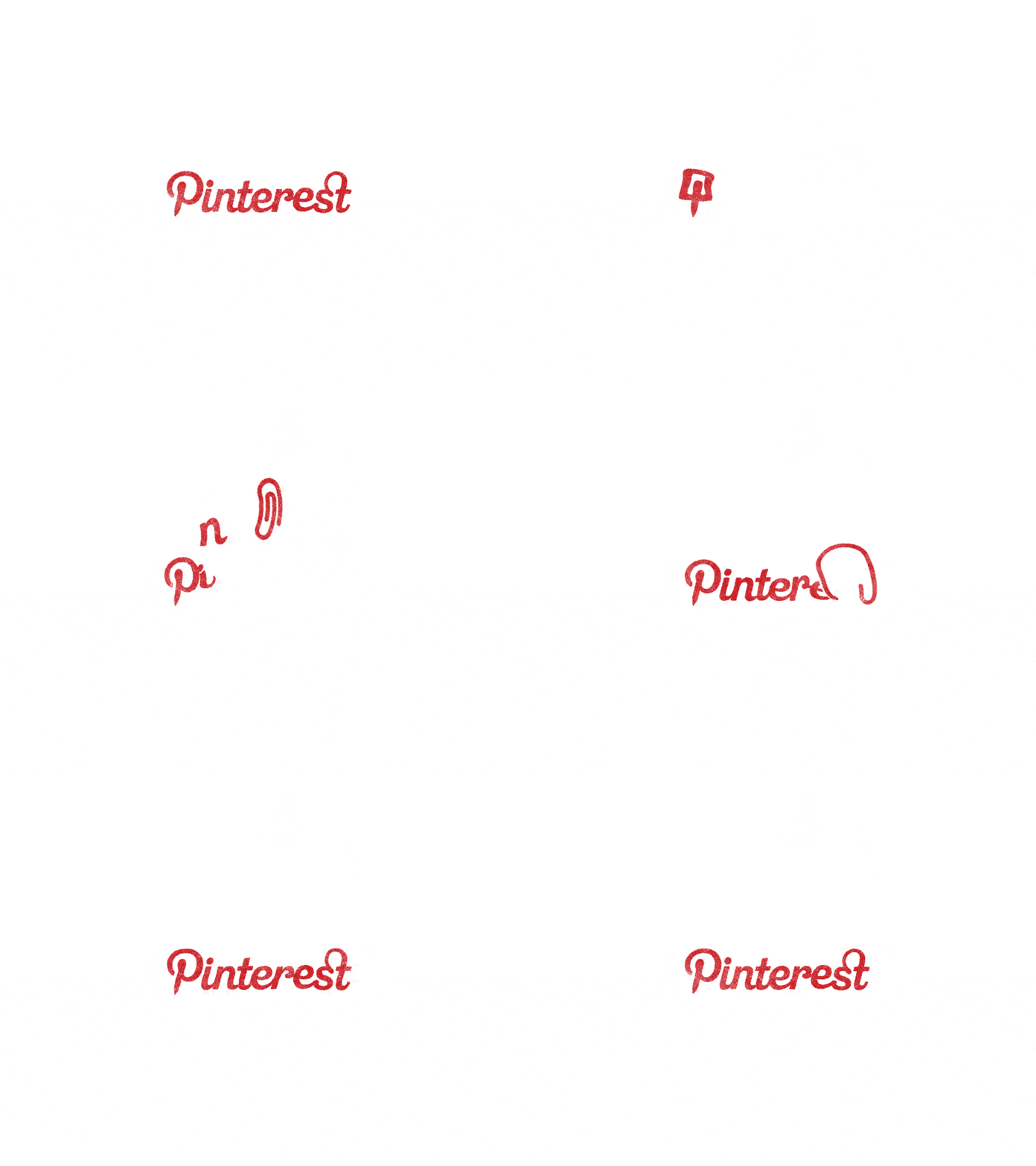
The brand’s entire identity revolves around “pinning” something to a board and saving ideas for inspiration. The Pinterest logo is one of the craftiest pieces of design, having a pin “hidden” in plain sight, being drawn to look like the letter “P.”
Pinterest’s animated logo earns its place among the best logo animation examples we’ve seen. With a cartoonish design, a pin bounces into view and then morphs into the iconic “P.” It’s then followed by a bouncing paperclip that eventually turns into the last two letters of the logo. The animation uses Pinterest’s easily recognizable wordmark and Pinterest red color.
Reddit’s mascot logo depicts a character that the community knows as Snoo. Snoo is actually a time-traveling, genderless alien with pom-pom ears and an antenna. Nowadays, the Reddit logo is an orange-red flat circle holding Snoo’s face, drawn in thick white lines, followed by Reddit’s black wordmark.
This animated Reddit logo pays homage to the 2005 logo, which had the entire character visible. Snoo bounces into view with its parts floating, and reassembles itself on the dropdown. The LED light flickering at the top of its antenna bounces on top of the “i” in “reddit,” as the wordmark cartoonishly pops up into view.
McDonald’s
The symbolic Golden Arches in the McDonald’s logo we all know today were initially the identifying mark of the franchise's restaurant architecture. The “i’m lovin’ it” slogan was added to the modern double-arched “M” symbol back in 2003, now known as the longest running McDonald’s brand slogan.
The McDonald’s logo animation is as simple as they come, with the Golden Arches being animated using self-drawing lines. The simplicity of the design reiterates the fact that the brand doesn’t need any frills to make a grand impression.
Dunkin’ Donuts
Nowadays, the Dunkin’ Donuts logo is a digital-friendly and minimalist mix of the brand’s logos between 1976 and 2019. The brand kept the orange and pink colors for their wordmark, in the same plump and round typeface. The noticeable difference is that the logotype is now just “Dunkin’.”
The logo animation, on the other hand, puts on a show with Dunkin’s classic combo: donuts and coffee. With a match-cut technique, the designer seamlessly transitions from a white donut hole to a glazed donut, to Dunkin’s iconic stylized coffee cup. Finally, a swift positioning animation makes room for the OG Dunkin Donuts wordmark.
By Samy Elbadwy
Paypal
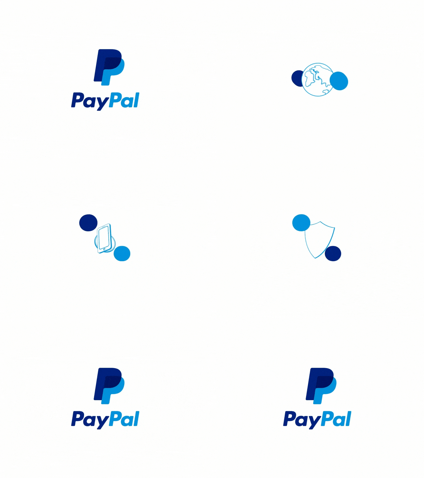
Back in 2014, PayPal completely revamped their logo design, changing not only the wordmark but also the icon. The new icon looks like a monogram with the overlapping double “P” in bold italics.
Paypal’s logo animation uses the brand’s corporate colors, animating two-fluid circles to rotate around the brand’s three major selling points. Namely, a globe for global payments, a smartphone and a coin for mobile and cryptocurrency transactions, and a shield for its purchase protection policy.
By Hamza Ouaziz
Sello
Sello is an e-commerce management platform that specializes in marketplace sales. The platform essentially integrates existing online stores into other popular e-commerce services, like Amazon, eBay, or Etsy.
With a play on the concept behind the brand, Sello’s logo animation is simple, yet witty. Using Sello’s slender and rounded typeface, the animated logo keeps the first four letters static, while the “o” morphs into object icons. The “o” morphs into a ring, then headphones, and finally into a bouncing baseball, illustrating the extensive range of products sold through Sello.
Conversable
Conversable, now a part of the LivePerson conversational cloud platform, has a logo that easily ranks as one of the most complex css logo animation examples on this list. The brand offers an AI-powered digital space for brand-to-consumer conversations.
The animated logo starts with a slight chromatic aberration effect, mixed with a glitch effect that looks like digital-distortion, with a pop-in entrance of the Conversable character logo. The spaceman’s face shield is actually a speech bubble, hinting at the brand’s messaging channels.
By Chenglei Wu
How to animate a logo with SVGator
Now that you’ve seen some of the craftiest logo animation inspiration examples, it’s time to create your own. Let us show you how to easily animate a logo, even if you're not familiar with CSS/Javascript coding! SVGator is the logo animation software that will automatically generate the animated logo’s code for you.
Step 1. Sign up for SVGator or log in
Create a new SVGator account, or log in, and start a new project.
Step 2. Create an SVG logo from scratch or import one into SVGator
Import a static SVG logo, or, better yet, create a new one from scratch using our SVG editor. SVGator’s pen tool, transform tool, node tool, and snapping options allow you to effortlessly:
- create perfectly straight lines and proportional shapes
- edit compound shapes and custom paths
- move/add/remove nodes
- adjust Bezier curves.
Step 3. Animate your SVG logo
Edit your logo animation live, select elements and add animators to the timeline, and see changes as you go, for a smooth workflow. Rotate, scale, add filters, change colors and gradients, morph, convert shapes into paths, or experiment with clipping paths and clipping masks. The sky’s the limit!
Step 4. Export your logo animation & add interactivity settings
Export your animated logo, choose the animation type (CSS/JavaScript), and select your interactivity settings in the same intuitive panel. SVGator will then generate a single SVG file with ready-to-use code.
Conclusion
Animated logos have never been easier to create. Time to put your freshly replenished inspiration to work with SVGator. Start your new logo animation project here!


Top comments (0)