
Note: This article was originally written for my personal blog. I am republishing it here for the DEV community.
It has been a while. My last redesign was three years ago, which has in part caused this site to be outdated in terms of both style and content.
The previous design
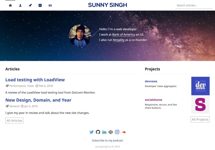
To stroke my ego a bit, I still like what I crafted back in 2016. It's far from perfect, but it does present my content and projects fairly well.
You may notice a few similaries between my old and new designs, and that is actually on purpose. We'll get to that in a moment.
The new design
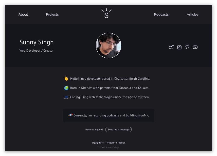
First thing that you probably notice is the dark theme. I decided to switch because:
😎 It creates a clean aesthetic.
📖 It is versatile for reading in day and night time.
🤷♂️ Ugh, I just really prefer dark themes.
Second thing is yes, I finally have a logo 🎉! I actually made it back in January of 2018, and it's insane that it took me a full year to finally use it. I lack proper graphic design skills, so I'm quite happy with how simple and clever it turned out. Having a logo should really help me in creating a more identifiable brand.
Alright, so the main issue with my old design was that someone visiting my homepage would have no idea what to do due to the overflow of information and actions. Here is what I mean:
- The main navigation had ambiguous icons. Will that email icon take you to a newsletter or contact page? All this just to make room for a search box that was only relevant on the blog.
- My description only told you that I was a web developer and where I worked. Anyone wanting to actually learn about me would have to know to click on the person icon in the navigation to go to the about page, and honestly I'd expect most people to have left the site by then.
- You could see lists of my articles and projects, but why would a new visitor care? I prefer that they learn more about me first, and then they can show interest in my content by going to the appropriate pages.
- The social icons are small and buried in the footer. I guess I just didn't see social media as important at the time as I do now. I also hate how I have so many linked as if I'm active on all of those platforms (I'm not).
The new design fixes all of these problems; I got rid of my about page, single project pages, the latest articles and projects on the homepage, the search, and more. Anyone new can now land upon my homepage and quickly learn about me. The navigation only has 3 other pages where you can find my projects, podcasts, and articles. Best of all, my main social media profiles are linked above the fold.
I mentioned earlier that both designs have similar qualities. This is because I believe in creating timeless designs instead of trendy ones, so making improvements with each redesign helps the brand to evolve over time.
I believe in creating timeless designs instead of trendy ones, so making improvements with each redesign helps the brand to evolve over time.
There's a couple of other aspects to the design that I enjoyed adding, such as the subtle animations, that you hopefully noticed:
☀️ The "sun rays" in my logo rise up and fade in when you load a page.
👋 The hand wave and laptop emojis animate on my homepage, but only once.
🚀 The rocket emoji on my homepage has an infinite flying animation effect.
↩️ The cards on my projects, podcasts, and articles pages have a swinging in effect.
Lastly, I put in a lot of effort into the article design. I simply wanted to make the content as readable as possible, and I did so by taking a few cues from the Refactoring UI Book. I tried to keep character length around 80 and applied generous space between each character, line, and section. Since I have full control over my own platform as opposed to a third-party like Medium, it's wildly important that I create a pleasing reading experience to keep people coming back to the blog.
The tech stack
As much as I love talking about design, I am a developer. So, let's get to the fun stuff by taking a look at the tech stack. Note that the entire site is open sourced on GitHub if you ever want to peruse the code.
⚛️ Gatsby & React
I was already using a static site generator that was built in Node.js called Metalsmith, but it lacked a lot of the features that I recently came across in Gatsby.
Here are the main reasons that I decided to revamp with Gatsby:
- It's built with familiar technologies that are already in my stack: Node.js and React. The reusable component model of React is great for maintainability.
- I don't have to think about performance as much. Many of the best practices are already baked in so that I can just focus on building the site.
- Hot reloading of code and content means that I can make updates to the site very quickly, without having to wait on a full rebuild.
💅 styled-components
Since I'm already using React, that means I can also take advantage of my favorite styling library, styled-components. There's still Twitter debates on whether CSS-in-JS is a good approach to styling, but after using it on a few projects I've decided that it is.
With styled-components, I simply create components with styling already attached. It's full CSS which gets included as a normal stylesheet, so media queries, keyframes, etc. work as normally. Oh and yeah, we can toss Sass and other preprocessors aside now that we're just working with JavaScript.
📖 GraphQL & MDX
All of my articles are written in MDX and retrieved with GraphQL. Like React, GraphQL is something that is already used by Gatsby which gives me a good opportunity to get more familiar with it. Right now it's just fetching local Markdown files, but I could easily bring in a full CMS if I wanted to.
MDX is pretty cool and fits in really nicely. It allows me to include React components in my Markdown files, which is currently how I embed YouTube videos, CodePen pens, and tweets. Nothing fancy yet, but I'm a component away from having runnable code demos in my articles (without a third-party embed).
📣 Socialshares, Feather, & React Kawaii
There's a few other miscellaenous libraries that I think are worth mentioning.
Of course it'd be a crime if I didn't use my very own socialshares social sharing buttons which you can see at the bottom of my articles.
For the homepage social icons and other UI icons, I use Feather.
Finally, the cutest of them all, React Kawaii provides SVG illustrations that are useful for different UI states (e.g. errors, empty content). You can currently see them on the 404 page and after you subscribe to the newsletter.
What do you think?
I'd love to hear your thoughts on the new design and tech stack, so let me know on social media or drop a comment below. Personally, I'm very happy with the way that the site looks and I enjoyed building it a lot. Hopefully this means that I'll be writing more often as well.

Top comments (12)
Great article. I am currently in the process of building my own personal site for my work. I have been using Gatsby and loving it. I agree that it takes care of a lot of things, like performance, for you and leaves you to focus on your content while being powerful enough to let you work how you want.
I didn't know about React Kawaii until reading this article. It looks so cool! I feel like I definitely need to work those into my page. :)
Thank you. React Kawaii is a fun touch to add, glad to have shared it with you!
Love the new design; you took a similar approach I am working on. Darker theme is easier on the eyes, though you left the font color a bit brighter which I find a bit straining. I like the large first letter effect but it is odd sometimes like your article starting with 2018, it leads with a large 2.
Really nice design!
Thanks Michael. Yeah I guess using a number for a drop cap isn't common. I'll consider changing that article to maybe say "This 2018" or something.
I probably should have spent a bit more time tweaking the text color. Do you have a color suggestion that doesn't create a contrast issue for accessibility?
Thanks for laying this out Sunny! Defiantly going to use this as a template for my rework.
Kind words Ben! My site is open sourced so feel free to use what you want.
Right on! Thanks _^
Thanks for the article, Sunny. Your page is very nice, love the dark theme. Also, as an anime/manga fan I'm really glad that i learned about React Kawaii. It is kawaii, indeed. :)
Thanks Strahinja! Haha happy to have shared React Kawaii. I'm into a bit of anime myself.
Site seems very fast. Looks good too; nice & clean. Good job.
Thanks for the kind words Kyle!
Here is a step by step guide about how to create your blog site using Gatsby.
zeptobook.com/create-your-blog-sit...