
In this guide, you will learn about the importance of Previews in Jamstack. I will also walk you through the process of adding the previews mode to a blog built with Next.js and Strapi headless cms for a better content editing experience.
The Preview Mode
One of the major features/selling points of the Jamstack web development architecture is its core principle of pre-rendering, i.e., generating the website's content during build time instead of every request time. Pre-rendering improves the speed, reduces the complexity, and reduces the cost of hosting the website.
The pre-rendering process in the Jamstack web development methodology is achieved with the help of a static site generator(SSG). SSG collects content from a headless CMS - where the files are created and stored - with the help of an API.
The contents are then converted into their static files(prebuilt HTML, CSS, and Javascript files) by the SSG during the SSG build time. Finally, the generated static files are stored in a content delivery network(CDN) and served as a whole to the end-user in every request.
Even though very beneficial, this pre-rendering process tends not to be ideal during the content creation process. Content creators and editors need to render a preview of their draft at every request time instead of waiting for the complete website build process before viewing their changes.
The easiest solution to the problem conferred by most Static Site Generators is setting up a Preview mode that will bypass the static site generator pre-rendering process. With the preview mode activated, content editors can view their changes on every page request instead of waiting for the complete build process to run.
Setting up the Preview mode
For this example guide, we will create a simple blog website for which we will later activate the previews mode to allow for a better editing experience.
Prerequisites
To follow through with the guide, you will need a basic knowledge of:
Next.js - Next.js is our static site generator of choice for this tutorial. Next.js is an open-source react framework used for building production-grade react websites. It comes with a preview API that we will use in this guide.
Tailwind CSS - Tailwind CSS is a utility-first CSS framework. It enables you to add CSS directly to your Html for easier development and scaling.
Strapi - Strapi is the leading open-source headless CMS used for managing content efficiently and designing secure production-ready RestFul or GraphQL APIs.
Markdown-to-jsx - We will use the Markdown-to-jsx npm package for converting the markdown files returned from strapi into jsx to be rendered by Next.js
Strapi Setup
The first step in this guide will be to create the backend of our blog. We will be using the strapi blog template as a starter for faster and easier development.
npx create-strapi-app blog-backend --template https://github.com/strapi/strapi-template-blog
You will be prompted for the installation type. Next, select quickstart to use the preconfigured settings. This command will create a new blog-backend folder ****with the Strapi backend fully set up and all dependencies installed during installation.
After the successful installation, you will automatically be redirected to your browser, where you will be prompted to register before using Strapi.

Add your details and click LET’S START to access the Strapi dashboard.
The blog template for Strapi comes with some preconfigured schema for blogging apps, making our development easier and faster.
Open the generated blogs-backend and navigate to the /api/article/models/article.settings.json file and replace the code with these lines of code.
    {
    "kind": "collectionType",
     "collectionName": "articles",
     "info": {
      "name": "article",
      "description": ""
     },
     "options": {
       "increments": true,
       "timestamps": true,
       "draftAndPublish": false
     },
     "pluginOptions": {},
     "attributes": {
       "title": {
         "type": "string",
         "required": true
       },
       "description": {
         "type": "text",
        "required": true
       },
       "content": {
         "type": "richtext",
         "required": true
       },
       "publishedAt": {
         "type": "datetime",
         "required": true
       },
       "status": {
         "type": "enumeration",
         "enum": [
           "draft",
           "published"
         ],
         "required": true,
         "default": "draft"
       },
       "slug": {
         "type": "uid",
         "targetField": "title",
         "required": true
       },
      "category": {
        "model": "category",
        "via": "articles"
       },
       "image": {
       "model": "file",
        "via": "related",
        "allowedTypes": [
           "files",
           "images",
           "videos"
         ],
        "plugin": "upload",
        "required": true,
        "pluginOptions": {}
       },
       "author": {
         "via": "articles",
         "model": "writer"
       }
     }
    }
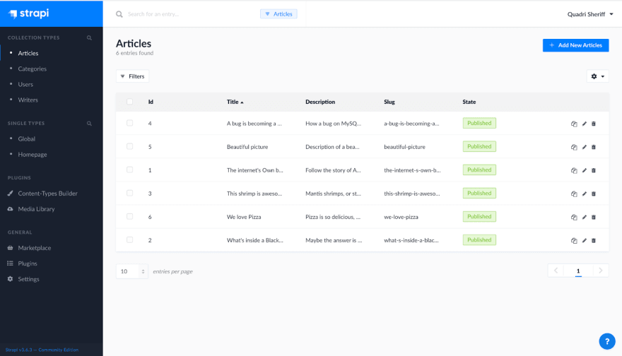
Close your backend server and restart with yarn develop to register the changes. Then, log in to Strapi's dashboard again and set the **Status** of the articles in Collection types to either **published** or **draft**. Also, add a **PublishedAt** date, and make sure to save your changes.
Next.js Setup
The second step in this guide will be the frontend setup with Next.js. First, scaffold your frontend project with this command.
npx create-next-app blogs-frontend
A blogs-frontend folder is created in your root directory.
Navigate into the folder and run npm run dev to start the frontend server. You can view your frontend locally using http://localhost:3000.
Tailwind CSS setup
Install Tailwind CSS into your frontend with npm.
npm install -D tailwindcss@latest postcss@latest autoprefixer@latest
Then, generate tailwind CSS configuration files.
npx tailwindcss init -p
This command will generate a **postcss.config.js** and a **tailwind.config.js** file to the root directory of your project. We will use these two files for any configurations relating to tailwind CSS in our project.
Finally, to complete the tailwind CSS setup, navigate to the **pages/app.js** file and replace import '../styles/globals.css' with import 'tailwindcss/tailwind.css'. You can delete the **styles** ****folder since we will not be using any custom CSS for our blog.
Markdown-to-jsx installation
Install markdown-to-jsx into your frontend use the following command -
npm install markdown-to-jsx
Markdown-to-jsx will be used to convert the markdown files obtained from Strapi into JSX files to be rendered in our frontend framework.
Connecting frontend to backend
To connect our Next.js frontend app to our backend, we will create a helper function that will make API calls to the Strapi backend with the fetch API.
Create the helper function, create a **lib** folder in your frontend folder root folder, and add a file named **api.js** to the **lib** folder.
Add the following code line to the api.js file.
    export function getStrapiURL(path = "") {
     return ${
       process.env.NEXT_PUBLIC_STRAPI_API_URL || "http://localhost:1337"
     }${path};
    }

    // Helper to make GET requests to Strapi
    export async function fetchAPI(path) {
     const requestUrl = getStrapiURL(path);
     const response = await fetch(requestUrl);
     const data = await response.json();
     return data;
    }
What this code does is that it sends a get request to Strapi URL with the fetch API. Since we are only building a blog, a helper to fetch GET requests is enough for our project.
Designing the blog layout
Now that we have our frontend and backend connected, plus tailwind CSS fully installed. The next step will be to create a layout for our blog.
Firstly, create a components folder in the root folder and add a Layout.js file into the folder. Next, add the following code into the **components/layout.js** file.
    import Header from './header';
    import Footer from './footer';

    const Layout = ({ children }) => (
    <>
      <Header />
      {children}
      <Footer />
    </>
    );

    export default Layout;
Then, we will create our header and footer files. First, add a header.js and a footer.js file to the component folder.
Add the following code to your header.js file
    import React from "react";
    import Link from "next/link";

    const Header = () => {
     return (
       <div>
         <nav className="flex justify-center items-center h-16 py-2 mb-2 bg-gray-100 w-full border-b">
         <div>
           <Link href="/">
             <a href="/" className="px-2 font-black lg:px-0 text-lg">
                Sheriff's Blog
               </a>
            </Link>
           </div>
         </nav>
       </div>
     );
    };

    export default Header;
Then, add the following code to the footer.js file.
    import React from "react";

    const Footer = () => {
     return (
      <footer className="border-t mt-10 pt-12 pb-32 px-4 lg:px-0">
         <div className="px-4 pt-3 pb-4 border-b -mx-4 border-gray-400">
             <div className="max-w-xl mx-auto">
                  <h2 className="text-xl text-left inline-block font-semibold text-gray-800">Join Our Newsletter</h2>
                  <p className="text-gray-700 text-xs pl-px">
                       Latest news ,articles and updates montly delevered to your inbox.
                   </p>
                   <form action="#" className="mt-2">
                      <div className="flex items-center">
                           <input type="email" className="w-full py-4 mr-2  bg-gray-100 shadow-inner rounded-md border border-gray-400 focus:outline-none" required />
                          <button className="bg-blue-600 text-gray-200 text-sm rounded">Sign Up</button>
                      </div>
                  </form>
              </div>
           </div>
       </footer>
     );
    };
export default Footer;
The layout component will be wrapped around our page code to give a uniform header and footer across our blog.
Designing the Home page
Move to your **index.js** file and discard the pre-existing code there. Then add the following lines of code to the **index.js** file.
    import Link from "next/link";
    import Layout from "../components/layout";
    import { fetchAPI } from "../lib/api";

    export default function Home({ articles }) {
     return (
       <>
         <Layout>
          <body className="antialiased md:bg-gray-100">
            <div className="grid grid-cols-1 md:grid-cols-3 gap-3">
               {articles.map((article) => (
                 <div key={article.id} className="md:p-8 p-2 bg-white">
                   <div>
                     {article.image && (
                      <img src={`http://localhost:1337${article.image.url}`} />
                     )}
                   </div>
                   {article.title}
                   <div>
                     {article.category && (
                      <p className="text-indigo-500 font-semibold text-base mt-2">
                         {article.category.name}
                      </p>
                    )}
                   </div>
                   <h1 className="font-semibold text-gray-900 leading-none text-xl mt-1 capitalize truncate">
                    {article.title}
                  </h1>
                   <Link href={`/article/${article.slug}`}>
                     <div className="max-w-full">
                       <p className="text-base font-medium tracking-wide text-gray-600 mt-1">
                         {article.description}
                       </p>
                     </div>
                   </Link>
                   <div className="flex items-center space-x-2 mt-20">
                     <div>
                       {article.author && (
                        <p className="text-gray-900 font-semibold pb-2">
                           {article.author.name}
                         </p>
                       )}
                       <p className="text-gray-500 font-semibold text-sm">
                         Created on - {new Date(article.created_at).toDateString()}
                       </p>
                       <p className="text-gray-500 font-semibold text-sm">
                         Updated on - {new Date(article.updated_at).toDateString()}
                       </p>
                     </div>
                   </div>
                 </div>
               ))}
             </div>
           </body>
         </Layout>
       </>
     );
    }

    export async function getStaticProps() {
     try {
       const articles = await fetchAPI("/articles?status=published");;
       return {
         props: {
           articles
         },
       };
     } catch (error) {
       return { error };
     }
    }
In this code, we exported articles with the published Status from the Strapi backend with getStaticProps(). The getStaticProps() is a Next.js API that will pre-render our page at build time using the props returned in it.
We then pass the props(articles) returned by getStaticProps() into the <Home /> component. The props are then rendered in a UI built with Tailwind CSS. We will also wrap the page in the <Layout /> component to access our pre-made header and footer components.
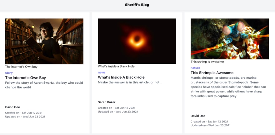
The homepage should appear similar to this -
Designing the blog post page
We will design a dynamic route to render each blog post page based on their slug in this step. Thus, the URL of each page will be dependent on the slug of the page.
Create an article folder in the **pages** folder, and add a **[slug].js** file to the **pages/article** folder. Add the following lines of code to the **pages/article/[slug].js** file.
    import Markdown from "markdown-to-jsx";
    import { fetchAPI } from "../../lib/api";
    import Layout from "../../components/layout";

    const Article = ({ article }) => {
     return (
       <>
         <Layout>
           <div className="mt-10">
             <div className="mb-4 md:mb-0 w-full max-w-screen-md mx-auto">
               <div className="absolute left-0 bottom-0 w-full h-full" />
              <div>
                 {article.image && (
                  <img src={`http://localhost:1337${article.image.url}`} />
                )}
               </div>
               <div>
                 {article.category && (
                   <a
                     href="#"
                     className="px-4 py-1 bg-black text-blue-200 inline-flex text-md items-center justify-center mb-2"
                   >
                     {article.category.name}
                   </a>
                 )}
               </div>
               <h2 className="text-4xl pt-2 font-semibold text-gray-500 leading-tigh`t">
                 {article.description}
               </h2>
              <div className="mt-3">
                 {article.author && (
                   <p className="text-blue-900 font-semibold pb-2">
                    Written by - {article.author.name}
                   </p>
                )}
               </div>
             </div>
             <article className="prose lg:prose-xl px-4 lg:px-0 mt-12 text-gray-700 max-w-screen-md mx-auto text-lg leading-relaxed">
               <Markdown>{article.content}</Markdown>
             </article>
           </div>
         </Layout>
       </>
     );
    };

    export default Article;

    export async function getStaticPaths() {
     const articles = await fetchAPI("/articles");

     return {
       paths: articles.map((article) => ({
         params: {
          slug: article.slug,
        },
       })),
       fallback: false,
     };
    }

    export async function getStaticProps({ params }) {
     const article = await fetchAPI(/articles/${params.slug}`);

     return {
       props: { article },
       revalidate: 1,
     };
    }
What this page does is that it gets a single article with its slug and displays the article. So, first, we query our backend for every article with the getStaticPaths() API. Then, we get the slug and store them in the slug params.
The slug params are then passed into the getStaticProps() API. The getStaticProps queries the backend with a single slug and returns the data collected from the backend as props. The props data are then passed into the < Article /> component and rendered with our UI created with tailwind CSS.
Each blog post should appear similar to this -

Now that our blog is completely designed, we can now configure the preview API for a more effortless content editing experience on our platform.
Activating the Preview mode
The first step will be to create a preview secret. Then, we will use this secret to access the preview mode securely in our browser.
Create a .env file and add your preview secret to the file
PREVIEW_SECRET=****
Next, we will add a helper function to our **/lib/api.js** file. We will use this helper to query our backend for preview data.
    export async function getPageData(slug, preview = false) {
     // Find the pages that match this slug
     const pagesData = await fetchAPI(
       `/articles?slug=${slug}&status=published${preview ? "&status=draft" : ''}`
     );

     // Make sure we found something, otherwise return null
     if (pagesData == null || pagesData.length === 0) {
       return null;
     }

     // Return the first item since there should only be one result per slug
     return pagesData[0];
    }
The code queries the Strapi for the requested slug and returns both published or draft blog posts.
The next step will be to create and configure the preview API route. In **/pages/API**, add a new file called **preview.js**. Then, add the following code to the file.
    import { getPageData } from "../../lib/api"

    export default async function handler(req, res) {
     if (req.query.secret !== (process.env.PREVIEW_SECRET || 'secret-token')) {
       return res.status(401).json({ message: "Invalid token" });
     }

     const pageData = await getPageData(req.query.slug, true);

     if (!pageData) {
       return res.status(401).json({ message: "Invalid slug" });
     }

     res.setPreviewData({});

     res.writeHead(307, { Location: `/article/${req.query.slug}` });
     res.end();
    };
What this code does is that it matches the secret in the preview URL to the preview secret in the .env file. After verifying the preview request, the API then activates the preview mode and redirects to the article location.
When the preview mode is activated, Next.js sets some cookies in your browser. We will add these cookies to any request going to Next.js automatically, and Next.js treats any request with this cookie as a preview mode request.
Go back to your **[slug].js** file, import the getPageData helper from the **lib/api** page.
import { fetchAPI, getPageData } from "../../lib/api";
Change your getStaticProps() code to the following lines of code
     export async function getStaticProps({ params, preview = null }) {
     const article = await getPageData(params.slug, preview);

     return {
       props: { article, preview },
       revalidate: 1,
     };
    }
Accessing the preview mode
Access the preview mode by navigating to this url [http://localhost:3000/api/preview?secret=](http://localhost:3000/api/preview?secret=)<preview-secret>&slug=<slug>
Where:
- = secret token defined in your
.envfile - = the draft page slug.
Deactivating the Previews mode
Navigate to the **pages/API** folder and add a new file named **exit-preview.js**. Next, add the following lines of code to the **exit-preview.js** file.
    export default function handler(req, res) {

     try {
       // Clears the preview mode cookies.
       // This function accepts no arguments.
       res.clearPreviewData()

       return res.status(200).json({ message: 'Cookies Cleared' })
     } catch (error) {
       return res.status(500).json({ message: error })
     }
    }
This code clears all the cookies set by the previews mode API in your browser.
Also, Navigate to pages/articles/[slug].js and change the <Article /> component to this -
    const Article = ({ article, preview }) => {
     return (
       <>
         <div>
           {preview ? (
             <div className="relative bg-indigo-600">
               <div className="max-w-7xl mx-auto py-3 px-3 sm:px-6 lg:px-8">
                 <div className="pr-16 sm:text-center sm:px-16">
                   <p className="font-medium text-white">
                     <span>Preview mode is on,</span>
                    <span className="block sm:ml-2 sm:inline-block">
                      <a
                       href="/api/exit-preview"
                        className="underline hover:text-cyan transition-colors"
                       >
                         turn off
                       </a>
                     </span>
                   </p>
                 </div>
               </div>
             </div>
           ) : null}
         </div>
         <Layout>
           <div className="mt-10">
             <div className="mb-4 md:mb-0 w-full max-w-screen-md mx-auto">
              <div className="absolute left-0 bottom-0 w-full h-full" />
              <div>
                 {article.image && (
                   <img src={`http://localhost:1337${article.image.url}`} />
                 )}
               </div>
               <div>
                 {article.category && (
                   <a
                     href="#"
                     className="px-4 py-1 bg-black text-blue-200 inline-flex text-md items-center justify-center mb-2"
                   >
                     {article.category.name}
                  </a>
                )}
               </div>
               <h2 className="text-4xl pt-2 font-semibold text-gray-500 leading-tight">
                 {article.description}
               </h2>
               <div className="mt-3">
                 {article.author && (
                   <p className="text-blue-900 font-semibold pb-2">
                     Written by - {article.author.name}
                   </p>
                 )}
               </div>
             </div>
             <article className="prose lg:prose-xl px-4 lg:px-0 mt-12 text-gray-700 max-w-screen-md mx-auto text-lg leading-relaxed">
               <Markdown>{article.content}</Markdown>
             </article>
           </div>
         </Layout>
       </>
     );
    };
The blog post pages should look like this now when the preview mode is activated.
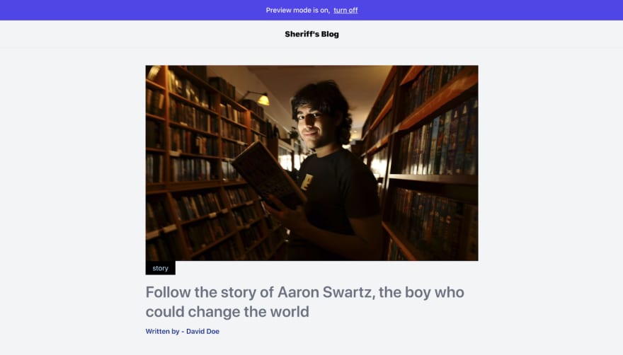
Click turn off to deactivate the preview mode. You can also deactivate the preview mode by navigating to
.


## Conclusion

The preview mode is an essential Static site generator tool that can improve the content editor experience when using the Jamstack architecture.

To learn more about Next.js preview mode, visit this link - [](https://nextjs.org/docs/advanced-features/preview-mode)https://nextjs.org/docs/advanced-features/preview-mode [](https://nextjs.org/docs/advanced-features/preview-mode).

Source Code - https://github.com/Quadrisheriff/previews-tutorial-

>This article is a guest post by  [**Quadri Sheriff**](http://twitter.com/QuadriSheriff3). He wrote this blog post through the [Write for the Community](https://strapi.io/write-for-the-community) program.


Top comments (0)