
When you Google something, there are probably millions of results. But they don't display all of them at once.
Pagination is the term web developers use to show only some of the results within a dataset
You're showing only some results, then there will be an option for "go to the next page," or some equivalent.
There are several variations of pagination. I recently sought out to answer, from a UI/UX view, what is the ideal pagination format? What's the most practical (dare I say, "best")?
Pagination Benefits
Why use pagination? Two major benefits come to mind:
- It's easier for users to digest small chunks of information
- It helps with the page load. Loading 10 results is much faster than 1,000 results (think seconds it takes a website to display)
Pagination Examples
This is so common amongst web developers that UI web libraries have pre-built design templates. For example, here's the default Bootstrap design:

Google has a unique one:

I remember several years ago, I did something like this:
Prior to going on this quest, this was my previous standard:
![]()
As you can see it has:
- First/Last icons
- Previous/Next icons
- Page you’re on
- Total number of pages
That was pretty simple (and simple is good!) but of course I thought:
Was there a better way?
Assumption: Search vs Browse
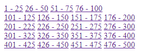
You're not remaking Google. You won't have a million results.
Your app should have a "search" capability that will allow a user to narrow down the results. Maybe it’ll be 100 or even 1,000 results. After a search, the user may sort the results. Overall it’ll be a rather small dataset.
If the user isn’t sure what they're looking for, then they are browsing the entire dataset.
For my use case, I'm using pagination for when a user is browsing an entire dataset.
Initial logic in designing the ideal pagination
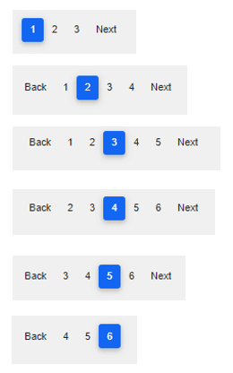
Using Google as an inspiration and a lot of thought, this was my first pass:
Considerations:
- First/Last buttons (if applicable)
- Previous/Next buttons (if applicable)
- Numeric indicators
No Need For First/Last Buttons
When you perform a search, you expect to see the most relevant results first. If the results aren't on the page, you'll go to the next page. And maybe even the one after that.
Once you're in the "middle" of the search results, you most likely won't have a desire to go back to the first page. Similarly, you probably won't have a need to skip to the last page; if you were that interested, you’d sort the results descending. As such, no need to show "First/Last" options.
Previous/Next
Assuming the results aren't on the first page, and you're actually utilizing pagination, you'll need Previous/Next buttons.
Only show if applicable. For example, when viewing the first page of results, don’t show a "Previous" button. Or at minimum, have it displayed but disabled (unclickable).
Two comments of interest when I was talking to York Myers, a friend who's a UI/UX expert:
- Consider using the term "Back" instead of "Previous". Fewer letters will be more consistent with the term "Next".
- Use icons (ex. arrow) if possible. Be mindful of your users though: depending on the demographic, it may be more clear to explicitly spell-out "Next" rather than have an arrow.
Page Numbers
A couple of obvious things:
- Show the current ("active") page that the user is on
- In addition to Previous (Back) / Next buttons, have a clickable button that has the page number on it. If you’re on Page 1, then have a button for "Page 2" and a button for "Next".
Not as obvious:
- How many numeric buttons do you need? After some thought and discussion, I think it should be no more than two numbers, before and/or after the current page the user is on. This is demonstrated in the image above.
(2) Final Recommendations
I think the logic in the preceding recommendation is ideal, however there was another suggestion offered. Take a look at the component below:

It has:
- Option to select rows per page (here, a dropdown with 10 pre-selected)
- Displaying the current set of results (here, 1 to 10)
- Total number of results (here, 14)
- Previous / Next as icons
That simplifies things, but personally I don't want to give the user an option to select the number of results to show.
Showing less options >> User has to think less
I realized that this is what GMail does. Another ideal pagination design pattern then becomes:
![]()
I'm a web developer with 20+ years experience. While I’m not a UI/UX expert, I’ve picked up a thing or two over the years and I did consult one for this article. Your comments/opinions are welcome!
This article was originally posted on Medium

Top comments (0)