Intro
A project from my Human-Computer interaction class (CS5340). Done in group of 4. This article will walk you through the design/development process.
Repos
https://github.com/steventhan/smart-marino-server
https://github.com/steventhan/smart-marino-client
https://github.com/steventhan/smart-marino-machine
Why did we start this project?
Northeastern students who attend Marino are often unable to find their desired machine to work out on, due to a high number of students already at the gym. If a student does not find a machine on the second floor, they will go to check the availability on the third floor. It is possible that while the student is on the third floor, a machine on the second floor will become available, yet another student who just entered the gym might grab it before the other student. This is not fair and there is no current way to regulate this. The Smart Marino application will assist students by allowing them to sign up for their desired type of machine and the app will let them know when a machine is available for them to use, only allowing that student to work out on that machine due to a “check in” system.
How do students use it?
Reserving a machine:
- Login using NEU account
- Select a machine using map or list view
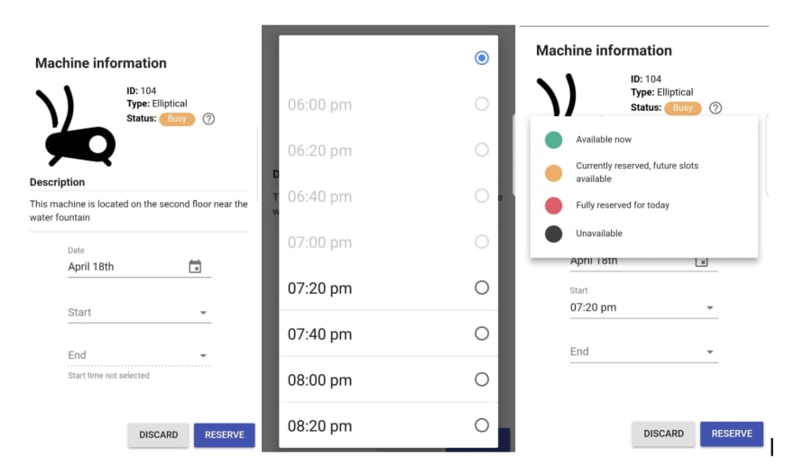
- Pick a time slot and reserve
Using a machine:
- Go to physical location of the reserved machine
- Either scan the QR code and manually input a "check-in" code shown on iPad screen into the web app
Implementation
Smart Marino consists of 3 parts:
- Web app that handles reservation
- iOS app that is displayed at machines
- Rest API backend that serves both web and Ipad app
The user-facing web app is made using ReactJS as the framework. We utilized Material-UI which is a React UI library that comes with a grid system and UI components designed to closely match Google’s material design components. Using React and an UI library allowed us to make reusable components (E.g. Reserve view and My reservations view share a few components); as a result, they helped greatly with consistency.
The iOS app is coded using Swift and Xcode. It keeps an open connection to backend server to reflect a machine status. It also queries reservation’s start and end time (if there is one) to accurately display the countdown timer. Both web and iOS app used the same font and machine status color to create a feel of consistency. There were concerns about the practicality of an iOS app, which requires an Apple device to run. We argue that it’s just a proof of concept for now and can be easily translated to an Android app, which would definitely reduce the cost equipping a workout machine.
Smart Marino’s backend API is built with NodeJS, use Mongodb for data storage. As authentication is offloaded to NEU and Google, we didn’t have to put in a lot of effort to make the backend secure. The backend only verifies credentials when a request for cancellation or checking-in arrives. This sped up the development process quite a bit because we didn’t have to send the authorized token back and forth when we just want to fetch machines’ availability and reservation information.
Look and feel
Our interface strictly follows Google’s material design guideline because we’re trying to make it as similar to a mobile application as possible. Various principles were implemented such as the flat looking views, ripple effect on click/tap, bottom-up page transition, floating action button etc.
General layout
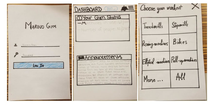
The initial sketches include layout designs for both desktop and mobile versions, but we eliminated the desktop version due to time constraint. Nevertheless, since it’s a web app, it’s fully functional when used with bigger screens.
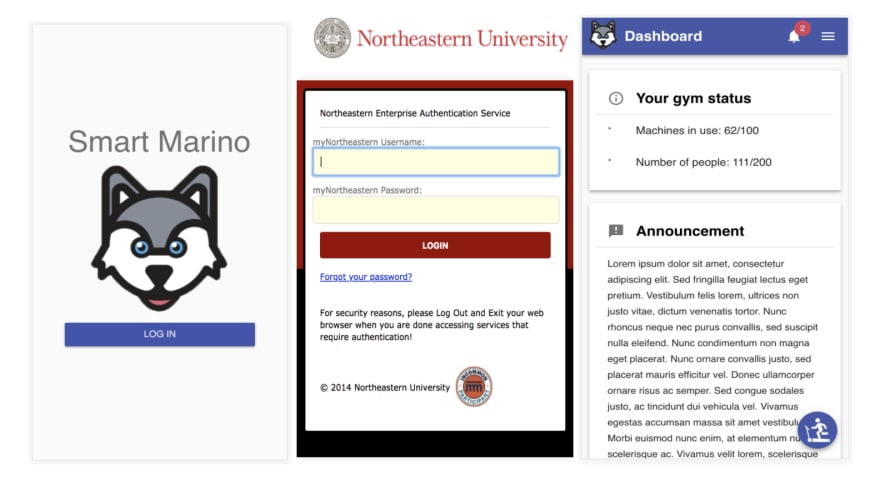
For mobile version, general layout remained relatively similar from the paper prototypes to final product. We had an app bar at top of the screen for each view that has the view’s name on the left, hamburger menu on the right. The view name changes to correctly reflects where the user currently is in the app. We added a logo next to the view’s name in our final product as it helps promote the brand and also serves as a home button. (One of the responses from heuristic evaluation was missing home button).


Top comments (0)