Hi, I'm Sam — software engineer at Spot and the 2nd most active maintainer of Emotion, a widely-popular CSS-in-JS library for React. This post will delve into what originally attracted me to CSS-in-JS, and why I (along with the rest of the Spot team) have decided to shift away from it.
We'll start with an overview of CSS-in-JS and give an overview of its pros & cons. Then, we'll do a deep dive into the performance issues that CSS-in-JS caused at Spot and how you can avoid them.
What is CSS-in-JS?
As the name suggests, CSS-in-JS allows you to style your React components by writing CSS directly in your JavaScript or TypeScript code:
// @emotion/react (css prop), with object styles
function ErrorMessage({ children }) {
  return (
    <div
      css={{
        color: 'red',
        fontWeight: 'bold',
      }}
    >
      {children}
    </div>
  );
}

// styled-components or @emotion/styled, with string styles
const ErrorMessage = styled.div`
  color: red;
  font-weight: bold;
`;
styled-components and Emotion are the most popular CSS-in-JS libraries in the React community. While I have only used Emotion, I believe virtually all points in this article apply to styled-components as well.
This article focuses on runtime CSS-in-JS, a category which includes both styled-components and Emotion. Runtime CSS-in-JS simply means that the library interprets and applies your styles when the application runs. We'll briefly discuss compile-time CSS-in-JS at the end of the article.
The Good, The Bad, and the Ugly of CSS-in-JS
Before we get into the nitty-gritty of specific CSS-in-JS coding patterns and their implications for performance, let's start with a high-level overview of why you might choose to adopt the technology, and why you might not.
The Good
1. Locally-scoped styles. When writing plain CSS, it's very easy to accidentally apply styles more widely than you intended. For example, imagine you're making a list view where each row should have some padding and a border. You'd likely write CSS like this:
   .row {
     padding: 0.5rem;
     border: 1px solid #ddd;
   }
Several months later when you've completely forgotten about the list view, you create another component that has rows. Naturally, you set className="row" on these elements. Now the new component's rows have an unsightly border and you have no idea why! While this type of problem can be solved by using longer class names or more specific selectors, it's still on you as the developer to ensure there are no class name conflicts.
CSS-in-JS completely solves this problem by making styles locally-scoped by default. If you were to write your list view row as
<div css={{ padding: '0.5rem', border: '1px solid #ddd' }}>...</div>
there is no way the padding and border can accidentally get applied to unrelated elements.
Note: CSS Modules also provide locally-scoped styles.
2. Colocation. If using plain CSS, you might put all of your .css files in a src/styles directory, while all of your React components live in src/components. As the size of the application grows, it quickly becomes difficult to tell which styles are used by each component. Often times, you will end up with dead code in your CSS because there's no easy way to tell that the styles aren't being used.
A better approach for organizing your code is to include everything related to a single component in same place. This practice, called colocation, has been covered in an excellent blog post by Kent C. Dodds.
The problem is that it's hard to implement colocation when using plain CSS, since CSS and JavaScript have to go in separate files, and your styles will apply globally regardless of where the .css file is located. On the other hand, if you're using CSS-in-JS, you can write your styles directly inside the React component that uses them! If done correctly, this greatly improves the maintainability of your application.
Note: CSS Modules also allow you to colocate styles with components, though not in the same file.
3. You can use JavaScript variables in styles. CSS-in-JS enables you to reference JavaScript variables in your style rules, e.g.:
// colors.ts
export const colors = {
  primary: '#0d6efd',
  border: '#ddd',
  /* ... */
};

// MyComponent.tsx
function MyComponent({ fontSize }) {
  return (
    <p
      css={{
        color: colors.primary,
        fontSize,
        border: `1px solid ${colors.border}`,
      }}
    >
      ...
    </p>
  );
}
As this example shows, you can use both JavaScript constants (e.g. colors) and React props / state (e.g. fontSize) in CSS-in-JS styles. The ability to use JavaScript constants in styles reduces duplication in some cases, since the same constant does not have to be defined as both a CSS variable and a JavaScript constant. The ability to use props & state allows you to create components with highly-customizable styles, without using inline styles. (Inline styles are not ideal for performance when the same styles are applied to many elements.)
The Neutral
1. It's the hot new technology. Many web developers, myself included, are quick to adopt the hottest new trends in the JavaScript community. Part of this is rationale, since in many cases, new libraries and frameworks have proven to be massive improvements over their predecessors (just think about how much React enhances productivity over earlier libraries like jQuery). On the other hand, the other part of our obsession with shiny new tools is just that — an obsession. We're afraid of missing out on the next big thing, and we might overlook real drawbacks when deciding to adopt a new library or framework. I think this has certainly been a factor in the widespread adoption of CSS-in-JS — at least it was for me.
The Bad
1. CSS-in-JS adds runtime overhead. When your components render, the CSS-in-JS library must "serialize" your styles into plain CSS that can be inserted into the document. It's clear that this takes up extra CPU cycles, but is it enough to have a noticeable impact on the performance of your application? We'll investigate this question in depth in the next section.
2. CSS-in-JS increases your bundle size. This is an obvious one — each user who visits your site now has to download the JavaScript for the CSS-in-JS library. Emotion is 7.9 kB minzipped and styled-components is 12.7 kB. So neither library is huge, but it all adds up. (react + react-dom is 44.5 kB for comparison.)
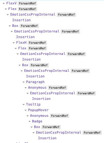
3. CSS-in-JS clutters the React DevTools. For each element that uses the css prop, Emotion will render <EmotionCssPropInternal> and <Insertion> components. If you are using the css prop on many elements, Emotion's internal components can really clutter up the React DevTools, as seen here:
The Ugly
1. Frequently inserting CSS rules forces the browser to do a lot of extra work. Sebastian Markbåge, member of the React core team and the original designer of React Hooks, wrote an extremely informative discussion in the React 18 working group about how CSS-in-JS libraries would need to change to work with React 18, and about the future of runtime CSS-in-JS in general. In particular, he says:
In concurrent rendering, React can yield to the browser between renders. If you insert a new rule in a component, then React yields, the browser then have to see if those rules would apply to the existing tree. So it recalculates the style rules. Then React renders the next component, and then that component discovers a new rule and it happens again.
This effectively causes a recalculation of all CSS rules against all DOM nodes every frame while React is rendering. This is VERY slow.
Update 2022-10-25: This quote from Sebastian is specifically referring to performance in React Concurrent Mode, without useInsertionEffect. I recommend reading the full discussion if you want an in-depth understanding of this. Thanks to Dan Abramov for pointing out this inaccuracy on Twitter.
The worst thing about this problem is that it's not a fixable issue (within the context of runtime CSS-in-JS). Runtime CSS-in-JS libraries work by inserting new style rules when components render, and this is bad for performance on a fundamental level.
2. With CSS-in-JS, there's a lot more that can go wrong, especially when using SSR and/or component libraries. In the Emotion GitHub repository, we receive tons of issues that go like this:
I'm using Emotion with server-side rendering and MUI/Mantine/(another Emotion-powered component library) and it's not working because...
While the root cause varies from issue to issue, there are some common themes:
- Multiple instances of Emotion get loaded at once. This can cause problems even if the multiple instances are all the same version of Emotion. (Example issue)
- Component libraries often do not give you full control over the order in which styles are inserted. (Example issue)
- Emotion's SSR support works differently between React 17 and React 18. This was necessary for compatibility with React 18's streaming SSR. (Example issue)
And believe me, these sources of complexity are just the tip of the iceberg. (If you're feeling brave, take a look at the TypeScript definitions for @emotion/styled.)
Performance Deep Dive
At this point, it's clear that there are both significant pros and significant cons to runtime CSS-in-JS. To understand why our team is moving away from the technology, we need to explore the real-world performance impact of CSS-in-JS.
This section focuses on the performance impact of Emotion, as it was used in the Spot codebase. As such, it would be a mistake to assume that the performance numbers presented below apply to your codebase as well — there are many ways to use Emotion, and each of these has its own performance characteristics.
Serialization Inside of Render vs. Outside of Render
Style serialization refers to the process by which Emotion takes your CSS string or object styles and converts them to a plain CSS string that can be inserted into the document. Emotion also computes a hash of the plain CSS during serialization — this hash is what you see in the generated class names, e.g. css-15nl2r3.
While I have not measured this, I believe one of the most significant factors in how Emotion performs is whether style serialization is performed inside or outside of the React render cycle.
The examples in the Emotion docs perform serialization inside render, like this:
function MyComponent() {
  return (
    <div
      css={{
        backgroundColor: 'blue',
        width: 100,
        height: 100,
      }}
    />
  );
}
Every time MyComponent renders, the object styles are serialized again. If MyComponent renders frequently (e.g. on every keystroke), the repeated serialization may have a high performance cost.
A more performant approach is to move the styles outside of the component, so that serialization happens one time when the module loads, instead of on each render. You can do this with the css function from @emotion/react:
const myCss = css({
  backgroundColor: 'blue',
  width: 100,
  height: 100,
});

function MyComponent() {
  return <div css={myCss} />;
}
Of course, this prevents you from accessing props in your styles, so you are missing out on one of the main selling points of CSS-in-JS.
At Spot, we performed style serialization in render, so the following performance analysis will focus on this case.
Benchmarking the Member Browser
It's finally time to make things concrete by profiling a real component from Spot. We'll be using the Member Browser, a fairly simple list view that shows you all of the users in your team. Virtually all of the Member Browser's styles are using Emotion, specifically the css prop.

For the test,
- The Member Browser will display 20 users,
- The
React.memoaround the list items will be removed, and - We'll force the top-most
<BrowseMembers>component to render each second, and record the times for the first 10 renders. - React Strict Mode is off. (It effectively doubles the render times you see in the profiler.)
I profiled the page using the React DevTools and got 54.3 ms as the average of the first 10 render times.
My personal rule of thumb is that a React component should take 16 ms or less to render, since 1 frame at 60 frames per second is 16.67 ms. The Member Browser is currently over 3 times this figure, so it's a pretty heavyweight component.
This test was performed on an M1 Max CPU which is WAY faster than what the average user will have. The 54.3 ms render time that I got could easily be 200 ms on a less powerful machine.
Analyzing the Flamegraph
Here's the flamegraph for a single list item from the above test:

As you can see, there are a huge number of <Box> and <Flex> components being rendered — these are our "style primitives" which use the css prop. While each <Box> only takes 0.1 – 0.2 ms to render, this adds up because the total number of <Box> components is massive.
Benchmarking the Member Browser, without Emotion
To see how much of this expensive render was due to Emotion, I rewrote the Member Browser styles using Sass Modules instead of Emotion. (Sass Modules are compiled to plain CSS at build time, so there is virtually no performance penalty to using them.)
I repeated the same test described above and got 27.7 ms as the average of the first 10 renders. That's a 48% decrease from the original time!
So, that's the reason we are breaking up with CSS-in-JS: the runtime performance cost is simply too high.
To repeat my disclaimer from above: this result only directly applies to the Spot codebase and how we were using Emotion. If your codebase is using Emotion in a more performant way (e.g. style serialization outside of render), you will likely see a much smaller benefit after removing CSS-in-JS from the equation.
Here is the raw data for those who are curious:

Our New Styling System
After we made up our minds to switch away from CSS-in-JS, the obvious question is: what should we be using instead? Ideally, we want a styling system that has performance similar to that of plain CSS while keeping as many of the benefits of CSS-in-JS as possible. Here are the primary benefits of CSS-in-JS that I described in the section titled "The Good":
- Styles are locally-scoped.
- Styles are colocated with the components they apply to.
- You can use JavaScript variables in styles.
If you paid close attention to that section, you'll remember that I said that CSS Modules also provide locally-scoped styles and colocation. And CSS Modules compile to plain CSS files, so there is no runtime performance cost to using them.
The main downside to CSS Modules in my mind is that, at end of the day, they are still plain CSS — and plain CSS is lacking features that improve DX and reduce code duplication. While nested selectors are coming to CSS, they aren't here yet, and this feature is a huge quality of life boost for us.
Fortunately, there is an easy solution to this problem — Sass Modules, which are simply CSS Modules written in Sass. You get the locally-scoped styles of CSS Modules AND the powerful build-time features of Sass, with essentially no runtime cost. This is why Sass Modules will be our general purpose styling solution going forward.
Side note: With Sass Modules, you lose benefit 3 of CSS-in-JS (the ability to use JavaScript variables in styles). Though, you can use an
:exportblock in your Sass file to make constants from the Sass code available to JavaScript. This isn't as convenient, but it keeps things DRY.
Utility Classes
One concern the team had about switching from Emotion to Sass Modules is that it would be less convenient to apply extremely common styles, like display: flex. Before, we would write:
<FlexH alignItems="center">...</FlexH>
To do this using only Sass Modules, we would have to open the .module.scss file and create a class that applies the styles display: flex and align-items: center. It's not the end of the world, but it's definitely less convenient.
To improve the DX around this, we decided to bring in a utility class system. If you aren't familiar with utility classes, they are CSS classes that set a single CSS property on the element. Usually, you will combine multiple utility classes to get the desired styles. For the example above, you would write something like this:
<div className="d-flex align-items-center">...</div>
Bootstrap and Tailwind are the most popular CSS frameworks that offer utility classes. These libraries have put a lot of design effort into their utility systems, so it made the most sense to adopt one of them instead of rolling our own. I had already been using Bootstrap for years, so we went with Bootstrap. While you can bring in the Bootstrap utility classes as a pre-built CSS file, we needed to customize the classes to fit our existing styling system, so I copied the relevant parts of the Bootstrap source code into our project.
We've been using Sass Modules and utility classes for new components for several weeks now and are quite happy with it. The DX is similar to that of Emotion, and the runtime performance is vastly superior.
Side note: We're also using the typed-scss-modules package to generate TypeScript definitions for our Sass Modules. Perhaps the largest benefit of this is that it allowed us to define a
utils()helper function that works like classnames, except it only accepts valid utility class names as arguments.
A Note about Compile-Time CSS-in-JS
This article focused on runtime CSS-in-JS libraries like Emotion and styled-components. Recently, we've seen an increasing number of CSS-in-JS libraries that convert your styles to plain CSS at compile time. These include:
These libraries purport to provide a similar benefits to runtime CSS-in-JS, without the performance cost.
While I have not used any compile-time CSS-in-JS libraries myself, I still think they have drawbacks when compared with Sass Modules. Here are the drawbacks I saw when looking at Compiled in particular:
- Styles are still inserted when a component mounts for the first time, which forces the browser to recalculate the styles on every DOM node. (This drawback was discussed in the section title "The Ugly".)
- Dynamic styles like the
colorprop in this example cannot be extracted at build time, so Compiled adds the value as a CSS variable using thestyleprop (a.k.a. inline styles). Inline styles are known to cause suboptimal performance when applied many elements. - The library still inserts boilerplate components into your React tree as shown here. This will clutter up the React DevTools just like runtime CSS-in-JS.
Conclusion
Thanks for reading this deep dive into runtime CSS-in-JS. Like any technology, it has its pros and cons. Ultimately, it's up to you as a developer to evaluate these pros and cons and then make an informed decision about whether the technology is right for your use case. For us at Spot, the runtime performance cost of Emotion far outweighed the DX benefits, especially when you consider that the alternative of Sass Modules + utility classes still has a good DX while providing vastly superior performance.
About Spot
At Spot, we're building the future of remote work. When companies go remote, they often lose the sense of connection and culture that was present in the office. Spot is a next-gen communication platform that brings your team together by combining traditional messaging and video conferencing features with the ability to create & customize your own 3D virtual office. Please check us out if that sounds interesting!
P.S. We're looking for talented software engineers to join the team! See here for details.

This post was also published on the Spot blog.


Oldest comments (138)
To be honest, the whole "it's hard to tell what's used by what" in plain CSS is already solved with BEM.
BEM scales very nicely.
So by using new CSS variables with CSS modules to create locally scoped overrides you can still create runtime themed styles.
Yes your "frontend" Devs will need to learn CSS instead of just treating it like the Typescript autocomplete object faceroll experience that current cssinjs promotes.
Other unpopular opinions I hold:
Nested CSS rules made popular by lesscss are a maintenance nightmare. Don't use them.
Extends is also bad.
Mixins... Yep I hate them too.
Sass paved the way but it's time to ditch it.
Always good to see some contrary opinions - not everything that "shines" is made of gold :)
Same (sorta), I will forever be in love with SASS and BE (BEM without the modifiers).
I satisfy all 3 of of the mentioned pro's of CSS in JS with: SASS+BE, custom HTML elements, and CSS variables.
I approach everything as a component and use custom HTML elements with a corresponding sass file with mixins only used to tap into our global design systems like our grids/buttons/fonts.
To me using BEM's modifier classes are equally as ugly (and annoying
.block__element--modifier???blegh!) as using utility classes and I absolutely hate referencing them in my JavaScript files. I restrict the use of modifiers for side-effects of user interactions which are modified via JS so I use custom HTML attributes as modifiers instead and do not worry about it bleeding into other components since I am taking advantage of SASS's locally scoped nature. I also keep SASS Elements one level deep in terms of nesting. My SASS components are usually flat and I only nest when doing something like the lobotomized owl.For getting colors or dimensions from JS into the stylesheet, i inject custom css variables into the DOM element's style attribute and reference it in the css:
and in your SASS:
Works beautifully.
I don't care about things being ugly.
My main goal is scaling in large teams and maintenance long term, so I care more about understanding dependencies and avoiding the cascade.
Looks like you've also dived deep into the problem 👍️
i guess it's the designer in me, but, to me, if it ain't beautiful, it ain't worth looking at.
Another thing I would mention is that your nesting of media queries is also a thing i loathe.
the pattern I follow is :
thing/index.scssThis way, you're following a mobile first approach and then you don't end up with this :
It's a pretty simple example, but I've seen worse.
Nesting media queries is one of the reasons I still love and use SASS. It allows me to immediately see all behavior for a single piece of styling. I don't have to go into 3-4 files (like in your case) in order to see how this component behaves on each resolution.
But to each their own, we all have our own preferences when it comes to some of this stuff. To me personally it's just easier to piece all of this stuff together when it's all in the same file, I can just immediately see "Oh this selector behaves like this on mobile, after 'md' and after 'lg' breakpoints".
same! multiple sass files for a single component? seems like a step backwards to me, harder to see the whole picture.
With this pattern you don't know how a component behaves on different breakpoints. If the component is complex is even more so, since when you change one element you have to check 4 files to make sure that it works as you intended. I highly discourage this pattern, nested media queries seems the natural way of styling a component IMHO.
Indeed, it's much easier to work with media queries that are simply called whenever they needed on a small bit of styling; than splitting entire stylesheets based on those same media queries.
Yes, you might up with a few more media queries but at least it's very easy for each developer to see what's going on. Having to look into separate files for the styling of a single component, as well as remembering what's happening for every single viewport, is a tremendous pain and unscalable nor maintainable.
also, they implied that we aren't doing mobile first using this approach which we 100% are and it's very easy to see that we are.
if you are a stickler for order then you would start from the bottom up and declare the padding at the mobile level and later reset for wider devices
but I also don't mind the convenience of using
include-mediato specifically target mobile if I don't want to use the bottom up approach. it isn't hard at all to reason about and I use it sparingly, only when I know it's going to be mostly mobile only styles.Hello @eballeste ,
Few questions on your implementation -
Are you using custom elements to create your own Web components or using customized custom elementsi.e. class MyButton extends HTMLButtonElement and customElements.define() takes a third argument - {extends: 'button'}?
Do your custom elements work perfectly fine in Safari?
In your custom elements, how are you rendering the markup? Are you using innerHtml (vulnerable to injection attacks) for two-way binding, or a better option?
This is a unrelated question to your stack. I am using EmotionJS in my React component library, how can I migrate my EmotionJS styles to SASS styles?
I love BEM and it's what I use when writing regular CSS for my own use.
The problem with BEM isn't BEM itself, it's getting your coworkers, new developers
and external agencies to understand and follow the syntax. We implemented BEM at a previous workplace and it worked perfectly until some core developers quit and new ones were hired, and then the styles just quickly deteriorated.
CSS modules and CSS-in-JS are locally scoped by default, and you have to specifically add syntax to make things global. As much as I dislike Tailwind syntax, that too has the advantage of keeping styling local to the place it's applied at least.
Did the new developers read the BEM documentation? In my experience a lot of people find that BEM "looks ugly" at first sight and then don't even try to understand it. While it solves so many problems.
There's linting you can use to enforce this.
This is my experience as well. BEM can scale really well, but keeping it consistent is a problem when you have multiple people working in a codebase. I mean same can be said for any tool. Getting everyone on board is usually the hardest part.
People are also detracted from BEM because of it's syntax and because it "looks ugly" to them, but once you actually start using it, your CSS becomes a breeze to use and read because its "standardized" in some way. It also produces flat styling without horrible nesting which is a big plus in my book. Simpler flat styling allows easier per situation override if needed and you don't have to battle CSS selector nesting and specificity that much at all.
When using BEM, I've usually went with BEM + utility classes approach. Some more common things like spacing (padding, margin), colors, and maybe some flex/block properties would be mostly in utility classes and everything else would be BEM. It worked quite nicely for projects that I've been working on. It also allowed me to build UI faster because I wouldn't have to apply same spacing values all over again for each component, but could just apply a utility class name to some wrapper element and get the spacing that I want.
These days when working with React, the projects that I usually work on use SASS Modules and that also scales nicely. It's easier to get people on the same page because there is no specific naming convention like BEM and people don't have to worry about naming things because everything is locally scoped. This approach works nicely in most situations except few edge cases where styles need to be shared or something kinda needs to be global, then it's not so elegant anymore and in a single file. But other than that, it works really well and I don't have to leave comments on PRs like "hey the name of this class doesn't adhere to BEM principles, it should be this and that etc."
I still prefer SASS Modules compared to CSS-in-JS (emotion, styled-components) because you are still "mostly" writing just regular CSS that is closer to the native web.
I'm also working on a project that uses styled-components and even though I do like type safety we get with that because we use Typescript, it also makes every little styling its own component and to see any conditional logic for styling I always have to jump to source of a styled component to see what's going on. At least with SASS Modules and conditionally applying classNames I can immediately see what class is being applied for a certain condition and just by its name I can probably tell what it does without having to go into its source.
But that's just me and my personal experience.
Mixins... I FKN love them. They are excellent at naming certain CSS "hacks": things that only make sense together, things that must act together otherwise the effect you want won't happen. Now you could write comments around it, but named mixins equate well-named, descriptive function names from clean coding.
if they could be strongly typed I might agree with you, but all they end up doing is hiding complexity.
Sorry, I don't get it. Do you have an example?
Good old BEM days with Knockout JS, not many React devs would know about BEM styling
BEM is really good i learnt from jonas sass course and it was really fun utilizing block, element and modifier classes
"Nested CSS rules ... are a maintenance nightmare."
Use things they way they're intended. If css rules are only intended to work in, say, tables, then nest them inside of tables. Or, just certain classes of tables. If they are to be general, then don't nest them.
These three .hilite classes will not conflict with each other; the deeper ones will always override the shallow one at the bottom, but only inside .french or .italian tables. Hilite will be orange in french tables; green in italian tables, and blue everywhere else in your whole app. If you want .hilite to do something else outside of your zoot-suit panel, write it that way:
Any HTML outside of the .zoot-suit panel will have to make their own style rules; they can use .hilite freely without any orange, green or blue bleeding in.
Only issue I have with this is that then you don't know if
.hiliteis something global, is it a utility class, is it something specific to that table only when you encounter it in HTML/JSX. If using.table__cell--hilitefor example you know that it's a highlighted table cell and you can get all that data without having to look at the source code. And you know that it should be a table only thing here since it's kinda namespaced withtable__Also, your example uses same class name for global selector and then selector that is more specific to 2-3 scenarios which now makes that selector super situation specific and it doesn't necessarily convey its meaning just by reading it. In my opinion it also raises CSS selector specificity unnecessarily.
But to each their own, I have my preferences and you have yours. Lot of this stuff is of course also situational and cannot really be applied to 100% of projects/situations.
To me both HTML-in-JS and CSS-in-JS look ugly, because you can't separate presentation from logic, hence can't divide this work between different developers without permanent merge conflicts.
U sure about that? Sass still uses javascript after compilation. And about, the DX, sass is kinda painful to work with.
I'm not sure what you mean when you say that "Sass still uses JavaScript after compilation". Unless you are referring to that fact that Sass Modules are compiled to a CSS file and a very small JS module which maps the human-readable class names to mangled class names.
Have you ever looked into Vue's style system? I'm not sure how they do it, but you simply add a "scoped" attribute to a style tag and it automatically scopes the CSS to the components. Their CSS is also compiled at build time into its own file without the need to render separate components. This is the one thing that kept me from switching to React for years. Their styling just works and it works really well.
I haven't messed with Vue 3's implementation, but they also allow you to use JS variables, which are rendered as inline styles: vuejs.org/api/sfc-css-features.htm...
Vue adds a hashed attribute to the dom element, for example:
data-v-ikd87k9.Then your CSS is transformed using PostCSS to target CSS-selectors with your attribute, for example:
.my-class[data-v-ikd87k9] {}I consider it a train-wreck when I can't view my DOM and see all the class names. I don't like my class names being mangled like that hash thing you mentioned. I'm fine with SCSS and not having styles scoped to components, because lots of my styles are cross-component anyway.
I agree, personally, I consider a readable DOM to be important, which is why I try to avoid Tailwind :)
However, I've never experienced Vue's hashing to have impacted this negatively.
What about Tailwind is not readable? If anything it's more readable.
And nothing prevents you from making custom classes composed of Tailwind helper classes.
Tailwind is very difficult to read when you get into more complex cases, especially when working on teams where not everyone knows Tailwind utilities. Having a class that actually describes what the purpose of the element is in addition to styling it is far more readable, takes up far less space, and can still allow for the use of utility classes where they are appropriate for example adding layout and margins.
Vue does not mess with the class names you add to elements, it just appends a data-hash attribute.
Angular does this by default.
Very very nice
Fantastic ... this article might have saved me from unknowingly going down a road that I really shouldn't go down, at some point ... saving this article in a place where I'll be able to find it again.
Charka-UI sweating right now reading this article😂
Hahahahah
I don't think so. Full disclosure I was a contributor on Chakra-UI.
Sage has been aware of the issues with Chakra and it's in their doc. He's been working on ZagJS which uses state machines to provide unstyled components. I assume that one could use CSS, Tailwind or CSS-in-JS to style those components. This is a YouTube video of Sage talking to Lee Robinson about The Future of Chakra/ZagJS.
While I agree with the author about CSS-in-JS, being "the 2nd most active maintainer of Emotion", he's been a contributor to the problem and previously thought of as a contributor to THE solution. We've all been there. If you haven't yet, just wait.
Shouldn't React with their vdom be sweating given projects like Svelte, Solid and Qwik? If you laugh at that remember that once JQuery and Angular JS ruled the world. They were each great for their time, like Emotion, but eventually every king falls.
What exactly is Svelte and Solid except the idea that surgical dom mutations are better than the complexity of a reconciliation engine. Now that we have modern optimized browsers, the svelte/solid model makes sense. A really big app with lots of dashboards and data feeds...do you really want that to be in svelte? Hrm.
There's also module federation where you sortah want css in js or you'd have to manually include a copy of extracted css into every federated module.
And you have to worry about tree shaking when its a .css file.
not that that's a big deal but it's an additional worry.
You could make the similar argument of using emotion to do dynamic css, and then using tailwind utility classes for the majority of your use case. Then you could have your cake and eat it too.
I think that Vanilla Extract is a good option that has many of the advantages and none of the cons. It is basically a CSS precompiler like SASS, but using TypeScript as a language. All the classes are generated at build time, the only runtime cost is choosing the right class (but you must do the same with SASS or plain CSS)
Nice article man, this helped me how to improve the implementation in Angular too!
Thank you for sharing your insights. I agree (judging from my current view point of past and present projects and experiences) that CSS-modules paired with SASS/SCSS are the cleanest and sanest approach to component styles.
But I would say it also checks the third point of your three-point list of good things (locally-scoped styles, co-location, JavaScript variables in styles):
You can share values between styles and js code, in both directions, during build time and during runtime. Each scenario requires its own mechanism (I want to cover this in a blog post but don't know when I will find the time), here is the gist of it:
:exportgetComputedStyle()sass-loader additionalData optionelement.style.setProperty('--some-prop', value)In my webpack config I share the colors (in a *.ts file) with my styles by generating variables like
$primary-main:Overall fantastic analysis on css-in-js, learned alot for sure and appreciate the time you took to analyze everything.
I am struggling to understand how you reached your conclusion for picking bootstrap though. while bootstrap does have utility classes its main use case is telling your app how it ought to be.
Tailwind intends to provide a utility class framework with basic defaults. Tailwind does NOT enforce any styling on your components like bootstrap does with things like its btn class
If you are morphing bootstrap into something to fit your design system i believe you would be much better off creating a design system in Tailwind instead.
if you have more info on why you picked bootstrap besides that you were familiar with it, i would love to understand further because everythinbg described including the ovverides you are doing to bootstrap scream at me that you would be better off with tailwind
We're not using all of Bootstrap, just their utility classes (which we have customized quite a bit). I'm not very familiar with Tailwind but I think they may have taken utility classes a bit too far.
Tailwind will now tree-shake its styles down on build, removing all unused styles.
Afaik they don't tree-shake anymore. The default for quite some time now is the JIT runtime, which only creates the CSS rules that are needed in the first place :)
You will absolutely love Tailwind, trust me bro
Bro, I personally used Tailwind and I can say it is really good solution but... it is really good solution for only a specific parts of styling, namely, for utility styles (mostly common & repetitive styles like positioning, padding, margins, flex, ...). But applying Tailwind for everything is a mess and vastly clutters codebase. Besides, it has steep learning curve (it may not be felt while you are working solo but in a team with noticeable numbers you can really see this). It has its own place in DX but it is definitely not a silver bullet.
Wether it clutters the codebase or not is up to you.
There is nothing preventing you from making your normal classes and use the @apply directive.
.myClass {@apply rounded-full mx-auto text-primary-500 my-8
}
So in that regard there is no difference.
Yes. And try to manage hundreds or thousands of this kind of meta classes across a huge codebase. You are adding yet another unnecessary abstraction layer on top of already provided abstraction... Don't think in terms of just you coding by yourself and setting conventions on how to use it, maybe it works to some degree, but not in a team .
You should've just went with Tailwind tbh
Bootstrap was just convenient because you were already familiar with the classes but there's so much you could've gained by using Tailwind, like JIT compilation (on demand one-time utility classes, variants for element state and media queries, ability to change things using a configuration file, etc)
And Tailwind is not opiniated, unlike Bootstrap.
110pct agree with all your points
Why people keep hyping tailwind is beyond me. Nothing about compiling a list of utility classes before you run your code, sounds at all useful to me... It literally prevents you from doing the easiest dynamic stuff because of the limitations of your utility classes and the only way around that is to do custom DOM manipulation to change css variables at runtime. Why do people still think this is a good idea? Why not use the benefits of css in js and have it compile to plain css files when building? Seems like a much more sensible and maintainable solution to me. Also, having all those utility classes that you don't use, creates far more overhead... CSS files have to be downloaded by the browser too... You literally have code in production that never gets used... I thought we moved past that :(
Sorry, but your argument about having unused utility classes is incorrect. Tailwindcss for a long time now compiles only the classes that are actually being used in your code.
Would be great to fact-check your arguments before you post since it might mislead those not familiar with the topic.
Ok, what about the other argument?
I've been using tailwind with Vue mainly, for dynamic stuff you would just conditionally apply different utility classes, no need to use CSS vars. Can't complain about the DX.
The only negative side I can see here is that in order to reuse your components in another project that project would need Tailwindcss set up as well, so they're not as portable. But that might also be true for css-in-js solutions, right?
In this sense web components would be the best probably, I might be wrong though.
You cant conditionally apply dynamic values. You also cannot access defined constants in tailwind with JavaScript, so if you need to apply custom logic based on theme breakpoints you have to define and manage them in two places.
By constants, do you mean tokens? because I experimented with tailwind in a project recently, it was ok. but i definetly appreciate the css-in-js route more these days.
Anyway I generated tokens from my config with this prelaunch tool:
and because i was using yarn 4, in the
package.json:and then i just made a simple provider
I also thought so, but you can actually avoid custom DOM manipulation through changing a single theme class via your declarative rendering library (React):
youtube.com/watch?v=TavBrPEqkbY
When you do that, the top level component with that theme class will re-render with a new theme class (but none of it's children will need to re-render since their props didn't change so the React VDOM diff will exclude them). Then, due to the theme class being a CSS variable, all the local styles scattered about the app, that reference the CSS variable, will update with the new theme during the CSS cascade. That way, you avoid the rendering de-optimization that you'd otherwise have if you changed all the local styles through re-rendering the entire app with JS.
Told people this for over half a decade. It is detectable by simple logic. What I'm most annoyed about is that emotion isn't CSS, it actively removes the C from CSS. You honestly might as well write a custom c++ or java frontend. And let's not forget class mangling. The whole SPA movement was a mistake
And why do you think one would want to remove the C from CSS?
Yeah sure, there has never been any problem with CSS, let's write all our CSS in a single file like in good all days.
Great article with great points. My company made a very large app with Styled Components and we are slowly moving away from it. The cons outweigh the pros. We're currently moving towards tailwinds. In our tests it has been easy to learn, and has reduced our bundle by quite a bit. We also find ourselves being more "productive" as team, meaning we're able to finish features faster which our managers like.
This is one of the reasons why I love Svelte. Styles are scoped, they're available right there at the component (.svelte) file and the compiler will warn you in case you have unused styles.
There are some truthfull insights, but all in all it falls miles to short of the truth.
The concept of utility classes is against the nature of the web, Tailwind, Bootstrap and more or less all of the JS-Frameworks are mostly abominations. Learning and using basic web concepts and technologies the way they are menat to be used is the way to go.
All of this might have had some use and rectificatoin when IE was still around like jQuery had. The only vaid use of the technology you promote is for fast prototyping - if at all. The overhead and loss of control through unneccessary dependencies in production environments is just irresposible.