This lesson was originally published at React Native School. Be sure to visit to access our full library of React Native lessons!
If you need to support both portrait and landscape orientations in your device you're most likely going to be reaching for the Dimensions API that ships with React Native.
My code is littered with calls to Dimensions.get('screen') - but what if a user starts by using their app in portrait and then switches to landscape?
In today's lesson we'll build a hook that gives you the user's current screen dimensions and updates when the device orientation changes.
Starter code
App.js
import React from 'react';
import { View, Dimensions, StyleSheet } from 'react-native';

const styles = StyleSheet.create({
  container: {
    flex: 1,
    backgroundColor: '#fff',
    alignItems: 'center',
    justifyContent: 'center',
  },
  containerLandscape: {
    backgroundColor: '#000',
  },
  box: {
    backgroundColor: 'red',
    height: 100,
  },
});

const screen = Dimensions.get('screen');

export default () => {
  const isLandscape = screen.width > screen.height;
  return (
    <View style={[styles.container, isLandscape && styles.containerLandscape]}>
      <View style={[styles.box, { width: screen.width / 2 }]} />
    </View>
  );
};
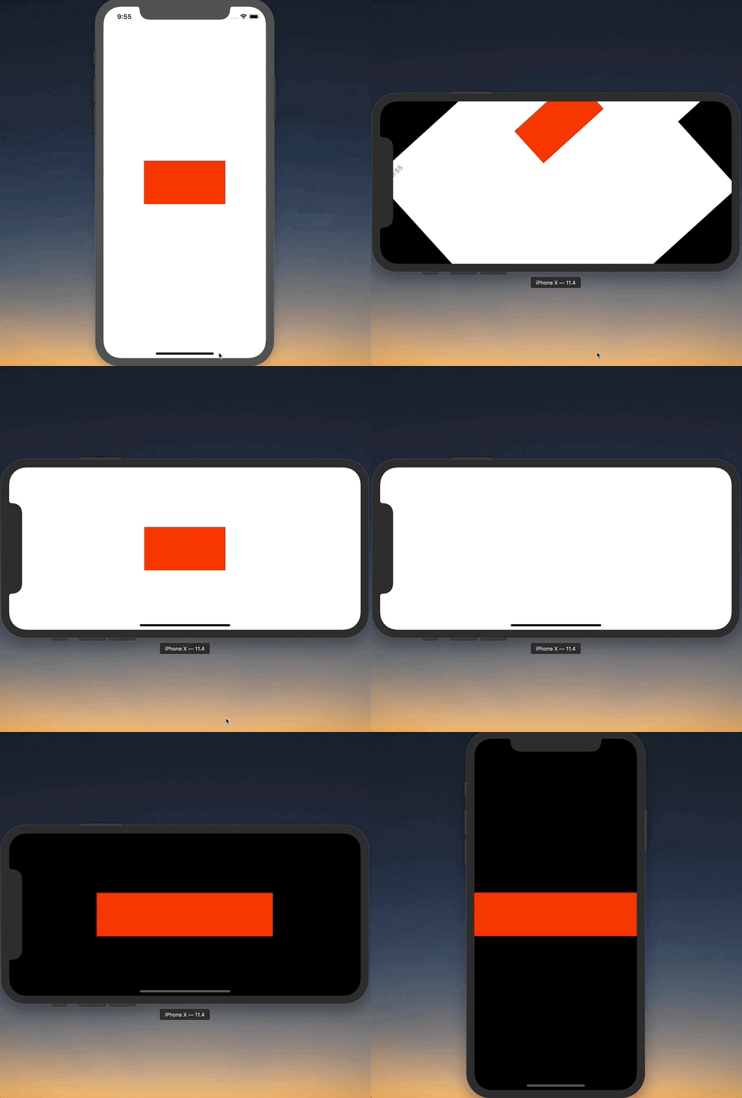
For this example app I want the width of our red box to always be 50% of the screen width. I also want the background to be black when in landscape. You can see that it does that if we keep the original orientation. Start in portrait we've got the right width box and right color background. If we switch to landscape though it stays what we originally had.
The Hook
We'll be creating a hook called useScreenDimensions. It should return the screen width, height, and whatever other data is provided to us. When the orientation changes it should update that info.
First, we'll use useState to return the initial dimensions:
App.js
// ...

const useScreenDimensions = () => {
  const [screenData, setScreenData] = useState(Dimensions.get('screen'));

  return screenData;
};

export default () => {
  const screenData = useScreenDimensions();
  const isLandscape = screenData.width > screenData.height;

  return (
    <View style={[styles.container, isLandscape && styles.containerLandscape]}>
      <View style={[styles.box, { width: screenData.width / 2 }]} />
    </View>
  );
};
This gives us the exact same behavior as we had before.
Next we'll listen to any dimension changes via Dimensions.addEventListener. This will call the callback function with an object containing window and screen.
App.js
// ...

const useScreenDimensions = () => {
  const [screenData, setScreenData] = useState(Dimensions.get('screen'));

  useEffect(() => {
    const onChange = result => {
      setScreenData(result.screen);
    };

    Dimensions.addEventListener('change', onChange);
  });

  return screenData;
};

// ...
This will update the the screenData variable which will in turn update our component.
If you run it now it works! But we've got a major issue.
Right now the listener is going to run forever - we never tell it when it should stop. This is can cause problems.
To clean up a listener with hooks you need to return a function from the useEffect hook.
For us that means returning a function in which we call Dimensions.removeEventListener;
App.js
// ...

const useScreenDimensions = () => {
  const [screenData, setScreenData] = useState(Dimensions.get('screen'));

  useEffect(() => {
    const onChange = result => {
      setScreenData(result.screen);
    };

    Dimensions.addEventListener('change', onChange);

    return () => Dimensions.removeEventListener('change', onChange);
  });

  return screenData;
};

// ...
Finally, it would be valuable to have this hook tell us whether or not the device is in portrait mode rather than depending on the consumer to have to do that every time.
App.js
// ...

const useScreenDimensions = () => {
  const [screenData, setScreenData] = useState(Dimensions.get('screen'));

  useEffect(() => {
    const onChange = result => {
      setScreenData(result.screen);
    };

    Dimensions.addEventListener('change', onChange);

    return () => Dimensions.removeEventListener('change', onChange);
  });

  return {
    ...screenData,
    isLandscape: screenData.width > screenData.height,
  };
};

export default () => {
  const screenData = useScreenDimensions();

  return (
    <View
      style={[
        styles.container,
        screenData.isLandscape && styles.containerLandscape,
      ]}
    >
      <View style={[styles.box, { width: screenData.width / 2 }]} />
    </View>
  );
};
And there you have it! An easy to reuse hook that will allow you to listen to any dimension changes in your app.
Final Code
App.js
import React, { useEffect, useState } from 'react';
import { View, Dimensions, StyleSheet } from 'react-native';

const styles = StyleSheet.create({
  container: {
    flex: 1,
    backgroundColor: '#fff',
    alignItems: 'center',
    justifyContent: 'center',
  },
  containerLandscape: {
    backgroundColor: '#000',
  },
  box: {
    backgroundColor: 'red',
    height: 100,
  },
});

// const screen = Dimensions.get('screen');

const useScreenDimensions = () => {
  const [screenData, setScreenData] = useState(Dimensions.get('screen'));

  useEffect(() => {
    const onChange = result => {
      setScreenData(result.screen);
    };

    Dimensions.addEventListener('change', onChange);

    return () => Dimensions.removeEventListener('change', onChange);
  });

  return {
    ...screenData,
    isLandscape: screenData.width > screenData.height,
  };
};

export default () => {
  const screenData = useScreenDimensions();

  console.log(screenData);
  return (
    <View
      style={[
        styles.container,
        screenData.isLandscape && styles.containerLandscape,
      ]}
    >
      <View style={[styles.box, { width: screenData.width / 2 }]} />
    </View>
  );
};


Top comments (0)