I have been coding CSS for almost 24 years and i feel that other devs keep mentioning that CSS is hard so i thought maybe i could share a few things on the matter to make it easier for a other developers.
My main mental model around CSS is to make it as predictable as possible so adding an element you almost blindly can tell how it changes your page as a whole.
CSS is supposed to be easy and can be with the right knowledge about some key features.
- The box model
- Margins cancel each other out
- Layouts
- Use tables for styling tables
- Em's, Rem's and Px
The box model
Okay so the easiest way to learn CSS is by understanding the box model and how you can make it your B*tch
Given this CSS on a div
div {
  border: 10px solid red;
  width: 200px;
  padding: 10px;
  margin: 10px;
}
This will be your default output where the center box is 200px wide as we stated in the styling

But if you instead add box-sizing: border-box
* {
  box-sizing: border-box;
}
You get this - can you see the difference?

So now the content box include the padding and border which resulted in the content box to go from 200px -> 160px because the colletive size of padding and border is 40px.
By doing this your layouts will be much more predictable and when you give your box a width: 200px its 200px not 240px.
Margins cancel each other out
Okay so this one I often see people forgetting and not a thing that is mentioned that often. So given this following CSS and markup
p {
  margin: 10px 0;
}
<p>some-text</p>
<p>some-other-text</p>
We should have 10px margin on both sides but a common mistake is thinking that the margins add up but actually cancel eachother out like this:

So for spacing elements i tend to use flex/grid and their gap property to have predictable spacing, mostly so i dont have to worry.
Layouting a page
So i have a few ways of working and looking back over the years there have been some terrible things we had to work around, if your familiar with the "clearfix" you know what i'm talking about.
Single row content
For single row content i tend to use flexbox and there are several reasons. Flex is by default a row so i have to write less. I dont need to care about how each element behaves - each element can relatively agnostic.
In this example i wanna create a top bar;

So it can be done in variaous ways, I tend to make sure all titles have no margins by default to make them more predictable.
Markup
<nav>
  <img src="http://placekitten.com/50/50" alt="">

  <h3>Some title</h3>

  <button>menu</button>
</nav>
Then I would style it something like this:
nav {
  display: flex;
  align-items: center;
  gap: 10px;
  background: #f1f1f1;
  padding: 10px;
}

nav img {
  height: 100%;
}
The reason I style the image to be 100% height is actually so if the designer later tells me can we set the height of the navigation bar to 50px then I just add that and now the menu will adapt to my needs.
Multi-line 2,3,n column layout
It's mostly for replicating rows and the likes i usually use grids for this.
For this example i wanna create a 3 column grid where we dont know how many elements goes into it because the element count changes.
Given this markup
<main>
  <div>1</div>
  <div>2</div>
  <div>3</div>
  <div>4</div>
  <div>5</div>
  <div>6</div>
  <div>7</div>
  <div>8</div>
</main>
We can style it like this:
main {
  display: grid;
  grid-template-columns: 1fr 1fr 1fr;
  gap: 20px;
}
NOTE: This requires each element to have some kind of content otherwise you wont be able to see them.
This is powerful because - lets say on tablet we only want 2 columns then we can do:
// Portrait tablet
@media only screen and (max-width: 768px) {
  main {
    grid-template-columns: 1fr 1fr;
  }
}

// Mobile
@media only screen and (max-width: 480px) {
  main {
    grid-template-columns: 1fr;
  }
}
I tend not to use the repeater because it just adds extra complexity without almost never being shorter than writing the whole thing out css repeat
Page layout
Lets create the layout below

So we have the navigation before and now wanna create sidebar, footer and content on the page
For main (wrapper) we can do this:
main {
  width: 100vw;
  height: 100vh;
  display: grid;
  grid-template-areas:
    "nav nav"
    "aside content"
    "footer footer";
  grid-template-columns: 230px 1fr;
  grid-template-rows: 50px 1fr 30px;
}
It's mainly making sure it fills out the whole page and then we describe our layout in the shortest way possible.
Remember to attach each of the elements to the main layout
nav {
  grid-area: nav;
}

section {
  grid-area: content;
}

aside {
  grid-area: aside;
}

footer {
  grid-area: footer;
}
We can decide the height and width of all static elements and can easly add a custom element to the box.
Use tables for styling tables
I have tried so many times to use grid, flexbox, floats and there are just so much in tables when you get it right.
It's one of the things i think i spend the most time to right about styling and very often its much easier to use a table when you get it right.
Ofc it removes the use of flex in your cells but this can be adapted by wrapping your content.
I wanna extend on styling tables and aim to do another whole blog post on tables.
Em's, Rem's and Px
Back about 10 years ago it actually mattered which one you use, but scaling your OS text and browser window will actually scale everything for you. Which it didn't back in the day that was why em's/rem's was powerful.
But most designers would want 10px when they design 10px and obfuscating your styling with ems and rems makes it so much harder to style something and in extension to that the benefits are not benefits anymore.
So i would suggest people to start using predictable and good ol' px again to make your design more predictable.
I could go on for ever about styling but these are the 5 major things that i tend to run into which would make everyones life easier if you know and do them well.
Hope you liked it leave a comment if you have any questions and subscribe for more
//Cheers

Top comments (46)
Nice article. I don't share your optimism with the rem/px discussion though. Sadly I fear we'll be using rem units long into the future. Things like tailwind use rem units and people will come up with the silliest arguments to defend it.
Yeah i dont use tailwind - probably why i didnt give it much thought - but it was just to say it had no benefits anymore xD
I'd still have to disagree with this for accessibility reasons, its true that zooming in and out on a browser will now zoom everything including text set with px - but that is only on a site by site basis. if the user is visually impaired and wants to universally set this in their browser is going to run into issues.
like you i dont use tailwind but i do use sass a lot, so i will just create a simple function that lets me use rem but with px values
@function rem($pixels, $context: $rem-base) {@return math.div($pixels, $context) * 1rem;
}
them i can write font-size: rem(37) or whatever and it will do the math for me. i know its 37px font but the browser will use the rem value
So yes, px may be easier for developers and most people wont notice anything, but there is a subset who will still benefit from us using rem - and accessibility for all is a developers concern
[edit]
and for those who want to read more on why this is still the case here is a great article to understand the real world some people live in, and no matter the size of this world it isn't hard for us so no excuses why we shouldn't make their life easier
Try to scale your os and tell it does not still work as you want it to. Those accessability claims aren’t relevant anymore.
Well there was i Think brave browser or something where they had one specific setting that ruined it then again i Think i Can live with that
@demkantor back in 2019 this probably had a difference, but now a days its not relevant i'd be happy to show you
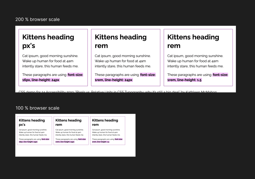
Codepen from the article:
codepen.io/resource11/pen/eYOQQxY
Screenshots in 100% vs 200%
I personally prefer to use rem.
Not because of accessibility but I think it's makes responsive layouts way nicer to develop.
We often have different font sizes for different screen sizes. When you use rem's for all you margins, paddings, gaps and font sizes you simply have to write a single media query for the base size and everything scales accordingly and looks way more balanced out of the box.
But i often find that its just never that simple because its not just about spacing its about flowing elements and what looks good on desktop fx 32px (2rems of 16px text) Might not be right for your mobile which often needs to have fx side padding of 10-20 now your locked in 24px fx
So interlocking your spacings with your font-size I believe is a mistake because now the designer/business/product owner comes to you and say ohh we need that font size to raise by 2px now all your layouts shifts due to this change.
I Like to say "yes" to the designer/business/product owner as often as possible so im not the reason why it cant happen
I will write up a whole article on this Em, Rem & Px talk
Because I have tried to build 100's of websites, mobile apps, web apps with css and have never liked rems/ems because I hand out ownership and lock font size with spacings
Essentially its just obfuscating what you really are trying to say
Last but not least this whole accessability talk - like most businesses would choose not to support it because its such a small audience unless you build directly to people with disabilities or govermental sites/portals.
First of all I have say that I found it refreshing that you listen to other arguments and try to argue and not blindly defend your opinion. Sadly that happens quite rarely these days. (Not to mention some comments here)
I got you point but I don't agree with you conclusion.
In my 15 years of web development i nearly never encountered a case where all font sizes have to be changed without adjusting paddings etc. accordingly.
In my opinion it's more often one of these two cases:
In the my opinion rarely case that you actually have to change all font sizes while keeping everything else the same, then your right that rem's are more work.
But even then it wouldn't be a problem for me. What I normally do is to define a (base) --gap css variable and then use calc to get the actual paddings, margins etc.
I think that's a good practice anyway because you can make the whole design more "spacey" or more "compact" by adjusting a single value.
So if you have done this you can change font-size and simply adjust gap size in the other direction. (so no hard locking here)
So for me even the rare case is pretty much a draw.
A pixel perfect design is possible in both ways and rem's give you more flexibility.
In conclusion I think rem's have way more practical advantages then drawbacks (you have to do some simple math).
I agree to you that I most projects accessibility doesn't matter, but I think that's a weak argument against getting more accessibility for free by simply using rem's.
Thanks for the reply; i Think im getting where your coming from and also that i Can see the benefits that your refering to.
It is still 6am here so i probably need to digest this and also try it out on a larger project - i Will get back to you on this i promise!
Just wanna note that i did try rems and ems before rems was “right” i found it hard to maintain and do small changes and also i almost never write media queries my self these days. But im willing to give it another go based on your arguements! ✌️
@sp90 rems and ems help users to scale text using the browser's settings. The difference is if users choose a large font size they won't see changes in the case of using px. I did it with your Codepen demo.
I find Tailwind and Bootstrap fairly useful as starting points, but the excess markup irritates me. Why use many classes where one will do, especially as far as the C in CSS is concerned. Great for prototyping layout, but can be improved on.
Personally i dont have anything against tailwind nor bootstrap; i just feel i Can do better without 🤣
The lines of css i need to Express almost any layout are so little compaired to copy and pasting class “lists” everywhere
Agreed. Horses for courses. A lot of backend devs aren't necessarily good at fronted stuff, which is perfectly fine. TW and BS are fantastic here. I consider myself both front- and back-end, so want to have greater control over style without the overheads.
Personally, I find that, as with most things, it's all about balance and need. One size (no pun intended) does not fit all. For the most part, I choose rem for consistency of scaling, but for borders or pixel perfection (thanks to OCD on such matters), I add px to the mix.
End-result is key here, but then, so is personal preference.
There is no perfect solution, but there are plenty of wrong ones.
Thanks for taking the time to read and comment; i agree go with what suites you best :)
I feel that if i where to use rem i would use it only for fonts and for media queries. Because this way my boxes layout are easy to Update and adapt to design changes and my UI flow is predictable
What i find throws me about REM is that when i inspect i cant instantly tell the spacing or size of an object in px
And my ocd is just Extreme when it comes to design and UI - i want it to be exact since i personally Think you get just that extra uff that the designers create by going the extra mile on it
Amazing post! Especially I loved the examples you describe, thanks for your job Simon☺️
I appreciate your comment a lot! 🙏🏼✌️
While I agree with mostly everything, I sincerely disagree with the
pxargument.Ultimately, it's not because using
pxmake a huge difference overremin the code, it's all about user needs.Browsers have a setting to set the default
font-sizeto the user need. If the user need to adjust thefont-sizea bit bigger for all websites, it's their own choice.Yes, they could zoom in, but they'd have to adjust on a site by site basis. It's very bothersome to those users that need it.
Yes, they could increase their OS font settings and make text bigger across the board. But now, to see your website to the size they need, everything else is in 48 px... It makes no sense...
By using
px, designers choose, consciously or not, to throw the user needs under the bus for their own satisfaction. The needs of one trumps the needs of the many...In reality, pixel perfect doesn't exists. Believing otherwise is just putting your head in the sand.
It's entirely possible to only increase the font-size OS-wide without affecting anything else. Now nothing is proportional to what the designer wanted.
When enabling High Contrast, all your beautiful colors are thrown out the window. Windows will trash most of your stylesheet and do what's right for the user.
A new device will have a smaller or bigger screens, different resolutions and different aspect ratio; All these throw away most of the pixel perfect image of the design.
At some point, designers need to realize they don't really have the control over their design. Using
pxis like desperately holding with skin of your teeth to the old ways when everybody has moved on to greener pastures.The web is responsive and must adapt to users, it's the nature of the beast.
Most people would be horrified when someone preach removing an access ramp for wheelchairs. Using
pxwould be the exact same principle for people that need the browser's default font-size.Most companies don't want to develop web apps and websites for a minority of users. It costs a bit more money and they want to keep that money even if they're making historical profits years after years after years.
But companies also kill people for profits, dumps chemicals in rivers and use children to assemble their products in other countries. You just can't trust them to do what's right...
Laws have been implemented for the benefits of people with disabilities and the next step is gonna be software. It's written on the wall it's gonna eventually happen. Maybe not in the next 5 years, but we all know most of the apps or website we write last decades.
How will it look in 10 years if a law is passed to cover software with WCAG 2.0 guidelines? How much is it gonna cost companies to comply? All because a designer wanted to keep control of its design and go against the very nature of the web?
You can already be sued in the US if your site is not accessible enough. It happened to Domino's:
There's nothing preventing people to jump on the bandwagon for internal software development too. If a disabled person can't work because a designer locks the font-size, there are gonna be lawsuits eventually.
Do NOT mess with the user needs
Hi and Thanks for your comment i feel that it comes from a good place and a strong feeling for rems - i Can nothing but respect that.
This is basically the discussion i had with most people in here try to look at the comments i debated with Simon - i Think it Will end in the same place. And as i Said to him his arguments actually made me wanna give it another go.
I would love to compair px Perfect vs em’s/rem’s dev site one day
Last but not least it would be impossible to increase font size just by using px should just be that they do a relative increase and set a fontsize 200% fx (dont know if this is possible; but i am going to find out) ✌️
Amazing post!
Much appreciated, thanks for reading along!
Cool post, I am all for pixel control and related media queries. The reason is simple actually: If I want to create something cool, I want to take my time and be as specific as I can!
Totally agree; but also css is like a flow so if the flow is off in the beginning the rest feels “off” ✌️ this is where i normally experiencing that its hard to debug
Сongratulations 🥳! Your article hit the top posts for the week - dev.to/fruntend/top-10-posts-for-f...
Keep it up 👍
Thank you, Simon, for your interesting perspectives on CSS. I look forward to reading your next articles about CSS and related topics. 👍
Thanks ✌️ much appreciated
Excellent article!
Thanks a lot 🙏🏼
thanks, this really helps. my concern is on responsive design. using width of 100vw for main in tablet and smartphone it ok for me. what about for desktop, large screen, mondern big screen ? 100vw might just cover the whole screen, which may scatter everything all around.
Ofc in some situations you dont want to use the 100vw, let me do a bonus article with some other tips for responsiveness.
I actually focus to write my css so i can write as little media queries as possible
I finally got the article on responsive content done - its mainly taking an outset in the current article above
Hope you like it:
dev.to/sp90/3-tips-on-css-responsi...
Very good!
Thanks happy that you like it
Gonna follow...❗
Some comments may only be visible to logged-in visitors. Sign in to view all comments. Some comments have been hidden by the post's author - find out more