
In this walkthrough, I'll guide you through the steps of building a simple navigation bar with GatsbyJS. We'll use Styled Components to style our application.

Motivation
I was trying to find an extremely simple and responsive Gatsby navigation bar that utilizes Styled components and useState hook but ended up creating my own. I'll be happy if there's at least one person that finds this tutorial somewhat useful.
Requirements
If you've found this tutorial, I assume that you've already got node and gatsby-cli installed on your machine.
node - check in terminal by typing:
node -v
gatsby-cli if not, use your terminal to install:
npm install -g gatsby-cli
Installation
Begin with creating a new project, we'll call it gatsby-navigation and use a default starter. I intended to change as little as possible inside the starter.
gatsby new gatsby-navigation https://github.com/gatsbyjs/gatsby-starter-default

It's time to navigate into the new site directory.
cd gatsby-navigation
Styled Components
Styled components is a CSS-in-JS framework, which enables you to write plain CSS utilizing template literals in your components without worrying about name collisions - meaning, it simply generates unique class names for styles. Components can be dynamically styled based on props or a theme. You don't have to worry about vendor prefixes. Furthermore, it takes advantage of the Critical CSS technique - ships the bare minimum required to render a page.
Install in terminal:
npm install --save gatsby-plugin-styled-components styled-components babel-plugin-styled-components
Don't forget to add 'gatsby-plugin-styled-components' to plugins array in gatsby-config.js
Start Building
Since we've got everything already installed, it's time to start developing our navbar.
gatsby develop
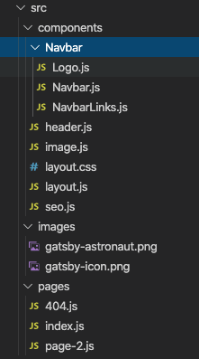
Let's start by creating a directory named Navbar with Logo.js, Navbar.js and NavbarLinks.js inside.
Logo
Almost every navigation needs a logo so we'll use GraphQL with gatsby-image to grab our logo from images directory.
gatsby-image enables us to optimize images without tons of tedious work.
// Logo.js

import React from "react"
import Img from "gatsby-image"
import { useStaticQuery, graphql } from "gatsby"


const Logo = () => {
  const data = useStaticQuery(graphql`
    query {
      file(name: { eq: "gatsby-icon" }, extension: { eq: "png" }) {
        childImageSharp {
          fluid(maxWidth: 50, pngQuality: 80) {
            ...GatsbyImageSharpFluid
          }
        }
      }
    }
  `)
  return (
      <Img fluid={data.file.childImageSharp.fluid} alt="logo" />
  )
}

export default Logo
Navbar Links
Link is a special component designed to link between internal pages instead of using <a> tags.
What is so special about it? Simply, it prefetches our pages.
// NavbarLinks.js

import React from "react"
import { Link } from "gatsby"

const NavbarLinks = () => {
  return (
    <>
      <Link to="/">About</Link>
      <Link to="/404">Services</Link>
      <Link to="/">Gallery</Link>
      <Link to="/404">Contact</Link>
    </>
  )
}

export default NavbarLinks
Navigation Bar
The component that holds most of the logic of our navbar. We'll use a conditional (ternary) operator to switch between props and a useState hook to hold the state of our navigation.
// Navbar.js

import React, { useState } from "react"
import NavbarLinks from "./NavbarLinks"
import Logo from "./Logo"
import styled from 'styled-components'

const Navigation = styled.nav``
const Toggle = styled.div``
const Navbox = styled.div``
const Hamburger = styled.div``


const Navbar = () => {
  const [navbarOpen, setNavbarOpen] = useState(false)

  return (
    <Navigation>
      <Logo />
      <Toggle
        navbarOpen={navbarOpen}
        onClick={() => setNavbarOpen(!navbarOpen)}
      >
        {navbarOpen ? <Hamburger open /> : <Hamburger />}
      </Toggle>
      {navbarOpen ? (
        <Navbox>
          <NavbarLinks />
        </Navbox>
      ) : (
        <Navbox open>
          <NavbarLinks />
        </Navbox>
      )}
    </Navigation>
  )
}

export default Navbar
You've got it!
Congratulations! By this time our application should look extraordinarily bad, but the guts are already in place...

Let's add some styling
Aside from making it responsive, it is time to use the good stuff that comes with Styled components. In our case, we'll use props to determine which styles should be active.
Final Logo
We've added a wrapper to enclose our image. You'd most likely use it to take us to our homepage so we'll make it treat our wrapper as a link.
// Logo.js
import React from "react"
import styled from "styled-components"
import Img from "gatsby-image"
import { Link, useStaticQuery, graphql } from "gatsby"

const LogoWrap = styled.div`
  margin: auto 0;
  flex: 0 1 36px;

  @media (max-width: 768px) and (orientation: landscape) {
    flex: 0 1 25px;
  }
`
const Logo = () => {
  const data = useStaticQuery(graphql`
    query {
      file(name: { eq: "gatsby-icon" }, extension: { eq: "png" }) {
        childImageSharp {
          fluid(maxWidth: 50, pngQuality: 80) {
            ...GatsbyImageSharpFluid
          }
        }
      }
    }
  `)

  return (
    <LogoWrap as={Link} to="/">
      <Img fluid={data.file.childImageSharp.fluid} alt="logo" />
    </LogoWrap>
  )
}

export default Logo
Final Navbar Links
Let's make a new component that's based on a Link component and style it.
// NavbarLinks.js

import React from "react"
import styled from "styled-components"
import { Link } from "gatsby"

const NavItem = styled(Link)`
  text-decoration: none;
  color: #111;
  display: inline-block;
  white-space: nowrap;
  margin: 0 1vw;
  transition: all 200ms ease-in;
  position: relative;

  :after {
    position: absolute;
    bottom: 0;
    left: 0;
    right: 0;
    width: 0%;
    content: ".";
    color: transparent;
    background: goldenrod;
    height: 1px;
    transition: all 0.4s ease-in;
  }

  :hover {
    color: goldenrod;
    ::after {
      width: 100%;
    }
  }

  @media (max-width: 768px) {
    padding: 20px 0;
    font-size: 1.5rem;
    z-index: 6;
  }
`
const NavbarLinks = () => {
  return (
    <>
      <NavItem to="/">About</NavItem>
      <NavItem to="/404">Services</NavItem>
      <NavItem to="/">Gallery</NavItem>
      <NavItem to="/404">Contact</NavItem>
    </>
  )
}

export default NavbarLinks
Final Navigation Bar
Now add styling based on props passed into our Hamburger component using template literals.
// Navbar.js

import React, { useState } from "react"
import styled from "styled-components"
import NavbarLinks from "./NavbarLinks"
import Logo from "./Logo"

const Navigation = styled.nav`
  height: 10vh;
  display: flex;
  background-color: #fff;
  position: relative;
  justify-content: space-between;
  text-transform: uppercase;
  border-bottom: 2px solid #33333320;
  margin: 0 auto;
  padding: 0 5vw;
  z-index: 2;
  align-self: center;

  @media (max-width: 768px) {
    position: sticky;
    height: 8vh;
    top: 0;
    left: 0;
    right: 0;
    left: 0;
  }
`

const Toggle = styled.div`
  display: none;
  height: 100%;
  cursor: pointer;
  padding: 0 10vw;

  @media (max-width: 768px) {
    display: flex;
  }
`

const Navbox = styled.div`
  display: flex;
  height: 100%;
  justify-content: flex-end;
  align-items: center;

  @media (max-width: 768px) {
    flex-direction: column;
    position: fixed;
    width: 100%;
    justify-content: flex-start;
    padding-top: 10vh;
    background-color: #fff;
    transition: all 0.3s ease-in;
    top: 8vh;
    left: ${props => (props.open ? "-100%" : "0")};
  }
`

const Hamburger = styled.div`
  background-color: #111;
  width: 30px;
  height: 3px;
  transition: all .3s linear;
  align-self: center;
  position: relative;
  transform: ${props => (props.open ? "rotate(-45deg)" : "inherit")};

  ::before,
  ::after {
    width: 30px;
    height: 3px;
    background-color: #111;
    content: "";
    position: absolute;
    transition: all 0.3s linear;
  }

  ::before {
    transform: ${props =>
      props.open ? "rotate(-90deg) translate(-10px, 0px)" : "rotate(0deg)"};
    top: -10px;
  }

  ::after {
    opacity: ${props => (props.open ? "0" : "1")};
    transform: ${props => (props.open ? "rotate(90deg) " : "rotate(0deg)")};
    top: 10px;
  }
`
const Navbar = () => {
  const [navbarOpen, setNavbarOpen] = useState(false)

  return (
    <Navigation>
      <Logo />
      <Toggle
        navbarOpen={navbarOpen}
        onClick={() => setNavbarOpen(!navbarOpen)}
      >
        {navbarOpen ? <Hamburger open /> : <Hamburger />}
      </Toggle>
      {navbarOpen ? (
        <Navbox>
          <NavbarLinks />
        </Navbox>
      ) : (
        <Navbox open>
          <NavbarLinks />
        </Navbox>
      )}
    </Navigation>
  )
}

export default Navbar
Wrapping up
Combining styled components with useState hook is a modern way of writing React’s code, it’s quite easy to implement and gives our app a clean look.
Feel free to share if you found it useful.
Sandbox


Top comments (0)