
Wondering how to set or style the active link in Material-UI? This Material-UI tutorial will teach you how to style an active drawer / tab item with simplest code possible.
The Mui AppBar and Drawer provide a great starting point - but they don't provide a solid foundation for highlighting the active tab. As a result, many developers end up with 'hacky' methods of setting active nav items. Fortunately, there's a better way.
Demo
Live Site
Codesandbox Demo
Github Repo
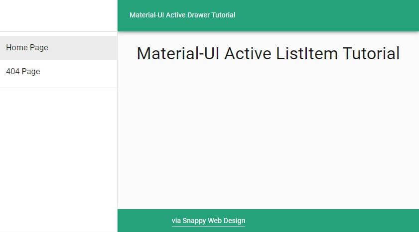
Preview:
Boilerplate (Starting Point)
import React from "react"
import { Link } from "gatsby" OR "@material-ui/core/Link"
import Drawer from "@material-ui/core/Drawer"
import List from "@material-ui/core/List"
import ListItem from "@material-ui/core/ListItem"
import ListItemText from "@material-ui/core/ListItemText"

export default function MuiDrawer() {
  return (
      <Drawer variant="permanent" anchor="left">
        <List>
          <ListItem button component={Link} to="/">
            <ListItemText primary="Home" />
          </ListItem>
          <ListItem button component={Link} to="/404">
            <ListItemText primary="404" />
          </ListItem>
        </List>
      </Drawer>
  )
}
The Solution:
To set the Active ListItem in the Material-UI Drawer, we can use the selected prop. To make this as clean as possible, we should make a custom ListItem. Here's what it looks like:
  let CustomListItem = ({ to, primary }) => (
    <ListItem
      button
      component={Link}
      to={to}
      selected={to === location.pathname}
    >
      <ListItemText primary={primary} />
    </ListItem>
  )
Now we can render our CustomListItem as follows, which will automatically set the Drawer ActiveItem based on the browser's location.
<CustomListItem to="/" primary="Home Page" />
Final Code
Here's how the Drawer looks in its final form:
import React from "react"
import { Link } from "gatsby"
import { useLocation } from "@reach/router"
import Drawer from "@material-ui/core/Drawer"
import List from "@material-ui/core/List"
import ListItem from "@material-ui/core/ListItem"
import ListItemText from "@material-ui/core/ListItemText"

export default function BarebonesDrawer({ children }) {
  const location = useLocation()

  let CustomListItem = ({ to, primary }) => (
    <ListItem
      button
      component={Link}
      to={to}
      selected={to === location.pathname}
    >
      <ListItemText primary={primary} />
    </ListItem>
  )

  return (
      <Drawer variant="permanent" anchor="left">
        <List>
          <CustomListItem to="/" primary="Home Page" />
          <CustomListItem to="/404" primary="404 Page" />
        </List>
      </Drawer>
  )
}
Finished Product
Bonus: Styled Material-UI Drawer
Need a quick copy and paste? Here's the code for the styled Drawer in the demo above:
View on Github
Did you find this article helpful?
If you did, would you take a second to share the article by clicking below? It helps our cause immensely!
Make sure to also click the follow button to get notified when new posts go live 🔔

Top comments (0)