Gradient text is becoming increasingly popular all over the web. We even use it on Fjolt in various places. In the past, gradient text required static images, but now it can easily be done with CSS rather than photoshop.
Web3 Text Gradient Style
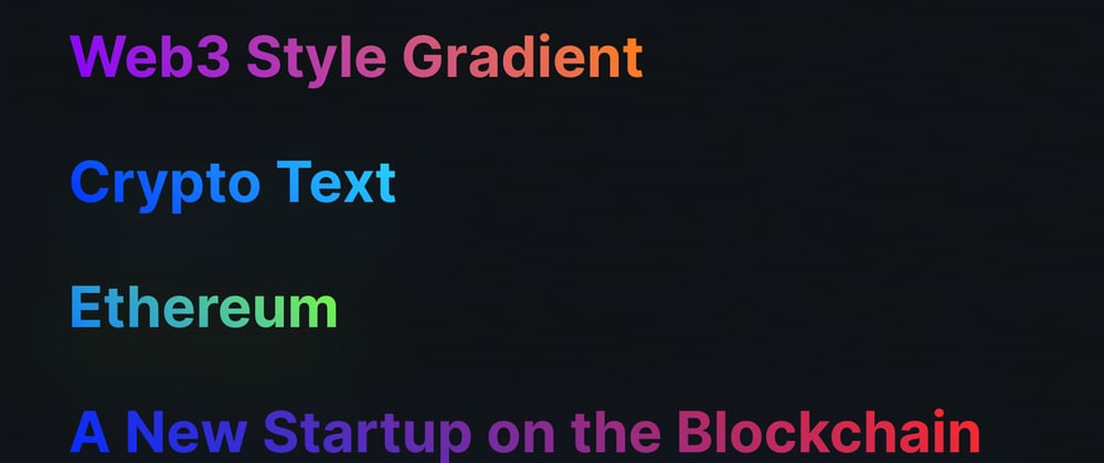
In this quick guide, we'll create a few different text gradients. These text gradients are very common in Web3 designs. Here are a few examples below, with an added glow to make them seem more futuristic:
Web3 Style Gradient
How do CSS Text Gradients Work?
It might surprise you to know that CSS gradient text is actually done through an unstandardized set of webkit CSS properties. These properties have become so pervasive on the web, that even Firefox supports them now.
Since most other browsers are largely chromium based, gradient text has very broad support in all modern web browsers for a set of non-standardized properties. Worried about older browsers? Since these are webkit properties, older browsers just ignore them, so you don't need to worry much about support.
That means those who can see gradient text, do, and those that cannot, just see the normal text color. Easy!
Adding Gradient Text
To add gradient text, we need to add the following CSS:
.text {
    background-image: linear-gradient(225deg, #28d8ff, #032eff);
    filter: drop-shadow(0 20px 30px #28d8ff33);
    color: black;
    -webkit-text-fill-color: transparent;
    -webkit-background-clip: text;
    -webkit-box-decoration-break: clone;
}
Let's break this down:
- background-image - is the gradient we want to use for our text
- -webkit-text-fill-color - replaces the normal color of the font with a transparent color, so the text disappears!
- -webkit-background-clip - clips the background image to the outline of the text. Now the background will only show where the text is.
- -webkit-box-decoration-break - is the strangest property I've ever seen in CSS, but it ensures the gradient works on multiple lines.
- filter - since we're using background clips and text, we can use a filter for the drop shadow rather than a normal box shadow.
Now it's up to you what gradient you want! Just adjust the background-image colors to show the gradient style you desire. You can find the full code for this demo here.


Top comments (0)