
What distinguishes a successful, yet simple mobile application from a multi-functional but failing one? The answer is hiding behind the 2 letters - UX. UX (User Experience) design is an essential thing every custom software development company should focus on.
What’s the difference between UX design and UI design? Imagine that you have a big nice cheeseburger in front of you. What you see, how the burger looks like - this is UI (user interface). However, once you get a bite of it - here comes UX - what you feel about it.
Food can look delicious and inviting but the taste is a complete disaster. The same applies to a mobile application: the interface and the outer look may be attractive (colorful, animated, beautiful), but the way you feel when using the product makes you want to throw the device against the wall.
Therefore, we conclude that a successful smartphone app must have a high-quality User Experience Design. In this article, we’re going to outline some cool tips that will help you ensure an amazing user experience.
1. Don’t let typical UX Myths fool you
Smartym Pro’s UI/UX Lead Designer shares his experience:
_“There are numerous UX myths that have been busted by UX Designers all over the world via User Tests. All these myths are stored on a specific website, I suggest all the UI/UX designers visit it in order not to become prey of stereotypes.
The key thing is not to search for a panacea and perfect pattern but to figure out who your users are. For instance, there is a popular tip for building a mobile app: don’t use too many buttons, be simple. Otherwise, you will lose the majority of your target audience.
But is it so? If people got used to utilizing lots of buttons before and then we suddenly remove all the unnecessary ones (according to our opinion)... what happens then? Everyone will be happy? No. New users - probably yes, but what about saving the current ones?

The thing is that there are hundreds and thousands of posts on the internet being like “10 UX Design tricks that will help your mobile application get on top” or “6 things you should not do when creating UX design” but most of them - are just a compilation of stereotypes that might work in no more than 50% of cases.
The biggest mistake many UI/UX designers make is that they use these recommendations without delving in the topic, without conducting any profound UX research. As a result, the final solution appears just as typical (or worse) as all the other digital products on the market.
2. Making separate features convenient and too obvious, you risk losing important things
_“Another tip for UX software development that is not correct: be obvious, create an intuitive workflow as users shouldn’t waste time trying to guess how to make a certain action, or find the required information, or resolve their issues.
I claim that it’s quite an amateurish thing to say. Everything depends on the context. For example, if it’s a gigantic interface with features that, say, serve such an important role as aircraft control or dealing with medical equipment.
So, you have to be cautious as while chasing the target of BEING OBVIOUS, you have a great risk of losing something more IMPORTANT (e.g., functionality).
At the same time, if you need to launch a basic app for thousands and millions of users, common activities should be implemented in the way that customers could do them without thinking. For example, money transfer or fund withdrawal.
When the key goal is to make everything as obvious and understandable as possible, you risk making it so only for yourself as a developer. Everything you do should be based on User research.”_ - continues our UI/UX expert.
The best advice here - don’t try to focus on the convenience first if you don’t know your audience. Many mobile app development teams mistakenly skip the UX Audit stage and let software engineers (or anyone else rather than a UX specialist) be responsible for the user engagement.
3. Don’t burden users with the unnecessary input fields

While working with a web or desktop application, numerous text fields don’t bother users that much, mobile screens are not made for big amounts of data being entered from a small keyboard.
First and foremost, this is irritating. Secondly, your users might consider your software solution unsafe if they see too many input fields asking for some additional personal details that don’t have anything in common with the goal of a mobile app.
Leave the minimum required number of fields, think about what will be comfortable for your future users to share. And remember about an amazing autocomplete, it’s very important!
4. Any blank screen will lead your app to failure
There are no official statistics on how many people have chosen to delete an application after a couple of times seeing a blank screen when trying to launch a feature. However, it’s quite obvious that when a user wants to do something but sees nothing - he/she stops using it and installs another product.
But the problem is the application might not have bugs at all: it was just the developers' omission and what’s going on behind the blank screen is actually long feature loading.
In our UI/UX design company, we avoid these situations by setting up a close collaboration between designers and engineers. Programmers analyze the functionality that needs time to be launched, designers suggest some graphic solutions that would entertain people while waiting.
In one of our previous posts about UI/UX trends of 2020, we’ve mentioned that animation is one of the main trends for the coming years. So, be creative when decorating your blank screens but don’t exaggerate!
_“Unfortunately, there is still a lot of legacy mobile products on the market, that lack some kind of a loading status. A loader is an indicator for users that the app is working fine.
Employing animations and other funny tricks is a great thing as adds some feelings, unlike another spinning loading circle.
However, be moderate with what you do. In a bank application, for example, you shouldn't demonstrate an animation of banknotes flying away somewhere, while a transaction is processing.”_ - comments Lead Designer at Smartym Pro.
5. Conduct UX research
This is the most important practice that summarizes everything mentioned above. What does UX Research even mean? It means that in the development process you should engage a professional to get close with the future customers, give them prototypes to try, collect and analyze their feedback. Hence, UX Research is all about getting into the users’ shoes.
There are some effective UX design methods that will help you familiarize with your target audience and create excellent UI and UX of your mobile app:
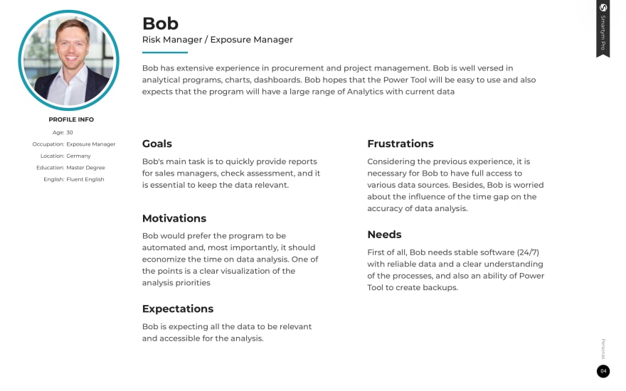
1). Proto-personas. Proto-personas help set the structure and priorities for users. You need to make assumptions in terms of audience perspectives and opportunities.
Based on personas, later assumptions can be validated via qualitative research. Proto-persona is a quasi-fictional character that represents your product user: has a name, face, some backstory, description of preferences;
2). Interviews. Interviews should be conducted both with stakeholders and future users. This will allow you to get valuable insights into their expectations.
One of the key points is to identify problem areas and get a complete list of roles and their tasks;
3). Journey map. A Customer Journey Map is a visual representation of every interaction your user will have with the product.
Maps enable teams to get a complete service picture, clarify the opportunities and get a “sneak peek” of how the current service structure will be transformed under the influence of a digital product;
4). Information architecture. One of the most essential elements of the UX Research process in mobile product development. This is a hierarchical structure of the future app’s screens with description.
Information architecture’s goal is to organize content in a way that is easy for future users to adapt to the functionality of the product and so that they could effortlessly navigate.
These are the methods that we use in Smartym Pro to deliver flawless usability, as well as eye-pleasing Visual Design and User Experience.
For over 5 years of work our team has proven the high-quality of our products’ UI and UX, and recently our efforts have been rewarded with a top mobile software development company position according to GoodFirms.
We are glad to share our UI/UX Design skills and expertise with you!
Conclusion
Therefore, it is very important to dedicate enough time to User Experience Research and Design. Fortunately, there are multiple useful recommendations to follow when building a great smartphone application.
Take into account that UX is the responsibility of not only designers but developers, project manager, business analysts, marketers, and quality assurance engineers. So, establish close team cooperation to achieve a perfect result.
Good luck with reaching the top 5 mobile apps in the App Store and Google Play markets! Using the tips mentioned in the article, you will surely get there sooner. If you need some creativity boost or have questions to ask, welcome to our friendly specialists that will help you!


Top comments (0)